Adshels with Difference: IKEA LEDshel and ANAR

Here are two adshel innovations currently doing rounds online. An adshel is a street shelter advertising unit, typically at a bus stop. Both use the media surface itself as the message, not just a place to hang a poster.

Ikea LEDshel

IKEA swapped the regular neon tubes found in adshels around Vienna with its LED range. The product becomes the medium, and the demonstration happens at full scale in the street. Credited to DDB Tribal Vienna, the move turns “better light” into something you can experience, not just read about.
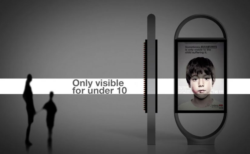
Only for children

In an effort to give abused children a safer way to reach out for help, the Spanish organization Fundación ANAR created an ad that displays a different message to adults and children at the same time.

The poster uses a lenticular top layer to show different images at varying angles and heights. An adult sees the image of a sad child with the line: “sometimes, child abuse is only visible to the child suffering it.” A child sees bruises and a direct help message with a phone number. This work is widely credited to Grey Group España.

What makes these “adshels with difference”

The shared mechanism is simple: upgrade the shelter from a passive frame into an active communicator. One example changes the hardware so the ad site demonstrates the product. The other changes the optical layer so the message adapts to who is looking.

Because the shelter itself performs the claim, the viewer can grasp the argument in seconds, which is why these ideas travel in public space.

In European city out-of-home media, small physical changes to the site often persuade more powerfully than a clever headline alone.

The real question is whether your out-of-home idea still works when the media unit itself has to do the explaining.

These are the out-of-home ideas worth borrowing because the medium carries the proof, not just the copy.

Why it lands

It makes the proof unavoidable. IKEA does not claim “LED looks better.” It lets the street lighting show it. ANAR does not claim “victims can’t speak safely.” It builds a channel that protects the child in plain sight.

It respects context. Adshels sit in public space where attention is brief. Both ideas communicate at a glance, because the medium itself is doing part of the explanation.

It uses targeting without data. The lenticular execution “targets” by viewpoint and height, not cookies. It is a physical interface decision, not a digital one.

Extractable takeaway: Out-of-home innovations travel when the site behavior carries the argument. If the medium demonstrates the product, or adapts the message to the viewer’s vantage point, the campaign becomes self-explanatory and hard to ignore.

Borrowable adshel moves

  • Turn the placement into the demo. If the product has a sensory benefit, make the environment show it.
  • Use physical segmentation. Angle, distance, height, light, and motion can personalize a message without any personal data.
  • Design for public constraints. Fast comprehension wins. The structure should communicate before the copy finishes.
  • Let the medium do the persuasion. When the execution is the proof, the message needs fewer claims.

A few fast answers before you act

What is an “adshel” in this context?

A street shelter advertising unit, typically at bus stops, that combines a poster frame with lighting and protective glass.

What is the IKEA LEDshel idea actually demonstrating?

LED lighting quality in real conditions. The shelter itself becomes a live showroom for the light range.

How does the ANAR poster show two messages at once?

Through a lenticular layer that changes what is visible based on viewing angle and height, so adults and children see different visuals and text.

Why is this more effective than a standard awareness poster?

Because it delivers a help message to the child without alerting the accompanying adult, which is the real constraint in the situation.

What is the reusable principle across both examples?

Make the media unit behave like the idea. When the medium demonstrates, adapts, or protects, the campaign does not need heavy explanation.

Austria Solar: Sun-Powered Annual Report

Austria Solar’s annual report arrives looking almost blank. Then you step into sunlight, and the pages wake up.

Serviceplan’s idea is to put solar energy “to paper” in the most literal way. The report’s typography and graphics only become visible when exposed to sunlight, turning the act of reading into a live demonstration of the product story.

How it works, and why the packaging matters

The mechanism sits in the production craft: a special printing process using light-reactive inks so the content remains invisible until UV-rich daylight hits the page, at which point the design reveals itself.

The report is then wrapped in light-proof foil before distribution, so recipients experience the reveal as a first-time moment rather than an already-exposed artifact.

In B2B and association communications, annual reports are expected to be worthy, and often get skimmed, so engineered “stops”, deliberate interruptions that force a reader to pause, can earn attention without needing louder messaging.

Why the reveal lands

This works because the medium is doing the persuasion. Because the content stays hidden until sunlight, the reader has to take one small step, which makes the reveal feel earned rather than announced. The real question is whether your format can do the convincing before your copy does.

Extractable takeaway: When your value proposition is invisible in everyday life, design a simple interaction that makes it visible in the moment. Let the audience “prove” the benefit to themselves through a familiar artifact.

There is also a quiet confidence in the restraint. The pages look empty at first, which builds curiosity. Then the content appears, which feels like a payoff rather than a pitch. This is a stronger move than adding more words when you need attention without hype.

The business intent behind the craft

The report is doing several jobs at once. It modernizes a traditionally dry format, positions Austria Solar as an innovation-led industry organization, and gives members and stakeholders a story they can easily retell.

Because the reveal is physical and repeatable, it also travels well in meetings. The report becomes a prop for advocacy, not just a document for compliance.

Practical moves to borrow from the sun-reveal report

  • Turn a claim into a demonstration. If your topic is energy, data, security, or sustainability, look for a way the format can embody the message.
  • Design for the first 10 seconds. Engineer a moment that forces curiosity before you ask for attention.
  • Make the interaction effortless. The user action here is trivial. Move into daylight.
  • Package the experience, not just the content. The light-proof wrap protects the “first reveal” so the idea survives distribution.

A few fast answers before you act

What is the core idea of Austria Solar’s sun-powered annual report?

It is an annual report printed so that its content only becomes visible when exposed to sunlight, turning reading into a physical demonstration of solar energy’s presence and power.

Why does making the content invisible at first help?

The initial blankness creates curiosity and a clear contrast. When the content appears, the reveal feels like a payoff, which increases attention and recall compared to a conventional report page.

What makes this more than a gimmick?

The interaction directly reinforces the organization’s story. The report does not just talk about solar power. It requires sunlight to function, which makes the message inseparable from the format.

Why does the light-proof wrap matter?

It preserves the first-time reveal by preventing premature exposure, so recipients experience the idea as a moment rather than a pre-exposed artifact.

Where else can this pattern work?

Any communication where audiences expect low novelty, like policy packs, compliance updates, investor or member reports, or annual reviews, especially when you can embed a simple demonstration into the artifact itself.

VGT: Fur iAd that bleeds when you swipe

VGT (an association combating animal factories), working with Austrian agency Demner, Merlicek & Bergmann, created an iAd, an interactive tablet ad unit, for the iPad edition of DATUM magazine.

The iAd shows a young woman wearing a fur coat. When the iPad user tries to continue browsing with the familiar finger-wipe movement, each swipe leaves a blood stain on the fur. The more you try, the more blood appears, turning a simple “next page” gesture into the message.

A navigation gesture that becomes the accusation

The clever part is that nothing “extra” is required from the user. No quiz. No mini game. No new behaviour. The iAd hijacks the most natural behaviour on the device. Swiping to move on. That is why it feels so sticky. The ad does not ask for attention. It punishes avoidance.

The mechanism: friction by design

Most advertising tries to reduce friction. This does the opposite. It introduces deliberate friction at the exact moment the audience normally exits. That choice forces a small pause, and that pause is where the ethical point lands. For tablet units, this kind of purposeful friction beats bolt-on interactivity that can be ignored.

In tablet-first media environments, gesture-based interactivity can turn a standard placement into a moral confrontation.

The real question is whether your interaction makes the viewer complicit, or merely entertained.

Why it lands even if you dislike shock tactics

This is not shock for spectacle. It is shock attached to an action the viewer chooses. You create the stains. That’s what makes the experience uncomfortable in a more personal way than a static image could. It also matches the medium. The iPad is intimate. It’s held close.

Extractable takeaway: When touch is the medium, tie consequence to a habitual gesture so the argument is felt in the hand, not just read on the screen.

How to borrow this for tablet units

  • Exploit a native gesture. Swipe, pinch, tap, drag. If the gesture is already habitual, the learning curve disappears.
  • Make the interaction mean something. The response should be the argument, not just a visual flourish.
  • Use friction sparingly and intentionally. Only add resistance when the resistance is the point.
  • Design for instant comprehension. The first swipe should explain the whole idea.
  • Earn the discomfort. If you push people emotionally, the payoff must be clarity, not confusion.

A few fast answers before you act

What is the VGT iAd concept in one sentence?

An iPad iAd that prevents an easy page swipe by leaving blood stains on a fur coat every time you try to move on.

Why use the swipe gesture instead of a video or a static image?

Because swiping is an action the user performs. When the consequence appears immediately, the viewer feels involved rather than merely informed.

Is this an example of “interactive storytelling” or “interactive persuasion”?

Both. The story is minimal, but the persuasion is embodied. The interaction itself carries the moral logic.

When does this kind of tactic backfire?

When the shock feels disconnected from the cause, when the friction blocks people without a clear point, or when the execution reads as manipulation rather than meaning.

What is the simplest way to apply this pattern ethically?

Use a familiar gesture, create an immediate consequence tied to the message, and ensure the user can still exit once the point is delivered.