TBWA Lisbon: Windows become Twitter billboard

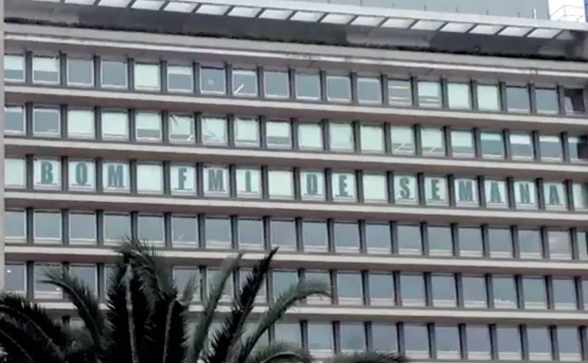
TBWA was the last agency to move to Lisbon’s advertising district. With their top competitors already there, they decided to showcase their creativity by turning 19 windows of their office into a 36m long Twitter billboard.

The stunt is simple in concept and bold in execution. The office becomes the medium. Instead of hiding behind a reception desk and a logo, the agency uses its own facade as a live publishing surface for the public street.

Turning an address into a live channel

The mechanism is real-time social content made physical. Tweets appear across the windows, transforming an office building into a public conversation layer. It is not “social amplification” in the usual sense. It is a direct translation from a digital feed into a street-level display.

In dense urban environments, public-facing digital surfaces work best when they make participation visible, immediate, and shared by everyone on the street.

The real question is whether your brand can turn participation into a public signal, not just another message people scroll past.

The video does not explain exactly how people were encouraged to send in their tweets, but it does show the breadth of what people shared. Tweets touch politics, taxes, Europe, Merkel’s visit, and more. That range matters because it signals that the billboard is not a branded script. It behaves like a live civic wall, meaning an open public message board where anyone can add a line and everyone on the street sees it.

Why it lands in an ad district full of competitors

When agencies cluster, sameness is the enemy. This activation works because it creates a visible signature at the point of competition. People do not have to be invited inside to experience TBWA. The building itself is performing in public, and the audience can participate without crossing a threshold.

Extractable takeaway: In a competitive cluster, your best differentiator is a street-level interface that makes participation visible to everyone nearby.

It also carries a little risk. Real-time public messages can be messy. That tension is part of the attention engine. It feels alive because it is not perfectly controlled.

The intent: differentiate through public participation

The business intent is positioning. TBWA is signalling modernity, openness, and confidence in real-time ideas. The agency is also using the street as a distribution channel to generate talk, foot traffic, and press interest.

A live, participatory facade is a stronger differentiator here than another logo on glass, because people can experience the idea without being invited in.

And it worked. In the end, all the window tweeting created quite a stir in the local media.

Practical moves from the Twitter window billboard

  • Use your own real estate. If you have a facade, treat it as media, not architecture.
  • Make digital physical. The jump from screen to street creates instant novelty.
  • Design for participation. People engage more when they can see themselves appear in public space.
  • Accept a little mess. Real-time content feels credible because it is not overly polished.
  • Build for earned media. A visible public installation gives journalists something to film, not just to quote.

A few fast answers before you act

What is the TBWA Lisbon Twitter billboard?

It is a facade activation that turned 19 office windows into a 36m long display showing tweets in public, effectively making the building a live billboard.

Why does turning tweets into a window display work?

Because it makes online conversation visible in a shared physical space, which creates surprise, participation, and social proof.

How did it create attention beyond the street?

The visibility and real-time nature made it easy for people and local media to capture and share, turning a building into a story.

Is this more about branding or engagement?

Both. The engagement mechanic is participation, but the branding outcome is differentiation and positioning in a competitive district.

What is the key takeaway for agencies and brands?

If you want to stand out locally, build a public interface that lets people contribute and be seen. It creates talk faster than self-promotion.

eBay: Give-A-Toy Store

One of the things that all people do during the holidays, besides real shopping, is window shopping. Storefront window displays therefore have a stronger significance during the holiday season. Keeping that in mind, eBay has developed a way to make this experience move from passive to interactive and engaging.

Give-A-Toy Store is a 3D Christmas window installation with QR code tagged toys, built to evoke the passer-by’s giving side. Scanning the QR codes inside the eBay app allows passers-by to donate that toy on the spot, with the window lighting up and rewarding them for the donation.

The window installation is currently available at Toys for Tots in New York (at 35th and Broadway) and San Francisco (at 117 Post St).

Additionally customers can also customize their own toys on eBay’s Facebook page. For each toy created, eBay will donate $1 (up to $50,000).

From window shopping to “giving on the sidewalk”

This is a simple flip. The window is no longer just display media. It becomes a donation interface. You look, you scan, you give. Then you get instant feedback in the physical world.

How the mechanism does the heavy lifting

The mechanic is intentionally friction-light. Toys are visually presented as scannable choices. The QR tag is the call-to-action. The eBay app is the checkout. The window lighting up is the reward loop, confirming that something happened and making the act feel social even if you are alone.

In high-traffic retail corridors, a good interactive storefront turns waiting and wandering into measurable intent, without asking people to step inside.

Why it lands in a holiday crowd

It works because it respects the window-shopping mindset. People are already browsing. They are already comparing. This just adds a small, clear next step that feels aligned with the season. The visual “thank you” in the window also matters. It makes the donation feel immediate and real, not abstract and back-end.

Extractable takeaway: If you can make the environment visibly react to a mobile action, you create trust and momentum. The moment becomes self-explanatory, and bystanders learn the behavior just by watching.

What the brand is really building

The real question is whether a holiday storefront can turn passing attention into a mobile action that feels immediate enough to complete on the sidewalk.

This is not only about donations. It is a product demo for mobile commerce in disguise. It shows that scanning can be a legitimate buying action, that the phone can complete a transaction in seconds, and that the brand can connect physical retail ritual with digital conversion.

What this teaches about interactive storefronts

  • Make the first action obvious. If scanning is the behavior, the codes must look like the product tag.
  • Design a physical confirmation. Light, motion, or animation reduces doubt and makes the act feel rewarding.
  • Keep the choice set tight. Fewer, clearer options beat a cluttered scene when people are walking past.
  • Match the moment. Holiday giving is a natural fit for “instant donate” mechanics.
  • Make it watchable. When others can see the window respond, you get free teaching and free social proof.

A few fast answers before you act

What is the core idea behind Give-A-Toy Store?

Turn a holiday window into a scannable donation experience, so giving happens in the same moment as browsing.

Why does the window lighting up matter?

It provides immediate confirmation and reward. That reduces hesitation, makes the interaction feel real, and invites others nearby to notice and copy the behavior.

What makes this different from a normal QR campaign poster?

The display is the product experience. The scene feels like a store window first, and the QR code is integrated as a natural “price tag” action rather than a separate ad instruction.

What is the biggest execution risk?

Friction. If scanning is unreliable, the app flow is slow, or the codes are hard to spot at walking distance, people will not complete the action.

How would you adapt this if you do not have an app?

Keep the structure. Use a fast mobile entry point, and pair it with a visible physical confirmation so people know their action worked.