When brand logic becomes visible
Across Burger King, Aerie, Yahoo Mail, Hotels.com, Huggies, and Cheetos, the work does not resolve into one dominant style. What it does share is something more useful. Each campaign makes the underlying brand logic easier to grasp without needing the case-study explanation afterward.
Brand logic is the commercial rule that links what a brand says, what it does, and why the audience should care. The strongest work this month makes that rule visible early, which matters because a legible mechanism improves comprehension, speeds recall, and gives the campaign a better chance of carrying business intent instead of just generating surface attention.
For enterprise brand teams, that is not a creative nuance but an operating advantage, because clearer strategy survives translation across agencies, channels, retail partners, and internal stakeholders.
It also travels better across consumer experience platforms and MarTech systems, where the strategy has to remain legible through content, CRM, personalization, commerce, and media execution.
The strongest campaigns now win by making strategy legible before they try to make execution louder.
The real question is whether people can decode the commercial intent fast enough for the work to compound in culture instead of stalling as cleverness.
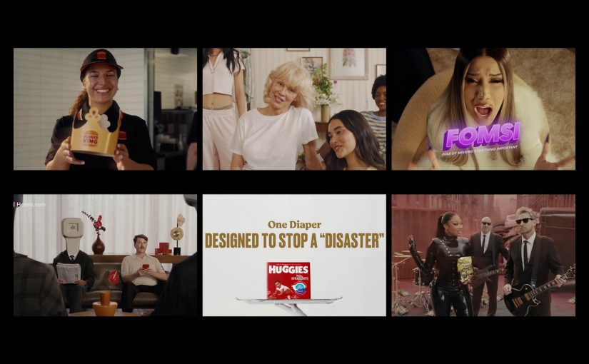
Six campaigns that made strategy easier to see
Burger King: There’s a New King, and It’s You
Burger King turns turnaround work into the campaign itself. Burger King U.S. and Canada president Tom Curtis helps anchor the message, and the brand shifts the crown from the mascot to the guest, ties the story to years of restaurant modernization, operational improvement, and feedback loops, and makes the listening agenda visible instead of hiding it behind generic brand language. That is why the work lands. It turns brand repair into a public narrative people can understand immediately.
Aerie: 100% Aerie Real
Aerie does not use AI as a trend hook. It uses Pamela Anderson to reinforce a policy-backed position that the brand will not use AI-generated bodies or people in marketing, extending its broader authenticity stance. The important move here is operational, not cosmetic. A cultural tension becomes a codified boundary, and that makes the brand stance more credible than a one-off message about authenticity.
Yahoo Mail: Planner
Yahoo Mail gives its AI feature a human entry point. In Yahoo’s launch framing, Planner is an AI-powered personal productivity hub, and rapper Cardi B introduces “FOMSI,” or fear of missing something important, as the tension the feature resolves. That is the smart translation layer. The product is not positioned as abstract intelligence. It is positioned as relief from inbox anxiety.
Hotels.com: It’s All in the Name
Hotels.com strips the proposition down to literal truth. In its new brand platform, the company argues that plenty of things in life are misleading, but its own name is not, and pairs that with a refreshed visual identity and a promise around rewards, simplicity, and flexibility. The discipline here is the point. The brand does not add complexity to seem more interesting. It removes abstraction so the value proposition is easier to decode and remember.
Huggies: Expensive Sh*t
Huggies takes a functional claim and stages it as risky entertainment. The one-hour event put 18 babies in Huggies Little Snugglers on high-value luxury items, streamed the result across TikTok Live, Instagram Live, and YouTube Live, and turned blowout protection into proof people would actually watch. That is what elevates it. The demonstration is not just believable. It is designed for distribution.
Cheetos: Pickle’s Back
Cheetos relaunches Flamin’ Hot Dill Pickle by packaging the return as entertainment first and product news second. The official music video pairs Megan Thee Stallion with Nickelback and turns a flavor comeback into a cultural moment rather than a standard limited-time announcement. That is the lesson. Launch mechanics matter more when the format feels native to how people already consume and share attention.
What brand teams should take from March’s best work
The common move across all six examples is not louder storytelling. It is clearer exposure of the mechanism.
- Burger King makes operational change visible.
- Aerie makes the authenticity rule visible.
- Yahoo makes the AI utility visible.
- Hotels.com makes the product proposition visible.
- Huggies makes the product performance visible.
- Cheetos makes the launch format visible.
The best campaigns of March 2026 did not win by saying more. They won by making the strategy easier to see, easier to feel, and easier to repeat.
A few fast answers before you act
What defined the strongest campaigns in March 2026?
The strongest work made the commercial idea immediately legible. Instead of asking the audience to infer the strategy, the campaigns surfaced it through proof, policy, simplicity, or entertainment.
How are brands using AI differently in campaigns?
The better use cases split in two directions. Some brands, like Yahoo Mail, frame AI as practical relief for a real problem. Others, like Aerie, turn their refusal to use AI in customer-facing imagery into a differentiating brand stance.
Why is clarity becoming a competitive advantage in advertising?
Clarity lowers decoding effort. When people understand the mechanism quickly, recall improves, the message travels faster, and the campaign is more likely to carry commercial intent instead of being remembered only for style.
What role does product demonstration play now?
Product demonstration still works, but it works harder when it is engineered for attention, social circulation, and emotional payoff, not when it stays trapped in a conventional feature explanation. Huggies is the clearest example this month.
What is changing in how brands launch products?
More launches are being wrapped in formats people actively choose to watch, including music video logic, creator energy, or entertainment structures. Cheetos shows how a product return can behave more like culture than an announcement.