
13th Street: Last Call Interactive Horror

Last year Lacta Chocolates came up with a web-based interactive love story called Love at first site. Now Jung von Matt and Film Deluxe take the same “viewer participation” impulse into a darker genre with an interactive horror experience designed for cinemas. Here, viewer participation means the audience can influence what happens on screen instead of only reacting to it.

The movie is called Last Call by 13th Street, and it is billed as the first interactive horror movie in the world.

How the film turns a screening into a live conversation

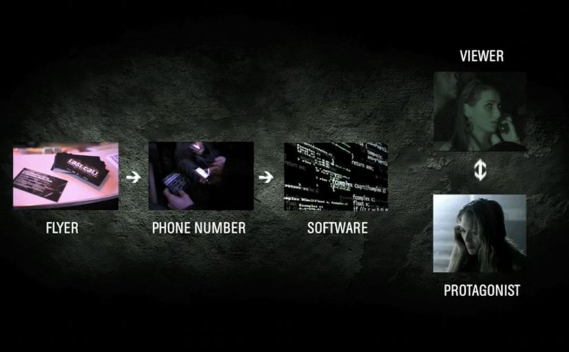
The core mechanic is simple and high-stakes. The audience can communicate with the protagonist through specially developed speech recognition that turns one participant’s answers, delivered via mobile phone, into on-screen instructions.

Instead of passively watching a character make bad decisions, one viewer gets pulled into the story and has to direct what happens next, under pressure, in front of a room full of people.

In European entertainment marketing, the strongest channel ideas are the ones that turn passive viewing into a shared physical experience.

Why it lands: it converts fear into responsibility

Horror is already interactive in your head. You are constantly thinking “don’t go in there” or “run”. Last Call makes that internal commentary explicit, then gives the viewer control at exactly the moment when tension is highest. That works because it turns private fear into public responsibility, which intensifies tension instead of interrupting it.

Extractable takeaway: If you want interactivity to feel meaningful, make the choice time-critical and socially visible. When a whole room watches one person decide, even simple branching choices feel heavier.

The intent: make a channel brand feel like an event

This is not interactivity for its own sake. It is a positioning play. The real question is whether the interaction makes 13th Street feel like the only place this kind of horror experience could happen.

The phone call is the hook, but the real product is the shared story people retell afterwards: “someone in our screening got the call”.

What to steal for your own interactive storytelling

  • Choose one decisive moment: interactivity works best when it happens at a peak, not throughout.
  • Keep the command vocabulary tight: yes or no, left or right, stay or flee. Clarity beats cleverness.
  • Make the interaction legible to spectators: the audience should understand what the caller chose without needing explanation.
  • Design for group emotion: the collective tension and reaction is part of the value.
  • Build the “retellable” sentence: “the character called an audience member” is stronger than any tagline.

A few fast answers before you act

What makes Last Call “interactive”?

A participant receives a mobile phone call and speaks choices that are translated via speech recognition into commands, which trigger different follow-up scenes.

Why use a phone call instead of a web interface?

A phone call feels personal and urgent, which matches horror. It also keeps the participant’s hands free and the interaction fast enough for a live screening.

Is this a real branching film or a gimmick?

It works like a branching structure with pre-produced scenes, selected based on a small set of recognized commands. The novelty is the live calling mechanic in a cinema context.

What is the biggest risk when copying this format?

Latency and ambiguity. If recognition is slow or choices are unclear, tension collapses. The interaction has to feel instantaneous and unmissable.

What is the transferable principle beyond horror?

Put the audience in a single, decisive role at a high-emotion peak. One clear decision, delivered fast, can create a stronger memory than many shallow interactions.
Tostitos: And Then There Was Salsa

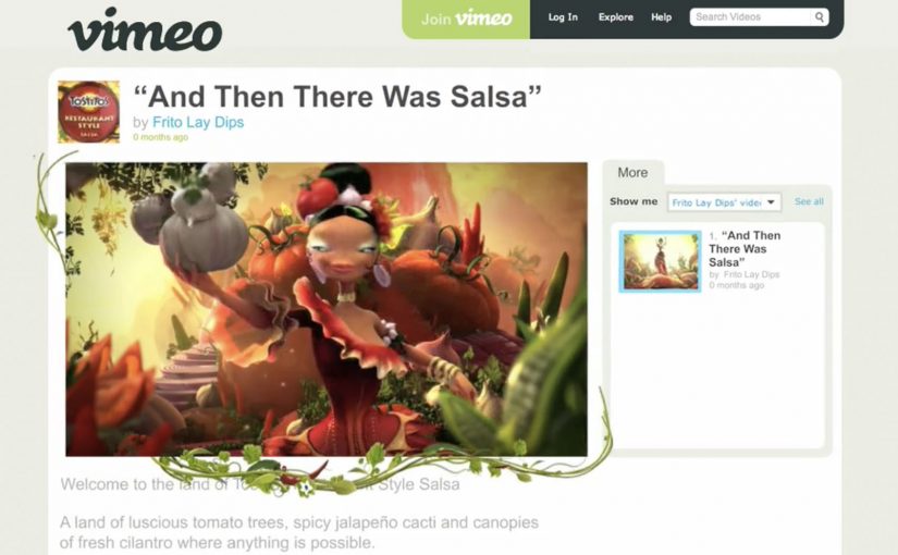
Frito-Lay teamed up with online video sharing site Vimeo to create a new advertising campaign for their Tostitos Salsa. The video began with some beautiful CG which then quickly swallowed the viewer’s browser to become a full-screen experience.

When the player becomes the canvas

The execution starts like a normal hosted film. Then the interface itself becomes part of the performance, as the visuals expand beyond the frame and turn the browser window into the stage.

The takeover mechanic in plain terms

The mechanism is a deliberate break of expectation. Here, the takeover mechanic means the film expands beyond the player so the browser window itself feels absorbed into the ad. The film uses high-polish CG to earn trust, then escalates into a page takeover that makes the viewer feel like they have crossed a boundary from “watching” into “being inside” the world of the spot.

In digital brand experiences, fullscreen takeovers work when the format shift is the message, not just a louder container for the same footage.

Why this lands

It delivers a physical sensation in a purely digital space. That moment of “wait, my browser is gone” creates surprise and attention, and it also flatters the viewer by treating the screen as a cinematic environment rather than a box with controls.

Extractable takeaway: If you want immersion, do not only add detail inside the frame. Change the frame itself in a way that reinforces the story you are telling.

What Frito-Lay is buying with the Vimeo partnership

The intent is to make a salsa film feel like an event. A takeover turns a standard online view into a shareable “you have to see this” moment, and it associates the product with craft, spectacle, and a bit of controlled chaos.

The real question is how to make a salsa ad feel bigger than a pre-roll without losing the viewer in empty spectacle.

What to steal for your next immersive video

  • Earn attention first, then escalate. Start simple, then make the environment change once the viewer is already hooked.
  • Make the format shift meaningful. The jump to full-screen should feel like part of the narrative, not a gimmick.
  • Design one unforgettable beat. The takeover moment is the memory. Everything else supports that single peak.
  • Pick the right host for the idea. A platform partnership matters most when the platform’s norms are part of the contrast you are exploiting.

A few fast answers before you act

What is “And Then There Was Salsa”?

It is a Tostitos Salsa online film distributed via a Vimeo partnership, designed to shift from a normal player view into a full-screen browser takeover for a more immersive effect.

What is the core mechanic that makes it feel different?

The experience changes the viewing container. It starts as a standard video, then expands beyond the player and takes over the browser window, so the interface becomes part of the execution.

Why does the Vimeo partnership matter here?

It matters because the idea depends on contrast. A familiar hosted-player environment makes the takeover feel more dramatic when the film suddenly breaks out of it.

When is a fullscreen takeover a smart choice?

When the goal is to create a memorable moment rather than maximize completion rates. It is especially useful when craft and spectacle are part of the brand story.

What should you be careful about with this pattern?

Overuse and irrelevance. If the takeover does not reinforce the idea, viewers experience it as interruption. Performance and compatibility also matter because the format depends on smooth playback.

NOOKA: Augmented Reality Accessorizer

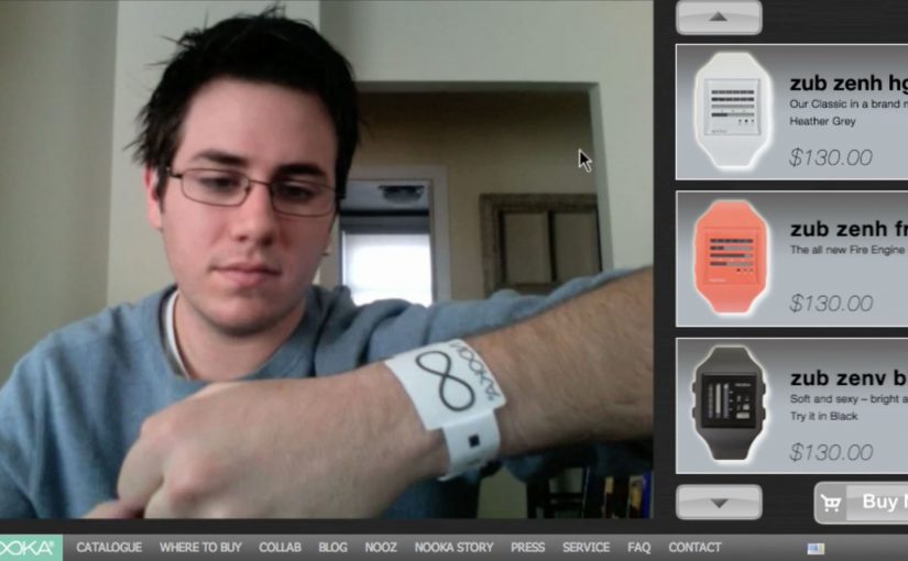
NOOKA watches created a video-led way to let you try out their watches virtually. All you need is a simple strip of NOOKA watch-representing paper to make it work, and once you see it in action, the idea becomes obvious.

A paper strip that turns your webcam into a fitting room

The mechanism is a coded wrist strip and a webcam. You place the strip on your wrist, hold your arm up to the camera, and the watch appears aligned to your wrist as you move. It is a fast, low-friction way to demonstrate “how it looks on me” without needing a physical product in hand.

Because the strip gives the webcam a stable reference, the overlay can track your wrist as it moves, which is what makes the preview feel believable.

In online retail, the fastest way to reduce hesitation is to replace abstract product specs with a visual proof the shopper can control.

The real question is whether you can turn “how will this look on me?” into a live proof the shopper can control before they decide.

Why this feels more convincing than a static product shot

Most product pages show the same images to everyone. This flips the experience from passive viewing to live preview. For look-and-fit products, a live preview like this is a stronger trust-builder than piling on more static shots. Even if the rendering is simple, the feeling of personalization comes from movement and alignment, not photorealism.

Extractable takeaway: If your product is bought on look and fit, design a try-on moment that uses a behavior people already understand (webcam + holding up your wrist), then make the payoff immediate so the demo does the selling.

Stealable moves for NOOKA’s print-to-digital bridge

By a “print to digital” bridge, I mean a physical cue that unlocks or anchors a digital preview in a way the viewer can control.

  • Use a physical key. A simple strip, card, or marker makes the digital experience feel tangible and intentional.
  • Keep the interaction one-step. The user should be able to try it within seconds, not after setup friction.
  • Build for sharing. The best proof is something people can show a friend in the moment.
  • Let the demo carry the story. If it needs heavy explanation, simplify the mechanic.

A few fast answers before you act

What is the NOOKA Augmented Reality Accessorizer?

It is an augmented reality try-on concept where a coded paper wrist strip and a webcam let a shopper preview a NOOKA watch aligned to their wrist in real time.

Why does a paper strip matter in an AR try-on?

It provides a consistent reference point for positioning and scale, and it makes the experience feel like a “real” object-assisted try-on rather than a random filter.

What makes this useful for e-commerce?

It reduces uncertainty about appearance and proportion. The shopper can see the watch on a wrist-sized reference and judge the look before buying.

What is one practical lesson to apply without AR?

Use a simple physical reference or on-screen guide that anchors scale and positioning, then let the shopper control the view quickly so the proof feels personal.

What is the main limitation of this type of approach?

It can show appearance and rough scale, but it cannot fully replicate comfort, weight, or how a strap feels. It works best as a confidence booster, not a perfect substitute for trying it on.