Coca-Cola: The Happy Flag

Coca-Cola: The Happy Flag

Airports in Denmark have a simple tradition. People welcome arrivals with flags.

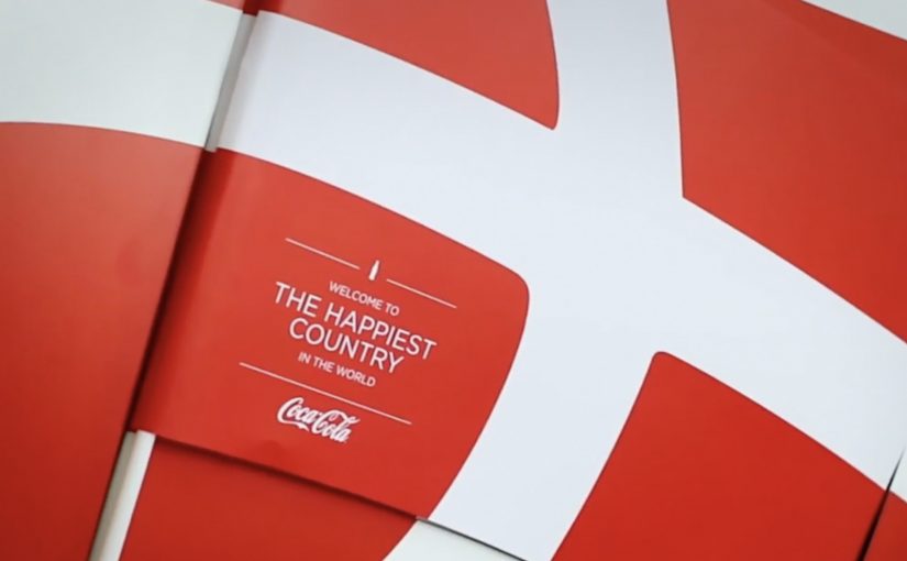
Coca-Cola takes a small cultural detail and turns it into a physical interaction. After a discovery that the Danish flag can be seen inside the Coca-Cola script, the brand brings that idea to Denmark’s biggest airport and makes the flag literally tearable from the logo.

The mechanism is a special poster where passers-by can take small Danish flags straight from the Coca-Cola mark, so even people who arrived without a flag can still join the welcome.

A logo that becomes a utility

This is not a poster that asks you to look. It is a poster that gives you something to do. The brand symbol becomes a dispenser. The action is obvious, the reward is immediate, and the result is visible in the room as more people start waving flags. For out-of-home, participation beats passive exposure when the action is effortless.

In global consumer brand portfolios, small rituals scale when you turn them into simple, repeatable behaviors that people are happy to perform in public.

The real question is whether your most recognizable cue can become a public action people do instinctively, not a message they merely notice.

Why it lands in an airport

Airports are full of waiting and scanning. A physical action breaks the autopilot, and the output is social. Because the poster turns the logo into a one-step flag source, the first few waves appear fast and trigger imitation. You do not keep a flag to yourself. You wave it. That makes the message travel without needing an additional media buy.

Extractable takeaway: When your brand asset is already recognizable, turn it into a useful object inside a real-world ritual. Utility creates permission. Participation creates memory.

The intent behind the “happiness” frame

The story is designed to borrow from Denmark’s “happiest country” reputation as described in various rankings and conversations, then translate that abstract label into something concrete. Here, “happiness” is framed as a warmer, more participatory welcome, not a vague claim. A warmer welcome. More flags in more hands. More people involved.

Moves to borrow for participatory out-of-home

  • Start with a local ritual. Find a behavior people already do gladly, then amplify it.
  • Make the interaction self-explanatory. If someone needs instructions, the moment dies.
  • Use a brand asset as the mechanism. When the logo is the tool, branding feels natural, not pasted on.
  • Design for public visibility. The best output is something others can see and copy instantly.

A few fast answers before you act

What is Coca-Cola’s “The Happy Flag” idea?

It is an airport poster activation where people can tear off Danish flags from the Coca-Cola logo, so more arrivals can be welcomed with flags even when greeters did not bring one.

What is the core mechanism that makes it work?

A familiar brand mark is redesigned as a dispenser. The logo becomes a physical utility, and the action produces a visible social signal in the space.

Why is an airport a strong place for this?

The environment already contains anticipation, reunions, and cameras. A simple, shareable gesture fits the emotional context and spreads through imitation.

How can brands adapt this pattern?

Pick a recognizable asset, connect it to a real-world ritual, and redesign it into a simple object people can use. Then make the output visible so participation recruits more participation.

What is the main failure mode to watch for?

If the action is not instantly obvious or the utility runs out quickly, participation collapses and the installation becomes a normal poster. Design the interaction, replenishment, and visibility so the first wave of use is effortless.

Video Campaigns: When the Player Is Message

Video Campaigns: When the Player Is Message

Two videos that did not just play, they proved the point

Video innovation rarely comes from “better footage”. It comes from changing how the viewer experiences the message. These two campaigns are clean examples of that approach.

In the last week or so I came across two campaigns that used video to innovatively deliver their message.

Volkswagen Hidden Frame – using the YouTube play bar as the story

The Volkswagen Side Assist feature helps drivers avoid accidents by showing other vehicles when they are in the side mirror’s blind spot.

To drive home the message, AlmapBBDO developed a film that used YouTube’s play bar to show the difference the VW Side Assist made in people’s lives.

No Means No – a player that interrupts denial

Amnesty Norway, in an attempt to change the Norwegian law on sexual assault and rape, developed a film that used a custom video player to pop up the key message.

The campaign was a success and the law was about to change as a direct consequence of the campaign.

Why interface-led video lands harder

Both ideas shift the viewer from passive watching to active noticing. By “interface-led” I mean the player UI, like the progress bar, overlays, or controls, doing storytelling work, not just housing the film.

Extractable takeaway: If the interface carries part of the argument, the viewer is forced to notice the point during playback, which reduces message loss.

The real question is whether your player can carry the argument when attention collapses.

Volkswagen used a familiar interface to make a safety benefit visible in the moment. Amnesty used an interface interruption to force the key message to be seen, not skipped. In both cases, the “player” stopped being furniture and became the persuasion device.

In global consumer brands and publisher-style marketing teams, interface constraints often determine what gets noticed and what gets ignored.

What these campaigns were really trying to achieve

The business intent was not “engagement” as a vanity metric. It was message delivery with minimal loss.

Volkswagen aimed to make an invisible feature feel tangible and memorable. Amnesty aimed to change perception and behavior at the cultural level, and the player design reinforced that urgency by refusing to be background noise.

Player-hacking patterns to copy

Here, “player-hacking” means designing the video controls and UI as part of the message, not just the wrapper.

  • Use the interface as evidence. When the message is hard to show, let the UI demonstrate it.
  • Design for the skip reflex. If your message is often ignored, build an experience that makes ignoring harder.
  • Keep viewer control intentional. Interactivity works when it serves comprehension, not novelty.
  • Make the “point” happen inside the viewing moment. Do not rely on a voiceover claim when the experience can prove it.

A few fast answers before you act

What is an “interface-led” video campaign?

An interface-led video campaign is one where the player experience, like the progress bar, overlays, or controls, is part of the storytelling, not just the container.

How did Volkswagen Hidden Frame use YouTube differently?

It used YouTube’s play bar as a narrative device to demonstrate the value of Side Assist, making the benefit feel visible rather than described.

What did Amnesty Norway’s No Means No change about the player?

It used a custom video player that surfaced the key message via a popup, ensuring the point was encountered during playback.

Why do these ideas work better than a standard film in some cases?

Because they reduce message loss. The viewer is guided to notice the point through the viewing mechanics, not just the content.

What is the practical takeaway for brands?

If your message is often missed, redesign the viewing experience so the message is structurally harder to ignore and easier to understand.

Antarctica: The Beer Turnstile

Antarctica: The Beer Turnstile

Carnival in Rio de Janeiro drives alcohol consumption up, and it also drives traffic risk up with it. Traditional safety warnings are easy to ignore in the middle of a street party.

Antarctica, as an official sponsor of Carnival, decides to make the safer choice feel easier than the risky one. With AlmapBBDO, they install a “beer turnstile” at a subway station where carnival groups gather. Scan an empty Antarctica can at the gate and the turnstile opens, giving you a free ride home.

Turning an empty can into a ticket

The mechanism is a direct behavior swap. Instead of telling people not to drink and drive, the brand turns public transport into the reward for doing the right thing. The “payment” is an empty can, scanned like a transit card, then collected at the turnstile.

In big-city event environments, the most effective safety interventions reduce friction at the exact moment decisions get made, and they do it with an incentive people can use immediately.

Why it lands

This works because it replaces moralizing with utility. The act is simple, public, and repeatable, and it reframes the end of the night as a next step you can take without planning. The real question is how to make the safer ride home easier than the risky one when people are already in motion. It also keeps the brand inside the solution rather than just beside the problem, which makes the sponsorship feel like action, not signage.

Extractable takeaway: If you want behavior change at scale, stop asking for restraint. Build a one-step alternative that fits the moment, then reward the safer behavior with access people already want.

What the beer turnstile gets right

  • Reward the right behavior at the decision point. Do not place the incentive after the moment has passed.
  • Use a token people already hold. An empty can is a frictionless “ticket” during Carnival.
  • Make it visible. A physical gate turns participation into social proof.
  • Keep the story one sentence long. “Scan a can. Ride free.” travels fast.

A few fast answers before you act

What is the Beer Turnstile?

A subway gate that accepts an empty Antarctica beer can as the “fare”, unlocking free travel during Carnival to reduce drunk driving.

Why is this more effective than a standard “don’t drink and drive” message?

Because it changes the default action. It makes the safe option simpler, faster, and immediately rewarding in the same moment people need to get home.

How does the can scanning work in practice?

The can’s code is scanned at the turnstile like a transit credential, then the can is collected as part of the exchange.

What results were reported for the activation?

Campaign write-ups reported usage of around 1,000 people per hour at the special gate, cited as 86% higher than conventional turnstiles that day, and a reported drop in drunk drivers caught of 43%.

When should brands use “brand utility” mechanics like this?

When a safety or public-good goal depends on real-time choices, and the brand can provide an immediate alternative action rather than just awareness.