
Slide to Unlock: Audi and Amnesty iAds

Audi “Slide to Unlock”

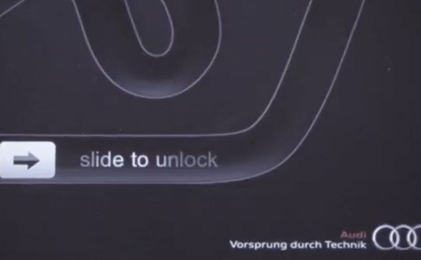
AlmapBBDO Brazil developed a distinctive iAd for the Brazilian Audi Magazine iPad app. Here, “iAd” refers to an interactive in-app ad unit built for iPad publications. The ad appeared in iPad publications and played with Apple’s familiar “Slide to Unlock” gesture to pull people into the experience.

Users instantly recognised the swipe interaction used to unlock Apple devices. After racing their finger around the track, they were rewarded with a free download of the first Audi Magazine issue from the App Store.

Amnesty International “Slide to Unlock the Truth”

Amnesty International ran an iAd in one of Sweden’s largest newspapers, DN, presenting readers with an image of a prison cell and a prisoner inside. The same “Slide to Unlock” gesture opened the cell and revealed a strong invitation to join Amnesty International as an activist.

Mechanic: borrow muscle memory, then repay it with value

Both executions use the same trick. They take an interaction people already know, then remap it to a brand action. In Audi’s case, the swipe becomes a playful mini-game. In Amnesty’s case, the swipe becomes a literal unlock that reveals a call to action.

In iPad-era rich media placements, the fastest engagement comes from interactions that feel native to the device instead of invented for the ad.

The real question is whether the gesture is already learned, so the first second goes to the message instead of the UI.

This approach is worth using when you can deliver a clear payoff within one gesture and one reveal.

Why it lands

The shared win is immediacy. There is no learning curve. The interface is already familiar, so attention goes straight to the message. Audi uses that familiarity to reduce friction on a content reward. Amnesty uses it to make the metaphor physical and emotionally legible.

Extractable takeaway: If you want interaction inside an ad to feel effortless, borrow a gesture people already trust, then make the outcome either instantly rewarding or instantly meaningful.

What to steal from gesture-first iAds

  • Start with a native gesture. Familiar interaction reduces drop-off in the first seconds.
  • Make the mapping obvious. Swipe-to-race and swipe-to-open both explain themselves.
  • Reward immediately. Audi pays the user back with a free issue. Amnesty pays back with a clear reveal and a direct next step.
  • Keep the loop short. One gesture, one transformation, one outcome.
  • Let metaphor do the work. Amnesty’s “unlock” is not decoration. It is the message.

A few fast answers before you act

What is the core idea behind “Slide to Unlock” iAds?

They repurpose a familiar device gesture to trigger a brand action, reducing friction and making interaction feel instinctive.

Why does borrowing a system gesture increase engagement?

Because users already know what to do. That removes instruction time and makes the first interaction feel safe and predictable.

What is the key difference between the Audi and Amnesty uses of the gesture?

Audi uses it for playful interactivity and a content reward. Amnesty uses it as a literal metaphor that reveals a persuasive call to action.

What is the biggest risk when using familiar UI patterns in ads?

If the gesture mapping feels unclear or gimmicky, people feel tricked. The interaction must lead to a payoff that justifies the borrowed familiarity.

What should you measure if you run an interaction-led ad?

Interaction start rate, completion rate, time-to-first-payoff, post-interaction clicks, and whether the interaction improves recall of the message.
ASICS: Race Ryan Hall at Columbus Circle

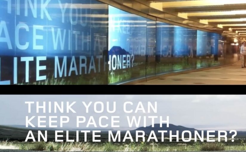
ASICS wants to level up physical interaction with their brand. So around this year’s ING New York City Marathon, they built a 60-foot video wall in the Columbus Circle subway station and challenged passersby to race U.S. marathon runner Ryan Hall.

The wall plays life-sized footage of Hall running at marathon pace, turning a commute corridor into a short, sweaty benchmark. You do not “watch” the message. You try to keep up with it.

Why a race works better than a slogan

In high-traffic urban transit environments, the fastest way to make a performance claim believable is to let people feel it with their own body, not just read it. Most sports sponsorship visibility lives on banners and logos. This flips the value. It gives the audience a direct comparison: your pace versus elite pace. Because the wall sets an elite pace as a moving yardstick, that comparison makes the brand message tangible in seconds, and it creates a story people can retell immediately.

Extractable takeaway: If you need credibility fast, turn the claim into a simple physical test that anyone can try without setup.

The craft move: frictionless participation

No sign-up. No app download. No instruction manual. The interaction is instinctive. See runner. Run next to runner. That simplicity matters because subway audiences have short attention windows and low patience for setup.

What ASICS is really doing with this build

On the surface it is a fun stunt. Underneath it is a credibility transfer, meaning the elite standard makes the sponsor’s performance story feel earned when people experience the comparison firsthand. The real question is whether your brand promise holds up when people can compare themselves to an elite benchmark in public. This is a stronger sponsorship play than more logo visibility because it produces felt proof, not just awareness. By letting everyday runners test themselves against a real benchmark, ASICS positions itself closer to serious performance culture, not just event sponsorship.

Big-event activation moves to copy

  • Turn a claim into a test. If the audience can try it, they will believe it.
  • Make participation obvious. The interaction should be understood without reading instructions.
  • Place it where behavior already fits. A corridor invites motion. Use spaces that support the action.
  • Design for one-sentence retell. “I raced Ryan Hall in the subway” is the whole message.

A few fast answers before you act

What is the core mechanic of this activation?

A long-form video wall shows Ryan Hall running at marathon pace, inviting passersby to physically race alongside the footage.

Why does transit placement matter here?

Transit corridors create natural “run lanes” and constant foot traffic, so the activation gets high exposure and the behavior feels socially plausible.

What makes this more effective than a normal video billboard?

It turns viewers into participants. The message is experienced as effort and pace, not as information.

What is the biggest execution risk?

If the wall is hard to notice, the corridor is too crowded to move, or the interaction cues are unclear, people default back to walking and the idea collapses.

How would you measure success?

Dwell time, participation rate, repeat attempts, social sharing volume, and any lift in event-area brand consideration versus baseline sponsorship exposure.

Chevrolet: Then & Now

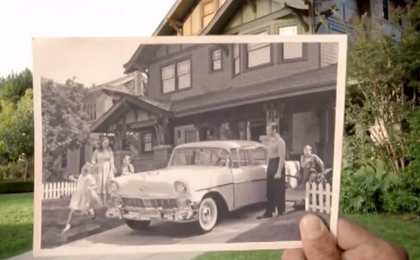
As a way to celebrate turning 100, Chevy creates a spot titled “Then & Now” that shows people staying connected to iconic moments, locations, and Chevrolet vehicles as if those moments are with them right there, right now.

A simple device that does the heavy lifting

The mechanism is beautifully restrained: vintage photographs of Chevrolets and the people around them are held up to the camera in the exact same locations today, aligning past and present into a single frame.

In automotive heritage storytelling, the fastest way to communicate longevity is to make time visible with a device that needs almost no explanation.

In heritage-heavy categories, anniversary storytelling lands best when it helps the audience locate their own memories in the present, not when it asks them to admire the brand.

Why it lands emotionally

The film does not argue that the brand matters. It shows that memory matters, and lets the vehicles sit naturally inside that truth. The hand-held photos are the emotional bridge. They make nostalgia feel personal, not corporate.

Extractable takeaway: If you can make time visible with one repeatable in-scene device, you can earn nostalgia without turning the work into a corporate victory lap.

The business intent behind the sentiment

A centennial can easily become self-congratulation. This avoids that trap by focusing on the audience’s continuity. The brand is the thread that runs through people’s lives, places, and rituals, rather than the subject demanding applause. The real question is whether your anniversary work makes the audience feel time passing in their own life, not whether it proves you have been around. Anniversary work should prioritize the audience’s continuity over brand self-congratulation.

Transferable moves for anniversary work

  • Choose one visual metaphor and commit. One repeatable device beats a collage of “greatest hits”.
  • Let people be the hero. Heritage feels earned when the customer’s life is the storyline.
  • Use restraint as a quality signal. Minimal copy and slow pacing can make the work feel more truthful.
  • Anchor the past in the present. Showing the same place now keeps nostalgia from drifting into museum mode.

A few fast answers before you act

What is “Then & Now” in one line?

A centennial film that aligns vintage Chevrolet photos with the same real-world locations today to show continuity across generations.

What is the core creative mechanism?

Hand-held historical photographs matched precisely to present-day scenes, creating a single frame that contains both time periods.

Why does this approach work for anniversary advertising?

It makes time visible instantly, and it ties the brand to lived memory rather than to corporate milestones.

What should you avoid in centennial storytelling?

Avoid making the milestone the hero. If the audience cannot see their own continuity in the work, the film risks reading like self-congratulation.

What is the most transferable takeaway?

If you can show the passage of time with one simple, repeatable device, you can tell a heritage story without overexplaining it.