
Vodafone: 5 Million Pixel Hunt

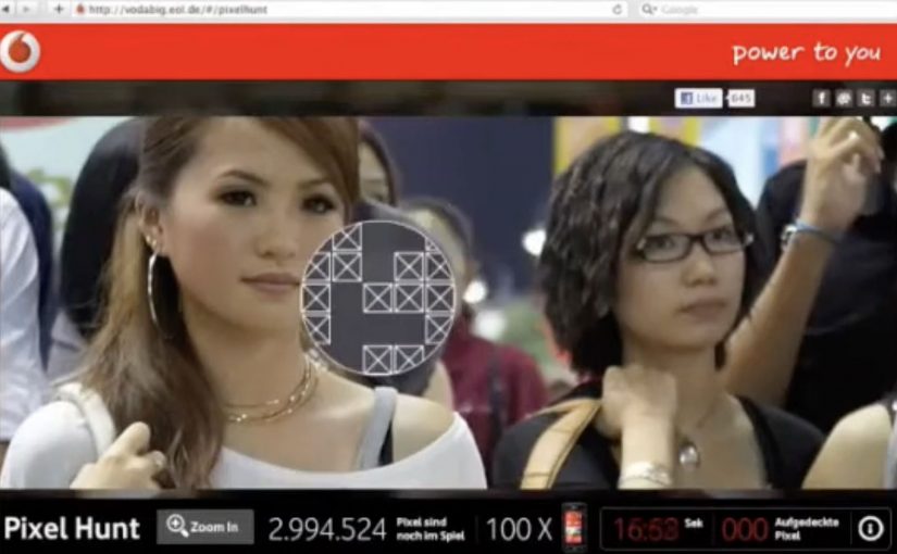
To promote the Vodafone LG Optimus Windows 7 phone with a 5-megapixel camera, Jung von Matt/Alster built a deceptively simple challenge: find the “winning” pixels inside a picture made of five million clickable pixels.

The premise is literal. One giant image is broken into a massive pixel field. A small set of those pixels are winners, and each winning pixel unlocks a prize, a new LG Optimus Windows 7 phone.

In handset launches, interactive “single mechanic” experiences can outperform heavier builds because the payoff is immediate and the learning curve is close to zero. By “single mechanic,” I mean one repeatable action loop that anyone can understand instantly.

A camera spec turned into a game mechanic

Most 5MP messaging ends up as lifestyle photography claims. This flips it into a rule: five million pixels. Go hunt them. That move makes the spec tangible, even if you never take a photo. Because the spec becomes a rule you can act on, the message lands without explanation and invites immediate participation.

It also reframes the product story from “better camera” to “better challenge.” The camera claim becomes the architecture of the experience.

In mass-market handset launches, the simplest interactive loops win because they reward attention in seconds, not minutes.

Why the pixel hunt pulls people in

A “pixel hunt” is a giant clickable image where only a small set of pixels are winners, and three forces do the work:

Extractable takeaway: When a spec can be turned into a single, repeatable micro-action with an obvious reward, participation scales faster than feature-heavy experiences.

  • Micro-actions: every click feels like progress, even when nothing happens.
  • Lottery logic: anyone can win, which keeps effort rational in small bursts.
  • Social proof: the more people play, the more the hunt feels “worth trying.”

The real question is whether your mechanic is so obvious that people can start without instructions and still feel progress within the first few clicks.

This is the kind of engagement design that scales without extra features. It is not a platform. It is a loop you can explain in one sentence.

Reported outcomes, and the real takeaway

The campaign is reported to have driven hundreds of thousands of visitors and to have had the full pixel field “clicked out” within weeks. Whether or not you track the exact numbers, the lesson holds: a single, repeatable micro-action can create massive aggregate participation when the reward is clear and the friction is low.

For spec-led launches, I would rather ship one obvious loop like this than a sprawling feature set that needs onboarding.

What to borrow from the pixel-hunt mechanic

  • Translate a spec into an experience rule, not a headline.
  • Use one action that is impossible to misunderstand, here it is “click to search.”
  • Make progress feel constant, even when outcomes are rare.
  • Keep the story retellable, “there were prizes hidden in five million pixels.”

A few fast answers before you act

What is a “pixel hunt” campaign?

An interactive image where users click through a dense pixel field to uncover hidden winning spots that unlock prizes.

Why does tying the hunt to “five million pixels” matter?

It turns a product attribute into the core mechanic. The spec becomes something you do, not something you are told.

What makes this kind of engagement scale?

Low friction plus high repeatability. People can participate in seconds, stop, and return without needing to relearn anything.

What is the biggest risk with this mechanic?

Fatigue. If the reward feels too remote, people churn. The prize framing and perceived odds must stay motivating.

How do you measure success beyond page views?

Unique participants, average clicks per session, return rate, and the conversion from participation into newsletter opt-ins, store visits, or qualified leads, depending on your objective.
Coca-Cola: Rush Hour Cinema

Bogotá gridlock, turned into a cinema you are already sitting in

On an average, commuters in Bogota spend daily 4 hours stuck in traffic. The infernal rush hour traffic jams are the result of unfinished constructions on main avenues, as well as on the rapid transit system, TransMilenio, which has seen work on its expansion come to a halt, due to irregularities in the handling of funds, and corrupt contractors.

So Coca-Cola with ad agency Ogilvy Colombia turned these traffic jams into a drive in cinema. The soda-pop giant launched this ingenious initiative on the eve of their 125th anniversary.

The mechanism: a drive-in cinema without the driving

The idea is as direct as it gets. If people are trapped in cars for hours, give them something worth watching, right there on the route they cannot escape.

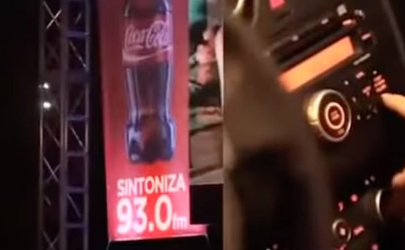
A drive-in cinema activation is a public screening designed for people inside vehicles, typically using a large screen for the picture and a radio frequency so the car stereo carries the audio.

In big-city commuting cultures, attention is already captive.

The smartest brand experiences do not try to fight the context. They use it.

The real question is whether you can turn inevitable waiting into a shared moment people remember, without adding friction.

Why it works: it flips frustration into a shared moment

Traffic jams create the same emotional pattern every day. boredom, irritation, and the feeling that time is being stolen. Rush Hour Cinema interrupts that loop with something communal. Drivers are not just waiting. They are watching the same thing together. Because the screen and radio audio synchronize everyone into the same story, the jam feels less like wasted time and more like an event. The experience also changes what people do with their phones. Instead of complaining or doom-scrolling, they have a simple story to capture and retell.

Extractable takeaway: When you synchronize strangers into the same moment, you convert “stuck” into “shared”, which boosts recall and retell.

The business intent behind the “nice surprise”

This is not a product pitch. It is brand behavior on display. Coca-Cola shows up as the brand that makes an unavoidable moment feel lighter, and it does it at scale, in the exact place where annoyance peaks. This is a strong play when the pain point is predictable and unavoidable, because you can upgrade the moment instead of interrupting it.

It is also efficient media. The audience is guaranteed. The dwell time is long. And the memory is anchored to a very specific location and feeling, which makes recall easier later.

Rush Hour Cinema is an ambient Coca-Cola activation in Bogotá that uses rush hour gridlock as the venue, transforming waiting time into a public drive-in style screening. Here, “ambient” means the experience lives in the environment people are already in, rather than pulling them into a separate channel.

Steal this pattern for pain-point media

  • Pick a context where time is already lost. Commuting, queues, delays, waiting rooms. People will thank you for filling it.
  • Make participation effortless. No app. No sign-up. Just look up and tune in.
  • Design for group reality. People experience it side-by-side, so the moment becomes social proof.
  • Keep the message implicit. When the gesture is the point, the brand earns goodwill without talking.

A few fast answers before you act

What is Coca-Cola’s Rush Hour Cinema?

It is an ambient activation in Bogotá that turns rush hour traffic into a drive-in style cinema. Drivers watch a large roadside screen while the audio plays through their car radios.

Why does a traffic jam make sense as a media channel?

Because attention and dwell time are already there. People cannot leave, and they are actively looking for relief from boredom and frustration.

What is the key design principle behind this idea?

Do not fight the context. Upgrade it. When you improve an unavoidable moment, the brand gets disproportionate gratitude and retell value.

How does the audio work in a drive-in setup?

The video runs on a big screen, and the audio is broadcast on a radio frequency so drivers can tune in using their car stereo.

What makes this feel like a shared experience, not just content?

Everyone watches the same thing at the same time, side-by-side. That turns private frustration into a communal moment, which increases memorability.

What is Coca-Cola trying to achieve with this execution?

It is not a product pitch. It is brand behavior on display. Coca-Cola shows up as the brand that makes an unavoidable moment feel lighter, right where annoyance peaks. If you copy this pattern, measure recall and sentiment in the moment, plus organic capture and retell.

Nissan Micra: Savvy With Space Banner

From an under-the-seat shoe drawer to an extra-large glovebox, the 2011 Nissan Micra makes the most out of what it has. Here, “space-savvy” means fitting more useful function into a small footprint without making the car feel cramped. To reach drivers who value space-savvy functionality, TBWA\RAAD Dubai takes the same idea into media and builds a banner ad that “packs in” more utility than you would expect.

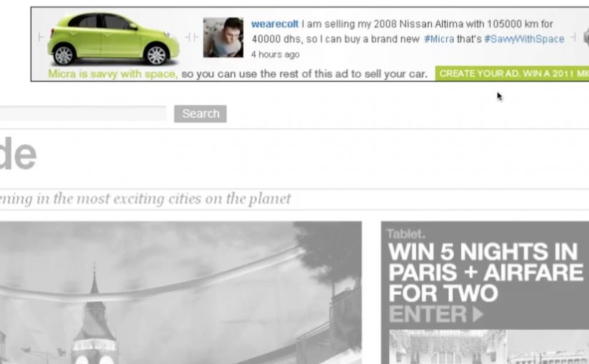
The punchline is simple. The banner is so clever with space that you can even use the ad itself to help sell your car.

When the format becomes the message

Instead of talking about storage compartments and smart design in a conventional way, the campaign uses the banner’s own layout as the demonstration. The ad behaves like the Micra. Compact, efficient, and surprisingly capable inside a tight footprint.

In automotive marketing, proving practical value often works best when the proof is baked into the experience format, not layered on as copy.

Why this lands

This works because it turns “space-savvy” from a feature claim into something you can feel. The audience is not asked to believe a list of compartments. They experience a compact unit that still does more than expected, which mirrors the product promise in a way that reads instantly.

Extractable takeaway: If your product advantage is “smart use of limited resources,” make the media unit demonstrate that constraint directly, so the format itself becomes the proof.

What the campaign is really optimizing for

The real question is whether the media can make clever functionality feel obvious before the audience has to read a feature list.

This is a strong fit for the Micra because the format does the selling work before the copy has to. The target is not everyone who wants a car. It is drivers who prioritise clever functionality and everyday usefulness. The banner’s “utility-first” design signals that the Micra is designed for people who like practical wins, not flashy theatre.

What functional brands can borrow

  • Let the container prove the claim. Build the story into the experience mechanics.
  • Design for instant comprehension. The idea should land before someone reads supporting text.
  • Match the medium to the benefit. Functional products benefit from functional media behaviors.
  • Keep it user-relevant. If the execution helps someone do something, attention comes easier.

A few fast answers before you act

What is “Savvy With Space” in this Nissan Micra campaign?

It’s a banner-led idea that uses the ad unit’s compact, space-efficient design to mirror the 2011 Nissan Micra’s “smart storage and functionality” positioning.

What makes this different from a normal feature ad?

The format demonstrates the benefit. Instead of only describing clever storage, the banner’s behavior and layout are designed to feel space-smart.

Who is the campaign aimed at?

Drivers who value practical, space-savvy functionality and small design decisions that make daily use easier.

What’s the reusable pattern here?

Make the medium behave like the product benefit, so the audience experiences the claim rather than just reading it.

What could go wrong if you copy this approach?

If the “cleverness” is not immediately obvious, it can look like gimmickry. The functional proof has to be legible fast.