The Swedish Post: The Sound of Green

The Swedish Post: The Sound of Green

The Swedish Post has a collection of pre-stamped parcels that makes it easy to send things. The task for ad agency Åkestam Holst was to tell people that it was possible to send almost anything overnight with these pre-stamped parcels.

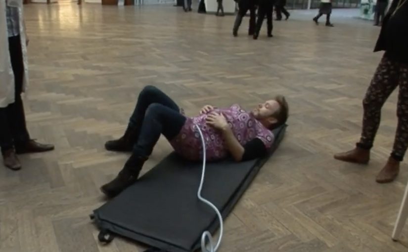
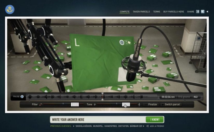
So they packed 80 parcels with all sorts of stuff and recorded 80 specific sounds. Those sounds powered “The Sound of Green” competition. Users picked a parcel, listened closely, and guessed what was inside. If they got it right, the Swedish Post sent the same parcel to the winner the very same day.

After a reported 140,240 guesses, the competition finally came to an end.

When proof beats promise

The mechanism is a neat translation of capability into play. Instead of listing what you can ship, you create 80 mystery parcels, record what they sound like, and let the public test their attention. The prize is not a voucher or a discount. The prize is the actual thing, delivered fast, which quietly demonstrates the core promise.

In consumer postal markets where “overnight delivery” sounds like a commodity claim, capability stories land better when they are demonstrated through a simple, repeatable experience.

The real question is whether the brand can make overnight delivery felt before someone ever ships a parcel.

Why it lands

This works because it turns logistics into curiosity. Sound is intimate and surprisingly hard to fake, so the listener leans in. The guessing format also creates a low-friction reason to spend time with the brand, and the same-day fulfilment makes the payoff feel real, not promotional.

Extractable takeaway: If you are selling an invisible service, build a public game that forces the benefit to show up as evidence, not copy.

What service brands can borrow

  • Demonstrate the promise. Replace “we can do anything” with proof people can experience.
  • Use a constraint to create focus. 80 sounds is large enough to feel rich, small enough to feel curated.
  • Make the prize the product. Shipping the parcel is the cleanest way to validate shipping.
  • Design for repeat attempts. A guessing mechanic naturally invites “one more try”.

A few fast answers before you act

What is “The Sound of Green”?

An online competition by the Swedish Post and Åkestam Holst where people listen to recorded parcel sounds, guess the contents, and winners receive the same parcel delivered the same day.

What is the core mechanism?

Pack real parcels, record the sounds they make, then let users choose a parcel sound and submit a guess. Correct guesses trigger real fulfilment.

Why use sound instead of photos?

Sound forces attention. It is less immediately obvious than visuals, and it creates a stronger sense of discovery when you finally figure it out.

What does this teach about marketing service businesses?

Claims are easy to ignore. Demonstrations are harder to dismiss, especially when the demonstration is interactive and ends in real delivery.

How do you keep a contest like this from feeling gimmicky?

Make the payoff identical to the promise. In this case, the reward is the service itself, delivered fast.

Nutricia: Baby Connection

Nutricia: Baby Connection

Young parents all over Belgium rely on Nutricia babyfoods every day. To support mums even before their baby is born, Duval Guillaume helped Nutricia create Baby Connection, an iPhone app designed to get dads more involved in the pregnancy.

Baby Connection works best when you use it as a couple. There is a mum version and a dad version, and everything each parent adds is automatically synced with their partner’s phone. The app can even transform two iPhones into one big screen.

A couples app that turns involvement into habit

The mechanism is simple and deliberate. Split the experience into two roles, then keep both roles in lockstep through syncing. Add a playful physical trick, two phones acting like one screen, to make “doing this together” feel tangible, not just promised.

In Belgian consumer brand building, support tools land best when they reduce friction for both parents and make the dad’s role practical, not symbolic.

Why it lands

This works because it shifts the conversation from “be more involved” to “here is exactly how”. Shared inputs, shared visibility, shared moments. The app design quietly nudges the couple into repeated check-ins, which is where involvement stops being intention and becomes routine.

Extractable takeaway: If you want two people to share responsibility, design the product so both can contribute in small ways, see each other’s contributions instantly, and feel like a team without extra coordination effort.

Launching an app with an experience, not a banner

The real question is how to make shared participation feel real before the baby arrives, not how to advertise another pregnancy app.

To launch Baby Connection, Duval Guillaume backed the app with a campaign designed to be as distinctive as the product itself, and to pull the idea into public conversation beyond the app store listing.

The stronger move is to market the shared behaviour the product enables, not just the app itself.

What pregnancy-support brands can borrow

  • Design for the couple, not the individual. Two roles, one shared narrative.
  • Make syncing the default. Shared visibility is the involvement mechanic.
  • Add one physical “together” moment. A simple device interaction can signal partnership better than copy.
  • Launch the product idea, not only the product. If the behaviour change is the point, market the behaviour.

A few fast answers before you act

What is Nutricia Baby Connection?

A paired iPhone app for expectant couples, with separate mum and dad versions that sync pregnancy updates and activities between both phones.

What is the core mechanism?

Two-role design plus automatic syncing, so both parents can add and see information without manual coordination.

Why does the “two iPhones as one screen” idea matter?

It turns a digital feature into a physical couple moment, reinforcing that pregnancy planning is shared, not solo.

What is the business intent behind this kind of app?

To support and deepen trust with parents before birth, by providing a practical tool that keeps the brand present in daily routines.

What is the most reusable lesson here?

If you want involvement from a second person, make contribution easy, feedback immediate, and shared progress visible.

Depaul UK: iHobo

Depaul UK: iHobo

It is easy to ignore a homeless person as you walk past them on the street, but after having one on your phone for three days Depaul UK hopes you will see the complex and varied issues behind youth homelessness.

This free app was created pro bono by Publicis London to raise awareness of Depaul UK, a charity devoted to youth homelessness in the UK.

Three days with a person you cannot swipe away

The mechanism is designed to feel like responsibility, not content. Over three days, the app keeps returning with prompts from a single “virtual homeless person”, pulling you back into their needs and decisions at inconvenient, everyday moments. That works because repeated prompts turn passive sympathy into felt responsibility.

In UK urban life where homelessness is visible but easy to mentally filter out, sustained micro-interruptions, small prompts that arrive during ordinary routines, can create empathy better than one big, easily-dismissed message.

Why it lands

The idea works because it weaponizes time. You do not get a one-minute burst of sadness and a clean exit. You get repeated friction, enough to feel the difference between “seeing” homelessness and “living alongside” it, even in a small way.

Extractable takeaway: If you need real attention for a complex cause, build a short, bounded experience that returns to the user repeatedly, then make the “I did something” step simple and immediate.

What Depaul is really trying to change

The real question is how to make someone feel ongoing responsibility for a problem they usually pass in seconds.

This is fundraising logic disguised as experience design. Depaul is trying to reach people who do not respond to posters and leaflets, and to do it on the device they check constantly. The app turns awareness into a relationship, then uses that relationship to make donating feel like a natural next step.

What cause campaigns can take from iHobo

  • Use duration as the persuasion. Three days is long enough to form a habit, short enough to try.
  • Design for interruption, not bingeing. Timed prompts beat long videos for sustained attention.
  • Keep the user’s role clear. Caring, deciding, responding. Clarity prevents drop-off.
  • Bound the experience. A defined end reduces resistance to starting.

A few fast answers before you act

What is iHobo?

A free mobile app created for Depaul UK that asks users to look after a “virtual homeless person” for three days to build awareness of youth homelessness.

What is the core mechanism?

Time-boxed engagement. The app returns with prompts over multiple days, creating repeated contact that is harder to ignore than a single awareness message.

Why three days?

It is long enough to create attachment and repeated friction, but short enough that people will still commit to trying it.

What makes this different from a standard charity film?

It turns passive viewing into ongoing responsibility. The message arrives on your schedule, not the campaign’s.

What is the most reusable lesson for other causes?

If the issue is complex, do not rely on a single emotional peak. Build a short series of small, repeated moments that accumulate into understanding and action.