
Toyota: A Glass of Water

A Glass of Water is a challenge created by Saatchi & Saatchi Stockholm for Toyota in Sweden. Its mission is to help drivers cut down their fuel consumption by 10% and reduce CO2 emissions, aligned with Toyota’s stated zero-emission vision.

When drivers register on the program website, they accept the challenge to place a glass of water on their dashboard or cup holder, then drive in a smooth manner that avoids spillage.

According to Toyota, the less you spill, the gentler you drive. Therefore the less fuel you consume.

A rule you can test on your next drive

The brilliance is the simplicity. No special car, no expert coaching, no complicated scorecard. Just a physical feedback loop that makes every harsh brake and every aggressive turn visible in the most basic way possible.

How the mechanism teaches eco-driving

Spilling is the metric. If you keep the water steady, you are accelerating, braking, and cornering more smoothly. That smoother style tends to reduce wasteful energy spikes, which is the same principle behind most eco-driving advice, translated into something you can feel immediately.

In European automotive marketing, behavior-change challenges work best when the rule is simple enough to try on the next drive.

Why it lands

It turns an abstract goal. “reduce fuel consumption”. into a personal game with instant feedback. The glass makes you self-correct without being told what to do, and it makes eco-driving feel like mastery rather than sacrifice. It also travels well as a story because anyone can explain it in one sentence.

Extractable takeaway: If you want people to change a daily behavior, give them a physical, low-effort indicator that converts “doing better” into a visible result they can improve on.

What Toyota is really buying

This is not just awareness. It is repeatable participation. Each drive becomes a new attempt, and each attempt reinforces the brand’s association with smarter, calmer driving rather than with lecturing about emissions.

The real question is how to make smoother driving feel self-evident and repeatable, not how to explain eco-driving more forcefully.

What to steal from the water-glass challenge

  • Use a single, legible metric. Spills are binary and instantly understood.
  • Make the feedback loop physical. Physical cues outperform abstract dashboards for habit shifts.
  • Lower the start barrier to almost zero. If people can start today, they will.
  • Turn restraint into skill. People adopt habits faster when it feels like competence.

A few fast answers before you act

What is A Glass of Water?

A driving challenge where you place a glass of water on the dashboard or cup holder and try to drive smoothly enough not to spill, as a proxy for reducing fuel consumption.

Why does “not spilling” relate to fuel savings?

Because avoiding spills requires gentler acceleration, braking, and cornering. That smoother driving style tends to reduce inefficient energy spikes.

What makes this different from typical eco-driving advice?

It replaces instructions with immediate feedback. The glass shows you how you are driving without needing an expert or a complex display.

What is the biggest risk with this kind of challenge?

If people treat it as a stunt rather than a habit tool, the effect fades quickly. The challenge needs repetition to translate into lasting driving style change.

How should a brand measure success for a behavior challenge like this?

Participation volume, repeat participation, and any measured or self-reported fuel consumption improvement among participants, not only views or clicks.
Black Eyed Peas: BEP360 AR music video

The smartest artists in 2011 are starting to behave like brands. Not only by releasing content, but by building experiences around it that fans can actually play with.

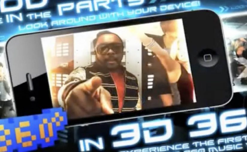
BEP360 is a strong example of that thinking. It packages a 360-degree, motion-controlled music video experience around The Black Eyed Peas, designed for iPhone, iPad, and iPod touch.

The core mechanic is simple. You move your device, and the camera view moves with you, giving you viewer control inside the scene. Viewer control here means you choose the camera angle in real time by moving the device. On top of that, BEP360 includes an augmented reality layer triggered by pointing the iPhone camera at the album cover for The Beginning, plus a virtual photo session feature that lets fans stage shots with the band and share them.

In global entertainment marketing, app-based experiences are becoming a practical way to deepen fandom between releases and justify paid content with participation.

The real question is whether you are building a replayable interaction fans control, or just dressing up a single-view clip with novelty features.

It is also an early signal of where “music video” can go when it is treated as a product experience rather than a clip you watch once. The app is billed as a first-of-its-kind 360-degree mobile music video, built under will.i.am’s will.i.apps banner, with augmented reality support via Metaio and 3D360 video technology referenced in early coverage.

Why this is more than a promo gimmick

The best part is the shift from passive viewing to participation. A 360-degree experience creates a reason to replay, because you cannot see everything at once. That replay value is what standard video launches rarely earn.

Extractable takeaway: If the experience gives people control over what they see, replay becomes the point, and that repeat engagement is what turns a launch into something that feels like a product.

What the AR layer adds, and what it does not

The AR trigger is not the main event. It is a novelty layer that extends the universe into the physical world, using the album cover as the marker. The real value is the combination of interactive video plus social output. Fans can create something and share it, which keeps the campaign alive without requiring more media spend.

Fan-first interactive video playbook

  • Give people viewer control. Control creates replay value.
  • Bundle features around one hero action. Here the hero action is “step inside the video”. Everything else supports that.
  • Use AR as an on-ramp, not the whole product. A quick wow moment is fine, but the experience must hold attention afterwards.
  • Design for sharing outputs. Photo sessions and remixable moments extend reach organically.

A few fast answers before you act

What is BEP360?

BEP360 is a Black Eyed Peas iOS app that turns a music video into an interactive 360-degree experience controlled by moving your device, with an added augmented reality layer triggered by the album cover.

What makes the music video “360-degree” in this case?

The camera perspective changes as you rotate or swing the phone, giving you control over where you look inside the scene while the track continues.

How does the augmented reality part work?

You point your iPhone camera at the The Beginning album cover, and the app overlays animated BEP characters and related content on screen.

Why does an app make sense for music marketing?

Because it can bundle interaction, social sharing, and ongoing fan content into one place. It gives people a reason to pay for the experience, not only consume a free clip.

What is the main risk with app-based fan experiences?

Friction. If downloads, device compatibility, or onboarding are annoying, the idea collapses. The experience has to deliver value within seconds.

Carrefour: Escaping shopping carts

A shopping cart appears where it should not be. It is spotted racing through neighbourhood streets, then turning up abandoned in unlikely corners of Rome. People start talking because the “protagonist” is absurdly familiar. The cart is the symbol of value, and now it is behaving like it has a mind of its own.

Saatchi & Saatchi Milan built this mystery for Carrefour Italia to support the rollout of 106 new Carrefour Markets in Lazio, grounded in the brand’s “Positive every day” positioning. The creative idea is simple. Value for money is an appeal people struggle to resist. So the carts become the carriers of that temptation.

The activation is designed as a two-phase integrated campaign. Here, “integrated” means the same narrative runs in parallel across multiple channels, so each touchpoint adds another “sighting” or a step of explanation. First, it seeds sightings and curiosity across multiple channels at the same time. Then it resolves the story by revealing where all those carts are heading.

A teaser built like a local urban legend

The first phase plays like breaking news. A live-feeling street presence. Transit placements. News-style content. Online video. Each touchpoint adds another “sighting” so the mystery grows without needing complex explanation.

The choice of protagonist matters. A shopping cart is instantly readable, and it already carries the promise of savings. When you animate that object, you turn a pricing message into a narrative people retell.

Solving the mystery without breaking the spell

The second phase keeps the same media system but shifts the objective. It moves from “have you seen it” to “here is where it is going.” The reveal connects the runaway-cart story to the new Carrefour Market openings, so the attention converts into a clear destination and a clear reason.

In large-scale retail launches, integrated campaigns work best when one story can travel from street to screen to store without changing its meaning.

Why this lands for a retailer

This is value communication that does not feel like a leaflet. It uses curiosity, pattern recognition, and a small dose of humour to make people look twice. The pricing promise stays present, but it arrives through a chase, not a claim. The real question is whether your rollout story makes value feel like a discovery instead of a discount. For multi-location openings, a repeatable curiosity loop is a stronger starting point than a price-led announcement.

Extractable takeaway: If value is your promise, stage it as a simple, repeatable story people can retell, then make the store opening the payoff.

What to steal for your next multi-location rollout

  • Choose a protagonist that already means something. Everyday objects can carry brand meaning faster than mascots.
  • Design a two-step rhythm. Tease first, then resolve. Mystery creates attention. Resolution creates direction.
  • Let every channel play a specific role. Street for credibility. Transit for frequency. Online for amplification. Press for legitimacy.
  • Make the reveal point somewhere real. The story must end at the store door, not inside the ad unit.

A few fast answers before you act

What is “The Mystery of the Escaping Shopping Carts”?

It is an integrated Carrefour Italia campaign where shopping carts are staged as “escaping” across Rome to build curiosity, then the story resolves by linking the carts to new Carrefour Market openings in Lazio.

Why use shopping carts as the protagonists?

Shopping carts are universal retail symbols and naturally connected to value for money. Turning them into characters makes the savings message feel like a story rather than a promotion.

What does “integrated” mean in this campaign?

It means multiple media channels run in parallel and reinforce the same narrative. Each channel adds sightings, social proof, or explanation, so the mystery grows consistently across the city.

Why does a teaser-and-reveal structure work for retail openings?

Because it builds attention before asking for action. The teaser creates talk and curiosity. The reveal converts that attention into a clear destination, which fits the goal of driving visits to new locations.

What is the main risk with mystery-led retail campaigns?

If the reveal is weak or delayed, people feel tricked. The payoff has to be satisfying, and it must clearly connect the story to a real store or offer.