
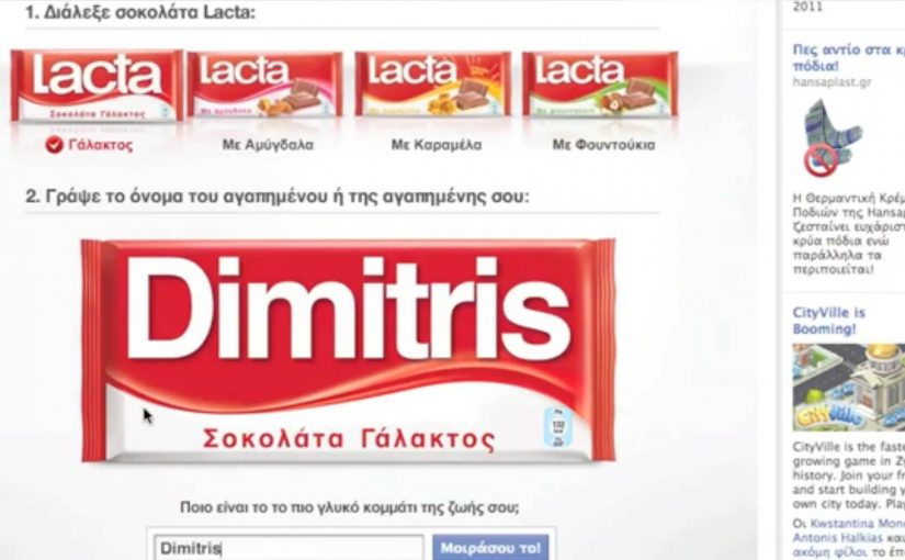
Lacta Chocolate Facebook App

You open the Lacta Chocolate Facebook app, type your loved one’s name, and customise a Lacta wrapper around them. The app matches them to a Lacta flavour, then you push it out as a wall-to-wall post, meaning a highly visible Facebook share that others can see, react to, and copy. In seconds, your “love message” becomes something your friends can respond to and replicate.

The app idea. Turn affection into something people want to publish

The app is built around a simple insight. People naturally compare their loved ones with chocolates. Lacta turns that behaviour into a lightweight creation tool, so the output is personal, visual, and instantly shareable. This works because the branded asset carries the user’s own relationship signal, so posting it feels expressive rather than promotional.

Why some Facebook apps explode while others flop

Plenty of Facebook apps chase scale and get nothing. The real question is why anyone would want to publish the result in the first place. The strongest social tools do not ask people to share a campaign. They give people something about themselves worth sharing.

Extractable takeaway: Social tools spread when the output helps people express identity or affection in public, because the brand travels inside a social signal the user already wants to send.

1) Simplicity

A couple of clicks to get to the app and to the point of action.

2) Shareability

All the standard sharing features that make it easy to spread.

3) Insight

Something a fan might actually use, comment on, and share.

Who builds it, and what the traction looks like

Once again OgilvyOne Athens gets into action and creates an app that lets people customise a Lacta chocolate wrapper in their loved one’s name and compare them to a particular Lacta flavour, before using the wall-to-wall post feature to get the message across.

For Lacta, the business intent is clear. Turn private affection into branded public visibility that fans distribute for free.

In consumer brands using social platforms as lightweight participation channels, this matters because the strongest ideas convert self-expression into distribution without adding friction.

In just over a month the app generates over 150,000+ fans, with thousands using personalised chocolate wrappers as profile pics.

What to steal if you build shareable social tools

  • Make the output the share. The personalised wrapper is the thing people want to publish, not a link to the app.
  • Keep the creation flow brutally short. Name input plus one decision is enough to get to a finished artefact.
  • Use a familiar emotional trigger. Affection and gifting makes the action feel socially safe, not promotional.
  • Design for copying behaviour. Seeing someone else’s personalised wrapper naturally prompts “make mine”.

A few fast answers before you act

What is the Lacta Chocolate Facebook app in one sentence?

It is a simple Facebook app that lets you personalise a Lacta wrapper with a loved one’s name, match them to a flavour, and share it as a wall-to-wall post.

Why does this app spread?

Because the output is personal and visual, the creation flow is fast, and the sharing mechanic is built into the final step.

What are the three success factors highlighted here?

Simplicity, shareability, and a real insight that people actually want to express publicly.

What is the business value behind the interaction?

It turns a private affection signal into branded public visibility, so distribution happens through what users already want to share.

What is the key execution lesson to copy?

Make the “thing people share” the natural end product of the interaction, not an optional add-on after the fact.

Mobistar: Basta Call Center Prank

Mobistar is long described as one of Belgium’s leading mobile operators and one of the country’s biggest advertisers. Over time, it also becomes known in public conversation for frustrating customer service.

So on January 10, 2011, Belgian TV makers at VRT decide to prank Mobistar, and the segment later airs on their new comedy show, Basta. A Mobistar security guard named Mathieu becomes the unlikely hero, largely because he stays calm and friendly throughout.

The prank that turns “call center pain” into a live experience

The execution is cruelly simple. A physical setup triggers a phone call. That phone call leads into an intentionally endless customer-service loop of transfers, hold music, dead ends, and “let me check with my boss” deflections. The joke is not the person calling. The joke is the system that can trap anyone, even someone trying to do the right thing.

In European telecom markets, customer service reputation can outweigh product features in the public conversation.

Why it lands: it exposes the gap between message and reality

Modern consumers get tired of overpromising brand messages, especially when the lived experience does not match. This prank goes viral because it dramatizes that mismatch without a lecture. You can feel the frustration build, and you recognize it instantly if you have ever battled a helpdesk script.

Extractable takeaway: If your brand invests heavily in advertising but underinvests in service, someone else will eventually tell your story for you. The narrative people remember will be the experience, not the tagline.

The uncomfortable lesson for big advertisers

The real question is whether your marketing is amplifying a service experience worth talking about, or drawing more attention to one people already resent.

The punchline carries a serious point. If brands want trust, they need to fund the product and the service before they fund the promise. Great campaigns amplify a great experience. They cannot replace it for long.

What to steal if you run CX, service, or brand

  • Audit your “moments of truth”: contact centers, chat, returns, and complaints shape reputation faster than brand film.
  • Measure friction, not just satisfaction: transfers, resolution time, and repeat-contact rate are where trust is won or lost.
  • Stop advertising around known pain: fix the root issue first, then scale the promise.
  • Turn service into a brand asset: when service is excellent, it becomes shareable for the right reasons.
  • Protect frontline humans: if your system is broken, your staff and customers suffer together.

A few fast answers before you act

What happened in the Mobistar prank?

A TV team stages a scenario that forces a Mobistar employee into an exaggerated, endless customer-service loop, mirroring the frustrations customers report when they seek help.

Why did Mathieu become the “hero” of the clip?

Because he stays polite and persistent while the system around him becomes increasingly absurd. His demeanor contrasts with the experience the prank is criticizing.

What is the business takeaway for brands?

Advertising cannot sustainably outshine poor service. When the lived experience disappoints, culture and media will surface the truth faster than any campaign can mask it.

How should a telecom brand respond to criticism like this?

Fix operational drivers first: staffing, escalation paths, first-contact resolution, and transparency. Then communicate improvements with proof, not slogans.

What should leaders measure to prevent this kind of reputational damage?

Resolution time, transfer rate, repeat-contact rate, complaint volume by issue, and sentiment in customer conversations. These tend to predict reputation better than awareness metrics.

Adidas: adiVerse Virtual Footwear Wall

A footwear wall that behaves like ecommerce

The future of instore displays is here. With this example you will see how today’s instore displays are evolving to meet our online experiences.

Adidas has created an in-store digital experience that was described at the time as showcasing over 8,000 Adidas shoes. The technology can be easily deployed to allow almost any retailer to sell the entire Adidas product range without having to be a flagship store in a major city.

How the adiVerse wall runs in-store

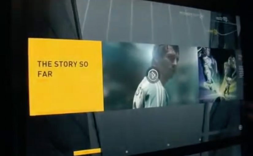
The experience is defined by a large footwear wall, made of multiple LCD touch screens that use facial recognition to detect a customer’s gender on approach to the wall. The adiVerse virtual footwear wall then customizes the product experience for that gender, and helps guide them to the perfect shoe.

Alternatively it lets them browse the entire range of products, with each shoe rendered in real-time 3D.

Endless aisle is a retail setup where a store sells the full catalogue digitally, even if only a fraction of it is physically stocked on the shelf.

Why it feels like online shopping, only bigger

This is essentially ecommerce browsing translated into a shared physical surface. You can scan, filter, compare, and inspect details, but the store controls the pacing and the context. The mechanism that matters is the blend of quick orientation plus depth on demand, and it works because shoppers can get to “relevant enough” fast, then only spend time on richer 3D detail when they care. In multi-brand sporting goods retail, bridging endless-aisle breadth with guided discovery is the difference between “too much choice” and “the right choice”.

Extractable takeaway: On any shared in-store screen, optimize for fast orientation first, then unlock depth only after the shopper signals intent.

The real question is whether your wall can move shoppers from browsing to a confident shortlist without turning discovery into an endless scroll.

Content depth for the winners, speed for everything else

The most popular products in the range get the full content play, including videos, game stats, product specs and even twitter feeds. Everything else stays light, so browsing does not become slow or confusing.

This “tiered content” approach is a practical way to keep performance high while still making hero products feel premium.

The retail play hiding inside the screens

In the end customers can add their selected product into a virtual cart, and check out via an iPad that the store sales staff would have.

That last step is the business intent. Sell the long tail without expanding floor space, while keeping checkout and assistance inside the store experience. Retailers should treat the wall as an assisted-selling surface, not a self-serve kiosk.

The adiVerse Virtual Footwear Wall is an in-store touchscreen wall that lets shoppers browse a large adidas shoe catalogue, inspect products in real-time 3D, and hand selections to store staff for checkout via tablet.

Patterns worth copying for your digital wall

  • Build an endless aisle that feels curated. Offer the full catalogue, but guide to a shortlist fast.
  • Use tiered content deliberately. Deep media for hero products. Lightweight data for everything else.
  • Make staff checkout the final bridge. Tablets in hand keep conversion human and immediate.
  • Design for “public browsing”. Big screens invite group decisions. The UI should support that.

A few fast answers before you act

What is the adiVerse Virtual Footwear Wall?

It is an in-store wall of touchscreen displays that lets shoppers browse a large adidas shoe catalogue, inspect products in real-time 3D, and pass selections to staff for checkout via tablet.

What does “endless aisle” mean in this context?

It is a retail setup where a store can sell the full catalogue digitally, even if only a fraction is physically stocked on the shelf. It expands choice without expanding floor space.

How does it personalize the experience?

It uses facial recognition to detect gender on approach and adapts the interface to that mode, while still allowing shoppers to browse the full range if they prefer.

Why does real-time 3D matter on a digital wall?

Because it supports confident decision-making in-store. Shoppers can inspect details quickly and compare options without needing a physical sample of every model.

What is “tiered content”, and why is it useful?

Hero products get rich media like video and deeper specs, while the long tail stays lightweight. This keeps browsing fast while still making winners feel premium.

How does checkout work in the flow?

Selections are handed to store staff who complete checkout on a tablet. That keeps conversion human and immediate, instead of pushing shoppers to leave the store journey.