
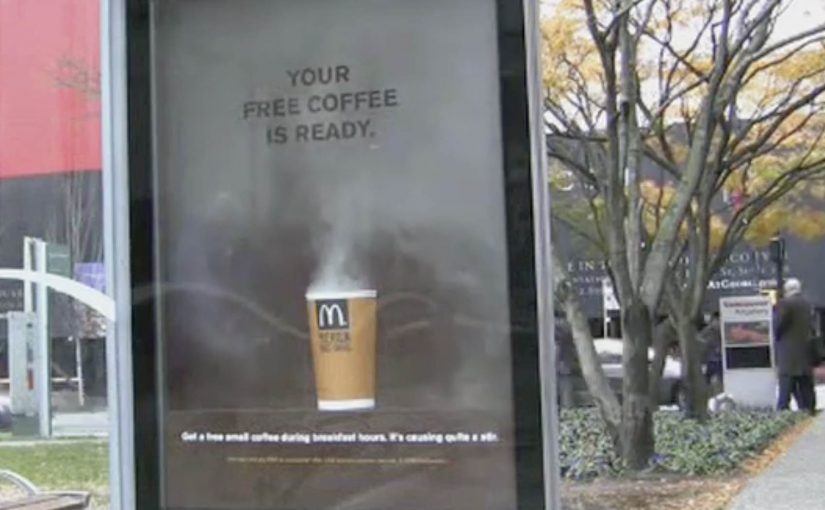
McDonald’s: Steaming Bus Shelter

Over the last couple of months we have seen some innovative bus shelter ideas from Cadbury and Coca-Cola. Now McDonald’s joins in with a cup of coffee that looks like it is still breathing.

Steam that writes the message for you

Instead of printing “hot coffee” on the poster, the execution uses real-looking steam rising from the cup. As the steam drifts across the panel, a simple line appears and disappears, turning a static bus shelter into a time-based reveal.

Interactivity here is low-tech but real. The ad changes over time in front of you, without screens, taps, or instructions. That works because a behavior you can see in real time makes the product benefit feel proved rather than merely claimed.

In out-of-home advertising, the strongest work turns waiting time into a short, sensory experience that people understand in a glance.

Why this lands in the street

Steam is a credibility cue. It signals warmth, freshness, and immediacy. At a bus stop, that matters because you are standing still, watching your breath in the cold, and you have time for one small surprise that feels physical rather than “ad-like”. The reveal also creates a micro-rhythm. By micro-rhythm, the ad creates a simple pattern of pause, reveal, and reset that a passer-by can read in seconds. Nothing happens. Then it happens. That pacing earns a second look.

Extractable takeaway: If you can make the medium behave like the product, you reduce explanation to near zero. The environment becomes your proof point, and the call-to-action feels like the obvious next step.

What McDonald’s is really buying with this shelter

This is a promotion mechanic disguised as a moment of theatre. The shelter does three jobs at once: it dramatizes the heat of the coffee, it frames the offer as “ready now”, and it catches commuters at the exact time window when a breakfast purchase is plausible.

The real question is whether the shelter makes hot coffee feel immediately available in the exact moment a commuter might buy it.

It also borrows the social logic of street magic. When something unexpected happens in public, people point it out. That turns one paid placement into multiple conversations, and it does it without adding complexity for the passer-by.

What to steal for your next transit activation

  • Use a single sensory cue. One clear signal beats layered cleverness in a noisy street.
  • Build a reveal that loops. A repeating moment gives late arrivals a chance to see it.
  • Make the message readable mid-glance. Design for people who look up for two seconds, not twenty.
  • Time the call-to-action to the context. Commuters make different choices at 8am than at 8pm.
  • Let the placement do the targeting. Transit media already filters for routines. Do not overcomplicate the copy.

A few fast answers before you act

What makes this bus shelter execution “interactive”?

The panel changes in real time in front of the viewer. The steam effect creates a repeating reveal, so the message appears and disappears rather than sitting permanently on the poster.

Does this need digital screens to feel modern?

No. The “modern” part is the behavior. A physical effect that updates over time can feel as fresh as a screen when it is tightly connected to the product benefit.

What is the main marketing objective here?

To drive immediate trial during a breakfast window by making “hot coffee” feel tangible, and by framing the offer as available right now.

What is the biggest risk with executions like this?

If the effect is subtle, unreliable, or hard to see from a normal standing distance, the entire idea collapses. The reveal must be legible without effort.

When is a bus shelter the right medium for this kind of idea?

When your message benefits from a short looped demonstration, and when your audience is naturally paused. Transit environments provide both attention and repetition.
Coca-Cola: Where Will Happiness Strike Next

A vending machine that behaved like a brand promise

The simplest activations often travel the farthest when the “idea” is visible in one glance. Coca-Cola’s Happiness Machine is a clean example of that kind of instantly understood storytelling.

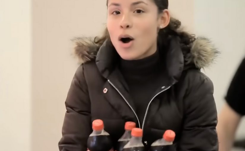
A Coca-Cola vending machine was transformed into a happiness machine that delivered “doses” of happiness by dispensing more than people expected from a normal purchase.

How the Happiness Machine mechanism worked

The mechanism was a familiar object with an unexpected behavior.

A vending machine is supposed to be transactional. Insert money, get a product. By breaking that script and delivering more than expected, the machine turned an everyday moment into a surprise experience that people immediately wanted to share.

The physical interface did the heavy lifting. No explanation was required because the “before versus after” was obvious in real time.

In global FMCG organizations, activations scale faster when a bystander can understand the payoff in three seconds.

Why the surprise felt contagious

Surprise creates attention, but generosity creates warmth. The experience worked because it did not feel like a trick. It felt like a gift. That distinction matters.

Extractable takeaway: Brands should pair a surprise twist with generosity so sharing feels like celebrating people, not exposing them.

People are happy to share content when it makes them look human, not gullible.

And because the moment happened in public, reactions became social proof. Social proof here means other people’s visible reactions validating that the moment is worth paying attention to.

The business intent behind “doses” of happiness

The intent was to make Coca-Cola’s “happiness” positioning tangible in a way advertising rarely can.

The real question is whether your brand promise can be experienced in public without anyone needing a caption.

Instead of describing a feeling, the brand staged it. The vending machine became a repeatable format that produced real reactions. Those reactions became content, and that content extended the experience far beyond the original location.

Stealable moves from the Happiness Machine

  • Use a familiar object. If people understand the baseline instantly, the twist lands faster.
  • Break a script with generosity. “More than expected” creates goodwill and shareability.
  • Design for public reaction. The audience is not only the participant. It is everyone watching.
  • Make the brand promise physical. If your positioning is emotional, create a moment people can feel, not just read.

A few fast answers before you act

What is the Happiness Machine, in one sentence?

A normal Coca-Cola vending machine behaves unexpectedly by giving people more than they paid for, creating a gift moment instead of a transaction.

How does the mechanism work?

Use a familiar object. Break the expected script. Deliver an instant, legible payoff. Let public reactions create social proof and distribution.

Why does this kind of surprise travel so well?

Because the story structure is clean. Normal situation. Unexpected twist. Human reaction. That sequence is easy to capture and easy to share.

What business intent does this serve?

It makes the “happiness” positioning tangible. Instead of describing a feeling, the brand stages a moment people can experience and witness.

What can brands steal from this execution?

Keep the setup simple, make the payoff instantly understandable, and design for spectators as much as participants. The crowd is part of the creative.

What should you measure if you copy this pattern?

In-the-moment attention and dwell time, organic capture and shares, sentiment, and recall. Also track whether people retell the action, not just the logo.

Pepsi Refresh: Monthly Grants for Ideas

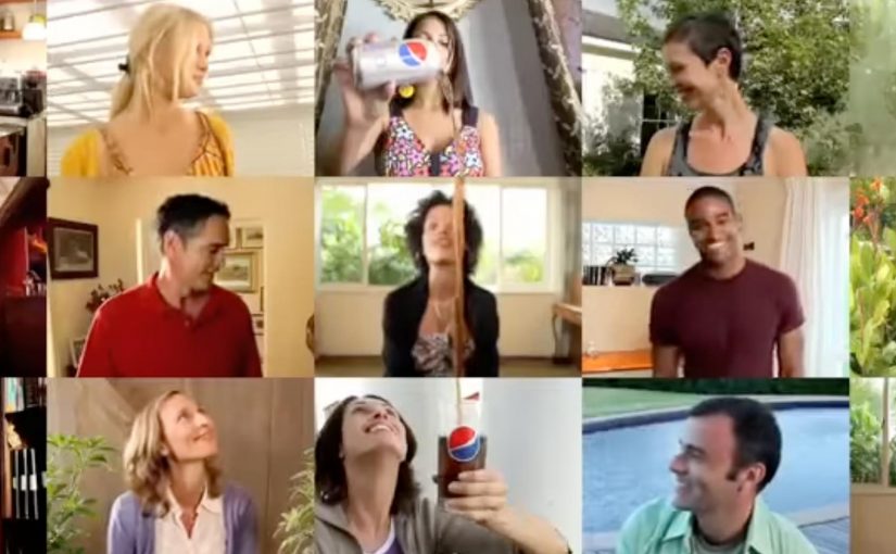
Pepsi wants to make the world a better place and so it has up to $1.3 million in Refresh grants to give out every month, ranging from $5,000 through to $250,000.

The social investment campaign can be seen online at www.refresheverything.com, and is being presented as Pepsi’s alternative to spending on television advertising at the Super Bowl this year.

From January 13, US residents can submit an idea online, choosing categories of health, arts and culture, food and shelter, the planet, neighborhoods, and education.

From February 1, 2010, visitors to the site will be able to vote on ideas, with the first 32 awards being announced on March 1.

The clever part is the trade

The headline here is not just the money. It is the positioning. The real question is whether you can trade a single paid burst for a repeatable participation loop without losing clarity or trust. Pepsi is framing this as an alternative to a single high-cost burst of attention, and shifting that investment into a participatory program where people submit, rally support, and vote.

Why this format can generate momentum

It works because the format creates a loop people can re-enter. Each month resets urgency, gives participants a clear job to do, and turns support-building into something visible.

Extractable takeaway: If you want participation to create reach, make recruiting support effortless and make the cycle easy to repeat.

  • A clear incentive. Monthly grants create repeated urgency, not a one-off moment.
  • Built-in categories. Health, arts, food and shelter, the planet, neighborhoods, and education make participation easy to understand.
  • Voting creates distribution. If your idea needs votes, you recruit your network. That recruitment becomes the media.

In large-scale brand purpose programs, participation grows when funding, voting, and sharing are designed as a repeatable cycle rather than a one-off moment.

What to watch if you run campaigns like this

  1. Transparency. People will want to understand how ideas are evaluated and funded.
  2. Participation fatigue. Monthly cycles help, but the experience has to stay simple to repeat.
  3. Proof of impact. The long-term credibility comes from showing what the funded ideas actually achieved.

What to steal from Pepsi Refresh

  • Make the trade explicit. Position the program as the alternative to a single high-cost attention burst.
  • Design for repeat participation. Use a simple monthly rhythm, clear categories, and a predictable submit-and-vote flow.
  • Let supporters do the distribution. Require votes so participants recruit their networks, and that recruitment becomes the media.

A few fast answers before you act

What is the Pepsi Refresh Project?

It is a social investment program where Pepsi offers monthly “Refresh grants” and invites people to submit community ideas and rally votes to get them funded.

How much funding is available?

Up to $1.3 million in grants per month, with awards ranging from $5,000 to $250,000.

When can people submit and vote?

From January 13, US residents can submit ideas. From February 1, 2010, visitors can vote, with the first 32 awards announced on March 1.

What categories can ideas be submitted under?

Health, arts and culture, food and shelter, the planet, neighborhoods, and education.

What is the strategic alternative being positioned here?

Pepsi is presenting the program as an alternative to spending on television advertising during the Super Bowl, shifting that spend into a participatory grant platform.