
Playable Music Posters: Tap to Hear

Borders between media are blurring. Books are being swiped, magazines digitally scrolled and even in print one can today occasionally navigate. So it is no surprise when regular paper posters come to life on being combined with bluetooth, conductive ink, sensors and speakers.

Paper as an interface, not a surface

The mechanism is straightforward. Conductive ink turns parts of a poster into touch-sensitive zones. Sensors detect taps, knocks, or touch patterns. Bluetooth and small speakers, or a paired phone, provide the audio output. The poster stops being an image and starts behaving like a controller.

In public retail and event environments, touch-based posters only work when people feel safe and permitted to interact.

In consumer marketing and live environments, interactive print means print that senses touch and triggers a digital response. It is a way to turn passive out-of-home into a touchpoint that behaves like a device.

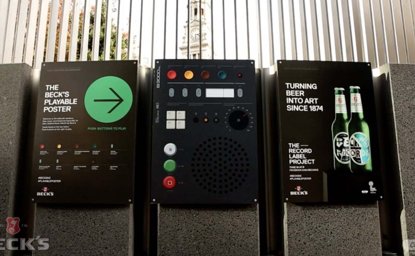
Beck’s Playable Poster

Looking for an innovative way to mark New Zealand’s Music Month, Beck’s partnered with Shine to design a playable poster. Using conductive ink and speakers the posters were made playable with a simple tap of the finger.

The Sound of Taste

Herb and spice brand Schwartz is all about flavour. So to dramatise flavour which was invisible and silent, they got print tech collective Novalia and ad agency Grey London to collaborate on an interactive poster. The poster used conductive ink to turn the surface area of the paper into an interactive interface that also connected to the viewers smartphone to deliver a richer experience.

Change the tune

Agency Republic from UK created a poster with an embedded sensor which when knocked changed the song being played on the agencies shared sound system.

Why these work: the demo happens in your hands

Each example keeps the interaction legible. Tap to trigger sound. Touch to explore flavour as audio. Knock to skip a track. The poster does not ask people to learn a new behavior. It hijacks an existing one, touching a surface, and rewards it instantly.

Extractable takeaway: When you want print to feel alive, make one obvious gesture trigger one immediate reward, and let the brand message ride on that moment of viewer control.

The real question is whether the interaction earns enough memorability to justify the added production. If the payoff is not instant and on-message, do not build it. Because the audience causes the outcome with a simple touch, the message sticks.

Practical patterns for interactive print

  • One interaction, one reward. Do not overload the surface with too many modes.
  • Make the “how” obvious. A tap zone, a knock cue, a simple instruction. Then deliver instantly.
  • Use phones as infrastructure. If pairing adds depth, let the phone do what paper cannot, audio, saving, sharing.
  • Design for public confidence. People will only touch a poster if it feels safe, clean, and socially acceptable.

A few fast answers before you act

What is “conductive ink” doing in these posters?

It creates touch-sensitive paths on paper, so taps or touches can be detected and mapped to actions like playing audio.

Do these posters need special printing like QR codes?

They still require specialist production, but the interaction can be integrated invisibly into the design. The poster itself becomes the control surface rather than carrying visible codes.

Why add Bluetooth to print?

Bluetooth allows paper to trigger sound through a phone or external speaker, which is essential when the content is audio or when you want richer layers than print can carry.

What makes an interactive poster feel “worth it” to a passer-by?

Immediate payoff and low friction. If the result is instant and satisfying, people will try it. If setup or pairing is slow, they walk past.

Where does this format fit best?

In environments where people have dwell time and curiosity, festivals, transit hubs, retail windows, office interiors, and brand experiences where interaction is socially normal.
Coca-Cola: Rainbow Nation Rainbows

A rainbow you can actually chase across Johannesburg

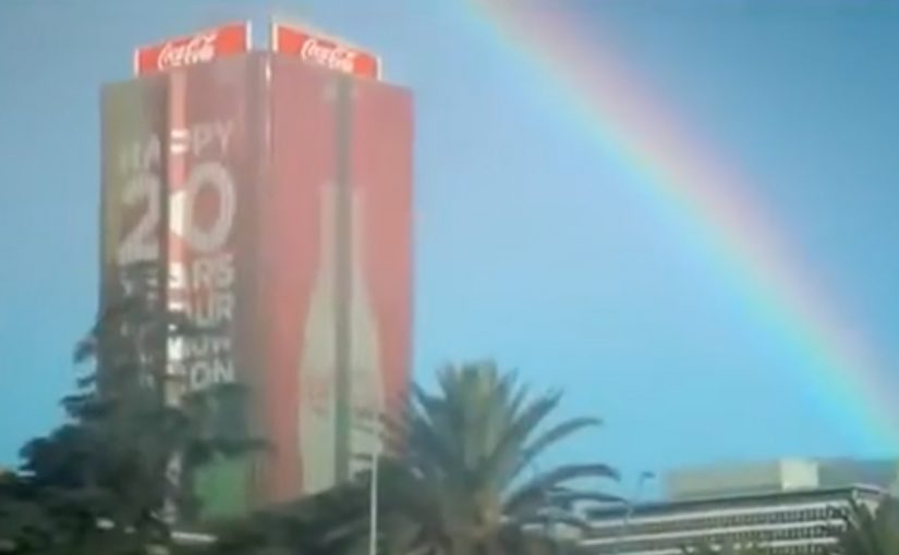
Twenty years ago, South Africa elected Nelson Mandela in the country’s first-ever democratic election. This led Archbishop Desmond Tutu to coin the phrase “The Rainbow Nation,” referring to the country’s diverse people.

Now to celebrate this 20th anniversary of democracy, Coca-Cola decided to literally create rainbows. Using sunlight, water, some fancy science and a little bit of magic, they made rainbows pop up all over Johannesburg. Some rainbows even reached the ground, for those who sought to discover where they ended.

The trick: make the symbol physical

This is not a graphic. It is a phenomenon placed into normal streets. And the moment the rainbow reaches the ground, the campaign stops being something you watch. It becomes something you can follow. This works best when the symbol becomes a physical invitation, not a slogan.

The real question is whether people can choose their way into the meaning, instead of being told what it means.

Why discovery beats declaration

You are not told what to feel. You either stumble into it and smile. Or you choose to go looking for the end. That voluntary participation is what makes it feel like magic, not messaging.

Extractable takeaway: If you want participation, turn the message into a small quest people can opt into, not a statement they are asked to agree with.

In city-scale brand activations, the strongest participation comes from turning a familiar symbol into a discoverable experience people can physically encounter.

What it was really celebrating

Twenty years of democracy, expressed through a shared symbol, brought to life in the city.

Ideas worth borrowing

  • Turn an abstract story into something people can encounter in the real world.
  • Add a simple “seek and find” layer so curiosity becomes the call-to-action.
  • Keep the explanation light. Let the experience carry the meaning.

A few fast answers before you act

What did Coca-Cola do for “Rainbow Nation”?

They made rainbows appear across Johannesburg to celebrate twenty years of South African democracy, including rainbows that reached the ground.

Why is the phrase “Rainbow Nation” used?

Archbishop Desmond Tutu coined “The Rainbow Nation” to describe South Africa’s diverse people following the country’s democratic transition.

What was the viewer experience?

People encountered rainbows in public space, and some could be followed to the ground to discover where they ended.

What is the core creative mechanic?

Transforming a cultural symbol into a real-world phenomenon people can discover in the city.

How do you recreate this idea without a rainbow?

Pick a symbol your audience already recognizes, make it physically encounterable, and add a simple “seek and find” hook so people choose to participate.

Restaurant of the Future: AR Dining

The restaurant of the future is a technology experience

Restaurants of the future are no longer defined only by food, service, or ambiance.

They become technology-driven environments, where digital interfaces blend directly into the dining experience.

Smartglasses, augmented reality, gesture-based interfaces, customer face identification, avatars, and seamless wireless payments begin to coexist at the table.

The result is not a single gadget. It is a fully integrated experience.

When dining becomes augmented

In the restaurant of the future, the menu does not need to live on paper or even on a phone.

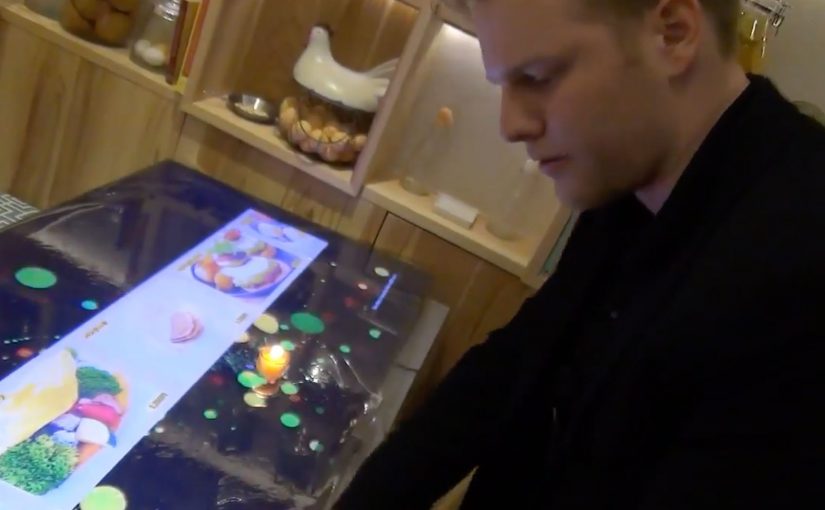
Information can appear in front of the guest through smartglasses or augmented displays. Dishes can be visualized before ordering. Nutritional details, origin stories, or preparation methods can surface on demand.

Gestures replace clicks. Presence replaces navigation.

The dining experience becomes interactive without feeling mechanical.

Identity replaces interaction

Face recognition and customer identification change how restaurants think about service.

Returning guests can be recognized instantly. Preferences, allergies, and past orders can be recalled automatically. Avatars and digital assistants can guide choices or explain dishes without interrupting human staff.

The restaurant adapts to the guest, not the other way around.

Payment disappears into the experience

Wireless payment technologies remove the most artificial moment in dining.

There is no need to ask for the bill. No waiting. No interruption.

Payment happens seamlessly as part of the experience, triggered by confirmation, gesture, or departure. Money moves, but attention stays on dining.

Mirai Resu. Japan’s restaurant of the future

To illustrate this vision, a short video from Mirai Resu in Japan shows what a fully integrated restaurant experience can look like.

Smartglasses, augmented visuals, gesture-based interaction, avatars, and invisible payment mechanisms come together into a single flow.

This is not a concept mock-up. It is a concrete glimpse into how dining, technology, and experience design merge.

In hospitality experience design, technology only “wins” when it fades into the flow and makes the human experience feel more effortless.

In experience-led hospitality brands, the winning AR layer is the one that keeps guests present while the service logic runs quietly in the background.

The real shift. Experience over interface

The most important takeaway is not the individual technologies. It is the shift away from explicit interfaces toward ambient interaction. By ambient interaction, I mean in-context cues and hands-free inputs that let guests act without hunting through screens. Restaurants should use this pattern to remove friction in ordering and paying, not to turn the table into a device demo. The real question is whether the tech can disappear enough that guests remember the meal, not the UI. Because the interaction happens in the moment and stays tied to the table, it keeps attention on dining, which is why it feels like hospitality rather than software.

Extractable takeaway: If an experience needs a screen to be understood, it is still an interface. The closer interaction stays to the real-world moment, the more it reads as service.

Steal this from AR dining

  • Prototype the full flow, not a feature. Order, identity, assistance, and payment should feel like one service journey.
  • Keep interaction in-context. Use gestures and overlays only when they reduce steps and keep guests present.
  • Make personalization explicit and optional. Recognition only lands when guests understand the trade and can opt out.

A few fast answers before you act

Is this about replacing staff with machines?

No. The value is removing friction so staff can focus more on hospitality and less on transactional steps.

Why does augmented reality matter in dining?

It can add information and interaction in-context, without pulling guests out of the moment or forcing phone-first behavior.

What does the Mirai Resu example actually demonstrate?

It demonstrates orchestration. Multiple technologies can be combined into one coherent service flow, rather than isolated gimmicks.

Where does “customer identification” fit in this vision?

It enables recognition on approach and service personalization, but it only works when guests understand the trade and feel in control.

What is the design principle to steal?

Design for experience continuity. Keep attention on dining, and make technology support the flow rather than interrupt it.