Build with Chrome: LEGO Chrome Experiment

Build with Chrome: LEGO Chrome Experiment

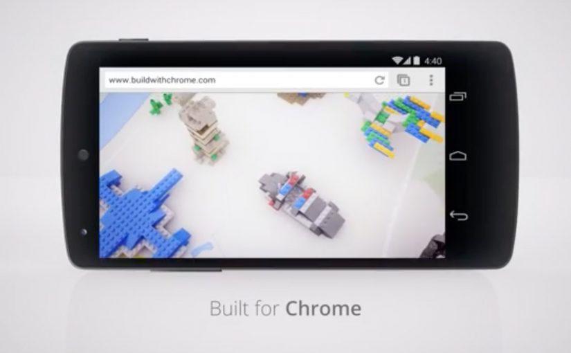
Google earlier this week released their latest Chrome Experiment in partnership with LEGO called “Build with Chrome”. In this case, a Chrome Experiment is a browser-based interactive demo built to show what Chrome can do.

Now anybody who visits www.buildwithchrome.com via their Chrome browser can use their mouse or touchscreen to build something out of the virtual LEGO bricks and share them directly on Google+.

Why this is a smart Chrome Experiment

This is a simple product demonstration disguised as play. It shows off what the browser can do by putting it in service of something people already understand. Building with LEGO.

Extractable takeaway: when you want people to remember a platform capability, attach it to a familiar action so the technology explains itself through use.

The real question is whether the experience makes the browser capability memorable by turning it into something people instantly know how to do.

  • Low learning curve. If you can drag and drop, you can participate.
  • Touch-ready by design. Mouse and touchscreen both make sense for “building”.
  • Social distribution baked in. Sharing is part of the experience, not an afterthought.

For digital teams building interactive brand work, the useful pattern is to turn a technical capability into a familiar act people want to repeat and share.

What Google is really demonstrating here

The business intent is bigger than a playful LEGO build. Google is using a familiar creative act to position Chrome as a browser that feels interactive, responsive, and socially connected without needing to make that case through technical claims.

That matters because people rarely remember feature lists, but they do remember the tool that let them make something quickly and show it to others. The mechanism works because the act of building becomes the proof of the platform.

What to take from this if you are building interactive brand work

This is worth stealing because the experience stays focused on one clear behavior, then lets that behavior carry the product story.

  1. Make the capability tangible. Don’t explain performance. Let people feel it.
  2. Choose a familiar metaphor. Familiar mechanics reduce friction and increase time spent.
  3. Design sharing as a natural next step. If the output is personal, people want to show it.
  4. Keep the experience single-purpose. One clear activity beats a feature kitchen sink.

A few fast answers before you act

What is “Build with Chrome”?

It is a Google Chrome Experiment built with LEGO that lets people create virtual LEGO models in the browser using a mouse or touchscreen, then share them online.

Why partner with LEGO?

Because LEGO is an instantly understood building system. It makes the digital interaction feel intuitive, playful, and worth sharing.

What is the core marketing mechanic here?

Hands-on participation. The experience turns a browser capability into a personal creation that people can publish socially.

What makes a Chrome Experiment effective?

It demonstrates a technology through an interaction people enjoy, without requiring explanation, and it encourages sharing through an output people feel ownership of.

What is the transferable lesson for digital teams?

If you want people to remember a platform capability, wrap it in a simple activity that creates something personal and shareable.

The Snapchat Pitch

The Snapchat Pitch

Its been a while (2011) since I came across an innovative Social Media recruitment campaign. In this latest example Norwegian ad agency DDB Oslo has tapped the growing trend of chat apps to attract talent to its agency.

To seek out new talent they created “The Snapchat Pitch”. Interested job seekers had to sum up their concept in 10 seconds or less via video, drawing or song and send it over to DDB Oslo via Snapchat. If the DDB creative department liked the pitch, they would fly the job seekers over to their office for a final interview.

Why Snapchat was the right medium for this recruitment idea

The constraint is the feature. Ten seconds forces clarity. It pushes candidates away from long explanations and toward an idea that lands instantly. That is a useful filter for creative roles, because the pitch is not only the message. It is also proof of judgment under pressure.

Extractable takeaway: When the format itself forces the behavior you want to assess, the application becomes a live demonstration instead of a claim on a CV.

Snapchat also shapes the tone. It is informal, fast, and personal. That lowers the barrier to submit, and it signals that DDB Oslo is looking for modern creators who can think in native mobile formats, not just traditional portfolio pieces. Here, native mobile formats means short, informal creative communication built for the phone screen, not adapted from a longer presentation. Snapchat is not a gimmick here. It is the right screening tool because the medium tests the same creative compression the job demands.

In agency recruitment, where portfolios often reward polish more than immediacy, that makes the channel itself part of the assessment.

What makes it different from typical agency recruitment

Most recruitment campaigns ask for credentials first and creativity second. This flips it. The creative output is the entry ticket. The interview is the reward. That sequencing matters because it makes the selection criteria visible and fair. Everyone starts with the same brief. Communicate an idea in 10 seconds.

The real question is whether the first application step can reveal creative judgment before the interview begins.

What DDB Oslo is really optimizing for

For DDB Oslo, the business intent is not just to look different. It is to widen the top of the funnel while screening for candidates who can already work inside a mobile-first creative constraint. That makes the application mechanic do two jobs at once. It attracts attention and improves fit.

What to borrow if you want to attract talent

  • Use a format-native challenge. Pick a platform where the format itself tests the skill you care about.
  • Make the first step lightweight. Low friction increases the number and diversity of submissions.
  • Reward the best with a real-world next step. A flown-in interview makes the upside tangible and shareable.

A few fast answers before you act

What is “The Snapchat Pitch”?

It is a recruitment idea by DDB Oslo where job seekers pitched a concept in 10 seconds or less via Snapchat using video, drawing, or song.

What did candidates have to submit?

A short concept pitch that fits into 10 seconds, sent to DDB Oslo through Snapchat.

What happened if the pitch was good?

If the DDB creative department liked the pitch, they would fly the job seeker to the office for a final interview.

Why use Snapchat for recruiting?

The platform enforces brevity and rewards clarity. It also tests whether candidates can think and communicate in a modern mobile-native format.

Why does the 10-second limit matter?

It turns the application itself into a filter. Candidates have to show judgment, clarity, and creative compression before they ever reach the interview stage.

Coca-Cola Happiness Machine #ReasonsToBelieve

Coca-Cola Happiness Machine #ReasonsToBelieve

Coca-Cola is at it again, this time unleashing happiness in Sweden. A special Coke machine sits at a bus stop to spread some summer happiness in the middle of the cold and dark Nordic winter. The results…

Why the bus stop is the perfect stage

A bus stop is pure waiting time. That makes it a natural canvas for surprise, generosity, and shared reactions. When the environment is grey and cold, the contrast of “summer happiness” lands even harder, because it flips the mood of the moment instantly.

Extractable takeaway: Waiting time is a pre-built attention state. Pair it with a simple, generous interruption and you get a shared reaction people want to retell.

What this activation proves in one simple move

You do not need a complex mechanic to create a strong brand experience. Here, “mechanic” simply means the one interaction rule that triggers the surprise. Put the idea in the right place, at the right time, and make the reward feel unmistakably human. Because the moment is public and immediate, people experience it together, and that is why it spreads on its own.

In European cities, transit touchpoints like bus stops are one of the few places where strangers reliably share the same small moment of time.

The real question is whether your idea turns that routine pause into a shared reaction people will retell.

This kind of work wins when simplicity and placement do the heavy lifting, not explanation.

Stealable patterns from a bus-stop surprise

  • Borrow “waiting time” as attention. Start where people are already paused and open to distraction.
  • Design for contrast. Put warmth and play into a cold, routine context so the shift is instantly legible.
  • Keep the rule simple. A single, human-feeling reward beats a complicated interaction people have to learn.

Click here to see other Coca-Cola Happiness campaigns from around the world.


A few fast answers before you act

What is the Coca-Cola Happiness Machine concept?

It is a series of experiential campaigns where a Coca-Cola machine behaves unexpectedly, giving people a surprise that feels generous and shareable in public.

Why does placing it at a bus stop work so well?

Because waiting amplifies attention. People are already paused, watching, and open to distraction. The setting turns a small surprise into a social moment.

What makes “happiness” activations feel authentic instead of gimmicky?

The reward has to be simple, immediate, and emotionally clear. If the moment reads as kindness or delight first, the branding can stay light and still win.

What is the main design lesson here?

Engineer contrast. Put warmth where people expect cold. Put play where people expect routine. That is how a short interaction becomes a memorable story.