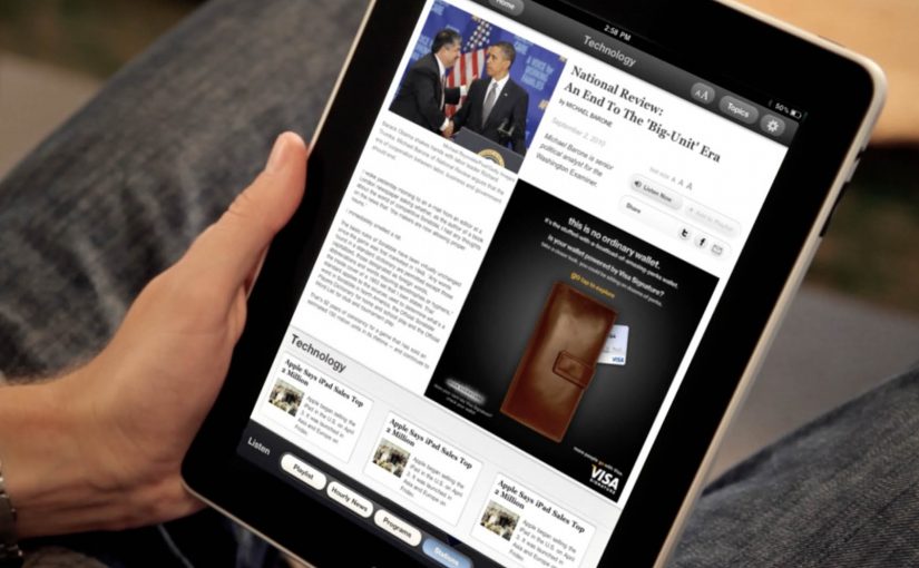
New research from the IAB has shown that when it comes to advertising on tablets, interactivity is the key. And once you look at what the best iPad units are doing, that conclusion makes intuitive sense.
Take Microsoft’s iAd for Windows Azure. Instead of explaining “code in the cloud,” it lets you touch and change code inside the ad, and the layout responds. That is the core pattern for tablet advertising. Don’t describe the value. Let the reader experience it in seconds.
On tablets, display works best when the ad behaves like a small piece of product UI rather than a static interruption.
The IAB point, translated into creative
If your audience is holding a touchscreen, your ad has an extra superpower. Touch. The best tablet units treat touch as the headline. Drag, swipe, tap, reveal, simulate. The objective is not “more features.” It is to earn attention by giving the user a simple action and an immediate payoff.
Five iPad ad interactions worth stealing
White Collar
In a simple use of touchscreen behaviour, users solve a puzzle by dragging an icon across the screen to locate answers to questions displayed in the banner. It’s lightweight, but it turns a passive placement into an active moment.
Volkswagen Park Assist
To experience the Volkswagen Tiguan’s Park Assist, users touch two targets on the screen. The car then reverses and parks itself between those targets. A feature demo becomes a two-tap “proof” moment.
Visa Signature
Built in HTML5, the ad presents a virtual wallet that lets users browse and plan a holiday, buy theatre or cinema tickets, or reserve a hotel. It behaves like a mini service experience rather than an ad.
Toyota
Using the slogan “Filled with People,” the ad lets users drag a slider to watch an unfinished Toyota move through the factory floor while it is assembled. The interaction makes the narrative feel earned, not narrated.
Microsoft
Microsoft wanted developers to understand that Windows Azure allows code to be created in the cloud. So they built an iAd that lets readers alter its code, which in turn changes the layout. It’s a direct translation of message into mechanism.
What these examples have in common
- One obvious gesture. Drag, tap, swipe. No tutorial needed.
- Fast payoff. The response is immediate, so the user feels in control.
- Feature-as-experience. Parking, planning, building, assembling. The “meaning” is in the interaction.
- Tablet-native pacing. These units assume longer attention than mobile banners and reward it.
What to steal for your next tablet execution
- Make the first interaction the headline. The opening instruction should be one short verb. “Drag.” “Tap.” “Swipe.”
- Use interactivity to prove one point. Pick one promise and build one satisfying micro-demo around it.
- Design for fat-finger reality. Targets must be generous. Feedback must be unmistakable.
- Keep exits graceful. If someone watches but doesn’t interact, the unit should still communicate the core idea.
A few fast answers before you act
Why does interactivity matter more on tablets than on desktop banners?
Because touch is the native input. When an ad uses the same gestures as the device, it feels more like content and less like a bolt-on placement.
What’s the simplest “interactive” pattern that still works?
A single drag or tap that reveals something meaningful. A before/after, a quick feature demo, or a short guided reveal with instant feedback.
What’s the most common way interactive tablet ads fail?
Too much complexity. Multiple steps, unclear targets, or slow loading kills the moment before the user gets a reward.
Do interactive ads always beat static ads?
No. Interactivity helps when it makes the message easier to understand or more satisfying to experience. If it’s interaction for its own sake, it becomes friction.
How do you decide whether a tablet idea should be a “mini app” like Visa’s example?
Only do it when the brand’s value is in navigation and choice. If you need users to explore options, then a mini UI can be the product story. Otherwise, a single micro-demo is usually stronger.


