Magnum Pleasure Hunt: AR bonbons in Amsterdam

Earlier on in April Magnum launched the second edition of its hit online game Magnum Pleasure Hunt. To extend the campaign further, a real time mobile augmented reality game takes the hunt to the streets of Amsterdam.

The game is currently ongoing and participants between April 22nd and April 29th can use a special mobile app to hunt down 150 chocolate bonbons hidden across 9 locations in Amsterdam, described in some write-ups as centered around the city’s Nine Streets area. The one who claims the most bonbons wins a free trip to New York, while the rest are rewarded with the new Magnum Infinity ice cream.

In European FMCG launches, location-based AR hunts work best when the rules are obvious in seconds and the reward ladder makes “one more try” feel worth it.

Why this is a smart extension of a digital hit

The original online game is built for reach and replay. The Amsterdam version adds scarcity and locality: the same “collect the bonbons” mechanic, but tied to time, place, and physical movement, which makes participation feel more like an event than a link.

What the AR layer adds to the experience

  • Instant purpose. You are not browsing a branded world. You are on a hunt with a clear target.
  • Real-world urgency. Limited dates and specific locations make the challenge feel live.
  • Social proof by default. People playing in public become the campaign’s moving media.

A quick comparison to Vodafone Buffer Busters

I find the Magnum mobile game to be a toned down version of the Vodafone Buffer Busters game that ran in Germany last September. Either way, it is good to see more brands using augmented reality as a medium of engagement.


A few fast answers before you act

What is Magnum Pleasure Hunt Across Amsterdam?

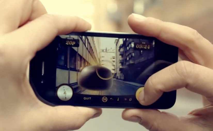
It is a time-limited mobile augmented reality game that moves Magnum’s “collect the bonbons” mechanic from the web to real locations in Amsterdam.

How do players participate?

Players use a mobile app while out in the city to find and collect virtual bonbons placed at specific locations during the campaign window.

What makes it different from the online Pleasure Hunt?

The online version is a digital-only chase. The Amsterdam version adds time and place, turning the hunt into a real-world activity with location-based stakes.

Why are prizes so central to this format?

Because the effort is physical. A clear top prize plus smaller “everyone gets something” rewards keep motivation high across both competitive and casual players.

What is the key design lesson for AR brand games?

Keep onboarding friction low. If people cannot understand the goal and the first action immediately, they will not start, especially outdoors.

The smallest Ikea store in the world

With city populations on the rise, living spaces have become increasingly limited. Ikea however believes that no matter how cramped your space, there’s always a solution. To demonstrate this, they built an entire Ikea store in a 298×250 pixels web banner.

People looking for studio flats as well as one/two bedroom apartments were targeted. The tiny Ikea store held 2800 products and was placed in ImmobilienScout 24, Germany’s largest online real estate market. As with their full size stores, shoppers were able to browse by department and buy all of the featured products.

A full store, compressed into one banner

The concrete move is the point. Ikea did not run a banner that “talked about” small-space living. It built a miniature storefront that behaved like a store, inside the same footprint where most brands would place a static message.

  • Format: 298×250 banner
  • Assortment: 2800 products
  • Placement context: shown where people were actively searching for apartments
  • Behaviour: browse by department and purchase, like a full-size store

Why the placement choice is the strategy

Putting the “store banner” inside a real estate marketplace aligns message and moment. If you are apartment hunting, you are already thinking in constraints. Size. layout. storage. That makes Ikea’s space-saving promise feel immediately relevant, because it shows up at the exact point the problem is top-of-mind.

What to borrow for shopper marketing

  • Make the media unit do the job. If the claim is “there’s always a solution”, show solutions in. Not slogans.
  • Match the intent environment. Place the idea where the need is active, not where attention is accidental.
  • Reduce steps to purchase. If people can browse and buy inside the experience, you keep momentum.

A few fast answers before you act

What was “the smallest Ikea store in the world”?
An entire Ikea store built inside a 298×250 pixel web banner.

How many products were included?
The banner store held 2800 products.

Where was it placed?
It was placed in ImmobilienScout 24, described as Germany’s largest online real estate market.

Who was it aimed at?
People looking for studio flats and one or two bedroom apartments.

Why does this work as shopper marketing?
It turns a small ad unit into a browsable store experience and puts it in front of people already thinking about limited living space.

smart Argentina: The Tweet Commercial

Argentina continues to set the standard in creative Twitter campaigns. In this latest execution, when you visit smart’s official account for Argentina, you might think some kid got in there and had his way with the keyboard. In reality, the feed is built from carefully crafted ASCII art tweets that stack into an animated sequence.

A Twitter timeline that behaves like a commercial

The mechanic is simple and slightly mischievous. The smart Argentina team publishes hundreds of ASCII frames as consecutive tweets, then relies on Twitter’s keyboard navigation to “play” them quickly. The result is billed as a Twitter-based animated commercial built from the timeline itself.

In social media marketing, repurposing native interface behavior into a brand experience is one of the fastest ways to earn attention without buying more media.

How to watch it the intended way

Visit the smart Argentina twitter account and hold down the “J” key to move rapidly through the tweets and see the flipbook effect. Alternatively, the video below captures the idea as it was meant to be experienced.

Why this works, even though it is “just tweets”

It treats a constraint as a canvas. The 140-character format becomes the production rule, and the feed becomes the screen. That restraint is also the brand fit. A small car brand using a small-message platform to create a big-format effect is a neat piece of coherence.

What to steal from this pattern

  • Build the ad out of the platform. If the medium is the message, people are more likely to show others how it works.
  • Exploit one native behavior. Here, a single shortcut becomes the playback engine.
  • Make the payoff legible in seconds. The moment the animation “clicks”, the story tells itself.
  • Let craft signal effort. Hundreds of frames reads as obsession, and obsession reads as share-worthy.

A few fast answers before you act

What is “The Tweet Commercial” in one line?

A flipbook-style animation made from hundreds of ASCII tweets, designed to “play” as you move through smart Argentina’s Twitter timeline.

What role does the “J” key play?

It uses Twitter’s keyboard navigation to advance quickly through tweets, effectively turning the timeline into a fast-scrolling animation reel.

Why is the “world’s first” claim risky to repeat as fact?

Because “first ever” is hard to prove across a platform’s full history. It is safer to treat it as how the work was billed at the time.

What is the transferable lesson for brand teams?

If your platform is saturated with conventional posts, build a sequence that only makes sense in the native interface. The novelty becomes the distribution.