Exito: Flossbook

Exito: Flossbook

Over the last year or so I have seen numerous brands use the basic website functionalities of Twitter and Pinterest to reach out and engage with their audiences.

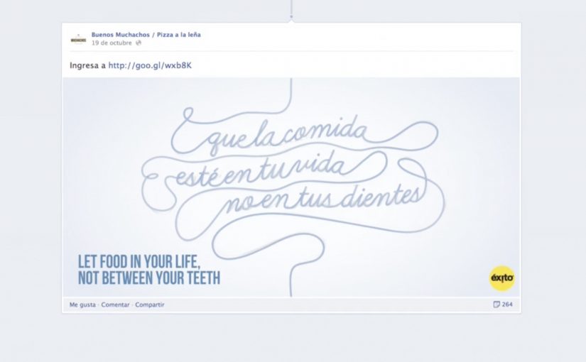
In this example, Sancho BBDO from Colombia creates a “banner” that promotes Exito dental floss by taking advantage of the Facebook Timeline. In the case video below you can see how the banner behaves like dental floss, sliding between pictures of food posted on restaurant fan pages.

The campaign reports that the Exito website received 30% more traffic and that the banner collected more than 200,000 likes across restaurant fan pages.

A banner that borrows the feed’s own grammar

The idea works because it treats the feed as the medium, not as a placement surface. Instead of shouting for attention, the unit inserts itself where the problem actually happens. Between the food and the teeth.

How the mechanism works

The execution uses a Timeline-format ad unit designed to appear between consecutive image posts, creating the visual metaphor of floss moving through a meal-heavy feed. It is still advertising, but it behaves like an interaction with the stream rather than a block sitting next to it. That matters because when the ad uses the stream’s own sequencing, the metaphor reads instantly and needs less explanatory copy.

In social platform marketing, the most durable executions are the ones that act like native feed behavior instead of interrupting it.

Why it lands

It lands because the metaphor is immediate and the placement is earned. If you are scrolling through indulgent food photography, you are already in the mental space where “maybe I should floss” makes sense. The banner does not have to convince you with copy. It just has to show up in the right gap, in the right moment, with a visual that explains itself.

Extractable takeaway: When a platform has a strong, repetitive content pattern, design your unit to exploit the “gap” between posts. The gap is where attention resets, and where metaphors can do more work than claims.

The business intent behind the trick

The real question is not whether a banner can get seen, but whether it can make its relevance obvious in the exact moment people are already primed for it.

This is efficient attention engineering. It makes a low-involvement product feel relevant by tying it to a high-frequency behavior. Scrolling food photos. That linkage is what turns a standard banner into a feed-native reminder you actually notice. Here, feed-native means the ad works inside the platform’s normal flow and spacing instead of fighting it.

What oral-care brands can lift from this

  • Start with the platform pattern. Identify what people repeatedly do and what they repeatedly see.
  • Build a metaphor that uses placement as part of the idea. Here, “between photos” is the point.
  • Keep the unit visually self-explanatory. If it needs instructions, it loses the feed moment.
  • Target the most relevant content contexts. Food imagery is the natural trigger for oral care.
  • Measure beyond clicks. Engagement and downstream site lift can be the real win for a feed-native format.

A few fast answers before you act

What is “Flossbook” in one sentence?

A Facebook Timeline-format banner that visually acts like dental floss by appearing between food photos in the feed.

Why is the Timeline placement essential to the idea?

Because the meaning is created by the gap. The banner becomes “floss” only when it sits between two posts like something threading through them.

What makes this feel native instead of intrusive?

It uses the feed’s own rhythm and spacing. The unit behaves like a piece of the stream, not an unrelated rectangle alongside it.

What is the biggest risk with “platform mechanic” ideas?

If the platform changes the format, the idea can break overnight. These executions need contingency planning for UI shifts.

How can other brands apply this without copying the metaphor?

Find the repeatable content pattern in your audience’s feed, then design an insertion that only makes sense in that exact pattern and moment.

Cape Town Tourism Facebook Holiday

Cape Town Tourism Facebook Holiday

Cape Town Tourism wanted to promote the unexpected side of Cape Town. All the small communities, never-heard of places and unearthed gems that can’t be found on Trip Advisor, Lonely Planet, Expedia, or even Google.

Since everyone could not be sent to Cape Town, people were allowed to send their Facebook profiles instead. Through a Facebook app users were given a virtual, tailor-made Cape Town holiday that exposed them to all the unexpected places. A few lucky winners even got to experience their Facebook profile’s holiday for themselves.

Why this idea fits tourism marketing right now

This is a smart twist on an old travel problem. Most destination marketing ends up showcasing the same highlights, using the same guidebook shorthand. Here, the hook is the opposite. The campaign is built around what standard lists miss, and it uses a person’s own Facebook profile as the input to make the recommendation feel personal. This is the right strategy for destination marketing because it turns generic discovery into personal discovery. That matters because using a person’s own profile as the input makes the destination feel more relevant before any trip is booked.

Extractable takeaway: When the audience becomes the input, discovery feels less like promotion and more like a recommendation built around personal relevance.

The pattern to steal is simple

For tourism brands trying to move beyond the same predictable shortlist, the challenge is making discovery feel personally relevant. The real question is how to make overlooked places feel worth exploring before someone ever books. If you want people to care about a place, product, or experience, give them a way to picture themselves inside it. This campaign does that in a very direct way. It takes something people already maintain daily, their Facebook profile, and turns it into a personalized route into discovery.

It also helps Cape Town Tourism promote the long tail. By long tail here, that means the lesser-known communities and hidden gems that do not show up in the usual places. Those places can finally get airtime because the experience is not optimized for the “top ten.” It is optimized for relevance.

A similar proof point from last year

Similarly last year, Obermutten a little and lovely mountain village from Switzerland was put on the world map through a very simple Facebook campaign. Check that out here.

What to steal for destination marketing

  • Let the audience be the input. Using a Facebook profile as the starting point makes the output feel personal, not promotional.
  • Sell the long tail, not the postcard. A personalised route gives “small communities and hidden gems” a real chance to surface.
  • Create an output people can compare. “Your Cape Town holiday” invites sharing because it is inherently personal and discussable.
  • Add a real-world payoff for a few. A small number of winners makes participation feel consequential, not just entertaining.

A few fast answers before you act

What is the Cape Town Tourism Facebook Holiday campaign?

It is a destination marketing idea that used a Facebook app to turn a user’s Facebook profile into a virtual, tailor-made Cape Town holiday.

What problem was Cape Town Tourism solving?

They wanted to promote the unexpected side of Cape Town. Smaller communities and hidden gems that are not easily found on mainstream travel platforms and guidebooks.

How did the Facebook profile app work at a high level?

Users submitted their Facebook profiles through the app, and the experience generated a personalized “holiday” that surfaced unexpected places based on that profile.

What made it shareable?

The user is part of the idea. The output is framed as “your” Cape Town holiday, which naturally invites comparison and conversation.

What is the broader takeaway for digital marketers in 2013?

Personal data can be turned into a story engine. When the audience becomes the input, relevance increases and discovery moves beyond the same predictable highlights.

adidas Y-3 Interactive Live Stream

adidas Y-3 Interactive Live Stream

At New York Fashion Week in September 2012, adidas Y-3 revealed its Spring/Summer 2013 collection with an “Interactive Live Stream Experience” built by Acne Production. The online audience got four different runway views, could magnify one view without losing perspective of the show as a whole, and could pin each look to Pinterest.

Since 2010, I have noticed a steady increase in innovations at fashion shows around the world. This execution pushed that trend forward by treating the live stream itself as a designed product, not a passive camera feed.

The context. Y-3 at New York Fashion Week

The show marked the 10th anniversary of adidas’ partnership with Yohji Yamamoto. Athletes, celebrities, and fashion mavens gathered at St John’s Center, which was transformed by Dev Harlan’s 3D projections.

The experience. Four views, one zoomed, full context retained

Acne set up the live stream with four concurrent runway angles. The key interaction was control. Here, control means choosing which runway angle to enlarge while the rest of the show stays visible. Because viewers could focus on one angle without losing the full stage picture, the stream felt curated and intentional rather than fragmented.

Why Pinterest mattered in the flow

Pinning each look turned viewing into collecting. It captured intent at the moment of attention and let the audience take the show with them. One click turned a runway moment into a saved, shareable reference.

Extractable takeaway: When a live format lets people save individual moments without leaving the experience, attention becomes portable and the event keeps working after it ends.

In fashion and brand storytelling, the scalable advantage is not just reach, but designing a live moment so viewers can navigate it, keep pieces of it, and revisit it later.

The business intent is to turn fleeting runway attention into saved looks and shareable references without pulling viewers out of the live moment.

This is a stronger digital show model than a single passive camera feed because it turns viewing, collecting, and sharing into one connected experience.

The real question is how to turn a live stream from a one-time broadcast into a format that creates ongoing attention and reuse.

What fashion brands can lift from this

  • Give viewers control, not just a feed: Multiple camera angles plus a “magnify” interaction keeps a live stream feeling explorable, not passive.
  • Preserve context while zooming in: Let people focus on one view without losing the whole runway. That is the difference between browsing and watching.
  • Make curation the sharing mechanic: “Pin each look to Pinterest” turns the show into a personal collection that naturally travels beyond the event.
  • Use production craft as a multiplier: 3D projections and a transformed venue become part of the story, not just decoration, and they travel well in recaps.
  • Design for the afterlife of the live moment: The live experience creates assets and saved looks that keep circulating after the show ends.

A few fast answers before you act

What was the adidas Y-3 Interactive Live Stream?

It was a multi-angle live stream for the Y-3 Spring/Summer 2013 runway that let viewers zoom one camera view while still keeping the full-show context, and pin looks to Pinterest.

What was the core interaction pattern?

Multi-view streaming with user-controlled emphasis. Viewers chose what to focus on without breaking the narrative of the show.

Why did “keep context” matter in live streaming?

If zoom removed context, viewers felt lost. Keeping the full show visible preserved rhythm and made the experience feel like one coherent event.

Why add Pinterest at the point of viewing?

It turned attention into a saved action immediately. Instead of asking viewers to remember a look later, the stream let them collect it while interest was highest.

What is the practical lesson for digital show formats?

Design the stream like a product. Give the audience simple controls that match how they watch, and offer a frictionless way to save and share what they like.