Homecenter: The Man Who Gave Everything Away

Homecenter: The Man Who Gave Everything Away

Homecenter is a large retail chain in Latin America that deals in goods related to home improvement and construction.

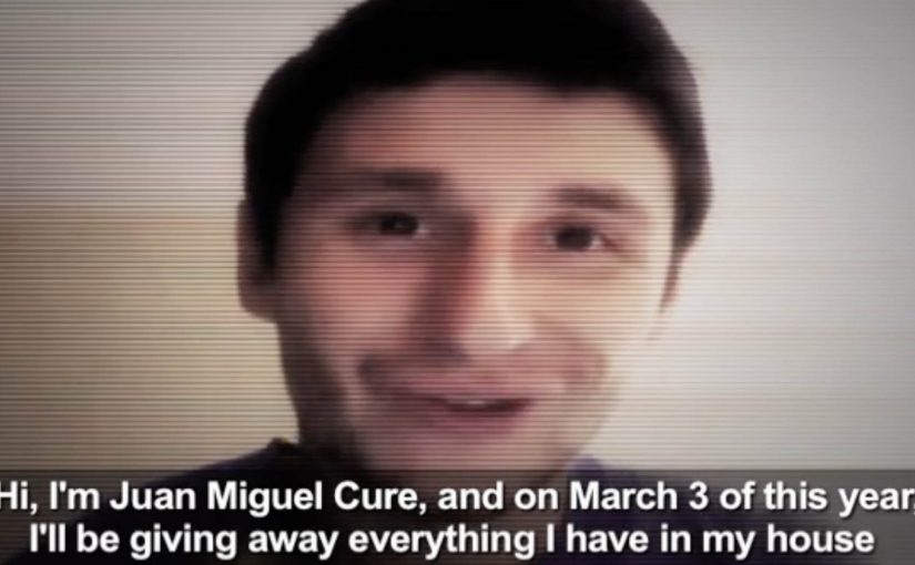
To create buzz for the opening of their new store (in March), Young & Rubicam Colombia got Juan Miguel Cure to give away everything from his house.

A launch story built on real sacrifice

Most store openings lean on discounts, flyers, and a ribbon-cut photo. This one flips the script by making the “offer” feel personal and public. One person gives up his stuff, and the opening becomes a story people want to repeat.

How the mechanic works

The mechanic is simple. Here, “mechanic” means the branded action that makes the story travel. Pick a relatable figure. Strip his home of its belongings. Turn that act into a public event and a piece of film that people can share. The brand is not trying to outshout competitors. It is trying to earn attention through a narrative that feels larger than retail.

In retail marketing for big-box home improvement brands, openings are won through local word-of-mouth and press amplification as much as through paid media.

Why it lands

Giving everything away is an extreme signal. It creates instant curiosity and a moral tension. Why would someone do this. That tension keeps people watching, and it makes the brand’s opening feel like something happening in the community, not something happening to the community. The generosity angle also changes the default posture toward promotion. Instead of “come buy”, it reads as “come witness”. Because the giveaway turns a retail opening into a witnessed act of sacrifice, people process it as a story worth passing on, not just a promotion to ignore.

Extractable takeaway: If you can attach your launch to a human-scale story with a clear sacrifice, you convert opening-day marketing from “announcement” into “news”, and news travels further than ads.

The business intent behind the generosity

The real question is whether the stunt can convert local attention into store traffic and brand memory. This is a smart launch idea because the stunt gives the store opening a memory structure, not just a promotional wrapper. This is a classic buzz play. It creates a shareable film asset, it seeds conversation locally, and it frames the new store as culturally present before the doors even open. The giveaway is the hook, but the real objective is simple. Get people to show up, talk about it, and remember the brand when they need home improvement goods.

What to steal for launch marketing

  • Choose one bold proof point. Extreme beats complicated. One clear act is easier to retell.
  • Build a narrative people can summarize in one sentence. If the story cannot be repeated quickly, it will not travel.
  • Make the brand role legible without forcing it. The brand can frame the moment, but the human story must stay in front.
  • Design for local amplification. Openings benefit from community sharing and local media interest more than global cleverness.
  • Plan the follow-through. When attention spikes, the store experience must be ready to convert curiosity into habit.

A few fast answers before you act

What is the core idea behind “The Man Who Gave Everything Away”?

Turn a store opening into a human story. A real giveaway becomes the headline, and the opening becomes the payoff.

Why does this work better than a normal “grand opening” campaign?

Because it behaves like news. A surprising, emotional act is more likely to be shared, discussed, and covered than a standard promotional announcement.

What is the biggest execution risk?

If it feels staged, manipulative, or unclear why the brand is involved, the audience will reject it. The motive must read as coherent, not exploitative.

How can a retailer adapt this without copying the stunt?

Use the same structure. One decisive act, one human lead, one simple story that points to the opening. The act does not have to be “everything away”, it just has to be unmistakable.

How do you measure whether the buzz actually helped?

Track opening-period footfall uplift, local share-of-voice, earned mentions, branded search lift, and conversion into repeat visits in the weeks after launch.

Forever Wild: YouTube Interventions

Forever Wild: YouTube Interventions

You click a trending video for a quick distraction, and suddenly the content you came for is interrupted by a stark message about rhino poaching. The contrast is the point. It forces you to notice what you normally scroll past.

Forever Wild, described as a no-budget anti-poaching initiative, wanted to make the illegal rhino horn trade feel urgent and push people to sign a petition intended for the US Congress. Ogilvy Cape Town responded with “YouTube Interventions”, remixing the format of popular videos so viewers looking for frivolous entertainment were confronted with the cost of their online attention.

A “YouTube intervention” is a deliberate disruption of an existing video viewing pattern. Instead of asking people to search for a cause film, the campaign inserts a cause message into what people are already watching, then uses that interruption to drive a clear action.

In global digital culture, the scarcest resource is attention, and the most effective cause work often borrows distribution from the very platforms that usually dilute serious messages.

The campaign’s urgency is framed through a common warning at the time, that rhinos could disappear within roughly a decade if poaching continued to escalate. Whether the viewer is convinced or sceptical, the interruption makes the question unavoidable. What are you spending your time on, and what does that choice enable?

The real question is whether you can borrow attention without breaking trust.

Why hijacking “silly” videos is the strategy

This idea does not compete for attention on merit alone. It piggybacks on attention that already exists. By choosing trending videos, the campaign meets people where their behaviour already is, then flips the emotional tone fast enough to create discomfort, reflection, and action.

Extractable takeaway: If you can’t buy reach, borrow an existing attention stream, then earn the right to ask for action with sharp contrast and a clear next step.

What the intervention format does better than a PSA

A normal PSA is easy to avoid. You skip it, scroll past it, or never choose it in the first place. An intervention changes the default. The viewer is already in viewing mode, already committed to watching something, and the disruption creates a brief window where a petition ask can actually land.

This is a better default than a traditional PSA when your biggest constraint is distribution, not storytelling.

Recognition that helped the idea travel

The work was described as being recognised in awards circuits in the period, including a Clio Awards shortlist and a Loeries medal for media innovation, which helped amplify the case beyond the initial view counts.

Practical steals from the intervention format

  • Borrow existing distribution. Put the message inside an attention stream people already trust and use.
  • Make the action immediate. Interruption without a clear next step is just shock.
  • Keep the device simple. The format should be explainable in one sentence.
  • Use contrast intentionally. Comedy or fluff next to crisis creates cognitive friction, and friction creates memory.

A few fast answers before you act

What are “YouTube Interventions” in this campaign?

They are remixed versions of trending videos that insert a rhino-poaching message into the viewing experience, then direct viewers to sign a petition.

Why target people watching frivolous content?

Because that is where volume lives. The campaign uses the audience’s existing behaviour and turns it into a moment of confrontation, rather than hoping people will seek out a serious film.

What problem does this solve for no-budget causes?

Distribution. Instead of paying for reach, the campaign borrows reach from content that is already spreading.

How does this avoid feeling like generic “shock advertising”?

By tying the disruption to a specific action. The message is not only “this is terrible”, it is “sign here”, with the interruption acting as the attention gate.

What is the biggest risk with intervention-style tactics?

Backlash. If the disruption feels deceptive or manipulative, viewers reject the message. The creative has to be transparent about why it is interrupting and what it wants people to do.

Turquoise Cottage: The Buddy Stamp

Turquoise Cottage: The Buddy Stamp

Most nightclubs in India put an admittance stamp on the wrist of their customers. Turquoise Cottage, a nightclub based in Vasant Vihar, New Delhi, was no different. However, with their digital agency, Webchutney, they created what then went on to be coined as “The Buddy Stamp”.

“The Buddy Stamp” was a unique QR code stamp which upon scanning gave customers useful and actionable information depending on the time of night.

A wrist stamp that keeps working after entry

The clever move is that the stamp is not branding. It is a tool. You already have it on you, so the lowest-effort scan becomes a doorway to whatever you need next, without searching, asking staff, or opening a menu.

How the QR code changes by time of night

The stamp routes to different content depending on when it is scanned. Early in the evening it can point to venue offers and drink specials. Later it can switch to practical “get home” help like cab options. It can even pivot the next day into recovery-style tips, which extends the brand’s care beyond the club.

In high-energy hospitality environments, time-based mobile utilities work when they reduce friction at the exact moment the customer needs help.

Why this lands

It respects how nights actually unfold. People do not want a generic microsite when they are out. They want one fast answer that fits the current hour, and they want it without social overhead.

Extractable takeaway: If you already “touch” the customer as part of entry, turn that touchpoint into a changing utility that anticipates the next decision, not just a logo.

What the club and agency are really optimizing

This is experience design disguised as a stamp. It upgrades service without adding staff steps, and it makes responsibility and convenience feel like part of the venue’s personality, not a lecture.

The real question is how a venue can turn a mandatory entry ritual into timely help people will actually use.

What venue teams can steal from this

  • Attach the utility to an unavoidable ritual. Admission is the perfect moment because everyone participates.
  • Use time as the personalization layer. You do not need profiles when the clock predicts needs well enough.
  • Design for the “next 30 minutes”. The best content is the thing people would otherwise ask a friend.
  • Extend care past the venue. Post-night help builds goodwill that outlasts the party.

A few fast answers before you act

What is The Buddy Stamp?

It is a QR code wrist stamp used as a nightclub admission stamp that links to different, practical information depending on the time of night.

What makes it different from a normal QR code poster?

The QR code lives on the customer. That makes it always available, and the time-based switching makes it feel context-aware without asking the user to do anything extra.

Why does “time of night” matter as a design input?

Because needs change predictably across an evening. Offers and discovery matter early. Getting home safely matters late. The best experiences match that rhythm.

What is the transferable pattern for other venues or brands?

Turn an existing physical touchpoint into a dynamic utility. Let one simple scan deliver the most useful next step for the customer’s current situation.

Why is the wrist stamp a better utility surface than a poster?

Because entry already puts it on every guest. That makes the utility universal, immediate, and easy to revisit without asking people to find a sign again.