Porsche 911: Birthday Song

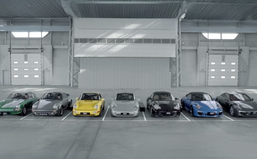
A birthday song plays. But the “instruments” are Porsche 911s. The film stitches together sounds from seven generations of the 911 and turns them into a celebratory tune that feels like performance heritage you can hear.

For the 50th anniversary of the Porsche 911, Fred & Farid Shanghai recorded the sound signatures across the model’s generations, then made them playable online via a musical keyboard. Fans can log in, tap keys, and compose their own tracks using real 911 audio samples.

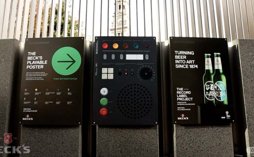
A branded “sound keyboard” is a web interface that maps recorded product sounds to notes or keys, so people can create short compositions. It turns passive listening into viewer control, and that extra participation time is what drives recall and sharing.

Reported results vary by source. One case write-up reports roughly 2.84 million video views over two months, and the keyboard being played about 1.86 million times worldwide.

Why this lands with Porsche fans

It does not explain the 911. It lets you “play” it. That is the emotional trick. The interaction makes the heritage feel accessible, and the sound makes it feel authentic. You are not learning history. You are using it. Because the keyboard makes the sound playable, the heritage stops being abstract and starts feeling personal.

Extractable takeaway: If you want heritage to feel current, turn the proof into a simple tool people can use, not a story they only watch.

In luxury automotive brand building, sound and craft cues often communicate performance credibility faster than specification copy ever can.

What the campaign is really aiming to shift

In China, the anniversary becomes a brand-image move. It reinforces Porsche as a sports-car maker by leaning on the one asset competitors cannot copy easily. The 911’s recognisable sound character across generations.

The real question is whether your brand has a defensible cue you can turn into something people can play with.

If you have an asset competitors cannot copy easily, you should design the interaction first and then use film to give it a default story.

What to steal for your own heritage-led activation

  • Turn heritage into a tool. Give people something they can do, not only something they can watch.
  • Use sensory proof. Sound is hard to fake and easy to remember.
  • Anchor interaction with a hero asset. The film gives the idea a “default” story, then the keyboard lets fans personalise it.
  • Make sharing inherent. Compositions are naturally shareable outputs. That is stronger than asking for shares.

A few fast answers before you act

What is the Porsche 911 Birthday Song campaign?

It is a 50th anniversary activation that records sounds from multiple 911 generations and turns them into two outputs. A hero “Birthday Song” film and an interactive web keyboard where fans can compose their own tunes.

Why use sound instead of visuals or specs?

Because sound carries performance identity instantly. It communicates emotional credibility and heritage without requiring technical explanation.

What makes the interactive keyboard more than a gimmick?

It creates participation time and personal output. When people make something themselves, they stay longer and are more likely to share. That improves memorability.

What business goal does this serve in China?

Strengthening Porsche’s sports-car credentials by making the 911’s heritage feel distinctive, modern, and culturally shareable.

What is the biggest execution risk with sound-led interactivity?

If the interface is slow or the sounds feel too similar, the “play” loop collapses. The experience needs immediate feedback and clearly different audio notes to feel satisfying.

Playable Music Posters: Tap to Hear

Borders between media are blurring. Books are being swiped, magazines digitally scrolled and even in print one can today occasionally navigate. So it is no surprise when regular paper posters come to life on being combined with bluetooth, conductive ink, sensors and speakers.

Paper as an interface, not a surface

The mechanism is straightforward. Conductive ink turns parts of a poster into touch-sensitive zones. Sensors detect taps, knocks, or touch patterns. Bluetooth and small speakers, or a paired phone, provide the audio output. The poster stops being an image and starts behaving like a controller.

In public retail and event environments, touch-based posters only work when people feel safe and permitted to interact.

In consumer marketing and live environments, interactive print means print that senses touch and triggers a digital response. It is a way to turn passive out-of-home into a touchpoint that behaves like a device.

Beck’s Playable Poster

Looking for an innovative way to mark New Zealand’s Music Month, Beck’s partnered with Shine to design a playable poster. Using conductive ink and speakers the posters were made playable with a simple tap of the finger.

The Sound of Taste

Herb and spice brand Schwartz is all about flavour. So to dramatise flavour which was invisible and silent, they got print tech collective Novalia and ad agency Grey London to collaborate on an interactive poster. The poster used conductive ink to turn the surface area of the paper into an interactive interface that also connected to the viewers smartphone to deliver a richer experience.

Change the tune

Agency Republic from UK created a poster with an embedded sensor which when knocked changed the song being played on the agencies shared sound system.

Why these work: the demo happens in your hands

Each example keeps the interaction legible. Tap to trigger sound. Touch to explore flavour as audio. Knock to skip a track. The poster does not ask people to learn a new behavior. It hijacks an existing one, touching a surface, and rewards it instantly.

Extractable takeaway: When you want print to feel alive, make one obvious gesture trigger one immediate reward, and let the brand message ride on that moment of viewer control.

The real question is whether the interaction earns enough memorability to justify the added production. If the payoff is not instant and on-message, do not build it. Because the audience causes the outcome with a simple touch, the message sticks.

Practical patterns for interactive print

  • One interaction, one reward. Do not overload the surface with too many modes.
  • Make the “how” obvious. A tap zone, a knock cue, a simple instruction. Then deliver instantly.
  • Use phones as infrastructure. If pairing adds depth, let the phone do what paper cannot, audio, saving, sharing.
  • Design for public confidence. People will only touch a poster if it feels safe, clean, and socially acceptable.

A few fast answers before you act

What is “conductive ink” doing in these posters?

It creates touch-sensitive paths on paper, so taps or touches can be detected and mapped to actions like playing audio.

Do these posters need special printing like QR codes?

They still require specialist production, but the interaction can be integrated invisibly into the design. The poster itself becomes the control surface rather than carrying visible codes.

Why add Bluetooth to print?

Bluetooth allows paper to trigger sound through a phone or external speaker, which is essential when the content is audio or when you want richer layers than print can carry.

What makes an interactive poster feel “worth it” to a passer-by?

Immediate payoff and low friction. If the result is instant and satisfying, people will try it. If setup or pairing is slow, they walk past.

Where does this format fit best?

In environments where people have dwell time and curiosity, festivals, transit hubs, retail windows, office interiors, and brand experiences where interaction is socially normal.

Volvo Trucks: The Epic Split

Brands all over the world are trying to create branded content. Volvo did that with great success last month when they filmed a hamster drive their entire truck up a mountain.

Now, Volvo demonstrates the precision and directional stability of its dynamic steering by getting Jean-Claude Van Damme to carry out his famous split between two reversing Volvo FM trucks. Here, “dynamic steering” refers to the steering system helping the truck hold a steady line under motion. The video, since release, is reported to have already passed 7 million views.

A feature demo disguised as spectacle

The mechanism is as clean as it gets. Take a technical claim, steering stability under motion. Express it in one unmistakable image that needs no explanation. Two trucks moving backwards in sync, a human balancing point-to-point between them, and the steering system as the silent hero.

In global industrial and automotive marketing, the most reusable branded content is engineered proof that compresses a technical benefit into a single, legible visual.

By “engineered proof,” I mean a demonstration where the product capability is the only plausible explanation for what you see.

Why the internet did the media buy for them

This lands because it is instantly readable and instantly arguable. People share it to say “this is real.” People share it to say “this is impossible.” Either way, the product claim travels with the argument.

Extractable takeaway: If your product advantage is hard to feel in a 30-second explanation, translate it into a one-frame “impossible” moment. The real question is “what made that possible.” Then let the audience debate the stunt while your feature becomes the answer.

It also avoids the common branded-content trap of overstorytelling. The brand stays in the background, the demonstration stays in the foreground, and the audience does the meaning-making in their own words.

How to borrow this pattern without a movie star

  • Start with one feature you can prove. Pick a claim that can be demonstrated, not merely asserted.
  • Design for instant comprehension. If a still frame cannot tell the story, simplify the setup.
  • Make the proof self-contained. The audience should not need a voiceover to understand what is being tested.
  • Keep the brand restraint. Overbranding weakens believability. Let the test carry the persuasion.

A few fast answers before you act

What is Volvo’s “The Epic Split” demonstrating?

It is designed to demonstrate the precision and directional stability of Volvo’s dynamic steering by showing two reversing trucks holding a steady path while Jean-Claude Van Damme performs a split between them.

Why does this count as branded content instead of “just an ad”?

The primary value is the demonstration itself. The content is built to be watched and shared as a feat, with the product benefit embedded in the feat rather than delivered as a sales message.

What makes a stunt like this more shareable than a typical product film?

Instant readability plus high stakes. A single image communicates the premise, and the audience immediately wants to test whether it is real, which drives sharing and discussion.

How do you know the spectacle is actually proving the feature?

If the moment works as a still frame, stays understandable without voiceover, and the technical claim is the only plausible explanation, then the spectacle is doing real demonstration work, not just decoration.

How can smaller brands apply the same approach?

Reduce the ambition, not the logic. Prove one feature with one clear test, make it understandable in one glance, and remove anything that distracts from the proof.