Gatebox: The Virtual Home Robot

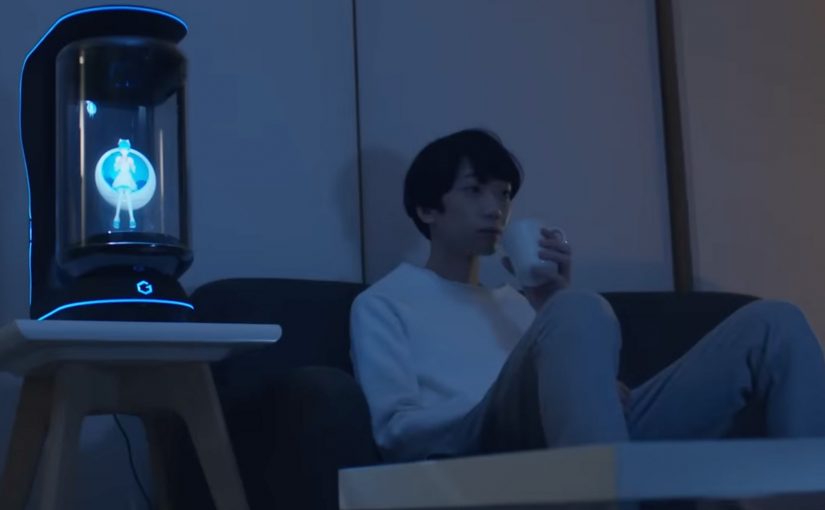
You come home after work and someone is waiting for you. Not a speaker. Not a disembodied voice. A character in a glass tube that looks up, recognizes you, and says “welcome back.” She can wake you up in the morning, remind you what you need to do today, and act as a simple control layer for your smart home.

That is the proposition behind Gatebox. It positions itself as a virtual home robot, built around a fully interactive holographic character called Azuma Hikari. Here, “virtual home robot” means a stationary device that uses a character interface to run simple routines and smart home control, rather than a mobile physical robot. The pitch is not only automation. It is companionship plus utility. Face recognition. Voice recognition. Daily routines. Home control. A “presence” that turns a smart home from commands into a relationship.

What makes Gatebox different from Alexa, Siri, and Cortana

Gatebox competes on a different axis than mainstream voice assistants.

Voice assistants typically behave like tools. You ask. They answer. You command. They execute.

Gatebox leans into a different model:

  • Character-first interface. A persistent persona you interact with, not just a voice endpoint.
  • Ambient companionship. It is designed to greet you, nudge you, and keep you company, not only respond on demand.
  • Smart home control as a baseline. Home automation is part of the offer, not the story.

The result is a product that feels less like a speaker and more like a “someone” in the room.

In consumer smart homes, the interface layer matters as much as the devices, because it shapes whether automation feels like commands or companionship.

Why the “holographic companion” framing matters

A lot of smart home innovation focuses on features. Gatebox focuses on behavior. By keeping a persistent character in your peripheral vision, it turns prompts into small social cues, which is why it can feel relational rather than transactional.

Extractable takeaway: If you want technology to be used every day, design for a lightweight loop of interaction that stays alive between commands, not just for perfect answers on demand.

It is designed around everyday moments:

  • waking you up
  • reminding you what to remember
  • welcoming you home
  • keeping a simple loop of interaction alive across the day

That is not just novelty. It is a design bet that people want technology to feel relational, not transactional.

What the product is, in practical terms

At its most basic, Gatebox:

  • controls smart home equipment
  • recognizes your face and your voice
  • runs lightweight daily-life interactions through the Azuma Hikari character

It is currently available for pre-order for Japanese-speaking customers in Japan and the USA, at around $2,600 per unit. For more details, visit gatebox.ai.

The business bet behind a companion interface

The real question is whether your home interface should be a command surface, or a companion that maintains a simple relationship across the day.

The intent is straightforward: keep the interaction loop alive so “smart home control” becomes a daily habit, not a feature you try once and forget.

Character-first companions are a stronger interaction bet than voice-only assistants when you want sustained engagement, as long as utility stays the default.

The bigger signal for interface design

Instead of:

  • screens everywhere
  • apps for everything
  • menus and settings

It bets on:

  • a single persistent companion interface
  • a character that anchors interaction
  • a device that makes “home AI” feel present, not hidden in the cloud

That is an important shift for anyone building consumer interaction models. The interface is not the UI. The interface is the relationship.

Four patterns to borrow for companion interfaces

  • Design for in-between moments. Build a lightweight loop of greetings, nudges, and routines that persists between explicit commands.
  • Make utility the baseline, not the punchline. The companion framing works only if home control and reminders stay reliable and fast.
  • Anchor interaction in one persistent “someone”. A stable persona reduces friction compared to hopping between apps, menus, and settings.
  • Use presence to change behavior. A visible, ambient interface shifts usage from “ask when needed” to “engage because it is there”.

A few fast answers before you act

What is Gatebox in one sentence?

Gatebox is a virtual home robot that combines smart home control with a holographic companion character, designed for everyday interaction.

Who is Azuma Hikari?

Azuma Hikari is Gatebox’s first character, presented as an interactive holographic girl that acts as the interface for utility and companionship.

What can it do at a basic level?

At a basic level, it can control smart home equipment, recognize face and voice, and run daily routines like wake-up, reminders, and greetings.

Why compare it to Alexa, Siri, and Cortana?

The comparison helps clarify positioning. Gatebox frames itself as more than a voice assistant, using a character-first, companion-style interface instead of a purely voice-first tool.

What is the commercial status?

It is described as available for pre-order for Japanese-speaking customers in Japan and the USA, at around $2,600 per unit.

NIVEA Creme: Second Skin Project

A mother puts on a headset and a skin-like suit. Her son does the same, thousands of kilometres away. The promise is simple. If they cannot be together for Christmas, technology will let them feel a hug anyway.

That is the set-up in NIVEA Creme’s “Second Skin Project” with Leo Burnett Madrid. The film introduces Laura in Madrid and her son Pablo, who is away volunteering in Paraguay. They are invited to test a “Second Skin” garment that is presented as a high-tech fabric designed to simulate human skin and transmit the sensation of touch at distance, paired with virtual reality headsets.

The story then pivots. What looks like a tech demo is used to make a point about touch, not technology. The most persuasive moment is not the suit. It is the human reunion that follows, designed to underline NIVEA Creme’s belief that nothing beats skin-to-skin contact.

The “Second Skin” mechanism that pulls you in

The film borrows credibility from advanced-sounding materials and VR. That framing creates anticipation, because the viewer wants to know whether the experiment can actually work. The suit and headset are the narrative engine that earns attention for long enough to land the real message.

In global consumer brands where heritage products compete with endless alternatives, emotional proof often carries more weight than functional claims.

The real question is whether the tech is the story, or whether it is just a credible pretext for the brand to own the value of touch.

The twist that protects the brand meaning

There is a risk with tech-led emotion. The technology can become the hero and the brand becomes a sponsor. This script avoids that by using the tech as a decoy. The reveal shifts the spotlight back to the product truth. A hug is still the best “gift” and NIVEA Creme wants to be associated with that intimacy.

Extractable takeaway: When you borrow a shiny mechanism to earn attention, make the emotional payoff explicitly restate what the brand believes, or the gadget takes the credit.

How to use “purpose + tech” without losing the human truth

  • Use technology as the hook, not the conclusion. Let it earn attention, then pay it off with a human truth.
  • Make the brand stance explicit. Here the stance is clear. Technology can be amazing, but touch matters more.
  • Cast real stakes. Distance, holidays, and family history make the outcome feel earned.
  • Keep the product role emotional, not technical. NIVEA Creme is not “the innovation”. It is the comfort cue that frames the story.

A few fast answers before you act

What is the NIVEA Creme Second Skin Project?

It is a Christmas-season film and experiment setup where a mother and son test a VR-led “Second Skin” suit that is presented as transmitting the feeling of touch at distance, then the story reveals the value of real human contact.

Why does the campaign use VR and a “second skin” suit?

Because it creates a believable question the audience wants answered. Can technology replicate a hug? That curiosity holds attention long enough for the campaign’s real point to land.

What is the core message NIVEA Creme is trying to own?

That skin-to-skin contact matters. The work uses technology to highlight that, even in a world of advanced tools, nothing replaces human touch.

What makes this more than a generic emotional video?

The narrative structure. It starts as a tech experiment, then pivots into a human reunion. That contrast makes the conclusion feel stronger than a straight sentimental story.

What is the biggest risk with “tech-as-story” campaigns?

Audience misattribution. People remember the gadget and forget the brand meaning. The fix is to ensure the emotional payoff clearly belongs to the brand stance, not the device.

Amazon Dash: The Button That Rewrites Loyalty

A one-click purchase is not the point. Default is.

Amazon Dash Button looks simple. A branded button you stick near the place of usage. You press it. The same item arrives again.

But the strategic move is not “one click.” It is making the reorder the default behavior.

Dash Button turns repeat buying into an ambient habit. By “ambient habit,” I mean a repeat action triggered by the environment rather than an active shopping session. It shifts commerce away from discovery and toward automation. It pushes the battle for the customer from the shelf and the screen to the home.

What the Dash Button does

Dash Button is a small connected device tied to one specific product, and often one specific pack size. You link it to your Amazon account. You place it where the need occurs.

Examples are obvious in everyday life:

  • Detergent button near the washing machine
  • Coffee button in the kitchen
  • Pet food button near the feeding area

When the product runs low, you press. Amazon confirms the order, typically via app notifications, and ships.

The experience is intentionally narrow. That narrowness is the innovation.

In consumer convenience products, loyalty is often less about love and more about default.

In high-frequency household categories, the interface at the point of use can matter more than the message at the point of sale.

Why the narrowness matters

Dash Button removes three high-friction moments that brands fight over every day. Because one button equals one SKU, the moment of need no longer reopens the choice.

Extractable takeaway: If you can turn repeat purchase into a single configured action, you shift competition from persuasion in the moment to setup before the moment.

  1. Search. The customer does not type a query.
  2. Comparison. The customer does not see alternatives.
  3. Persuasion. The customer does not view ads, ratings, or promotions in the moment.

In other words, the customer does not shop. They simply replenish.

Once a household adopts replenishment behavior, the role of branding changes. The brand becomes less about persuasion and more about being the chosen default.

The hidden bet. Repeat purchases are the real moat

Dash Button is a physical expression of a platform strategy.

If Amazon captures replenishment categories, it wins the durable, high-frequency part of retail. The items that quietly drive recurring revenue and predictable logistics.

The button also functions as a data instrument. It reveals how often a household needs a product, where it is used, and which categories are truly habitual versus occasional.

That insight feeds subscriptions, predictive delivery, and future interface removal.

What this signals to CPG and retail leaders

Dash Button compresses marketing into an upstream decision.

The real question is how you become the configured default before the point of purchase even exists.

For CPG leaders, this forces uncomfortable clarity on loyalty, pack architecture, trade visibility, and availability. For retailers, it signals a shift in power toward whoever owns the reorder interface.

The consumer tension. Convenience vs control

Dash Button introduces a trust tradeoff.

Consumers value convenience, but they also worry about accidental orders, loss of price checks, oversimplified choice, and dependence on a single platform.

Those tensions do not invalidate the model. They clarify what platforms must solve through better confirmations, clearer reorder states, and smarter replenishment rules.

The bigger story. Interfaces disappear

Dash Button fits a broader direction in commerce. Buying moves away from screens and toward contexts.

The pattern is consistent: less explicit shopping, more embedded intent, more automation, and more default-driven brand outcomes.

Dash Button is not the endpoint. It is an early, tangible step toward commerce that feels invisible.

What to steal from Dash-default loyalty

  • Win the setup, not the moment. Treat the “configured default” as the real battleground, not the last-second persuasion layer.
  • Make narrowness a feature. If the goal is replenishment, deliberately constrain the action so choice does not reopen at the moment of need.
  • Put the trigger where the need occurs. The closer the interface sits to usage, the more it behaves like an always-on shelf for repeat buying.
  • Design for convenience with control. Keep confirmations and reorder states clear so automation feels helpful, not risky.

A few fast answers before you act

What was Amazon Dash?

Dash was a physical reorder button that let customers buy a specific everyday product with one press, removing browsing and checkout steps.

What is the core mechanism?

Turning replenishment into a default action. One button equals one SKU. The interface collapses choice into speed and habit.

Why does this change loyalty dynamics?

Because the reorder interface becomes the brand decision. If the button exists, switching requires extra effort, so the default compounds over time.

What is the business intent?

Increase repeat purchase frequency and reduce churn by owning the replenishment moment and lowering friction to near zero.

What should other brands steal?

Design for the reorder moment. If your category is habitual, the winning move is to remove steps, make the default easy, and earn repeat behavior through convenience.