Daffy’s: The Undressing Room

Daffy’s: The Undressing Room

You are walking past a Daffy’s store window in Manhattan and it looks like a fashion show has moved onto the street. Models are inside the display. A crowd is outside. And the public is controlling what happens by text message.

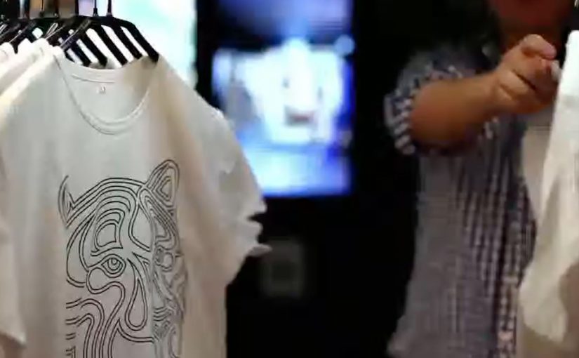
Daffy’s is a fashion retailer from NYC. For their fall fashion launch, they created a street-level event that blended window shopping, a fashion show, and an interactive peep show, meaning passers-by could text outfit requests to models inside while the exchange played out publicly on the glass, to create live interaction from hundreds of passers-by for an entire day and night.

The idea was simple. Put great-looking models in the window with items from the new range. Ask the public at street level to text a special number for each model, requesting specific items to try on and then change out of. Each message was projected onto the store window, letting the crowd follow the conversation, while the models used phones to interact with people on the street.

That shift from window to stage is what turns a shopfront into a live media channel when footfall competes with endless distractions.

Why the mechanism pulls a crowd

The mechanism is a tight loop. You text. Your message appears publicly. The model responds with an immediate, visible action. That creates instant feedback, plus social proof, because everyone can see that participation changes the experience.

Extractable takeaway: When participation is public and the response is immediate, bystanders become an audience because they can see cause and effect in real time.

It also turns fashion into a game with a scoreboard you can read. The projected message stream makes the crowd feel like a single audience, not scattered individuals passing by.

In high-traffic retail corridors, the format works best when the interaction loop is visible to everyone, not just the person who texts.

What Daffy’s is really buying

This is not just “engagement” for its own sake. It is earned attention at street level, then a shareable story that travels beyond the location. The activation is designed to make people stop, watch, talk, and tell others to come over.

The real question is whether you are designing for fast, visible participation that creates social proof, or just staging a spectacle.

This pattern is worth copying only when you can keep the loop tight and keep people safe once the crowd forms.

According to Daffy’s communications, more than 1,500 text messages were received between 6:00 p.m. and 9:30 p.m., and the event was suspended twice by NYC police due to crowd overflow impacting pedestrian and vehicle traffic.

Practical takeaways for interactive storefronts

  • Make the audience the controller. Participation should change something real, not just “send a message”.
  • Project the input publicly. Visibility creates social proof and gives bystanders a reason to join.
  • Design for fast feedback. The shorter the gap between action and response, the bigger the crowd gets.
  • Let the store be the medium. If the window is already the brand’s stage, use it as one.

A few fast answers before you act

What was Daffy’s “Undressing Room”?

A storefront window event where passers-by texted requests to models inside the window, and the messages were displayed publicly so the crowd could follow along in real time.

Why does projecting messages onto the window matter?

It turns private participation into a public feed. People see that the experience is live, and that others are actively shaping it, which increases curiosity and crowd growth.

What’s the core interaction design pattern here?

Public input plus immediate physical response. The text is the trigger. The window action is the payoff.

What makes this more effective than a normal fashion show?

Viewer control. People do not just watch. They influence what happens, and that makes them more likely to stay, share, and bring others.

What’s the biggest operational risk with this kind of activation?

Crowd control. If the moment works, it attracts more people than a normal storefront can safely handle, so permits and on-site management matter.

WWF: Augmented Reality Tiger T-Shirt

WWF: Augmented Reality Tiger T-Shirt

A retail AR gut-punch for WWF’s Siberian tiger

This is a great piece of Augmented Reality for WWF aimed at raising awareness around the plight of the Siberian tiger, created by Leo Burnett Moscow.

WWF printed thousands of tiger t-shirts and distributed them online and to key stores in Moscow featuring specially placed AR video mirrors that would instantly activate the AR experience the moment a tiger t-shirt was detected. An AR video mirror is a camera plus screen installation that overlays digital effects on your live reflection in real time. And at that moment, the experience became quite graphical to anyone wearing the t-shirt, complete with bullet wounds, huge amounts of blood and sound effects to match it.

How the “video mirror” mechanic does the heavy lifting

The setup is simple. Put the message on the body. Put the trigger in the store. Put the reveal in a mirror people already trust as “truth”.

An AR video mirror is a camera plus screen installation that shows your live reflection while overlaying digital effects in real time. In this case, the mirror detects the tiger shirt and then renders the simulated injuries and audio as if they are happening to you. Because the overlay is pinned to your live reflection, the reveal feels immediate, which is why the message hits before you can distance yourself from it.

In retail environments and public spaces, AR activations work best when the interaction is instant, unmistakable, and socially visible to bystanders.

Why the experience lands so hard

It converts an abstract cause into a first-person moment. You do not just look at an endangered animal. You temporarily “become” the target.

Extractable takeaway: If you want awareness to stick, bind the reveal to a trusted routine and reduce viewer control, so the audience feels the story in their own reflection before they can rationalize it away.

The intent behind making it graphic

The creative choice forces attention and memory. A polite AR overlay would be easy to ignore. A visceral one is harder to dismiss and more likely to be retold, especially when friends are watching from behind you.

The real question is whether the shock serves the story or becomes the story.

Graphic AR is a valid tool only when the cause is unmistakable and the reveal points back to it within seconds.

Design moves to borrow from this AR mirror

  • Use a frictionless trigger. Detection happens automatically. No app download. No QR hunt. No instructions.
  • Choose a culturally “trusted” surface. Mirrors feel like evidence, which makes overlays feel more real than a phone screen effect.
  • Make the message social. The bystander view matters. People react together, and that reaction becomes the spread mechanism.
  • Design the reveal as a single sentence. “This is what it feels like to be hunted.” If the concept cannot be repeated instantly, it will not travel.

A few fast answers before you act

What is the core idea of the WWF tiger t-shirt AR campaign?

It uses an AR video mirror to detect a tiger t-shirt and instantly overlay a graphic “poaching” simulation on the wearer, turning awareness into a first-person experience.

Why use an AR mirror instead of a mobile AR app?

The mirror removes friction and makes the moment public. Everyone nearby sees the same reveal at the same time, which increases impact and sharing.

What makes this activation effective as cause marketing?

It translates a distant problem into a personal reaction. The wearer feels shock and vulnerability, and that emotional spike improves recall and conversation.

What are the key components if you want to replicate the mechanism?

You need a clear trigger (the shirt), a camera plus screen “mirror” setup, real-time overlay rendering, and a reveal that communicates the message in seconds.

What is the main risk with shock-based AR experiences?

If the graphic content overwhelms the cause, people remember only the stunt. The message has to be explicit enough that the emotional reaction points to the intended story.

KitKat: Human Vending Machine

KitKat: Human Vending Machine

We all know how it feels to need a break from the routine of working like a machine. That is why KitKat brought a quirky trend from Japan over to the UK by installing a human vending machine in London’s busy Victoria Station.

Commuters were given a chance to buy a KitKat for 20p, but from a machine with a real difference. A real person operated it from inside, turning a quick purchase into a small moment of surprise and a quick chat. The money was described as going to charity.

A vending machine that replaces automation with a person

The mechanic is straightforward. It looks like a standard vending machine on the concourse. You put money in. You make a selection. Then a real “vendor” inside the unit hands you the bar, human-to-human, at vending-machine speed.

In high-traffic commuter environments, ambient activations (quick, in-the-flow brand interactions placed in public space) work best when the interaction is instant, the reward is obvious, and bystanders can understand the joke in one glance.

Why it lands

This works because it turns the very thing people are tired of, being treated like a machine, into the punchline. The vending format signals efficiency and routine. The human reveal breaks that expectation and delivers the “Have a break” idea as an experience, not a line of copy.

Extractable takeaway: If your brand promise is about relief, do not only describe relief. Stage a short, public interruption of routine where the consumer feels the promise in real time.

What the activation is really doing for the brand

The real question is whether you can make the “Have a break” promise felt without turning the commute into a bottleneck.

This is a strong format when the idea is obvious from a distance and the handoff stays genuinely fast.

At face value, it is a cheap bar and a good deed. Underneath, it is a behavioural prompt in a place where people are stressed, rushed, and receptive to a small uplift. The “human machine” also creates instant social proof. Every interaction becomes a tiny piece of live theatre that recruits the next person in line.

How to borrow the human-vending-machine pattern

  • Make the concept self-explanatory. The best stunts do not need instructions. The crowd teaches the crowd.
  • Build one clean reveal. A single unexpected moment beats multiple clever steps.
  • Design for the queue. Waiting becomes part of the experience and amplifies visibility.
  • Anchor the stunt to the brand line. The “break” is the product, and the bar is the proof.
  • Give people a reason to feel good. A charity tie-in can reduce cynicism and increase participation.

A few fast answers before you act

What is the “human vending machine” idea in one line?

A vending machine that dispenses KitKat bars, but the dispensing is done by a person inside the unit, turning a routine purchase into a surprise interaction.

Why does this work specifically in a commuter station?

Stations concentrate stress, repetition, and time pressure. A fast, playful interruption is more valuable there than a slow, explanatory brand experience.

What makes it feel like a KitKat idea rather than a random stunt?

The experience embodies the brand’s break positioning. It converts “take a break” from a slogan into a short, tangible moment.

What is the main execution risk?

Throughput. If the interaction slows down and the queue becomes frustrating, the stunt flips from “break” to “delay” and the mood collapses.

What should you measure beyond footfall?

Queue conversion rate (people who stop and join vs those who pass by), average interaction time, sentiment in on-site reactions, and whether the activation shifts purchase behaviour during the commute window.