Chrome: Super Sync Sports

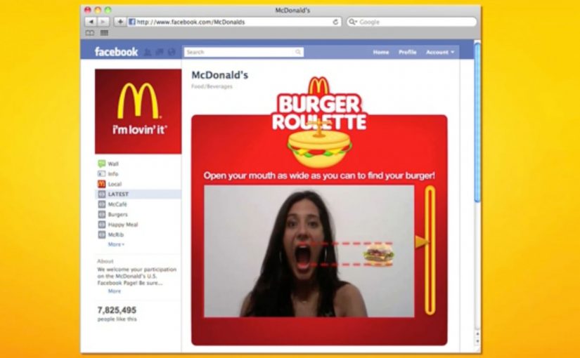
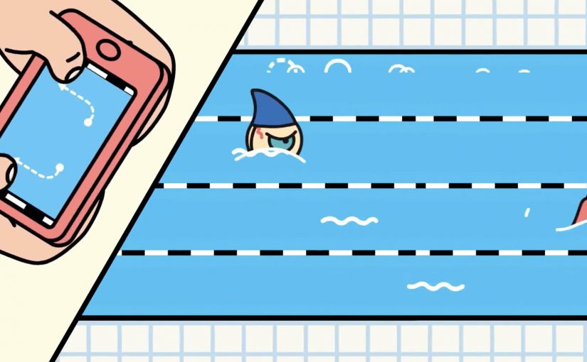
Google has recently released their latest Chrome Experiment called “Super Sync Sports” which allows players to convert their mobile phones and tablets into a remote control for their desktop browser.

To give it a spin visit www.chrome.com/supersyncsports/, choose a game i.e. running, swimming or cycling and then follow the instructions to sync your mobile phone. Once the sync is complete you can then play your way to victory, while the game plays out on your desktop.

What “super sync” really means in practice

The core mechanic is simple. Your desktop browser becomes the shared “big screen” for the race, while each phone or tablet becomes a personal input surface. Instead of mirroring the desktop, the mobile device acts like a controller and streams gestures to the browser in real time.

This is a classic second-screen pattern. A shared display for feedback, plus personal devices for control. It is a small idea with a lot of leverage when the onboarding is frictionless.

In digital marketing and product teams, multi-device web interactions are a repeatable way to turn passive screens into participatory experiences.

Why it lands (even when it is “just a game”)

It also makes a quiet point about distribution. The browser is the platform, so the “controller” is something people already have in-hand. That matters if you are designing for living rooms, events, retail floors, or any moment where downloads and logins kill momentum.

Extractable takeaway: When you want participation, put the rich visual feedback on a shared screen and keep input on personal devices. This lowers setup friction, supports groups naturally, and makes interaction feel immediate without specialized hardware.

The tech stack is the message

What will be interesting to see is how this type of interaction and technology is finally leveraged. The experience is described as being built on HTML5-era capabilities such as WebSockets for live synchronization, plus Canvas and CSS3 for rendering and motion. For brands, the value here is the interaction model, not the sports theme. The real lesson is not the specific APIs. It is the end-to-end pattern of low-latency input, shared feedback, and lightweight pairing.

The real question is whether you are building a one-off demo or a repeatable interaction model that people can join with the device already in their hand.

What to steal for brand experiences

  • Pairing flow: Use a short, forgiving pairing step (code on the big screen, quick join on the phone) and get to interaction fast.
  • Shared spectacle, private control: Keep the crowd watching one shared output, while each participant has a private “control lane” on their device.
  • Competition as UI: A leaderboard (even a lightweight one) can turn a demo into a repeatable loop.
  • Design for latency: Prefer simple, discrete gestures that still “feel” athletic even with imperfect connectivity.
  • Make it modular: The same controller concept can drive product configurators, quizzes, sampling stations, or event installations.

A few fast answers before you act

What is Super Sync Sports?

It is a Chrome Experiment that lets you run a sports game on a desktop browser while using a phone or tablet as the controller.

Why use a phone as the controller instead of the desktop keyboard?

It reduces the learning curve, supports multiplayer easily, and makes the interaction feel more physical. Touch gestures can map naturally to “run”, “swim”, and “cycle” without extra hardware.

What makes this pattern useful beyond games?

The same multi-device approach can turn any shared screen into a participatory surface. Think demos, audience voting, retail activations, guided experiences, or interactive storytelling where people control outcomes from their own device.

Which technologies are doing the heavy lifting?

The experience is described as using WebSockets for real-time synchronization, and Canvas and CSS3 for visuals and animation, all running in the browser.

What is the biggest risk if a brand tries this pattern?

Onboarding and latency. If pairing takes too long or input feels delayed, the magic disappears. The best executions keep the join flow short and the interaction vocabulary simple.

Miami Ad School: Three Student Concepts

Three student concepts that show their thinking in one move

This year Miami Ad School has produced a run of strong conceptual projects from current students. Here are three that stand out because each one has a clear mechanic and a crisp “why this brand” fit. Here, the mechanic means the one user action and system response that make the concept work.

What makes these concepts travel

Each idea takes a familiar behavior. Choosing food, correcting spelling, inviting friends. Then it adds a single interaction rule that turns the behavior into a branded moment. It is not “advertising about a thing”. It is an experience that demonstrates the thing.

McDonald’s Burger Roulette App

This student concept is designed as a Facebook app that helps you find the “perfect” McDonald’s burger for your mouth. The premise is playful decision support. You answer a few prompts, the system narrows your choice, and the brand becomes the helpful guide instead of a menu you skim and forget.

UNICEF Donate A Word

This student concept proposes a new way to donate for child education by using the spelling feature inside Google Chrome. When a misspelled word is flagged, the prompt becomes a donation trigger, turning a small everyday friction into a small everyday contribution.

In portfolio-driven creative education, concepts like these matter because they show whether a student can turn brand strategy into a usable interaction, not just a line of copy.

Heineken Invite

This student concept uses a social-media-connected bottle opener that invites friends over for a beer. The social mechanic is competitive. Whoever has the most friends attending earns a free case of Heineken, turning “opening a beer” into an invitation ritual and a reason to gather.

Why it lands

All three ideas share the same advantage. They make the brand useful inside a moment people already have, rather than interrupting people to talk about the brand. The mechanic is the message, and the interaction is simple enough that you can explain it in one sentence without killing the effect. That works because a visible rule lets people grasp the idea instantly and connect the payoff to the brand.

Extractable takeaway: Build concepts around one native behavior and one immediate response. If the “rule” is explainable in a sentence and demonstrable in a clip, the idea will be remembered, and repeated.

The real question is whether the interaction makes the brand promise visible without extra explanation. The strongest student concepts are the ones where the interaction itself carries the branding work.

What brand builders can take from these student concepts

  • One behavior, one rule. Keep the mechanic tight. Complexity kills concept believability.
  • Make the brand the enabler. The best student concepts position the brand as the thing that makes the moment better, not the logo that arrives at the end.
  • Design for quick demonstration. If you cannot show it in 10 seconds, it will not spread beyond the pitch.
  • Payoff matters. Personal recommendation, effortless giving, or a social reward. The user needs a reason to do the action.

A few fast answers before you act

What is the common pattern across these three concepts?

Each turns a familiar action into a branded interaction rule with an immediate payoff, making the experience feel like proof rather than promotion.

Why are student concepts often framed around apps or gadgets?

Because interfaces make mechanics visible. You can show input, response, and reward quickly, which makes the idea easy to understand and easy to share.

What makes a concept like “Donate a Word” compelling?

It piggybacks on an existing habit and converts a tiny, repeated behavior into a tiny, repeated donation moment, which feels effortless and scalable.

What is the main risk when brands try to build ideas like this for real?

Friction. If the mechanic is not instant and obvious, people will not complete it in the real world, even if it looks great in a concept film.

What’s the single best takeaway for marketers reviewing student work?

Look for concepts where the mechanic expresses the brand promise without extra explanation. If the interaction itself makes the point, the idea is strong.