Google: Project Re:Brief

In 2011, Google partnered with four global brands in an advertising experiment. Their goal was simple. How can the ideas that defined the advertising industry in its infancy inspire a whole new generation of creatives and marketers?

So Google set out to re-imagine and remake some of the most iconic ad campaigns from the 1960s and 1970s with today’s technology, led by the same creative legends who made these campaigns.

Re-briefing classics with modern tools

The premise is a clean creative constraint. Here, a re-brief means keeping the original strategic promise while rewriting the assignment for today’s interfaces, devices, and distribution. Take an idea that became culturally famous in its original medium, then re-brief it as if you were building it for a digitally connected world. Not by “updating the look”, but by asking what the original strategy would do if it had today’s interfaces, devices, and distribution.

In global brand advertising, revisiting iconic work is a practical way to test which storytelling principles survive a major technology shift.

The four remakes

With that said, here are the results of the best of the old with the best of the new.

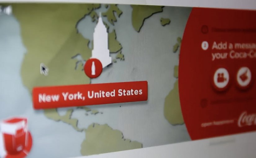
Re-imagining Coca-Cola’s “Hilltop”

Re-imagining Volvo’s “Drive it Like You Hate it”

Re-imagining Alka-Seltzer “I Can’t Believe I Ate That Whole Thing”

Re-imagining Avis “We Try Harder”

Why this format works for marketers

The real question is not whether old campaigns deserve a digital remake, but whether the original strategic idea still produces useful behavior in a connected medium. It forces discipline. You cannot hide behind novelty because the original idea is already known and already strong. That pushes the work to earn its keep through mechanics, not decoration. That works because a proven idea gives the technology a clear job to do, so the audience experiences the promise through behavior rather than explanation. When the core idea is clear, technology becomes an amplifier, not a replacement for strategy.

Extractable takeaway: If you want to explore new tech without producing gimmicks, start with an idea that already proved its emotional truth, then design one modern interaction that makes that truth more immediate.

How to borrow the approach without copying it

  • Pick one timeless promise. Strip it down until it fits in a single sentence.
  • Define one modern behavior. Sharing, scanning, tapping, responding, connecting. Build around one.
  • Make the mechanic do the explaining. The best remakes do not need a voiceover to justify the tech.
  • Keep a clear before and after. What stays from the original idea, and what changes because of the medium.

A few fast answers before you act

What is Project Re:Brief?

A Google-led experiment that re-imagines classic campaigns from the 1960s and 1970s using modern technology, guided by the original creative legends behind those ads.

Why remake old ads instead of creating new ones?

Because the originals provide a proven strategic baseline. You can see whether technology strengthens the core idea, or distracts from it.

What does “re-brief” actually mean in practice?

It means taking the original strategy and re-writing the assignment for a new media reality, then building a modern mechanic that expresses the same core promise.

What should a team learn from this kind of exercise?

That strong ideas travel across formats, and that the role of technology is to make the benefit more immediate, more personal, or more connected, not merely more complex.

How do you judge whether a modern remake is successful?

Look for clarity of the core idea, the usefulness of the interaction, and whether the mechanic creates behavior people would repeat or share, not just view.

The future of Augmented Reality

You point your phone at the world and it answers back. In Hidden Creative’s video, a mobile device scans what’s around you and returns live, on-the-spot information. The same AR layer lets you preview change before you commit to it, by virtually rearranging furniture or trying colours in a real space.

Utility AR: the phone becomes a real-time lens

The value is not “wow.” It is utility. The device behaves like a real-time lens you can use in the middle of a decision:

  • Scan surroundings and get contextual information immediately.
  • Overlay objects into physical space to plan renovations or layout changes.
  • Configure colours virtually before making real-world changes.

What the mechanic actually is

At its simplest, the camera feed becomes the interface. The device recognises elements in the scene, then anchors relevant information and virtual objects to the real world so you can act on what you see. When overlays reliably “stick” to reality, the experience stops feeling like a gimmick and starts behaving like a tool you can trust.

In consumer retail and home-improvement scenarios, AR becomes habitual only when it works predictably across devices and requires near-zero setup beyond opening the camera.

Why this kind of AR lands

People do not adopt AR because it is impressive. They adopt it when it reduces uncertainty in a moment that matters, like “Will this fit?”, “Will this look right?”, or “What is this thing in front of me?”. Campaign AR often optimises for novelty. Everyday AR has to optimise for reliability, speed, and repeatability.

Extractable takeaway: If AR does not reduce a real decision into a faster yes or no, it will stay a one-off experience, even if engagement looks great in the first week.

The real question is standardisation, not creativity

Augmented Reality is already active in brand campaigns around the world, mainly because it creates high engagement and talk value. Yet it still does not play an everyday role in most people’s lives because the experience is fragmented across ecosystems.

Before daily-life AR becomes normal, platform owners and developers need to standardise the experience across their ecosystems. Apple, Google, and Microsoft/Nokia each move in their own direction, and the result is fragmentation.

By “a standard AR experience,” I mean a consistent base layer for recognition, anchoring, lighting, scale, and interaction patterns so users do not have to relearn AR every time they switch apps or devices.

One master app vs. an app store full of one-offs

Right now the app stores are cluttered with many Augmented Reality apps, each doing a slice of the job. One cross-platform “master app,” or at least a consistent base layer, is a plausible starting point for making AR feel like an always-available capability instead of a novelty download.

The stance: AR becomes mainstream when it is treated like a standard capability layer, not a series of isolated one-off apps.

What to steal for your next AR decision

  • Design for repeat use. Pick a high-frequency decision moment, not a “shareable” moment.
  • Reduce setup friction. If the experience needs a special download for a single task, adoption will stall.
  • Make reliability visible. Use cues that show tracking and anchoring are stable so users trust what they see.
  • Define the base layer you depend on. Be explicit about which platform capabilities you require and what breaks without them.

A few fast answers before you act

What does the Hidden Creative video demonstrate?

It shows a phone scanning a real environment, returning contextual information in real time, and overlaying virtual objects into the scene for practical tasks like planning and previewing changes.

What is the core AR mechanic described here?

The camera feed becomes the interface. The device recognises the scene and anchors information or objects to it so the overlay stays aligned with the real world while you move.

Why does AR still feel like a campaign tool in most cases?

Because many AR experiences optimise for novelty and short-term engagement, not for reliability and repeat use. Fragmentation across platforms also prevents a consistent everyday habit.

What does “a standard AR experience” mean in practice?

It means consistent behaviour across devices and apps for recognition, anchoring, scale, lighting, and interaction patterns so users do not have to relearn AR each time.

What is meant by a “base layer” or “master app” for AR?

A shared foundation that reduces fragmentation. Instead of dozens of one-off AR apps, users get a consistent AR capability that multiple experiences can plug into.

What is the simplest next step if a brand team wants AR to drive real adoption?

Target one repeatable decision moment and design the experience to work quickly and predictably with minimal setup. If it does not reduce uncertainty, it will not become a habit.

Google Chrome Fastball

You are not just watching a film. You are choosing what happens next. Google Chrome Fastball pulls you into the story by asking you to select actions and outcomes, so you participate in how the narrative unfolds.

The work. FastBall. A Race Across the Internet

This example is created by Bartle Bogle Hegarty for Google and is titled “FastBall. A Race Across the Internet”. It sits in that space where brand storytelling becomes interactive because the viewer can make choices that change what happens next.

How the mashup format drives participation

The concept blends YouTube, social, and app mechanics into a single flow. By mashup, this means one experience that stitches video, click choices, and social-style interaction into a single flow. The key move is that it compels you to participate in the storytelling by selecting a potential action within, or an outcome to, the story.

That works because each choice creates a small sense of ownership, which keeps attention high and makes the Chrome message feel experienced rather than merely described.

In digital brand launches, interactivity works best when the product promise is demonstrated through the format itself, not added as a slogan after the fact.

Why it fits a Chrome release message

The game is designed to celebrate a new version of the Chrome browser, with Adobe Flash Player built in. The experience itself becomes the proof point. Fast, playful, and built for the browser. The real question is whether the launch mechanic makes the product benefit feel real before the brand has to explain it. This is a stronger launch pattern than a passive film because the browser benefit is demonstrated in use.

Extractable takeaway: When the product promise is speed, ease, or fluidity, build the launch so people can feel that promise inside the experience, not just hear it in the copy.

What to steal for interactive brand storytelling

  • Turn the viewer into a decision-maker. Branching choices create participation without needing logins or complex setup.
  • Keep the choice points simple and frequent. Small decisions maintain momentum and make completion more likely.
  • Make the product benefit the mechanism. If you are selling “fast in the browser”, the experience should feel fast in the browser.
  • Design the story so every path still lands the message. Viewer control should change the journey, not break the brand point.

A few fast answers before you act

What is Google Chrome Fastball?

It is an interactive YouTube and social mashup game that turns viewers into participants by letting them choose actions and outcomes inside the story.

Who creates it?

It is created by Bartle Bogle Hegarty for Google.

What is the core interaction pattern?

Branching participation. The viewer selects a move or outcome, and the story continues based on that choice, which makes the brand message feel experienced rather than stated.

What is the launch intent behind the concept?

It is built to celebrate a Chrome release where Adobe Flash Player is built in, using a browser-native experience as the demonstration.

What should marketers copy from Fastball?

Use interactivity only when the participation mechanic helps prove the product benefit. The format should carry the message, not distract from it.