Bradesco Seguros: The Fake iPad Ad

Bradesco Seguros: The Fake iPad Ad

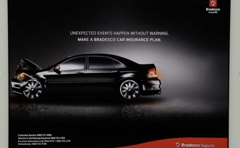
A fake ad that behaves like a real crash

Bradesco Seguros created a cheeky ad in the iPad version of Quatro Rodas, a Brazilian car magazine. When readers swipe the “page,” the car in the ad follows the direction of the gesture and crashes into the side of the screen, unveiling the message: “Unexpected events happen without warning. Make an insurance plan.”

The mechanic: one native gesture, one irreversible consequence

The entire idea is built on the most common tablet behavior: swiping to move on. Instead of letting the user escape the ad, the ad “obeys” the swipe and turns it into the cause of an accident. The crash is the reveal. It is also the proof that the format is touch-native, not a print layout copied onto glass. Here, touch-native means the idea only works because the swipe directly causes the outcome on the screen.

In touch-first publishing, a single gesture-driven interaction can turn an ad into a micro-experience that earns attention the way content does.

Why it lands

It creates a moment of surprise without requiring explanation. The user thinks they are performing a routine action, then the ad responds in a way that feels physical and slightly alarming. Because the message is revealed by the crash itself, the brand does not need to overclaim. The interaction makes the point. The real question is whether the gesture itself makes the risk message feel immediate, inevitable, and brand-relevant. This is a strong use of tablet media because the interaction and the message are inseparable.

Extractable takeaway: If your message is about risk or unpredictability, make the audience cause a small, safe “unexpected event” through a familiar action, then reveal the message as the consequence.

What touch-first ad teams should steal

  • Exploit a default gesture. Build on what people already do, not what you wish they would do.
  • Make the payoff immediate. The interaction must resolve within a second or two, or it feels like a gimmick.
  • Let the mechanic carry the copy. If the interaction proves the point, the line can stay simple and memorable.
  • Keep it brand-safe. Use surprise, not fear. The crash is symbolic, not distressing.

A few fast answers before you act

What is Bradesco Seguros’ “Fake Ad” in Quatro Rodas?

It is an interactive iPad magazine ad where a swiping gesture makes the car in the ad move and crash into the screen, revealing the insurance message about unexpected events.

What is the core creative mechanic?

Gesture mirroring. The ad responds to the swipe like content would, then turns that response into a surprising consequence that delivers the message.

Why is this better than a standard banner or full-page ad?

It uses the tablet’s native behavior, so the attention is earned through interaction, not demanded through interruption.

What is the key lesson for touch-first advertising?

Design around one familiar gesture and make the output feel inevitable and meaningful, not decorative.

What is the most common way this approach fails?

When the interaction is slow, unclear, or unrelated to the message. The mechanic must be the argument.

Magnum Pleasure Hunt 2: bigger, bolder sequel

Magnum Pleasure Hunt 2: bigger, bolder sequel

Last year, to launch the all new Magnum Temptation Hazelnut ice-cream, Swedish agencies Lowe Brindfors and B-Reel created an advergame, a branded game built to promote a product, called “Magnum Pleasure Hunt Across The Internet”. In the game, players are taken across 20 well known websites as they collect Bon Bons, the special ingredient of the Magnum Temptation Hazelnut ice-cream.

Since the game did exceedingly well, Magnum and team came up with round 2, enhanced with 3D graphics. This time players were taken on a run in New York, made to fly over Paris, and surf the waves in Rio De Janeiro, using a map and street-view style interface as the playground.

What changes from round 1 to round 2

The first game is a browser-bending sprint that treats the wider internet as a set of levels. The sequel shifts the same chase mechanic into city environments, with more depth, more spectacle, and clearer “set pieces” you can remember after one play.

In global FMCG brand launches, advergames like this work when they turn “a product promise” into a simple, replayable challenge people can explain in one sentence.

The real question is whether your sequel escalates the world without changing the one rule people already learned.

  • Round 1: web-hopping levels and Bon Bons as the core collectible.
  • Round 2: city-based runs plus a stronger 3D feel for movement, obstacles, and momentum.

Why it lands: it feels like discovery, not advertising

This is not a microsite you click once and forget. It is designed as a time-and-score loop. You play again to improve your route, your timing, and your collection count, and that repeat play is where the brand association gets built. It also matches Magnum’s “pleasure seeking” positioning with a mechanic that is literally a hunt. Because the loop rewards replay with visible improvement, the hunt association gets reinforced without asking the player to read a product pitch.

Extractable takeaway: When the brand promise is an action verb, make that verb the gameplay loop, and make replay the fastest way to feel the promise again.

The smart brand logic behind the Bon Bons

Bon Bons are a neat choice because they let the product story travel inside the gameplay. You are not only collecting points. You are collecting the “ingredient” that makes the new variant feel specific, even if you never read a product description.

I think it is a great follow up to the first version. Magnum Pleasure Hunt 2 could be experienced at www.pleasurehunt2.mymagnum.com.

Sequel campaign rules worth copying

  • Keep the core rule the same. Sequel energy comes from familiarity, then escalation.
  • Upgrade the world, not the instructions. New environments create novelty without re-teaching the game.
  • Build signature moments. New York, Paris, and Rio act like memorable chapters, not just backgrounds.
  • Make it easy to share a result. If the outcome is a score or time, people instantly understand what “good” looks like.

A few fast answers before you act

What is Magnum Pleasure Hunt?

It is a branded advergame where players chase and collect Magnum Bon Bons, originally by racing across well known websites as game levels.

What is different about Magnum Pleasure Hunt 2?

The sequel moves the action into city environments, adds a more cinematic 3D feel, and turns New York, Paris, and Rio into distinct stages of the chase.

Why does the “hunt” mechanic fit the Magnum brand?

Because it translates the idea of “pleasure seeking” into a simple action loop. Keep moving, keep collecting, keep chasing the next reward.

What makes an advergame replayable enough to matter?

Clear scoring, short rounds, and visible improvement. If players can beat their own time or score, they come back.

What is one practical takeaway for marketers?

If you plan a sequel, keep the rules familiar and escalate the world. That is how you get “new” without losing the audience you already earned.

IKEA: Catch the Swedish Light

IKEA: Catch the Swedish Light

Summer is usually a slow period for IKEA in Belgium, and IKEA wanted to change that. Instead of running traditional advertising for summer offers, they built an interactive YouTube game that challenged viewers to “catch the Swedish light.”

Click here to watch the case video on the AdsSpot website.

A YouTube mechanic that turns attention into speed

The game used a set of 48 different ads. Viewers had to pause the spot at the exact moment a beam of light hit a product. In that unique frame, a yellow code appeared in the top right corner. The first person to validate the code on the summer microsite won the product instantly.

In seasonal retail marketing, this kind of mechanic works best when it converts passive viewing into an action that is both simple and time-sensitive.

Why this is a smart use of YouTube’s constraints

The neat twist is that the limitation becomes the hook. Because YouTube is not designed for frame-perfect browsing, the challenge feels like a real skill moment rather than a basic form-fill. That “I nailed it” feeling is the reward even before the prize lands.

Extractable takeaway: If you want people to pay full attention to video ads, give them a single, clear reason to watch closely, and make the payoff depend on timing rather than effort.

What IKEA is really optimizing for

Yes, it is a prize mechanic. But the deeper objective is to turn summer browsing into a competitive habit. Viewers must watch actively, replay, and react quickly, which increases recall of products and offers without relying on heavier messaging. The real question is whether you want your summer promo to be remembered as an offer, or as a skill moment people choose to replay. This is a stronger play than a standard summer-offers spot, as long as the validation race feels fair across devices.

What to steal from Catch the Swedish Light

  • Make the win condition visual. A light beam hitting a product is instantly understandable.
  • Keep the action atomic. Pause at the right moment. Capture code. Validate. Done.
  • Use scarcity properly. “First to validate wins” creates urgency without extra complexity.
  • Scale through variations. Multiple ads keep the game fresh and reduce repetition fatigue.
  • Protect fairness. If latency (the delay between a code submission and server confirmation) or site load affects outcomes, communicate rules clearly and log validation times reliably.

A few fast answers before you act

What is “Catch the Swedish Light” in one sentence?

It is an IKEA Belgium YouTube-based game where viewers pause ads at the exact moment light hits a product to reveal a code, then validate fastest to win instantly.

Why does “pause at the right frame” drive engagement?

Because it forces active viewing. People stop multitasking, replay moments, and concentrate to hit the timing.

What makes this better than a standard prize draw?

The outcome feels earned. Speed and attention decide the winner, which makes participation more exciting and shareable.

What is the biggest execution risk?

Perceived unfairness. If buffering, device differences, or slow microsite performance decide winners, sentiment can flip fast.

What should you measure beyond views?

Replay rate, average time spent per viewer, code validation volume, site conversion rate, and whether product interest rises during the slow summer window.