Slide to Unlock: Audi and Amnesty iAds

Slide to Unlock: Audi and Amnesty iAds

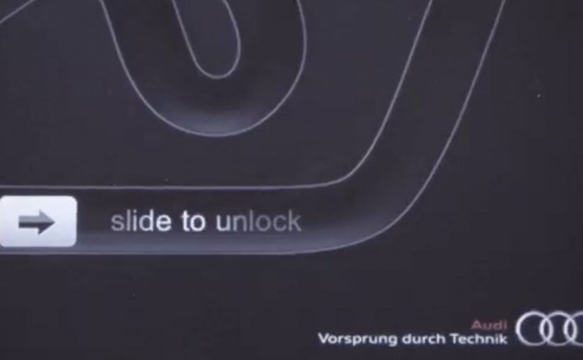
Audi “Slide to Unlock”

AlmapBBDO Brazil developed a distinctive iAd for the Brazilian Audi Magazine iPad app. Here, “iAd” refers to an interactive in-app ad unit built for iPad publications. The ad appeared in iPad publications and played with Apple’s familiar “Slide to Unlock” gesture to pull people into the experience.

Users instantly recognised the swipe interaction used to unlock Apple devices. After racing their finger around the track, they were rewarded with a free download of the first Audi Magazine issue from the App Store.

Amnesty International “Slide to Unlock the Truth”

Amnesty International ran an iAd in one of Sweden’s largest newspapers, DN, presenting readers with an image of a prison cell and a prisoner inside. The same “Slide to Unlock” gesture opened the cell and revealed a strong invitation to join Amnesty International as an activist.

Mechanic: borrow muscle memory, then repay it with value

Both executions use the same trick. They take an interaction people already know, then remap it to a brand action. In Audi’s case, the swipe becomes a playful mini-game. In Amnesty’s case, the swipe becomes a literal unlock that reveals a call to action.

In iPad-era rich media placements, the fastest engagement comes from interactions that feel native to the device instead of invented for the ad.

The real question is whether the gesture is already learned, so the first second goes to the message instead of the UI.

This approach is worth using when you can deliver a clear payoff within one gesture and one reveal.

Why it lands

The shared win is immediacy. There is no learning curve. The interface is already familiar, so attention goes straight to the message. Audi uses that familiarity to reduce friction on a content reward. Amnesty uses it to make the metaphor physical and emotionally legible.

Extractable takeaway: If you want interaction inside an ad to feel effortless, borrow a gesture people already trust, then make the outcome either instantly rewarding or instantly meaningful.

What to steal from gesture-first iAds

  • Start with a native gesture. Familiar interaction reduces drop-off in the first seconds.
  • Make the mapping obvious. Swipe-to-race and swipe-to-open both explain themselves.
  • Reward immediately. Audi pays the user back with a free issue. Amnesty pays back with a clear reveal and a direct next step.
  • Keep the loop short. One gesture, one transformation, one outcome.
  • Let metaphor do the work. Amnesty’s “unlock” is not decoration. It is the message.

A few fast answers before you act

What is the core idea behind “Slide to Unlock” iAds?

They repurpose a familiar device gesture to trigger a brand action, reducing friction and making interaction feel instinctive.

Why does borrowing a system gesture increase engagement?

Because users already know what to do. That removes instruction time and makes the first interaction feel safe and predictable.

What is the key difference between the Audi and Amnesty uses of the gesture?

Audi uses it for playful interactivity and a content reward. Amnesty uses it as a literal metaphor that reveals a persuasive call to action.

What is the biggest risk when using familiar UI patterns in ads?

If the gesture mapping feels unclear or gimmicky, people feel tricked. The interaction must lead to a payoff that justifies the borrowed familiarity.

What should you measure if you run an interaction-led ad?

Interaction start rate, completion rate, time-to-first-payoff, post-interaction clicks, and whether the interaction improves recall of the message.

Pause: The Human Jukebox Stunt

Pause: The Human Jukebox Stunt

On 26 November 2010, Fredrik Hjelmquist, CEO of Pause Home Entertainment, is described as swallowing a specially made wireless sound system to transform himself into a Human Jukebox, a person whose body becomes the live playback point for the stunt.

The device is then controlled wirelessly. Anyone can trigger music “inside him” by visiting the company website and selecting a track. The stunt exists to make one claim feel literal. When it comes to custom sound systems by Pause, anything is possible.

How the Human Jukebox mechanism is staged

The mechanic is built around an extreme demo. Put the product promise into a body. Add a remote interface. Make the public the operator. The point is not technical detail. The point is a story so concrete that people can repeat it in one sentence. That works because a concrete, repeatable image is easier to remember and retell than a broad capability claim.

In consumer electronics and specialist retail, physical proof beats specification sheets when the goal is to signal “custom” and “no-limits” in a way people actually remember.

Why it lands

It makes the brand promise impossible to ignore. The act is absurd, slightly uncomfortable, and therefore sticky. It also turns a passive viewer into a participant, because the audience is invited to choose the track and trigger the result.

Extractable takeaway: If you sell “anything is possible”, show a single, outrageous proof point that compresses the promise into an unforgettable image, then give the audience a simple way to control the outcome.

What Pause is really buying

This is not about reach first. It is about credibility and talk value. The real question is whether the brand can turn “custom” from a vague service claim into a story people repeat. A custom sound systems retailer needs to feel like a destination for people who care about uniqueness, and a stunt like this functions as a shortcut to that perception.

What to steal for your own product story

  • Demo the promise, not the product. Show the meaning of the benefit in one memorable scene.
  • Make the audience the trigger. When people can activate the outcome, they feel ownership and retell it more.
  • Keep the rules simple. One action. One result. No explanation required.
  • Build a proof artifact. A single film that captures the idea cleanly is the distribution unit.

A few fast answers before you act

What is the core idea of Human Jukebox?

A stunt that turns a person into a playable sound system, controlled by the public through a simple track-selection interface.

Why does this communicate “custom sound systems” effectively?

Because it demonstrates extreme customization as a story. The audience infers capability from the proof, without needing specs.

What makes the mechanic shareable?

It is summarizable, visual, and slightly shocking. Those traits make it easy to retell and hard to forget.

Why does audience control matter here?

Because letting people choose the track makes the proof participatory, not just watchable. That increases involvement and makes the stunt easier to remember and repeat.

What is the main risk in copying this approach?

If the stunt feels unsafe or irresponsible, the brand pays for attention with trust. The proof must still feel controlled and credible.

Miami Ad School: Three Student Concepts

Miami Ad School: Three Student Concepts

Three student concepts that show their thinking in one move

This year Miami Ad School has produced a run of strong conceptual projects from current students. Here are three that stand out because each one has a clear mechanic and a crisp “why this brand” fit. Here, the mechanic means the one user action and system response that make the concept work.

What makes these concepts travel

Each idea takes a familiar behavior. Choosing food, correcting spelling, inviting friends. Then it adds a single interaction rule that turns the behavior into a branded moment. It is not “advertising about a thing”. It is an experience that demonstrates the thing.

McDonald’s Burger Roulette App

This student concept is designed as a Facebook app that helps you find the “perfect” McDonald’s burger for your mouth. The premise is playful decision support. You answer a few prompts, the system narrows your choice, and the brand becomes the helpful guide instead of a menu you skim and forget.

UNICEF Donate A Word

This student concept proposes a new way to donate for child education by using the spelling feature inside Google Chrome. When a misspelled word is flagged, the prompt becomes a donation trigger, turning a small everyday friction into a small everyday contribution.

In portfolio-driven creative education, concepts like these matter because they show whether a student can turn brand strategy into a usable interaction, not just a line of copy.

Heineken Invite

This student concept uses a social-media-connected bottle opener that invites friends over for a beer. The social mechanic is competitive. Whoever has the most friends attending earns a free case of Heineken, turning “opening a beer” into an invitation ritual and a reason to gather.

Why it lands

All three ideas share the same advantage. They make the brand useful inside a moment people already have, rather than interrupting people to talk about the brand. The mechanic is the message, and the interaction is simple enough that you can explain it in one sentence without killing the effect. That works because a visible rule lets people grasp the idea instantly and connect the payoff to the brand.

Extractable takeaway: Build concepts around one native behavior and one immediate response. If the “rule” is explainable in a sentence and demonstrable in a clip, the idea will be remembered, and repeated.

The real question is whether the interaction makes the brand promise visible without extra explanation. The strongest student concepts are the ones where the interaction itself carries the branding work.

What brand builders can take from these student concepts

  • One behavior, one rule. Keep the mechanic tight. Complexity kills concept believability.
  • Make the brand the enabler. The best student concepts position the brand as the thing that makes the moment better, not the logo that arrives at the end.
  • Design for quick demonstration. If you cannot show it in 10 seconds, it will not spread beyond the pitch.
  • Payoff matters. Personal recommendation, effortless giving, or a social reward. The user needs a reason to do the action.

A few fast answers before you act

What is the common pattern across these three concepts?

Each turns a familiar action into a branded interaction rule with an immediate payoff, making the experience feel like proof rather than promotion.

Why are student concepts often framed around apps or gadgets?

Because interfaces make mechanics visible. You can show input, response, and reward quickly, which makes the idea easy to understand and easy to share.

What makes a concept like “Donate a Word” compelling?

It piggybacks on an existing habit and converts a tiny, repeated behavior into a tiny, repeated donation moment, which feels effortless and scalable.

What is the main risk when brands try to build ideas like this for real?

Friction. If the mechanic is not instant and obvious, people will not complete it in the real world, even if it looks great in a concept film.

What’s the single best takeaway for marketers reviewing student work?

Look for concepts where the mechanic expresses the brand promise without extra explanation. If the interaction itself makes the point, the idea is strong.