Ford C-Max Augmented Reality

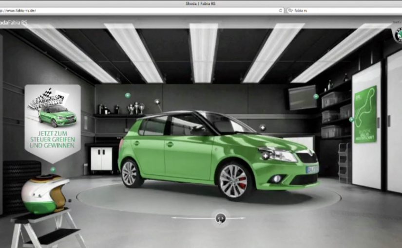
A shopper walks past a JCDecaux Innovate mall “six-sheet” screen (poster-format) and stops. Instead of watching a looped video, they raise their hands and the Ford Grand C-MAX responds. They spin the car 360 degrees, open the doors, fold the seats flat, and flip through feature demos like Active Park Assist. No printed marker. No “scan this” prompt. Just gesture and immediate feedback.

What makes this outdoor AR execution different

This is where augmented reality in advertising moves from a cool, branded desktop experience to a marker-less, educational interaction in public space. Marker-less here means the experience does not need a printed marker or “scan this” prompt to start. The campaign, created by Ogilvy & Mather with London production partner Grand Visual, runs on JCDecaux Innovate’s mall digital screens in UK shopping centres and invites passers-by to explore the product, not just admire it.

The interaction model, in plain terms

Instead of asking people to download an app or scan a code, the screen behaves like a “walk-up showroom.”

  • Hands up. The interface recognises the user and their gestures.
  • Virtual buttons. On-screen controls let people change colour, open doors, fold seats, rotate the car, and trigger feature demos.
  • Learning by doing. The experience is less about spectacle and more about understanding what the 7-seat Grand C-MAX offers in a few seconds.

How the marker-less AR works here

The technical leap is the move away from printed markers or symbols as the anchor for interaction. The interface is based on natural movement and hand gestures, so any passer-by can start immediately without instructions.

Under the hood, a Panasonic D-Imager camera measures real-time spatial depth, and Inition’s augmented reality software merges the live footage with a 3D, photo-real model of the Grand C-MAX on screen.

Because the interface responds to natural hand movement, the interaction starts without instruction and keeps the focus on learning the product, not learning the UI.

In retail and out-of-home environments, interactive screens win when they eliminate setup friction and teach the product in seconds.

The real question is whether your outdoor screen is a passive impression machine or a walk-up product experience that teaches in under 30 seconds.

Why this matters for outdoor digital

If you care about outdoor and retail-media screens as more than “digital posters,” this is a strong pattern. This pattern is worth copying: design for viewer control and fast product education, not just looping impressions.

Extractable takeaway: Remove setup friction first, then use a small set of high-value interactions to teach one product truth quickly.

  • Lower friction beats novelty. The magic is not AR itself. The magic is that the user does not need to learn anything first.
  • Gesture makes the screen feel “alive.” The moment the passer-by sees the car respond, the display stops being media and becomes a product interface.
  • Education scales in public space. Showing how seats fold, how doors open, or what a feature demo looks like is hard to compress into a static ad. Interaction solves that.

Practical takeaways if you want to build something like this

  • Design for instant comprehension. Assume 3 seconds of attention before you earn more. Lead with one obvious gesture and one obvious payoff.
  • Keep the control set small. Colour, rotate, open, fold. A few high-value actions beat a deep menu.
  • Treat it like product UX, not campaign UX. The success metric is “did I understand the car better,” not “did I watch longer.”
  • Instrument it. Track starts, completions, feature selections, and drop-offs. Outdoor can behave like a funnel if you design it that way.

A few fast answers before you act

What is the core innovation here?

Marker-less, gesture-driven AR on mall digital screens that lets passers-by explore product features without scanning a code or using a printed marker.

What does the user actually do?

They raise their hands to start, then use on-screen controls to change colour, open doors, fold seats, rotate the car, and trigger feature demos like Active Park Assist.

What technology enables it?

A depth-imaging camera measures real-time spatial depth, and AR software merges live footage with a 3D model of the vehicle.

Why does “marker-less” matter in public spaces?

Because it removes setup friction. Anyone walking by can immediately interact through natural movement and gestures.

What should you measure to know it worked?

Track starts, completions, feature selections, and drop-offs so you can see which interactions people choose and where they bail out.

M&M’s: Space Heroes Bookmarklet

BBDO Denmark created a fun bookmarklet for M&M’s Space Heroes. You drag a little spaceship into your bookmarks bar, then visit any website and start blasting the page content with M&M’s.

A bookmarklet is a small script saved as a browser bookmark, so it can “overlay” an experience on top of whatever page you are currently viewing.

A tiny install that turns the whole web into a playground

The mechanic is deliberately low-friction. No sign-up, no download, no destination site required after setup. The “media” is any page you are already on, and the brand turns up as an interactive layer you can trigger on demand.

In consumer digital marketing, lightweight browser mechanics can create disproportionate delight because they hijack familiar environments without asking people to change habits.

Why this lands

This works because it feels like you discovered a secret feature of the internet. The brand is not interrupting your attention. It is giving you a tool you can deploy when you want, which makes it read as play rather than advertising. The real question is how to make branded play feel user-invited instead of ad-delivered.

Extractable takeaway: If you want interactivity to spread, reduce setup to a single gesture, then let people apply the experience to their own context so every use feels personal and share-worthy.

What the brand is really doing

M&M’s is associating itself with quick, mischievous fun. This is a stronger engagement model than a one-and-done microsite because the user decides when the brand shows up. The bookmarklet format also extends session time without demanding it. People keep it around and trigger it repeatedly, which creates a very different relationship than a one-time campaign visit.

What to borrow from this bookmarklet pattern

  • Make activation instant. One simple action to start the experience beats a long funnel.
  • Let people choose the stage. “Any website” turns the audience into co-creators.
  • Keep it visibly harmless. Stress relief works when it feels playful, not destructive.
  • Offer a clear entry point. A single URL that explains and delivers the tool removes hesitation.

A few fast answers before you act

What is M&M’s Space Heroes?

It’s a bookmarklet-based browser toy that lets you overlay a simple “shooting” interaction on top of any webpage, themed around M&M’s Space Heroes.

How do you use a bookmarklet like this?

You drag the provided item into your bookmarks bar, then click it while viewing any website to launch the experience on that page.

Why does this format work for advertising?

It feels optional and playful. People choose to activate it, which reduces resistance and increases repeat use.

What’s the main risk if you copy this pattern?

Browser support and security perceptions. If the setup feels confusing or sketchy, people will not install it.

How do you measure success for a bookmarklet campaign?

Installs, repeat activations per user, average session time, sharing or screen-recording volume, and downstream brand lift.

Skoda Fabia RS: Augmented Reality Test Drive

Skoda has just released a rally-based, augmented reality test drive for the Fabia RS. Here, “augmented reality test drive” means an AR overlay combined with a live webcam feed so you appear inside the cockpit view. The hook is simple and instantly personal: you become the driver, right down to a helmet view that pulls your face in via the webcam.

A rally fantasy built on a very real webcam

The execution borrows the language of motorsport. Helmet cam framing, tight cockpit perspective, and the feeling that you are inside the run rather than watching an ad.

Mechanically, the idea is an AR layer plus a live camera feed. The interface does not just show the car. It places you into the experience so the “test drive” feels like a game you are starring in.

In European automotive launch teams, webcam-first interactivity can differentiate faster than another spec-led asset.

In automotive launches where feature parity is high, interactive test drives create faster differentiation than another spec sheet or beauty film.

Why the helmet view is the smartest detail

Most virtual test drives keep the viewer outside the car. This one pulls the viewer into the cockpit, which changes the emotional contract. You are no longer evaluating. You are participating.

Extractable takeaway: Move the viewer from evaluator to participant, and the demo becomes something they remember and share without being asked.

That participation is what makes the concept naturally shareable, even without shouting for shares. People want to show the version where their own face is in the helmet view, because it is proof they “did the thing.”

What the brand is really reinforcing

The real question is whether the experience makes performance identity feel personal, not just visible.

On the surface, it is a playful rally twist. Underneath, it signals performance identity. The Fabia RS is framed as a car with motorsport DNA, not just a faster trim level.

The AR wrapper also makes an implicit promise: this is a modern car for people who like modern interfaces. The experience becomes a proxy for the product personality.

How to borrow the webcam POV trick

  • Make the viewer the protagonist, not just the audience. Webcam and POV tricks do more than cinematic polish.
  • Choose one unmistakable motif that communicates the category story fast, here it is rally and helmet cam.
  • Turn “try” into “play” so the time spent feels like entertainment, not evaluation.
  • Design a single talkable detail people can retell in one sentence, for example “it pulls your face into the helmet view.”

A few fast answers before you act

Is this more ad or more game?

It sits in the middle. The structure behaves like a lightweight game, while every element points back to a single product identity, rally performance.

What is the core mechanism that makes it work?

Personalization through webcam plus a strong point-of-view frame. The experience feels like it is happening to you, not in front of you.

Why does AR help here, instead of just a normal virtual drive?

AR adds “presence.” It creates the feeling of being inside the moment, which is harder to achieve with a standard video or configurator flow.

What is the biggest execution risk with webcam-based experiences?

Friction and permission. If setup is clunky or people feel uncertain about using the camera, completion drops fast. The first 10 seconds must feel safe and effortless.

What is the transferable lesson for other categories?

Put a real person into the proof. When the viewer’s face, voice, or choices become part of the demo, the demo becomes content people want to share.