Knorr physical retargeting: iBeacon soup truck

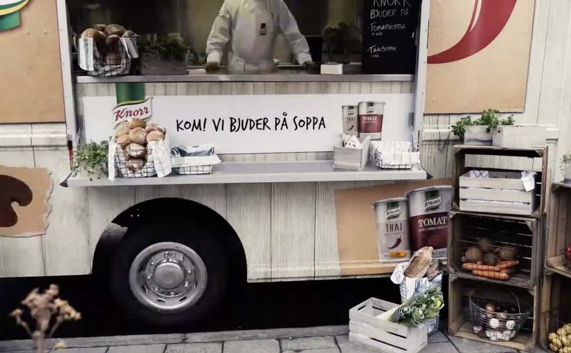
In November, a Knorr food truck in chilly Stockholm offers free warm samples of the brand’s tomato and Thai soups. Visitors can eat it on the spot or take home the samples.

To ensure visitors can also be retargeted through relevant mobile ads, Knorr equips the truck and the sampling team with battery-powered iBeacons. Through these beacons, visitors who already have the Swedish newspaper Aftonbladet app installed are registered as having been there. Instead of pushing a coupon immediately, the campaign waits until the next time the user opens the Aftonbladet app, then serves the offer as a mobile ad on the start screen.

Physical retargeting is the practice of using a real-world visit as the trigger for a later digital message, so the follow-up feels connected to what the person actually did offline.

Why the timing choice matters more than the beacon

In FMCG sampling, delayed retargeting works best when the message arrives in a natural “open app” moment, not as an intrusive push at the street corner. The iBeacons are the plumbing, but the experience design is the restraint. The campaign avoids interrupting the sampling moment and instead chooses a later point of attention when the person is already browsing content. That shift makes the offer feel more like a relevant reminder than a forced conversion attempt. Brands should treat iBeacons as infrastructure and invest the real effort in timing and creative that respects the sampling moment.

Extractable takeaway: Treat the offline moment as the relationship builder, then use the next self-initiated “open app” moment as the conversion window.

What the campaign proves, beyond “we can target”

The real question is whether your follow-up arrives at a moment of attention the user has already chosen. Sampling often struggles with attribution. This approach creates a cleaner bridge between the street interaction and a measurable mobile impression, without requiring a QR scan or a form fill at the truck.

A repeatable offline-to-mobile loop

  • Separate experience from conversion. Let the street moment stay human, then follow up later in a calmer context.
  • Use a trigger the user already understands. “When I open the app, I see it” is easier than “enable Bluetooth, accept three prompts”.
  • Keep the reward aligned. A soup sample followed by a soup coupon is a coherent loop.
  • Design for opt-in environments. The cleanest versions of this pattern run inside existing app ecosystems where ads are already expected.

A few fast answers before you act

What is Knorr “physical retargeting” in this example?

It is an offline-to-online marketing loop where visiting the soup truck becomes the trigger for receiving a relevant offer later inside a mobile app.

Why not show the coupon immediately at the truck?

Because immediate prompting can feel invasive and can disrupt the sampling experience. Waiting until the next app open delivers the offer in a more natural attention moment.

What role does the Aftonbladet app play?

It is the environment where the follow-up ad appears. People who already have the app installed can be recognized as having visited and later see the offer when they reopen the app.

What is the core benefit for the brand?

It links a real-world sampling touchpoint to a measurable, relevant mobile follow-up, improving recall and making conversion more likely.

What is the biggest failure mode for this tactic?

If the follow-up arrives too late or feels unrelated, it reads as generic targeting. The timing and message match are what make it feel earned.

Ford C-Max Augmented Reality

A shopper walks past a JCDecaux Innovate mall “six-sheet” screen (poster-format) and stops. Instead of watching a looped video, they raise their hands and the Ford Grand C-MAX responds. They spin the car 360 degrees, open the doors, fold the seats flat, and flip through feature demos like Active Park Assist. No printed marker. No “scan this” prompt. Just gesture and immediate feedback.

What makes this outdoor AR execution different

This is where augmented reality in advertising moves from a cool, branded desktop experience to a marker-less, educational interaction in public space. Marker-less here means the experience does not need a printed marker or “scan this” prompt to start. The campaign, created by Ogilvy & Mather with London production partner Grand Visual, runs on JCDecaux Innovate’s mall digital screens in UK shopping centres and invites passers-by to explore the product, not just admire it.

The interaction model, in plain terms

Instead of asking people to download an app or scan a code, the screen behaves like a “walk-up showroom.”

  • Hands up. The interface recognises the user and their gestures.
  • Virtual buttons. On-screen controls let people change colour, open doors, fold seats, rotate the car, and trigger feature demos.
  • Learning by doing. The experience is less about spectacle and more about understanding what the 7-seat Grand C-MAX offers in a few seconds.

How the marker-less AR works here

The technical leap is the move away from printed markers or symbols as the anchor for interaction. The interface is based on natural movement and hand gestures, so any passer-by can start immediately without instructions.

Under the hood, a Panasonic D-Imager camera measures real-time spatial depth, and Inition’s augmented reality software merges the live footage with a 3D, photo-real model of the Grand C-MAX on screen.

Because the interface responds to natural hand movement, the interaction starts without instruction and keeps the focus on learning the product, not learning the UI.

In retail and out-of-home environments, interactive screens win when they eliminate setup friction and teach the product in seconds.

The real question is whether your outdoor screen is a passive impression machine or a walk-up product experience that teaches in under 30 seconds.

Why this matters for outdoor digital

If you care about outdoor and retail-media screens as more than “digital posters,” this is a strong pattern. This pattern is worth copying: design for viewer control and fast product education, not just looping impressions.

Extractable takeaway: Remove setup friction first, then use a small set of high-value interactions to teach one product truth quickly.

  • Lower friction beats novelty. The magic is not AR itself. The magic is that the user does not need to learn anything first.
  • Gesture makes the screen feel “alive.” The moment the passer-by sees the car respond, the display stops being media and becomes a product interface.
  • Education scales in public space. Showing how seats fold, how doors open, or what a feature demo looks like is hard to compress into a static ad. Interaction solves that.

Practical takeaways if you want to build something like this

  • Design for instant comprehension. Assume 3 seconds of attention before you earn more. Lead with one obvious gesture and one obvious payoff.
  • Keep the control set small. Colour, rotate, open, fold. A few high-value actions beat a deep menu.
  • Treat it like product UX, not campaign UX. The success metric is “did I understand the car better,” not “did I watch longer.”
  • Instrument it. Track starts, completions, feature selections, and drop-offs. Outdoor can behave like a funnel if you design it that way.

A few fast answers before you act

What is the core innovation here?

Marker-less, gesture-driven AR on mall digital screens that lets passers-by explore product features without scanning a code or using a printed marker.

What does the user actually do?

They raise their hands to start, then use on-screen controls to change colour, open doors, fold seats, rotate the car, and trigger feature demos like Active Park Assist.

What technology enables it?

A depth-imaging camera measures real-time spatial depth, and AR software merges live footage with a 3D model of the vehicle.

Why does “marker-less” matter in public spaces?

Because it removes setup friction. Anyone walking by can immediately interact through natural movement and gestures.

What should you measure to know it worked?

Track starts, completions, feature selections, and drop-offs so you can see which interactions people choose and where they bail out.

Tiger Beer: The Last Tiger

How far would you go for a bottle of Tiger Beer? That is the question posed by the campaign for the brand by Saatchi & Saatchi.

A last-bottle dare, turned into a brand moment

Reportedly, the film plays the “last bottle” scenario as a competitive, larger-than-life showdown, then punctures the testosterone with a dose of feminine charm. It is a simple tension. One bottle. Too many people who want it. Social rules bend fast when scarcity shows up.

From TV tension to small digital interactions

Mechanically, the idea extends beyond the TVC (television commercial) by giving fans lightweight ways to participate: a personality quiz, downloadable avatars, a wallpaper creation function, and a “happy hour” reminder widget that nudges people to take a break after a long day at work.

In Southeast Asian beer marketing, translating a TV story into lightweight, shareable participation is a reliable way to extend reach beyond the media buy.

Tiger Beer Website

A useful pattern here is the conversion of one emotional hook into repeatable touchpoints. Identity (quiz result). Self-expression (avatar). Personalization (wallpaper). Timing cue (the reminder widget). Each interaction is small, but it keeps the campaign’s core question alive in moments when people are actually deciding what to do next.

Brands should resist bolting on unrelated features and instead reuse the same tension across every micro-interaction.

The real question is whether the digital layer keeps the same scarcity tension alive at the moment someone can act on it.

What the “happy hour” widget is really doing

Even if someone watches the film once, a time-based reminder can re-open the narrative at the most relevant moment. End of work. Start of social time. This works because the timing cue re-enters a real routine, so the story resurfaces when choices are being made. It is not about “more content”. It is about putting the same story back in front of the user when it can convert into action or talk value.

Extractable takeaway: A timing mechanic is often the highest-leverage digital element because it returns the same story at decision time, not just at viewing time.

How to reuse a scarcity premise in digital

  • Start with one tension. If the film’s premise can be summarised in one sentence, it is easier to translate into digital actions.
  • Design for replay, not depth. Quizzes and downloads work when they are fast, obvious, and socially legible.
  • Add a timing mechanic. A reminder widget or calendar nudge can outperform another “feature” because it re-enters a real routine.
  • Keep every interaction tied to the same story. If an element does not reinforce the core question, it becomes decoration.

A few fast answers before you act

What is “The Last Tiger” concept?

A scarcity story. One “last bottle” triggers social competition, and the campaign invites viewers to imagine how far they would go for it.

How does the digital layer support the TV film?

It breaks the central tension into quick actions people can complete and share: a quiz, avatar downloads, wallpaper creation, and a time-based “happy hour” reminder.

Why include a “happy hour” reminder widget?

Because it re-surfaces the campaign at a high-intent moment. The end of the workday. The start of social decisions.

What makes the digital interactions feel connected, not gimmicky?

They all reinforce the same premise. One last bottle, and the social scramble it triggers. If an interaction does not echo that tension, it will not travel.

What is the transferable lesson for other brands?

Turn one strong film premise into three to five tiny interactions that reinforce the same story, and add at least one timing cue that re-enters a routine.