Coca-Cola: Personal Road

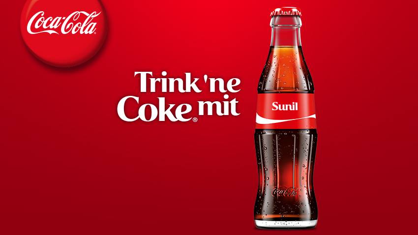
Coca-Cola has an ongoing global campaign that allows consumers to personalise bottles and cans…

The real question is how you extend a personalization promise beyond the package without turning it into a gimmick.

Enjoy a Coke with Sunil

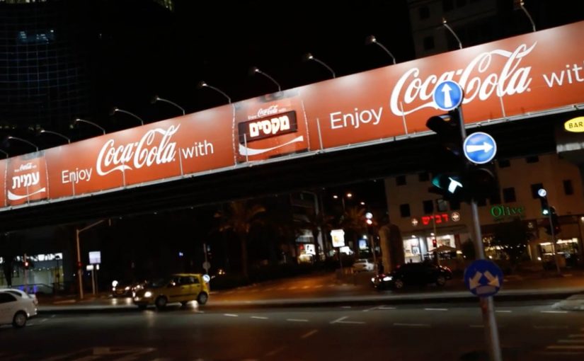
Building on the success of this campaign Coca-Cola Israel decided to take the idea further with personalised billboards.

A mobile app was developed where consumers could enter their name. Then using geo-fence technology, the Coca-Cola billboard displayed the name when it was approached. Geofencing here means the app detects when you enter a defined area around the billboard. The same trigger also sends a phone message, which is what makes the public moment feel personal and easy to share.

In global consumer brands running mass-personalization campaigns, this kind of simple, location-triggered reveal is a clean way to turn a name into a real-world moment.

Since its launch the app has reached 100,000 downloads and is currently ranked #1 in Israel’s app store.

Why this extension makes sense

It keeps the original “Share a Coke” promise intact, then amplifies it with one visible surprise that is immediately confirmed on the device you are already holding.

Extractable takeaway: If you want personalization to stick, pair one unmistakably personal output people can see with one immediate confirmation they can keep.

  • It keeps the personalization promise. The name is not only on the package. It shows up in the world around you.
  • Location makes it feel “for me”. The moment you approach the billboard, the experience becomes uniquely yours.
  • Mobile closes the loop. The phone notification confirms the moment and turns it into something you can share.

The reusable pattern

Start with a personalization mechanic people already understand. Then add a single “surprise and confirm” moment in the real world, powered by location and a simple mobile action.

  • Keep the input tiny. Ask for one thing, like a name, and make it obvious what happens next.
  • Make the output public and specific. Put the person’s name somewhere they cannot miss in the real world.
  • Confirm on mobile. Send a message at the same moment so the experience is memorable and shareable.

A few fast answers before you act

What is Coca-Cola “Personal Road”?

It is a Coca-Cola Israel extension of the personalised-name campaign that uses a mobile app and geofencing so a billboard displays your name as you approach, and your phone notifies you.

How does the billboard know when to show a name?

The app uses geo-fence technology to detect proximity, then triggers the personalised billboard moment when the user approaches.

Why pair the billboard moment with a smartphone message?

The message confirms what just happened and makes it easy for the consumer to capture and share the experience.

What is the key takeaway for location-based campaigns?

Make the rule simple and the payoff instant: one input from the consumer, one visible personalised output, and one mobile confirmation that seals the memory.

A New Kind of Catalog 2: IKEA’s AR catalog

Last year Ikea re-imagined their catalog via a visual recognition app that brought its pages to life through inspirational videos, designer stories, “x-ray” views that peek inside furniture, and more.

Now, for the 2014 IKEA catalogue, they push that idea into something far more useful: you can place virtual furniture directly into your home by putting the printed IKEA catalogue where you want the furniture to appear, then viewing the result through your phone or tablet using augmented reality (AR), meaning digital objects layered onto a live camera view of your real space.

The simple mechanic that makes a paper catalogue feel like a showroom

The experience design is almost disarmingly straightforward. The catalogue is not just media. It becomes the physical reference point that tells the app where “here” is, and roughly how big “life-size” should be. Because that reference point anchors position and scale, the placement feels believable enough to support a buying decision.

  • Open the IKEA catalogue app on a phone or tablet.
  • Scan a supported product page.
  • Close the catalogue and place it on the floor (or surface) where you want the item to “live.”
  • Watch the furniture appear in-context, then explore alternatives by browsing within the app.

In global retail and consumer brands, this kind of print-to-mobile AR, where the printed catalogue acts as the marker for the AR view, works because it turns “can you picture it?” into “can you see it here?” at the exact moment people are deciding.

Why it lands: utility beats novelty

AR marketing often dies as a gimmick because the “reveal” is entertaining but irrelevant. Here, the reveal is practical: scale, placement, and fit are exactly what shoppers worry about most.

Extractable takeaway: If emerging tech does not reduce a real decision friction, treat it as a distraction, not a strategy.

Even when the rendering is not perfect, the direction is clear. Reduce uncertainty. Help people make a confident choice. And if it cuts down on “it looked smaller online” returns, that utility is measurable, not just shareable.

What IKEA is really doing with this catalogue

This is a classic “bridge” play, a deliberate handoff between inspiration and purchase. IKEA keeps the reach and habit of a paper catalogue, then uses mobile interactivity to remove friction at the decision stage.

The real question is whether it removes enough doubt to change a purchase decision, not whether the AR looks impressive.

AR is worth investing in when it behaves like decision support, not when it just decorates a story.

It also quietly reinforces a brand position: IKEA is not only about affordable design. It is also about smart, accessible tools that help you plan and live better at home.

How to design an AR catalog people reuse

  • Make the printed piece part of the interface. Treat paper as a trigger, a marker, a controller. Not a dead-end.
  • Reward the scan with decision support. The “wow” should reduce doubt: sizing, configuration, compatibility, placement, or proof.
  • Design for fast repetition. The real value comes when people try multiple options in minutes, not once for curiosity.
  • Keep the action close to purchase. The best AR demos shorten the path from consideration to “yes” without feeling like a hard sell.

A few fast answers before you act

What is IKEA doing differently with the 2014 catalogue?

They extend the catalogue beyond scan-to-watch content by letting people place virtual furniture into their real home environment using AR.

How does the AR placement work in simple terms?

You scan a supported page, place the physical catalogue where you want the item to appear, and the app overlays a furniture model into the live camera view.

Why is a printed catalogue useful in an AR flow?

The catalogue becomes a physical reference point for position and approximate scale, making placement feel more believable than a free-floating 3D object.

What business problem does this help solve?

It reduces purchase hesitation by letting people judge fit and placement earlier, and it can help lower the risk of dissatisfaction and returns.

What’s the key lesson for marketers using emerging tech?

Build the experience around utility that supports a decision. Novelty may earn a try. Utility earns repeat use and moves people toward purchase.

Coca-Cola: Chok Chok

Mobile and creative thinking can come together to create really compelling marketing campaigns. In this example, Coca-Cola Hong Kong created a “Chok Chok” mobile app that turned the viewer’s smartphone into a remote control for their TV ad.

To collect the Coca-Cola bottle caps that appeared on the TV screen, viewers had to swing their phones when the ad came on. Those who successfully managed to swing and collect were instantly rewarded with prizes that included cars, sports apparel, credit card spend value, travel coupons and movie tickets.

As a result the campaign was seen by 9 million people and the app got over 380,000 downloads.

The real question is whether your second-screen idea creates a one-step action people can do instantly when the media moment appears.

For those wondering, the bottle cap collection was enabled through the audio signal of the ad, which triggered the application and synced the user’s motion with the ad. The accelerometer in the phone was also used to assess the quality of the motion. Together they were used to catch the bottle caps virtually.

However as far as I know, Honda in the UK was the first to pioneer this kind of an interactive TV ad, even though it did not receive results like Coca-Cola.

In mass-reach consumer campaigns where TV attention and smartphone use overlap, audio-synced interactivity can turn a passive spot into a short participation window.

Why this works so well

It works because it gives the viewer control in a way TV usually does not. Here, “viewer control” means one deliberate physical action that directly drives what you get from the ad. Because the ad’s audio triggers the app and the accelerometer judges motion quality, the “catch” feels causally tied to the on-screen moment instead of feeling random.

Extractable takeaway: If you want participation in real time, design a one-second action that maps cleanly to an on-screen event, then make the feedback and reward immediate.

  • Viewer control is the hook. The ad is not just watched. It is “played” through a simple physical action.
  • Timing creates urgency. You have to act when the ad is live, which turns media time into a moment of participation.
  • Feedback is immediate. You swing, you collect, you win. The loop is easy to understand and easy to repeat.

Steal this second-screen loop

Start with a single, unmistakable behavior the viewer can do in one second. Then use a reliable synchronization trigger (here, the ad’s audio) and a sensor input (here, the accelerometer) to connect the phone action to what happens on screen. This is the right level of interactivity for broadcast media: simple action, obvious timing, instant payoff.

  • One-second action. Choose a gesture the viewer can do immediately when the spot starts.
  • Reliable sync trigger. Use a broadcast-carried signal to trigger the experience, such as the ad’s audio.
  • Sensor validation. Use the phone sensor input to assess whether the action quality is good enough to “count”.
  • Immediate feedback. Keep the loop legible: swing, collect, win.

A few fast answers before you act

What is Coca-Cola “Chok Chok”?

It is a Coca-Cola Hong Kong mobile app that synchronizes with a TV ad and lets viewers swing their phones to collect on-screen bottle caps for prizes.

How did the app sync with the TV ad?

The app used the audio signal of the ad as the trigger, then aligned the on-screen moments with the user’s motion so “collection” happened at the right time.

What role did the accelerometer play?

The accelerometer assessed the quality of the swinging motion, helping determine whether the viewer “caught” the bottle caps virtually.

What is the main takeaway for interactive TV and second-screen work?

Make participation effortless, tie it to a tight timing window, and reward the action immediately so the viewer feels impact in the moment.