BMW i window into the near future

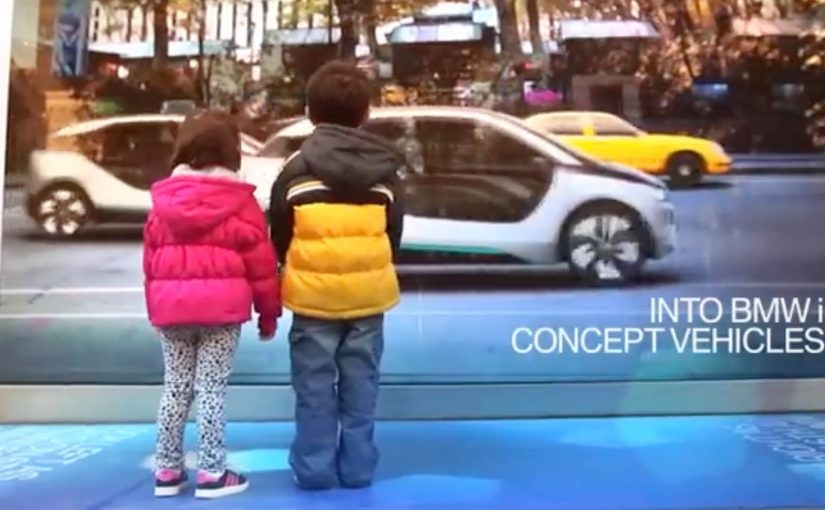
A street-level window in New York City behaves like a digital mirror. Here, “digital mirror” means a live street scene that can replace the cars in the image in real time. As traffic passes, the “reflection” transforms everyday cars into BMW i3 and i8 vehicles, giving passersby a glimpse into the near future.

The context. BMW i and “Born Electric”

The upcoming BMW i vehicles look distinctly futuristic and are positioned to arrive as early as late 2013. To build awareness for the BMW i Born Electric Tour in New York City, BMW reinforces a simple message. The future is closer than you think.

The real question is whether you can make a future-state product promise feel present without asking people to opt in.

This kind of work succeeds when the transformation is unmistakable from a distance and repeats for every passerby.

The execution. A live reflection that rewrites reality

BMW turns a window at the event location into a real-time “reflection” of passing traffic. The system captures what is happening on the street and swaps the vehicles in the live view for BMW i models, so the future feels present in the exact moment people walk by.

In public spaces, low-friction interactive experiences win when they are legible from a distance and require no download or instruction.

Why this works. Low friction, high surprise

The interaction requires no download, no instruction, and no commitment. It is immediate, legible from a distance, and designed for public curiosity. Because the swap happens in the same sightline people already have, surprise arrives before skepticism. The value is the reveal. A familiar street scene. Then a future version of that same scene.

Extractable takeaway: If you want people to believe “the future is close,” show the future inside a familiar frame, in real time, with one unmistakable before-and-after.

Make the promise feel present

  • Borrow a default behavior. Use a frame people already check, like a reflection or a window, so attention is automatic.
  • Make the change binary. One clear swap that anyone can spot, even in motion.
  • Let repetition do the work. Design it so the reveal happens again and again for new passersby, without setup.

A few fast answers before you act

What is BMW i Window Into the Near Future?

A street-level installation that turns a window into a live digital “reflection,” transforming passing traffic into BMW i3 and i8 vehicles.

What is it promoting?

Awareness for the BMW i Born Electric Tour in New York City, and the idea that the future is closer than you think.

What is the main user behavior?

Walk by, notice the window, and experience the surprise as the street scene is transformed in real time.

Why is the window format effective?

It uses a natural behavior, looking at reflections, then subverts it with a future-state overlay.

What is the transferable pattern?

Place the experience where attention already exists, then deliver one high-clarity transformation that makes the product promise tangible.

ASICS: Race Ryan Hall at Columbus Circle

ASICS wants to level up physical interaction with their brand. So around this year’s ING New York City Marathon, they built a 60-foot video wall in the Columbus Circle subway station and challenged passersby to race U.S. marathon runner Ryan Hall.

The wall plays life-sized footage of Hall running at marathon pace, turning a commute corridor into a short, sweaty benchmark. You do not “watch” the message. You try to keep up with it.

Why a race works better than a slogan

In high-traffic urban transit environments, the fastest way to make a performance claim believable is to let people feel it with their own body, not just read it. Most sports sponsorship visibility lives on banners and logos. This flips the value. It gives the audience a direct comparison: your pace versus elite pace. Because the wall sets an elite pace as a moving yardstick, that comparison makes the brand message tangible in seconds, and it creates a story people can retell immediately.

Extractable takeaway: If you need credibility fast, turn the claim into a simple physical test that anyone can try without setup.

The craft move: frictionless participation

No sign-up. No app download. No instruction manual. The interaction is instinctive. See runner. Run next to runner. That simplicity matters because subway audiences have short attention windows and low patience for setup.

What ASICS is really doing with this build

On the surface it is a fun stunt. Underneath it is a credibility transfer, meaning the elite standard makes the sponsor’s performance story feel earned when people experience the comparison firsthand. The real question is whether your brand promise holds up when people can compare themselves to an elite benchmark in public. This is a stronger sponsorship play than more logo visibility because it produces felt proof, not just awareness. By letting everyday runners test themselves against a real benchmark, ASICS positions itself closer to serious performance culture, not just event sponsorship.

Big-event activation moves to copy

  • Turn a claim into a test. If the audience can try it, they will believe it.
  • Make participation obvious. The interaction should be understood without reading instructions.
  • Place it where behavior already fits. A corridor invites motion. Use spaces that support the action.
  • Design for one-sentence retell. “I raced Ryan Hall in the subway” is the whole message.

A few fast answers before you act

What is the core mechanic of this activation?

A long-form video wall shows Ryan Hall running at marathon pace, inviting passersby to physically race alongside the footage.

Why does transit placement matter here?

Transit corridors create natural “run lanes” and constant foot traffic, so the activation gets high exposure and the behavior feels socially plausible.

What makes this more effective than a normal video billboard?

It turns viewers into participants. The message is experienced as effort and pace, not as information.

What is the biggest execution risk?

If the wall is hard to notice, the corridor is too crowded to move, or the interaction cues are unclear, people default back to walking and the idea collapses.

How would you measure success?

Dwell time, participation rate, repeat attempts, social sharing volume, and any lift in event-area brand consideration versus baseline sponsorship exposure.

Airwalk: The Invisible Pop-Up Store

GoldRun and Young & Rubicam have created what is billed as the world’s first invisible pop-up store. Here, “invisible” means the storefront is an AR layer that only appears on a phone at specific GPS coordinates.

Sneakerheads and skaters visit the virtual store at Washington Square Park in NYC and Venice Beach in LA. You show up, look through the phone, and the drop reveals itself.

A pop-up you cannot see until you are there

The mechanism is a location-based AR layer. The product is GPS-linked to specific places, so access is earned by presence, not by refreshing a webshop.

Instead of browsing shelves, people “capture” the virtual sneaker in the app and unlock a purchase path. The retail action is still commerce, but the pre-commerce moment is play.

In youth culture launches where scarcity and scene credibility matter, location-based drops create stronger heat than broad e-commerce blasts.

Why this lands with sneaker culture

This is not just novelty AR. It taps into three instincts that already exist in sneaker communities:

Extractable takeaway: When scarcity is the story, make the constraint experiential (where, when, who) so fans can earn access and retell the effort.

  • Scarcity: limited runs feel meaningful when access is constrained.
  • Proof of effort: being there becomes part of the story and the status.
  • Social retell: the experience is easy to describe and easy to show.

The “invisible store” framing also upgrades the idea from a promo to a cultural moment. It makes the drop feel like an event that happened, not a product that launched.

The business intent under the stunt

Airwalk gets a high-impact relaunch without paying for traditional retail real estate. The brand borrows the authenticity of parks and beaches, then turns those places into distribution.

The real question is whether you can make showing up part of the product value, not just the marketing.

That matters because it makes the product and the environment inseparable. The sneaker is not simply “for” skaters and surfers. It appears where they actually are.

Launch moves from geo-locked pop-ups

  • Make access physical, even if the product is bought digitally.
  • Turn scarcity into a mechanic, not a banner headline.
  • Design a one-sentence retell, for example “the store only exists at two spots.”
  • Pick locations that already signal the brand, so the setting does some of the messaging work.

A few fast answers before you act

What is an “invisible pop-up store” in practical terms?

It is a temporary retail experience that exists only through a phone interface at specific real-world coordinates. No physical store build is required.

What is the core mechanic that drives participation?

Geo-fenced discovery. People must travel to a location to reveal the product, then complete an action in-app to unlock purchase.

Why not just sell the shoes online normally?

Because the launch is the marketing. Turning purchase access into a hunt creates earned attention, social proof, and a stronger sense of drop culture than a standard checkout flow.

What are the biggest risks with this approach?

Friction and disappointment. If the experience is hard to access, unstable on devices, or feels unfair due to distance, enthusiasm flips quickly.

What should a brand measure to know if it worked?

Location visits, completion rate from “found” to purchase, time-to-sell-out, and the volume and quality of organic sharing that shows people proving they were there.