
Thalys: Sounds of the City

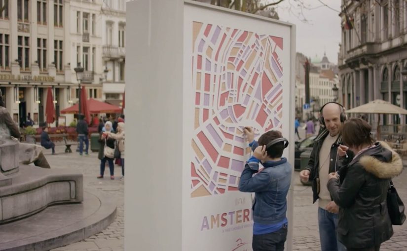
To encourage people to use the train to go and explore nearby cities, railway service Thalys creates three interactive billboards. Each billboard represents a city, and each is host to more than 1,000 unique sounds from that city.

Pedestrians who walk past these billboards are invited to plug in with their personal headphones and start exploring. So instead of using headphones to block out the city, they are made to use them to rediscover one.

When a billboard becomes a listening device

The mechanism is the whole point. A city map on a billboard doubles as an audio interface. Plug your headphones into different points and you unlock different sounds, turning a familiar out-of-home billboard format into a self-guided micro journey.

That matters because the interface makes exploration feel self-directed, which is why the destination becomes memorable before the trip starts.

In European high-speed rail travel, nearby cities compete on spontaneity and sensation as much as price or schedule.

Why it lands

This works because it flips a modern habit. Headphones usually remove you from your surroundings. Here they pull you into a destination you have not reached yet, using curiosity and discovery instead of discounts and slogans.

Extractable takeaway: If your audience already carries an interface, design the experience so their default behavior becomes your entry point. Then reward exploration with variety, so people keep trying “one more” interaction.

What Thalys is really selling

The real question is not how loudly you advertise a nearby city, but how quickly you make it feel explorable.

For travel brands, a sensory preview like this is stronger than another fare-led message.

The campaign sells proximity. You do not need a long promise about travel. You get a sensory preview that makes the next city feel close and personally explorable, even in the middle of your current one.

What travel marketers can lift from this

  • Turn passive media into a tool. If the unit does something, people approach it voluntarily.
  • Build a library, not a single message. 1,000+ sound fragments makes repeat interaction feel natural.
  • Use “rediscovery” as the hook. Familiar objects can become new experiences with one clever twist.
  • Let the audience choose the path. Interactivity creates viewer control and longer dwell time.

A few fast answers before you act

What is Thalys “Sounds of the City”?

It is a set of interactive billboards that let passersby plug in headphones and explore a city through a large library of location-specific sounds.

Why use sound instead of visuals?

Sound creates immersion fast and feels personal through headphones. It also differentiates travel advertising that usually relies on images.

What behavior does the idea exploit?

People already carry headphones and use them in public. The billboard redirects that habit from blocking out the world to exploring a destination.

What is the main metric to watch for OOH interactivity like this?

Dwell time, repeat interactions per person, and any measurable lift in intent or searches for the featured routes and cities.

How can another brand apply the pattern?

Identify a “portable interface” your audience already has, then design a physical touchpoint that turns exploration into the reward.

Pepsi Max: Unbelievable Bus Shelter

Pepsi Max for its new ‘Unbelievable’ campaign rigged an ordinary bus shelter in London, to perform tricks on unsuspecting travellers.

Using a custom see-through digital display, people waiting at the bus shelter were made to believe that they were actually seeing things like hovering alien ships, a loose tiger, a giant robot with laser beam eyes and so on.

The reactions to these ‘unbelievable’ scenarios were then captured and put in the below viral video.

Why this works. Even before you talk about “tech”

The technology is impressive, but the mechanic is simple. Here, “mechanic” means the repeatable audience interaction pattern, not the underlying tech. It takes an everyday moment. It inserts a believable layer of impossible. Then it lets people do the rest. React, laugh, point, film, share. Because the impossible is framed inside a familiar “window”, disbelief lands fast and reactions become the content. In high-footfall urban out-of-home environments, a brand moment has to work wordlessly, in seconds, for strangers who did not opt in.

Extractable takeaway: If you can turn passive waiting time into a personally witnessed story, you get emotion, proof and distribution before you spend on media.

That is the real move. It transforms passive waiting time into a story that feels personally witnessed.

The bus shelter as a “media product”

This activation treats the bus shelter like a product interface, not just a placement. It has inputs and outputs. Here, “activation” means a physical installation that creates a live brand experience in public space.

  • Input. People arrive with low expectations and spare attention.
  • System. A “window” that looks like reality, then breaks it in a controlled way.
  • Output. Instant emotion, social proof from nearby strangers, and a camera-ready moment.

In other words, it is not only out-of-home. It is an experience designed to be recorded and re-distributed.

The real question is whether your experience turns bystanders into witnesses, and witnesses into voluntary distribution.

What makes it shareable. And why the video is the second product

The live moment is the first product. The viral video is the second product. The second product extends the reach far beyond the street corner.

Tech is optional. If the premise is not instantly legible, it will not travel.

  • High signal in seconds. You understand what is happening instantly.
  • Escalation. Each new “unbelievable” scene raises the stakes and keeps attention.
  • Human faces. The reactions are the content. The brand stays present but not intrusive.
  • Social permission. If others are reacting, you react too. Then you share.

What to take from this if you build brand experiences

  • Design the moment first. The best “viral videos” start as real-world moments people want to show others.
  • Keep the premise instantly legible. If it needs explanation, it loses momentum.
  • Make capture a feature. If people will film it, stage it so the footage works.
  • Build a repeatable format. One idea, multiple scenarios, consistent payoff.
  • Let the audience star. The most believable proof is human reaction, not brand claims.

A few fast answers before you act

What is Pepsi Max “Unbelievable” in one sentence?

It is a London bus shelter activation that used a see-through digital display to create impossible scenes, then turned real public reactions into a viral video.

Is this augmented reality?

It functions like augmented reality for the audience, because it overlays illusions onto what looks like a real street view, even though the experience is delivered through a physical digital screen.

Why do people share this kind of content?

Because it triggers instant emotion and disbelief, and it is easy to explain visually. People share it to pass on the surprise.

What is the key design principle behind the activation?

Make the better story happen in the real world. Then make it easy for the story to travel as video.

What is the practical takeaway for marketers?

When you create a moment that people genuinely want to record, distribution becomes an outcome of the experience, not a separate media plan.

Plan: The Erasable Billboard for Girls’ Education

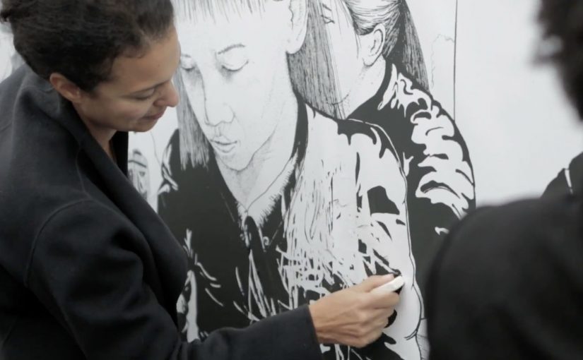
A large illustrated billboard appears in a busy city square. People donate, receive a simple eraser, and start rubbing away the artwork. As the top layer disappears, a second illustration is revealed underneath, shifting the story from girls working to girls going to school.

Plan has reported that tens of millions of girls worldwide are pushed into work instead of education, while in many less privileged countries boys are more likely to get access to schooling. To spark action, Plan and CLM BBDO created an erasable billboard with an illustration designed to be removed to reveal another illustration underneath. The billboard ran in central locations in Paris and Berlin. Passers-by were invited to donate in exchange for an eraser, then use it to change what the billboard showed.

Why the “erasable” mechanic is so strong

The mechanism does two jobs at once. It raises money, and it makes the issue understandable without explanation. The before-and-after is literal. Work disappears. School appears. The donor is not only informed. The donor performs the change. Cause-led campaigns should treat participation as the message, not a bonus layer.

Extractable takeaway: When the donor completes the transformation with their hands, the message becomes a memory and the donation feels consequential.

Definition-tightening: the eraser is not a gimmick. It is the interface, meaning the simple physical tool that gives the donor viewer control over the story. Because the act of erasing creates ownership, it makes someone more likely to donate, talk about it, and remember it.

In social-impact fundraising, participatory outdoor media can turn a small donation into a visible act of change that people feel in their hands.

The real question is whether your donation ask feels like participation or just passive sympathy.

What Plan is really buying

This is a public proof of participation. Instead of asking people to “care” in private, it makes caring visible, social, and shared. Every person who erases becomes a live endorsement that the issue matters enough to stop and act.

Steal this pattern: make giving tactile

  • Make the transformation physical. A tangible before-and-after beats a poster full of statistics.
  • Use the donation as the trigger. The action should only unlock after contribution, not before it.
  • Let participation create the content. The billboard changes because people change it.
  • Design for bystanders. Watching others erase is part of the persuasion.

A few fast answers before you act

What is the “Erasable Billboard” idea?

An illustrated billboard designed to be physically erased. Donors receive an eraser and reveal a second image underneath, shifting the story from girls working to girls going to school.

Why exchange a donation for an eraser?

Because it turns giving into an action. The eraser is a simple reward, but more importantly it is the tool that lets the donor create the transformation themselves.

What makes this more effective than a standard charity billboard?

It is participatory and observable. The public sees the billboard changing in real time, which builds social proof and makes the issue easier to grasp.

What is the main emotional lever?

Viewer control. The donor does not only learn about the problem. The donor performs a symbolic solution in front of others.

What is the biggest execution risk?

If the transformation is not instantly readable, people will not engage. The before-and-after needs to be obvious from a distance and satisfying up close.