ibis: Sleep Art Paints Your Night

ibis: Sleep Art Paints Your Night

You fall asleep in an ibis room. While you’re out, a robot “wakes up” and turns your night into an abstract painting. By morning, you have sleep captured as a physical artifact, not a vague promise.

How Sleep Art works

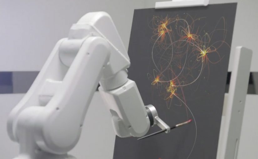
The setup is simple in concept and slightly mad in execution. A mattress fitted with sensors captures signals like movement, temperature and sound. Those inputs are translated into brush strokes, and a robot paints them onto a canvas live through the night.

In European hospitality marketing, making an invisible benefit like “better sleep” visible and shareable can create disproportionate talk value for an economy brand.

The real question is whether a hotel brand can turn a private, hard-to-prove benefit into something people notice, remember, and share.

Where it shows up

The Sleep Art experience is positioned as available in European capitals including Paris, London and Berlin. Brand materials for the same operation also describe a Warsaw stop as part of the run.

Why this lands

This hits because it turns a universal, private activity into something you can see, keep, and show. It also gives ibis a distinctive proof object for its sleep story. By proof object, I mean a tangible output, like a canvas or shareable visual, that makes the benefit visible without extra explanation.

Extractable takeaway: If your core benefit is hard to perceive in the moment, translate it into a concrete output people can take home, screenshot, or share, so the benefit becomes demonstrable without extra explanation.

What the brand is really doing

Sleep Art is a product promise made legible. It frames “happy sleep” as both experience design (the room, the bed, the ritual) and content creation (the artwork), so the campaign functions as acquisition, PR, and brand repositioning at the same time.

How to make invisible benefits visible

  • Make the benefit visible. Convert an intangible promise into an artifact people can show.
  • Instrument the experience. Sensors are not the headline. The output is.
  • Design the morning-after moment. The reveal is where the story becomes tellable.
  • Scale with a lighter digital version. A physical installation creates the myth. A simple app extends reach.

A few fast answers before you act

What is ibis Sleep Art?

It’s a branded experience that converts sleep signals into abstract art, originally via a sensor-equipped bed feeding a robot that paints a canvas during the night.

What data does it use?

Signals such as movement, temperature and sound from sensors in the sleep setup, translated into visual patterns and brush strokes.

Why put a robot in the story at all?

The robot makes the transformation feel physical and “real,” which increases memorability and gives the brand a strong visual for PR and sharing.

How do people participate?

Through a registration mechanic routed via the ibis Facebook presence, positioning it as a limited, win-an-experience style activation.

What makes this a strong hospitality campaign pattern?

It turns a differentiator that’s hard to prove quickly, sleep quality, into a visible output that can travel beyond the hotel stay.

Fridge Magnets: Pizza Button and Smart Drop

Fridge Magnets: Pizza Button and Smart Drop

Who says plain fridge magnets cannot be reinvented? Here are two brands who do exactly that, and in the process also enhance the brand experience with their consumers.

VIP Fridge Magnet

Red Tomato Pizza in Dubai take their loyal pizza patrons very seriously. So they created the “Pizza Emergency Button”, a fridge magnet with a difference. Each button has a loyal pizza patron’s favorite pizza programmed into its memory. When hungry, all the loyal patron needs to do is flip the pizza box lid on the magnet and press the pizza button inside.

Wifi Water Magnet

Evian in Paris created a simple fridge magnet that allows owners to order water and request a particular delivery time directly from their fridge.

The “Smart Drop” magnet is made up of a microcontroller, LED screen, a wireless chip, battery and an inbuilt HTML5 app that does all the work.

The mechanic: turn the fridge door into a service interface

Both executions take a boring surface and give it a single, high-frequency job. One turns repeat ordering into a one-press ritual. The other turns replenishment into a quick scheduling choice, without opening a laptop or digging for an app.

In connected-home style experiences, the winning pattern is not “more features”. It is fewer steps placed exactly where the habit already happens.

Here, “connected-home” means a branded shortcut embedded in an existing household habit, not a full smart-home platform.

Why this lands

These magnets win because they reduce effort at the moment of desire. Hunger and “we’re out of water” are not times when people want menus, logins, or long flows. A physical button and a tiny display on the fridge convert a decision into a reflex.

Extractable takeaway: If the customer action repeats weekly, design the interface around speed and placement first, and only then worry about adding options.

What the brands are really buying

Red Tomato turns loyalty into a tangible perk that feels exclusive and personal. Evian turns replenishment into an owned service moment, and makes delivery feel like part of the product, not a separate chore.

The real question is whether the brand can earn a permanent shortcut into a repeat household behavior.

What to steal for repeat-order design

  • Anchor the interaction to the habit location. Put the “button” where the decision already happens.
  • Make the primary action one-step. If it needs instructions, it is not a fridge magnet anymore.
  • Personalize the default. Pre-selecting “my usual” removes choice friction and makes the experience feel made for me.
  • Show just enough state. A tiny display that confirms quantity and timing often beats a full app for repeat tasks.

A few fast answers before you act

What makes these magnets more than gimmicks?

They replace a recurring micro-task with a faster interface placed at the point of need. The form factor is the strategy, not decoration.

When does a physical button beat an app?

When the action is frequent, low-consideration, and time-sensitive. In those cases, speed and placement outperform feature depth.

Why does placement matter so much here?

Because the fridge is where need becomes action. Putting the interface there removes recall and navigation steps that usually interrupt repeat behavior.

What is the transferable principle for digital teams?

Design around the moment of intent. If you can remove steps at that moment, you usually get higher repeat usage than by adding more functionality.

What is the biggest risk with this pattern?

Over-engineering. If the device needs setup, troubleshooting, or too many choices, the friction cancels out the convenience.

Flashmob Marketing Hits: April 2012

Flashmob Marketing Hits: April 2012

A big red push button sits in a quiet Flemish square. A sign says “Push to add drama”. Someone presses it, and the street turns into a live TV scene.

Flashmob marketing has been quite a fad in the last weeks. If you are unfamiliar with the concept, a flashmob is a large group of people who assemble suddenly in a public place, perform an unusual and pointless act for a brief time and then disperse. The whole act is normally recorded on video and then put on the web to generate more buzz.

Flash mobs can convert physical spectacle into shareable media without buying every impression. Here, “earned attention” means reach generated by people choosing to watch and share, rather than by paid placement.

Three street moments worth watching again

Daily dose of drama

To launch their new digital channel in Belgium, TNT placed a big red push button in a quiet Flemish square. A sign with the text “Push to add drama” invited people to use the button. And then the “ordinary day” collapses into staged chaos.

Why it lands: the invitation is frictionless, the payoff is immediate, and the viewer at home gets the same shock that the passer-by gets on the street.

The worst breath in the world

Tic Tac turns a simple “can you help me with directions” moment into social dread. A lost tourist asks for help in a busy square. Then, one person after another reacts as if the breath is so bad it triggers an apocalyptic chain reaction.

Why it lands: it weaponizes a universal fear, then exaggerates it so far that embarrassment becomes comedy. The crowd reaction becomes the story.

The Wouaaah Effect

For its Q10 Plus product, NIVEA in France creates a playful attention ambush on the streets of Paris. An unsuspecting woman tries a cream sample, walks on, and is suddenly met by a sequence of people lavishing her with attention.

Why it lands: it makes a product promise feel physical. The benefit is not “told”. It is acted out as a mini social fantasy.

Why the pattern behind the fad travels

The mechanism is simple. Create a one-line invitation, trigger a public spectacle, and film genuine reactions from the “mark” (the unsuspecting participant who triggers the stunt) and the bystanders. The distribution is the video, not the street corner. The street corner is the credibility engine because the live setting makes the reactions feel real, which makes the clip easier to share.

Extractable takeaway: If the trigger is simple and the payoff is instantly legible, real human reactions carry the persuasion when the video leaves the street.

In European consumer marketing teams trying to earn reach through social sharing, the street is only the proof point, not the media plan.

The real question is whether your spectacle earns a story people want to retell, or just a clip they scroll past.

What the brands are buying

These are not careful, message-heavy campaigns. They are attention accelerators. Flash mob-style stunts are worth doing only when the payoff embodies a brand promise you can show through human reactions. The business intent is to earn reach through surprise and shareability, then let the brand borrow the emotional afterglow of the moment.

How to steal the good parts without copying the gimmick

  • Start with a legible trigger. One button. One question. One sampling moment.
  • Design the escalation curve. The first five seconds decide if people stay for the next thirty.
  • Make reactions the hero. The crowd is your proof and your punchline.
  • Give the video a clean “retell”. If the concept cannot be explained in one sentence, it will not travel fast.

A few fast answers before you act

What qualifies as a flash mob in marketing terms?

A staged public action that appears spontaneous to bystanders, is filmed for real reactions, and is distributed primarily as a video asset to generate buzz.

Why do flash mob videos spread more than many traditional ads?

They feel like captured reality. The viewer gets surprise, spectacle, and social proof in the same clip, which makes sharing feel like passing on entertainment, not advertising.

What is the biggest creative risk with flash mob marketing?

People can read it as forced or manipulative. If the trigger feels like a trick, the audience turns on it and the brand takes the hit.

How do you keep a flash mob idea brand-relevant?

Make the payoff embody the brand promise. Drama for a drama channel, breath anxiety for mints, and attention for a beauty benefit are all direct translations.

What is the practical “steal” for marketers who cannot stage a street stunt?

Borrow the structure. A simple trigger, a clear escalation, and authentic human reactions, then build it for a format that you can execute safely and repeatedly.