Samsung: Unleash Your Fingers

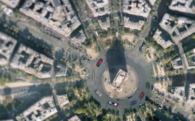
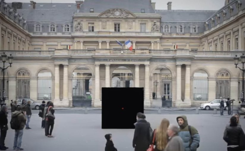
For the launch of the Galaxy S II in France, Samsung brought JayFunk, the internet finger tutting phenomenon, from Los Angeles to Paris to deliver an incredible and surprising choreography.

When “touch” becomes performance

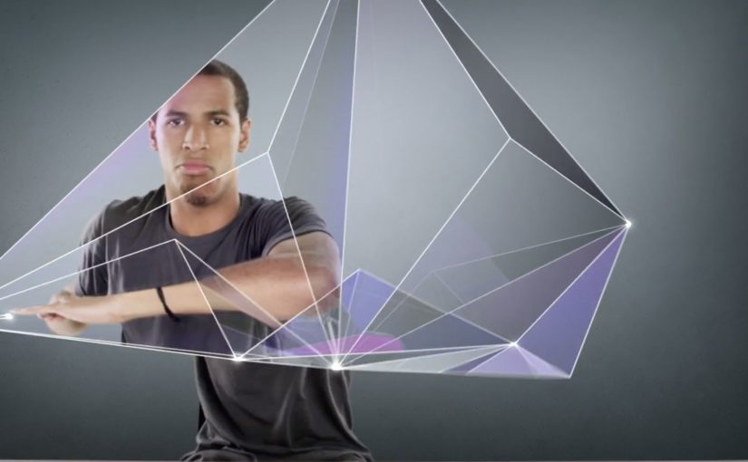
Finger tutting is a style of dance where intricate shapes and geometric figures are created using hands and arms. Samsung frames that craft as the purest expression of what a touch device asks of you. Your fingers become the headline.

The mechanic is the metaphor

The film does one clear thing. It takes a niche skill. It stages it like a reveal. It lets the choreography do the talking, then uses visual treatment to make the hands feel almost “interface-like”. The message is implicit. This is a phone built for what your fingers can do.

In consumer electronics launches, the fastest route to preference is often a single metaphor that makes a feature feel obvious without listing specifications.

Why it lands

This works because it respects attention. There is no explanation tax, no product demo checklist, and no forced storyline. It is a short, repeatable spectacle that makes “touch” feel expressive, not functional. Because the performance externalizes touch as a visible skill, the product promise becomes intuitive before the viewer processes a single specification. Samsung’s own newsroom later described the video as quickly climbing viral charts and reaching millions of views at the time, which fits the format. It is built to be replayed and forwarded.

Extractable takeaway: When your product benefit is hard to visualize, borrow a human craft that embodies it, then let the craft carry the proof while the brand stays in the background.

What Samsung is really signalling

The brand is not only selling a handset. It is staking a position in culture. Touchscreens are not just input. They are a playground. Casting a specialist performer signals modernity, precision, and mastery, all without ever saying those words.

The real question is how to make touch feel culturally meaningful before anyone asks about specifications.

What launch teams can take from this

  • Lead with a single, watchable skill. Spectacle beats explanation when the benefit is sensory.
  • Make the metaphor tight. Fingers, touch, gestures. Everything points to one idea.
  • Keep product presence restrained. Let the audience connect the dots. It feels smarter and travels better.
  • Design for replay. Short, surprising sequences outperform long narratives for launch buzz.
  • Use culture as targeting. A niche community can become your amplification engine if you treat it with respect.

A few fast answers before you act

What is the main idea behind “Unleash Your Fingers”?

Turn touch interaction into a cultural performance, so the phone’s core benefit is felt rather than explained.

Why use finger tutting instead of a normal product demo?

Because it externalizes “dexterity on glass” in a way people can immediately understand and want to share.

What should a brand be careful about with a performance-led launch film?

Do not let the performance become disconnected from the product. The metaphor must stay legible, and the brand role must feel earned.

How could a non-tech brand apply the same approach?

Pick a human craft that embodies your promise, then film it so the craft proves the point without heavy narration or feature lists.

What is a practical success metric for work like this?

Beyond views, look for lift in branded search, share rate, completion rate, and recall of the single idea the film is built around.

Google Maps Racing Advergame

Mini France has managed to successfully offer a virtual Mini experience with the help of a Social/Google Maps mash-up advergame called “Mini Maps”. Here, advergame means a branded game that turns the marketing idea into the experience itself.

With DDB Paris and Unit9 they created a Facebook app that lets you customize a virtual Mini and then challenge Facebook friends to time trials around the world through Google Maps. In the challenge you are racing your friends over satellite images of your favorite locations around the world!

Why this works

  • The idea is instantly graspable. Customize your Mini. Pick a place. Race the clock. Challenge friends.
  • Google Maps is not a backdrop. The satellite layer becomes the playable surface, which makes every track feel personal.
  • Social competition is built in. Time trials make it easy to compare performance without complex multiplayer setup.

In interactive brand marketing, the scalable advantage comes when a familiar platform becomes part of the mechanic, not just part of the media plan.

What this signals for interactive brand experiences

The real question is not whether a brand can borrow a popular platform, but whether the platform becomes the mechanic that makes the brand memorable. The strongest move here is that Google Maps is not a skin around the idea. It is the idea in use. That matters because location becomes the hook, customization becomes the commitment step, and friendly competition becomes the retention loop, meaning the simple reason people come back and play again. This gives the brand repeat interaction instead of one-time exposure.

Extractable takeaway: When the platform supplies the play mechanic, the brand experience feels more native, more personal, and easier to revisit with friends.

What to steal for map-based social games

  • Use real places as the content. When the track is a familiar location, the hook is instant and personal.
  • Make competition the retention loop. Time trials against friends give players a reason to come back and improve.
  • Keep customization lightweight but expressive. A few visible choices are enough for ownership without slowing play.
  • Build the platform into the mechanic. If Google Maps is the story, the experience should demonstrate it, not just reference it.

A few fast answers before you act

What is “Mini Maps”?

“Mini Maps” is a Facebook advergame for Mini France that combines social sharing with Google Maps to create location-based time trial races.

What does the viewer actually do?

You customize a virtual Mini and then challenge Facebook friends to time trials across Google Maps locations, racing over satellite imagery.

Why is Google Maps central to the experience?

Because it provides the world itself. The satellite view turns real places into tracks, which makes the challenge feel more personal and replayable.

What is the reusable pattern here?

Start with a concrete action, move to a simple challenge mechanic, then let social competition drive repeated return visits.

What should brands copy from this model?

Use a platform feature as the core mechanic, keep the player action simple, and add a lightweight social challenge that gives people a reason to come back.

The Escape Service: Press the red button

DDB Paris creates a new service for the French rail booking site Voyages-sncf.com. “The Escape Service” lets people escape to any destination they want by simply pushing a magical red button.

Together with the French collective Pleix, they design three celebrations that emerge from a 3×3 meter black box that unfolds like a giant jack-in-the-box. In Paris, the cube lures passers-by in, asks where they want to go, then bursts into a destination-themed surprise and hands out a mock ticket for the chosen trip.

The film also ends by inviting viewers to press the button themselves and experience a first-person view version of the Escape Service. That first-person view version is a POV cut where the camera takes your place at the button.

A black box that behaves like a travel shortcut

The mechanism is deliberately minimal. There is one obvious choice, press the red button. The payoff is oversized, because the box transforms into a celebration that makes “go anywhere” feel real without explaining routes, prices, or schedules.

In European rail and travel marketing, turning an abstract promise like “escape” into a public, physical moment helps people imagine the journey instantly.

Why the red button is the real interface

The button turns travel intent into an action you can perform in one second. That matters because it removes hesitation. You do not need to “plan” to participate. You only need curiosity, and the street does the rest.

Extractable takeaway: When your promise is intangible, make the first step a one-second action that people can try without planning, then let the payoff do the explaining.

What the campaign is really proving for Voyages-sncf.com

This is not about a single destination. It is about choice and immediacy. The idea says: if you can decide on the spot, you can book on the spot. The mock ticket detail pushes the story from spectacle into something you can take away and show.

The real question is whether your service promise can be compressed into one action people will try without needing more information.

This kind of one-action interface is worth copying when you need to turn curiosity into intent fast.

Moves to borrow from the red-button mechanic

  • Reduce the interaction to one decision. One button is better than a menu when you need street participation.
  • Make the reward visible to bystanders. If spectators can understand the payoff, the crowd recruits the next person.
  • Personalize the outcome fast. A destination choice and a ticket-like takeaway make the moment feel “mine”.
  • Bridge offline to online without forcing it. A first-person online version extends reach without changing the story.

A few fast answers before you act

What is “The Escape Service” for Voyages-sncf.com?

It is a public pop-up experience where a black box invites people to press a red button, choose a destination, and trigger a surprise celebration that dramatizes the idea of escaping by train.

Why use a red button and a box?

Because it is self-explanatory. A single button removes friction and creates a clear before-and-after moment that people remember and film.

What makes this more than a stunt?

The mechanic maps cleanly to the service promise: pick a destination and go. The mock ticket detail turns the experience into a personal travel intent, not only entertainment.

How does this support online booking?

It makes “decide and book” feel effortless. The film’s first-person online extension reinforces that the same impulse can continue digitally.

What is the transferable lesson for service marketing?

When your product is intangible, build a physical interface that compresses the benefit into one action and one memorable payoff.