Tele2: Giant Phone

Tele2 is launching a new offer that sounds technical on paper. Fixed telephony delivered through the mobile network. In plain terms, that means a home-phone style service carried over the mobile network instead of a traditional fixed line. The fastest way to make that believable is to let people use it like a normal landline.

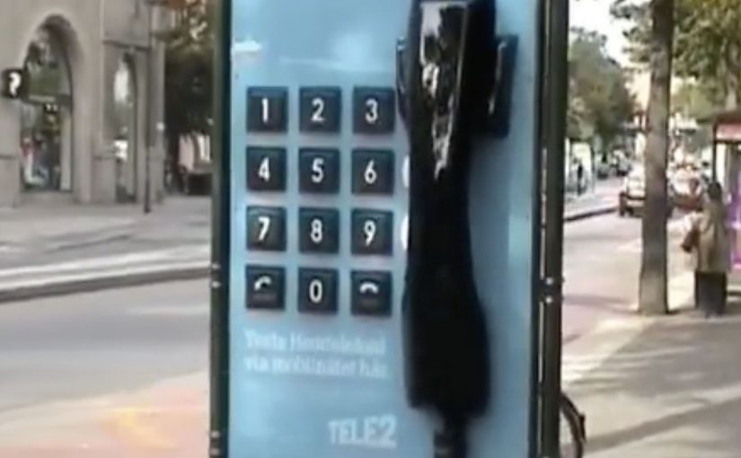
So Forsman & Bodenfors builds giant, working phones in Sweden’s three biggest cities. Passersby can pick up the handset and call whoever they want for free, whether that is a friend, a taxi, or the first number that comes to mind.

To keep the street theatre alive, Tele2 occasionally calls the giant phones. Whoever answers at that moment wins a prize.

The giant-phone mechanic

The mechanic is a physical demo of a simple promise. A “home phone” style service that rides the mobile network behaves exactly like the thing people already understand: pick up, dial, talk. The oversized installation does two jobs at once. It acts as out-of-home media you cannot ignore, and it removes friction by turning product education into a one-step trial.

In technical product launches, the most reliable shortcut to trust is an immediate, public, hands-on trial that converts jargon into a familiar behavior.

Why the simplicity message sticks

This works because the audience does not have to believe a claim. They verify it themselves in seconds. The scale makes it socially safe to participate, because the act of “trying it” is also the entertainment. The prize-call twist adds intermittent reward, which keeps attention and creates a reason to stay nearby a little longer.

Extractable takeaway: When your value proposition is hard to explain, design a live interaction where the user completes the core promise in one obvious action, then let the environment do the storytelling.

What Tele2 is really selling

The obvious message is “it’s easy.” The real question is whether the new delivery model feels familiar enough to trust. The deeper message is “it’s close enough to the old thing that switching feels low-risk.” The activation reframes a potentially abstract network feature as continuity: you still have a phone experience, just delivered differently.

Launch lessons from the giant-phone demo

  • Prototype the promise. Build a demo that behaves like the old habit, even if the technology underneath is new.
  • Make the demo the media. If the unit cannot be ignored, you buy awareness and comprehension with the same spend.
  • Keep participation effortless. “Pick up and call” beats any explanation panel.
  • Add a timed trigger. A random callback, reward, or live moment gives people a reason to linger and talk about it.

A few fast answers before you act

What was Tele2 trying to prove with the giant phones?

That its fixed-telephony offer delivered over the mobile network feels as straightforward as a traditional landline. You pick up a handset, dial, and it works.

Why use giant phones instead of a standard street team?

The scale creates instant attention and makes the demo impossible to miss. It also turns the product trial into a public spectacle that others notice and join.

What makes this an effective “technical product” launch pattern?

It replaces explanations with verification. A user experiences the core benefit directly, which reduces skepticism and increases recall.

How does the prize-call element help the concept?

It creates anticipation and a reason to stay engaged, while adding a simple narrative hook people can repeat to others.

Where does this approach work best today?

Any launch where the promise is “this new infrastructure behaves like the old familiar thing,” such as networks, payments, or connected services that need trust before adoption.

3D Holograms: Two Marketing-World Examples

3D holograms are a great way to attract and engage consumers. Here, “3D holograms” refers to hologram-style displays that use animation to create a depth illusion in a physical setting. They can be quite effective if your brand is having trouble getting noticed or if your product’s capabilities can best be described using images and animation.

Though brands find it daunting to venture into this, there are still some brands out there bold enough to try it. Here are some nice examples.

Why holograms can cut through

The strength of a hologram-style display is that it behaves like moving product theater. Because it behaves like moving product theater, it can stop people mid-walk, and it can compress a lot of “show, do not tell” explanation into a few seconds. In retail aisles and brand events, it competes against the surrounding noise, not against other media placements.

Extractable takeaway: Use depth and motion only when they reduce explanation time or make the core action instantly legible. If depth is not doing work, you are paying for novelty.

The real question is whether motion plus depth makes the story easier to grasp than a flat screen or static print. When the answer is yes, the format can earn attention fast.

Coca Cola In-Store Display

This example shows how a hologram-style display can work as an in-store attention magnet. The content is pure visual storytelling, which makes it easy to understand at a glance and easy to remember later.

Samsung Jet Launch

At launches, holograms can do a different job. They help dramatize product capability and create a sense of spectacle that standard stage content often struggles to match. That spectacle then becomes a shareable proof that something “big” happened.

What to steal if you are considering holograms

  • Pick one message that benefits from depth. If depth is not doing work, you are paying for novelty.
  • Design for walk-by comprehension. People should get it in under three seconds.
  • Keep the loop tight. Short, repeatable sequences beat long narratives in retail and event contexts.
  • Make the hero action visible. If the product feature is the star, animate that feature, not abstract brand graphics.

A few fast answers before you act

When do 3D hologram displays make sense for marketing?

When you need fast attention in a physical space, or when animation plus perceived depth explains the product better than flat media.

What is the main advantage over a normal screen?

Presence. The illusion of depth makes the content feel more like an object in the space, which can increase stop power and recall.

What is the biggest execution risk?

Paying for the format without a story that needs it. If the creative is not designed around depth and motion, the result feels like expensive wallpaper.

How should success be measured?

Dwell time, footfall impact near the unit, assisted recall, and any downstream action that matters to your context, like store inquiry, trial, or social amplification.

What is a practical way to keep cost under control?

Start with one hero unit and a short content loop, then scale only if you can prove incremental attention and understanding versus simpler formats.

Nike: Trackball for CTR360

When Nike launched the CTR360 football boot in Singapore, they wanted something that could deliver the revolutionary features that make this product the ultimate in ball control.

So an interactive in-store experience was created where ball control and product knowledge of the Nike CTR360 was both seamless and seductive.

The real question is how to make a ball-control claim feel true within a few seconds of interaction.

For performance products, the best retail education is interaction, not explanation.

Why this retail execution works

The strongest part is that it does not separate “demo” from “education”. The interaction itself becomes the explanation. You learn by doing, and that is exactly how a ball-control product should be introduced. In performance-footwear retail, shoppers believe what they can trigger themselves without instructions. Here, “the mechanic” is the single interaction pattern that carries both the demo and the message.

Extractable takeaway: When a benefit is about control, design one self-explanatory action that proves control before you explain anything else.

  • Product truth in the mechanic. Control is demonstrated through controlled interaction, not described in copy.
  • Low friction discovery. Visitors do not need instructions to begin. The interface invites experimentation.
  • Retail as experience, not shelving. The store becomes the medium that proves the claim.

What to take from it

If your product benefit is physical or performance-based, build a retail moment that lets people feel the promise quickly. The goal is not to show every feature. It is to create one memorable proof point that makes the product easier to believe and easier to talk about.

  • Pick one proof point. Let people feel the promise quickly, instead of trying to cover every feature.
  • Make the start frictionless. Invite experimentation without needing staff to interpret what to do.
  • Design for retellability. Create a moment people can describe right after they try it.

A few fast answers before you act

What did Nike do for the CTR360 launch in Singapore?

Nike created an interactive in-store experience that demonstrated ball control while also communicating CTR360 product features through the interaction itself.

Why pair product education with interaction?

Because performance products are understood faster through demonstration than explanation. The experience makes the benefit tangible.

What is the core pattern behind this kind of retail activation?

Translate the product promise into a simple, inviting interaction. Then let that interaction deliver both the “wow” and the learning.

How do you know if an in-store experience is doing its job?

If a visitor can explain the product benefit immediately after trying it, without needing staff to interpret it, the design is working.