Coca-Cola: Give a Coke, Be Santa

A vending machine that asked you to choose who you are

The strongest holiday ideas turn seasonal sentiment into a simple action people can take in public. Coca-Cola’s holiday vending machine is a clean example of that move.

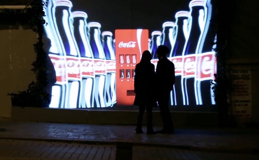
Coca-Cola wanted to bring out the Santa in everyone. So for the 2013 holiday season, they created a special vending machine that prompted users to either get a free Coke or give a free Coke.

The two-button mechanic that made sharing the story

If the user chose a free Coke, the machine quickly dispensed the drink for the user to enjoy.

However, if the user decided to share, then the machine did something a little more special. Watch the video below to find out.

In high-traffic FMCG retail settings, a binary choice lets a brand value show up as behavior in seconds.

Why “give” feels better than “get” in December

The psychology here is straightforward. A free product is nice, but it is forgettable. A choice that reflects identity is sticky.

Extractable takeaway: If you want a value like generosity to travel, put it into a visible choice where the “better self” option is easy to pick and easy to witness.

By putting “give” and “get” side by side, the machine turns a small decision into a moment of self-image and social proof, meaning other people can see the choice and validate it. During the holidays, people want to see themselves as generous, and they want to be seen that way by others.

The business intent behind bringing out the Santa

The intent is not simply distribution.

The real question is whether your brand promise can be expressed as a choice people are proud to make in public.

This is a stronger holiday move than a message-only campaign because it makes the value legible and repeatable at the point of interaction.

Coca-Cola uses the vending machine to translate a brand promise into behavior. The brand is associated with warmth and sharing because the consumer enacts it, not because the brand claims it.

How to reuse this give-or-get choice design

  • Turn values into a choice. Make the brand idea something people can do, not just hear.
  • Reward the “better” behavior. If sharing is the story, make sharing the more memorable path.
  • Keep the interaction instantly legible. Two clear options beat complex instructions in public spaces.
  • Design for a public moment. When others can witness the decision, the story travels faster.

A few fast answers before you act

What did Coca-Cola build for the 2013 holiday season?

A special vending machine that offered users a choice: take a free Coke or give a free Coke.

What was the core mechanism?

A simple two-option prompt. Choosing “get” dispensed a Coke immediately. Choosing “give” triggered a more special outcome.

Why does the “give” option matter so much?

Because it turns a freebie into an identity moment. People remember what they chose, and others can witness it.

What business goal did this support?

Making Coca-Cola’s holiday positioning feel real by linking the brand to a visible act of sharing, not just a message about sharing.

What is the main takeaway for brands?

If you want to own a value like generosity, design an interaction where people can demonstrate that value in the moment.

Coca-Cola Turkey: Invisible Vending Machine

Since the time I started writing this blog, I have come across many innovative vending machines. Some I featured right here on Ramble.

Now to add to this collection, here is an invisible vending machine from Coca-Cola Turkey that becomes visible only when couples walk by. The machine was created specially for Valentine’s Day (last week) and was installed in Istanbul to spread happiness Coca-Cola style.

A vending machine you cannot see until the right moment

The trick is the reveal. What looks like a normal stretch of wall becomes a vending interface only when two people approach together. That instant transformation creates a micro-scene, and the micro-scene pulls in everyone nearby.

In consumer brand activations, public installations work best when the interaction is obvious, fast, and shareable without instruction.

How the interaction is described to play out

  • Invisible by default. The unit blends into the wall and does not present itself as a machine.
  • Couples trigger the reveal. When two people pass together, the interface lights up and becomes visible.
  • Personal moment, not just a dispense. In coverage at the time, the machine asks for names and then produces two personalised cans.

Why it lands

This is not “another vending machine story”. It is a street-level surprise that creates a small, romantic spotlight for a couple, and a quick bit of theatre for everyone else. The invisibility is not a gimmick. It is a pacing device that makes the reveal feel like a reward. The real question is whether the experience creates a transformation that bystanders can explain in one sentence.

Extractable takeaway: If you want people to stop, watch, and retell an activation, build a visible transformation into the experience. A before-and-after moment is easier to share than a static stunt.

What Coca-Cola gets out of the Valentine framing

Valentine’s Day provides the social permission for public sweetness, names, and sentiment. For the brand, it is a clean link back to togetherness and “sharing happiness”, while turning a sample into a story people can repeat without being prompted.

Retail theatre patterns worth borrowing

By “retail theatre” I mean designing a retail moment as a small piece of live, shareable experience, not just a dispense or transaction.

  • Hide the interface until it matters. Visibility can be part of the reward, not just a prerequisite.
  • Keep the trigger legible. People should understand why it happened in one glance, or they will not mimic it.
  • Design for bystanders. The couple is the participant. The crowd is the media channel.
  • Personalise lightly. Names, messages, or small custom outputs feel intimate without needing heavy data.

A few fast answers before you act

What is the “invisible vending machine” concept?

A vending machine that stays hidden until a couple approaches, then reveals itself and delivers a Valentine-themed Coca-Cola moment.

Why make the machine “invisible” at all?

It creates a sharp reveal, and that reveal is the shareable payload. People remember transformations more than static installations.

What is the simplest way to replicate the effect?

Use a clear proximity trigger plus lighting and screen content that turns on instantly, and ensure the “why it appeared” is immediately understandable.

What is the biggest execution risk?

If the trigger is inconsistent or unclear, people will not repeat the behaviour and the crowd will not form. Reliability matters more than complexity.

What should you measure beyond views?

Dwell time, participation rate per hour, bystander clustering, social mentions generated on site, and any lift in nearby sales during the activation window.

Coca-Cola: Personal Road

Coca-Cola has an ongoing global campaign that allows consumers to personalise bottles and cans…

The real question is how you extend a personalization promise beyond the package without turning it into a gimmick.

Enjoy a Coke with Sunil

Building on the success of this campaign Coca-Cola Israel decided to take the idea further with personalised billboards.

A mobile app was developed where consumers could enter their name. Then using geo-fence technology, the Coca-Cola billboard displayed the name when it was approached. Geofencing here means the app detects when you enter a defined area around the billboard. The same trigger also sends a phone message, which is what makes the public moment feel personal and easy to share.

In global consumer brands running mass-personalization campaigns, this kind of simple, location-triggered reveal is a clean way to turn a name into a real-world moment.

Since its launch the app has reached 100,000 downloads and is currently ranked #1 in Israel’s app store.

Why this extension makes sense

It keeps the original “Share a Coke” promise intact, then amplifies it with one visible surprise that is immediately confirmed on the device you are already holding.

Extractable takeaway: If you want personalization to stick, pair one unmistakably personal output people can see with one immediate confirmation they can keep.

  • It keeps the personalization promise. The name is not only on the package. It shows up in the world around you.
  • Location makes it feel “for me”. The moment you approach the billboard, the experience becomes uniquely yours.
  • Mobile closes the loop. The phone notification confirms the moment and turns it into something you can share.

The reusable pattern

Start with a personalization mechanic people already understand. Then add a single “surprise and confirm” moment in the real world, powered by location and a simple mobile action.

  • Keep the input tiny. Ask for one thing, like a name, and make it obvious what happens next.
  • Make the output public and specific. Put the person’s name somewhere they cannot miss in the real world.
  • Confirm on mobile. Send a message at the same moment so the experience is memorable and shareable.

A few fast answers before you act

What is Coca-Cola “Personal Road”?

It is a Coca-Cola Israel extension of the personalised-name campaign that uses a mobile app and geofencing so a billboard displays your name as you approach, and your phone notifies you.

How does the billboard know when to show a name?

The app uses geo-fence technology to detect proximity, then triggers the personalised billboard moment when the user approaches.

Why pair the billboard moment with a smartphone message?

The message confirms what just happened and makes it easy for the consumer to capture and share the experience.

What is the key takeaway for location-based campaigns?

Make the rule simple and the payoff instant: one input from the consumer, one visible personalised output, and one mobile confirmation that seals the memory.