NuFormer: Interactive 3D video mapping test

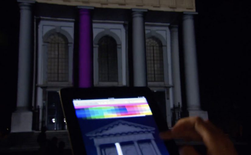
NuFormer, after executing 3D video mapping projections onto objects and buildings worldwide, adds interactivity to the mix in this test.

Here the spectators become the controller and interact with the building in real time using gesture-based tracking (Kinect). People influence the projected content using an iPad, iPhone, or a web-based application available on both mobile and desktop. For this test, Facebook interactivity is used, but the idea is that other social media signals can also be incorporated.

From mapped surface to live interface

Projection mapping usually works like a film played on architecture. This flips it into a live system. The building is still the canvas, but the audience becomes an input layer. Gesture tracking drives the scene changes, and second-screen control, meaning a phone or browser used as a remote, extends participation beyond the people standing closest to the sensor.

Extractable takeaway: Interactive mapping is most compelling when the control model, the set of simple inputs people can learn instantly (wave, move, tap), is legible at a glance and the projection responds quickly enough that people trust the cause-and-effect.

In large-scale public brand experiences, projection mapping becomes more than spectacle when it gives the crowd meaningful viewer control instead of a one-way show.

Why the “crowd as controller” move matters

Interactivity changes what people remember. A passive crowd remembers visuals. An active crowd remembers ownership. The moment someone realises their movement, phone, or social input changes the facade, the projection stops being “content” and becomes “play.”

The real question is whether your interaction model makes people feel in control within seconds, or confused for minutes.

Because the facade responds immediately to a person’s input, the crowd shifts from watching to experimenting, which keeps people around long enough to teach each other and try again.

That also changes the social dynamics around the installation. People look for rules, teach each other controls, and stick around to try again. The result is longer dwell time and more organic filming, because participation is the story.

What brands can do with this, beyond a tech demo

As described in coverage and in NuFormer’s own positioning, branded content, logos, or product placement can be incorporated into interactive projection applications. The strategic upside is that you can design a brand moment that is co-created by the crowd, rather than merely watched.

When social signals are part of the input (Facebook in this case), the experience can also create a bridge between the physical venue and online participation. That hybrid loop is where campaigns can scale.

Patterns for your next mapping brief

  • Pick one primary control. Gesture, phone, or web. Then add a secondary layer only if it increases participation rather than confusion.
  • Make feedback immediate. The projection must respond fast or people assume it is fake or broken.
  • Design for “spectator comprehension.” Bystanders should understand what changed and why, from a distance.
  • Use social inputs carefully. Keep the mapping between input and output obvious so it feels fair, not random.
  • Plan for crowd flow. Interactive mapping is choreography. Sensors, sightlines, and safe space matter as much as visuals.

A few fast answers before you act

What is “interactive projection mapping” in this NuFormer test?

It is 3D projection mapping where the projected content changes in real time based on audience input. Here that input includes Kinect gesture tracking plus control via iPad, iPhone, and web interfaces.

Why add phones and web control when you already have gesture tracking?

Gesture tracking usually limits control to people near the sensor. Second-screen control expands participation to more people and enables a clearer “turn-taking” interaction model.

How does Facebook interactivity fit into a projection experience?

It acts as an additional input stream, letting social actions influence what appears on the building. The key is to make the mapping from social action to visual change understandable.

What is the biggest failure mode for interactive mapping?

Latency and ambiguity. If the response is slow or the control rules are unclear, crowds disengage quickly because they cannot tell whether their input matters.

What should a brand measure in an interactive mapping activation?

Dwell time, participation rate (people who trigger changes), repeat interaction, crowd size over time, and the volume and quality of user-captured video shared during the event window.

Miami Ad School: Three Student Concepts

Three student concepts that show their thinking in one move

This year Miami Ad School has produced a run of strong conceptual projects from current students. Here are three that stand out because each one has a clear mechanic and a crisp “why this brand” fit. Here, the mechanic means the one user action and system response that make the concept work.

What makes these concepts travel

Each idea takes a familiar behavior. Choosing food, correcting spelling, inviting friends. Then it adds a single interaction rule that turns the behavior into a branded moment. It is not “advertising about a thing”. It is an experience that demonstrates the thing.

McDonald’s Burger Roulette App

This student concept is designed as a Facebook app that helps you find the “perfect” McDonald’s burger for your mouth. The premise is playful decision support. You answer a few prompts, the system narrows your choice, and the brand becomes the helpful guide instead of a menu you skim and forget.

UNICEF Donate A Word

This student concept proposes a new way to donate for child education by using the spelling feature inside Google Chrome. When a misspelled word is flagged, the prompt becomes a donation trigger, turning a small everyday friction into a small everyday contribution.

In portfolio-driven creative education, concepts like these matter because they show whether a student can turn brand strategy into a usable interaction, not just a line of copy.

Heineken Invite

This student concept uses a social-media-connected bottle opener that invites friends over for a beer. The social mechanic is competitive. Whoever has the most friends attending earns a free case of Heineken, turning “opening a beer” into an invitation ritual and a reason to gather.

Why it lands

All three ideas share the same advantage. They make the brand useful inside a moment people already have, rather than interrupting people to talk about the brand. The mechanic is the message, and the interaction is simple enough that you can explain it in one sentence without killing the effect. That works because a visible rule lets people grasp the idea instantly and connect the payoff to the brand.

Extractable takeaway: Build concepts around one native behavior and one immediate response. If the “rule” is explainable in a sentence and demonstrable in a clip, the idea will be remembered, and repeated.

The real question is whether the interaction makes the brand promise visible without extra explanation. The strongest student concepts are the ones where the interaction itself carries the branding work.

What brand builders can take from these student concepts

  • One behavior, one rule. Keep the mechanic tight. Complexity kills concept believability.
  • Make the brand the enabler. The best student concepts position the brand as the thing that makes the moment better, not the logo that arrives at the end.
  • Design for quick demonstration. If you cannot show it in 10 seconds, it will not spread beyond the pitch.
  • Payoff matters. Personal recommendation, effortless giving, or a social reward. The user needs a reason to do the action.

A few fast answers before you act

What is the common pattern across these three concepts?

Each turns a familiar action into a branded interaction rule with an immediate payoff, making the experience feel like proof rather than promotion.

Why are student concepts often framed around apps or gadgets?

Because interfaces make mechanics visible. You can show input, response, and reward quickly, which makes the idea easy to understand and easy to share.

What makes a concept like “Donate a Word” compelling?

It piggybacks on an existing habit and converts a tiny, repeated behavior into a tiny, repeated donation moment, which feels effortless and scalable.

What is the main risk when brands try to build ideas like this for real?

Friction. If the mechanic is not instant and obvious, people will not complete it in the real world, even if it looks great in a concept film.

What’s the single best takeaway for marketers reviewing student work?

Look for concepts where the mechanic expresses the brand promise without extra explanation. If the interaction itself makes the point, the idea is strong.

SAS: Up for Grabs on Facebook

To promote a million-seat fare sale, Scandinavian Airlines (SAS) and Crispin Porter + Bogusky Stockholm ran a Facebook competition where fans could “grab” a free trip. The ask was visual and dead simple, and it turned participation into the media.

Fans changed their profile picture into a custom “Up For Grabs” image, then posted a matching photo on the SAS Facebook wall where they physically “grabbed” the trip. Every entry looked like an ad, and every ad looked like a friend.

The mechanic that turns fans into distribution

The campaign’s mechanism was a two-step loop. First, replace your profile image with a branded frame that signals you are “in”. Second, publish a playful photo on the brand wall that demonstrates the concept, grabbing the prize. That wall then becomes a live gallery of social proof, with each new post re-selling the fare sale in a more human way than a banner ever could.

In airline marketing, promotions that convert participation into shareable images can outperform price-only fare announcements.

Why it lands

It turns an abstract offer into a physical gesture. “Grab a trip” becomes something you can perform, photograph, and show. The profile-picture switch is a light commitment that broadcasts intent, and the wall post is a public performance that invites imitation. The momentum comes from visibility, because the more entries you see, the more “normal” it feels to join.

Extractable takeaway: When you need scale fast, design one participation artifact that doubles as an ad unit, and make the action easy enough that people will copy it without instructions.

What the shutdown reveals about the strategy

The campaign was reportedly against Facebook promotion terms, and it was shut down. That ending is part of the story, because it highlights the tightrope of social-first promotions. The creative is built on a behavior Facebook historically restricts for contest entry, asking people to publish specific content as a condition of participation, even if the idea is clever and the buzz is real.

The real question is whether the participation mechanic can spread the offer without depending on a platform behavior that can be switched off overnight.

The stronger strategic read is that the creative idea is right, but the distribution mechanic is too dependent on borrowed platform rules.

What to steal for your own launch

  • Make the entry format the message. If the entry itself demonstrates the offer, you get free repetition of the proposition.
  • Use a low-friction first step. Profile-picture frames and templates work because they are fast and socially legible.
  • Design a single visual trope. “Grabbing” is a trope anyone can reproduce, and that consistency creates a recognizable feed.
  • Build compliance in from day one. If the mechanic depends on prohibited platform behaviors, plan a compliant alternative before launch.

A few fast answers before you act

What is the core idea of Up for Grabs?

A Facebook contest where fans change their profile picture to a branded frame and post a “grabbing the trip” photo on the SAS wall to compete for a free flight.

Why does the profile-picture step matter?

It turns participation into persistent visibility. The frame signals “I am in”, and it spreads through everyday browsing without requiring an additional media buy.

What made the campaign travel beyond the SAS page?

Each entry was both participation and promotion. When fans changed their profile picture and posted a matching photo, the fare sale moved into personal networks instead of staying inside brand media.

Why was it shut down?

It was reportedly closed for violating Facebook promotion rules by conditioning entry on specific platform actions, such as posting photos on the wall.

How do you keep the upside without the platform risk?

Keep the visual template and the “grab” trope, but move the submission mechanic to a compliant entry flow, then allow optional sharing that is not required to participate.