The Noite: Troll Ad Button

To promote a new season of The Noite, Publicis Brasil plays directly with a habit online video has trained into everyone. Skip the ad and move on.

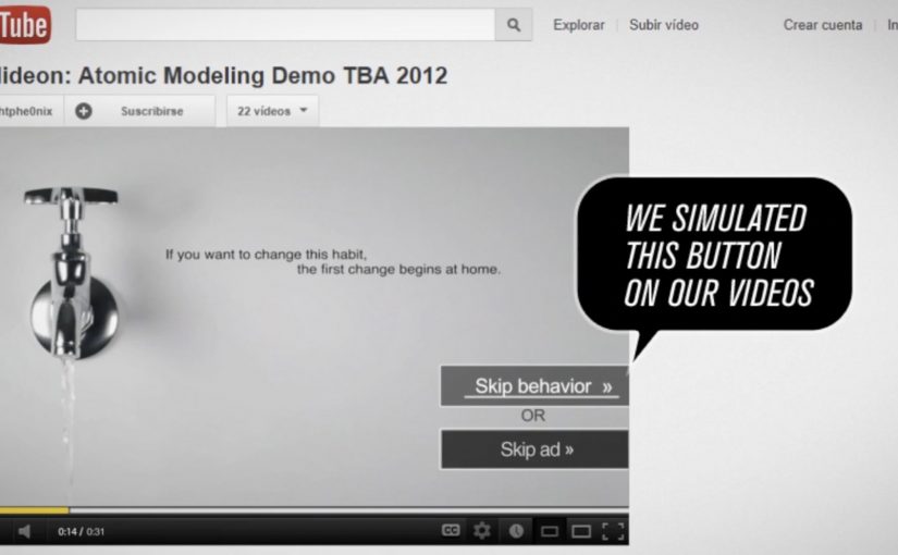
Instead of treating that skip as the enemy, the campaign introduces a second choice. Viewers can click either “Skip Ad” or “Troll this ad”. The “troll” option leads to an unexpected piece of content that stays connected to the original message, and the campaign claims the result was four times more views than comparable pre-roll.

Turning a skip moment into a choice

The mechanic is not more targeting or louder creative. It is viewer control at the exact moment attention usually collapses. If you want to leave, you can. If you want to “troll”, you get rewarded with a playful detour that still carries the show.

In online video advertising, where skippable formats condition people to minimize attention, a simple interactive choice can convert avoidance into participation.

Why it lands

This works because it admits the truth of the format. People dislike being delayed. So the campaign reframes the pre-roll as a game with an opt-out, not a lecture with a countdown. The second button also creates curiosity, because it promises a different outcome than the usual “wait or skip” loop, and curiosity is one of the few reliable reasons people volunteer attention.

Extractable takeaway: If your audience’s default behavior is to escape, build a choice that makes staying feel like a self-directed action, then pay it off immediately with content that still ladders back to the brand.

What the show is really optimizing

The stated win is views, but the deeper win is sentiment. The Noite positions itself as culturally fluent in the platform’s frustrations, and that makes the promotional message feel less like interruption and more like shared humor. It is a promotion that behaves like entertainment.

The real question is not how to stop people from skipping, but how to make the pre-roll moment feel worth choosing.

The smarter move is not to fight skip behavior. It is to design a branded detour that respects it.

What to borrow from the button logic

  • Design at the drop-off point. Put your idea where attention usually dies, not after it.
  • Offer a real opt-out. Interactivity only feels fair if “leave” is genuinely available.
  • Make the alternate path rewarding fast. The payoff has to arrive immediately or the trick reads as manipulation.
  • Keep it on-message. The detour can be weird, but it should still be clearly linked to the original proposition.

A few fast answers before you act

What is the “Troll Ad Button” idea in one line?

A skippable pre-roll that adds a second option, “Troll this ad”, so viewers choose a playful alternate experience instead of simply skipping.

Why is a second button more effective than a better pre-roll film?

Because it changes the relationship with the format. It turns the moment into a decision the viewer owns, which can trigger curiosity and voluntary attention.

What metric did the campaign claim?

That it generated four times more views than similar pre-roll executions.

What is the key risk with “interactive pre-roll” mechanics?

If the alternate option is not genuinely different or feels like a trick, viewers punish the brand with distrust and faster skipping next time.

When should you use this pattern?

When your audience already expects to skip, and your brand can credibly reward curiosity with content that feels entertaining and immediate.

Burger King: Anti Pre-Roll Pre-Roll

Turning the internet’s biggest annoyance into the idea

The smartest digital work often starts with a blunt truth the audience already feels. Burger King’s take on pre-roll irritation is a clean example of that approach.

Pre-rolls on YouTube are considered as one of the most annoying things on the internet. Here, “pre-roll” means the ad that plays before a video starts.

It is a fact that even Burger King acknowledges, even though they profit enormously from them.

So for their campaign in New Zealand they decided to take a slightly different approach. They created 64 videos that made fun of the annoying pre-rolls and then tailored it to the video that was about to be watched.

How 64 tailored pre-rolls made interruption feel relevant

The mechanism was contextual creative at scale.

Instead of running one generic pre-roll, Burger King produced a library of short spots designed to match the viewer’s intent. The pre-roll referenced the type of content about to play, making the interruption feel less random and more like a commentary on the moment. By “contextual creative,” I mean variants that change based on the content about to be watched.

That shift matters because it changes the viewer’s question from “how fast can I skip?” to “what are they going to say about this one?”

The real question is: can you turn the skip reflex into a moment of curiosity.

In global consumer brands buying always-on video, contextual creative is the simplest way to make paid interruption feel earned.

Why self-aware interruption can win attention

Pre-roll is hated because it steals time and breaks flow.

Extractable takeaway: If you cannot remove an interruption, acknowledge it and pay it back with relevance.

This idea reduced that emotional tax by acknowledging the annoyance and using humor to create alignment with the viewer. When a brand says what people are already thinking, it earns a small amount of trust. Tailoring the message to the next video adds a second reward: relevance.

In other words, it does not remove the interruption. It makes the interruption entertaining enough to tolerate.

The business intent behind mocking the format

The intent was to keep the media advantage of pre-roll while reducing the brand penalty that comes with it.

By turning the format itself into the joke, Burger King aimed to increase watch time, reduce skip reflex, and improve brand sentiment. The audience still gets interrupted. But they feel understood, and that changes how the brand is remembered.

If you have to run pre-roll, self-aware contextual creative is a cleaner play than pretending the format is not annoying.

What to steal for your next video campaign

  • Start with a shared frustration. If the audience already dislikes the format, acknowledge it instead of pretending it is fine.
  • Make relevance the reward. Contextual tailoring can turn an interruption into a moment of curiosity.
  • Scale with a clear template. A creative system. Many variants. One consistent joke structure.
  • Earn seconds, not impressions. In pre-roll, attention quality is the real KPI.

A few fast answers before you act

What did Burger King do differently with pre-roll in New Zealand?

They created 64 pre-roll videos that mocked the annoyance of pre-roll and tailored the message to the video the viewer was about to watch.

What was the core mechanism?

A library of contextual creative variants designed to match viewer intent, making the interruption feel relevant and humorous.

Why does self-aware humor work in an interruptive format?

Because it aligns the brand with what viewers already feel, reducing irritation and increasing willingness to watch.

What business goal did this support?

Improving attention quality and sentiment while still benefiting from the reach and placement of pre-roll media.

What is the main takeaway for brands?

If you cannot remove an interruption, redesign it so the audience gets a payoff. Relevance and humor are two of the fastest payoffs available.

Sodimac: The 5-Second Skip Behavior Ad

Viewers usually spend five seconds counting down to the “Skip Ad” button. Homecenter Sodimac from Chile uses that exact moment to ask a better question: do you want to skip the ad, or skip the behavior?

Working with agency MayoDraftfcb, Sodimac created a set of environmental messages that turn the skippable format into a moral choice. The button becomes the idea. Either you opt out, or you commit to changing a small wasteful habit.

A tiny mechanic that flips the meaning of “skip”

The creative move is to hijack an interface behavior people already know. That matters because it removes learning friction. The audience understands what to do instantly, and the campaign only has to change what that action means.

In brand communication, this is a neat example of interface-led storytelling. By that I mean the story is carried by a native UI element, not just the film around it.

The platform UI is not just a container for the message. It is the message.

In skippable video media, the first five seconds are the only attention you can reliably design for.

Why this works better than a standard awareness film

It uses the countdown moment as the content, so the viewer understands the choice instantly and the message lands before the skip reflex kicks in.

Extractable takeaway: If the platform gives people a default behavior, design your idea so that default action becomes the point, not the obstacle.

  • It is time-native. The idea fits the five-second window instead of fighting it.
  • It creates viewer control. The viewer makes an explicit choice, not a passive nod.
  • It is measurable. The “change” action is a click, not a vague sentiment.
  • It is consistent with the topic. Environmental habits are about small repeated actions. The format mirrors that.

Reported impact, and the real lesson

The campaign is reported to have driven over 80,000 people to choose the “change” option within a week. This is a smarter use of pre-roll than most awareness films because it makes the click mean something. The real question is whether your first five seconds invite a meaningful choice or just a reflexive skip. The bigger takeaway is structural: if you can turn a default skip behavior into a meaningful action, you get engagement that feels earned rather than bought.

Design rules for your next skippable campaign

  • Build for the first five seconds, and make the idea readable without audio.
  • Use the interface as a prop, buttons, timers, overlays, or any native UI element that viewers already trust.
  • Offer a single clean choice, so the click means something unambiguous.
  • Make the action lead somewhere useful, tips, tools, pledges, or a next step that matches the promise.

A few fast answers before you act

What is the core idea in one line?

It reframes the skippable pre-roll moment. Skip the ad, or skip the bad habit.

Why does this mechanic fit environmental messaging?

Because sustainability is built on small decisions repeated often. A skippable ad is also a small decision, repeated often.

What makes this different from a normal call-to-action?

The CTA is embedded inside a familiar platform behavior. The campaign is not asking for extra attention. It is redirecting an existing action.

What is the biggest risk with “interface hijack” ideas?

Here, “interface hijack” means repurposing a familiar UI element like the Skip button without hiding what is happening. If the viewer feels tricked, trust collapses. The choice has to feel fair, clear, and reversible.

What should you measure to prove it worked?

Click choice rate, completion rate, and downstream behavior on the landing destination, plus any lift in eco-tip engagement over the campaign window.