
The Great Escape

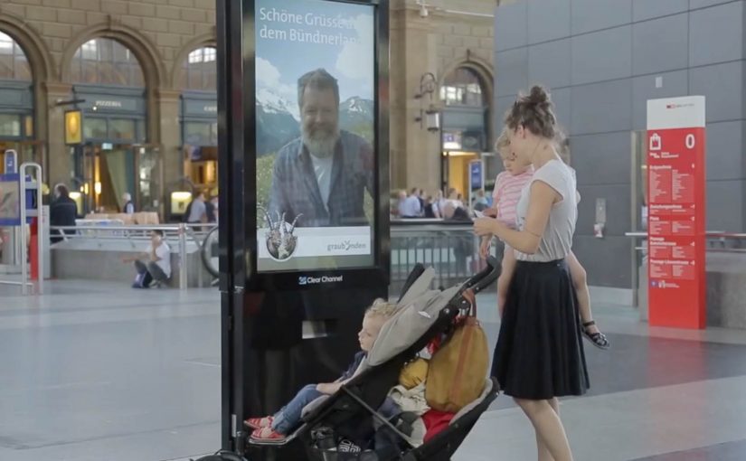
A stressed commuter walks through Zurich’s main train station, eyes forward, pace set to “late again.” Then a large interactive display stops them. On screen is a real Graubünden mountain man. He sees them. He speaks to them. He invites them to step out of the city and into the mountains. The offer is not “someday.” It is now. An all-expense-paid trip to Vrin, a mountain village in the Lumnezia Valley. The only catch is brutal and perfect. They have to drop everything and jump on the train leaving from the next platform.

Escape in one decision

Bring the mountain to the most hectic place in Switzerland, then make escape a one-decision act.

The context you already build on

In 2011, Graubünden Tourism and Jung von Matt had created a clever stunt to publicize the remote mountain village of Obermutten on Facebook. There they targeted people closer to home, specifically stressed urban commuters in a Zurich train station.

What happens at Zurich station

Step 1. Replace “beautiful scenery” with a human invitation

Instead of showing landscapes, the campaign puts a real local face in front of commuters. He can see and talk to people as they walk past. It feels personal, not broadcast.

Step 2. Turn interaction into an offer with real stakes

Anyone who engages is offered an all-expense-paid trip to Vrin. The offer is framed as a cure for stress, delivered at the exact moment stress is visible.

Step 3. Make the brand promise non-negotiable with one constraint

The only catch is the mechanism. By mechanism, I mean the single rule that turns the offer into a test. They have to drop everything and take the train that is about to leave from the next platform. That single constraint transforms the idea from a nice story into a real test of desire.

In European destination marketing, the hardest part is turning “someday” escape into a choice people will make on an ordinary weekday.

The real question is: can you turn “escape” from a promise into a decision someone can make in under a minute?

Why this works as live communication

Here, “live communication” means a real person responding in real time, not a pre-recorded loop.

Extractable takeaway: When you sell an experience, shorten the gap between promise and proof. Use live interaction plus one simple constraint so the choice becomes meaningful.

It collapses the distance between promise and proof

Tourism often sells “escape” as a future plan. Here, escape is immediate, and the decision is binary. Stay, or go.

It uses technology to create intimacy, not spectacle

The interactive display is not the point. The point is that someone in the mountains is speaking to you directly in the middle of the city.

The constraint is the creative

The “next train” rule is what makes it unforgettable. It forces commitment. It also creates the story people retell because it is a moment with consequence.

The deeper point

Escape marketing works best when it demands a real choice, not passive appreciation. If you want people to believe in a destination, do not just show it. Put a human being from that place in front of the audience, then convert emotion into action with a simple, immediate next step.

Practical moves for instant escape offers

  • Lead with a human: Put a real local face in front of people, not a montage of scenery.
  • Make “now” the default: Frame the reward as immediate, not a future plan or a delayed sweepstakes.
  • Use one constraint: Add a single rule like “next train” so the offer becomes a test of intent.
  • Design for retellability: Build a moment with consequence that people can summarize in one sentence.

A few fast answers before you act

What is The Great Escape in one sentence?

An interactive display in Zurich station lets a real Graubünden mountain man speak to commuters and invite them on an immediate trip to Vrin.

What makes it different from standard digital out of home?

It is not a looped video. It is a live, human interaction that turns attention into a real decision.

What is the key mechanic that creates urgency?

The “next platform, next train” constraint. People have to go now, not later.

How does it connect to the earlier Obermutten work?

It builds on the same strategy. Make a remote mountain place culturally visible through an idea that people actively participate in.

What is the reusable pattern for brands?

If your promise is experiential, create a live proof moment, then add a constraint that forces a meaningful choice.
The Noite: Troll Ad Button

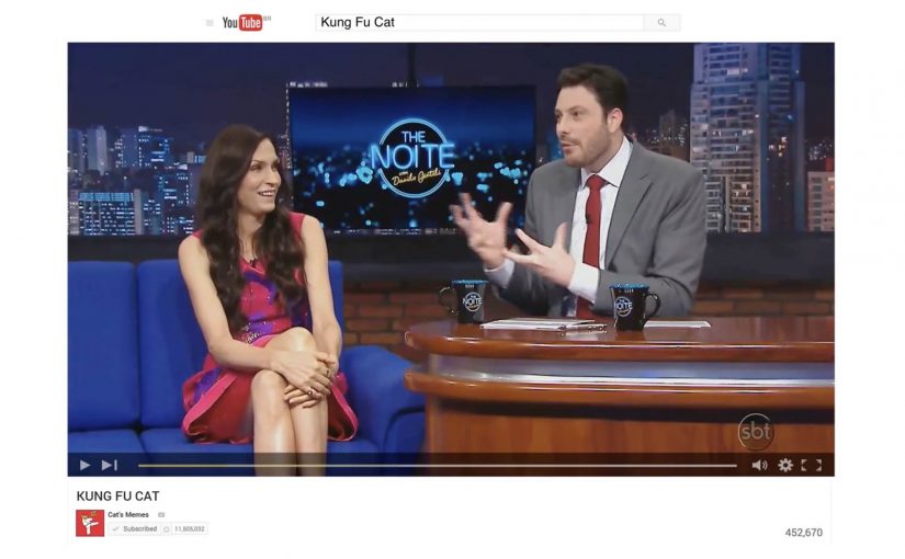
To promote a new season of The Noite, Publicis Brasil plays directly with a habit online video has trained into everyone. Skip the ad and move on.

Instead of treating that skip as the enemy, the campaign introduces a second choice. Viewers can click either “Skip Ad” or “Troll this ad”. The “troll” option leads to an unexpected piece of content that stays connected to the original message, and the campaign claims the result was four times more views than comparable pre-roll.

Turning a skip moment into a choice

The mechanic is not more targeting or louder creative. It is viewer control at the exact moment attention usually collapses. If you want to leave, you can. If you want to “troll”, you get rewarded with a playful detour that still carries the show.

In online video advertising, where skippable formats condition people to minimize attention, a simple interactive choice can convert avoidance into participation.

Why it lands

This works because it admits the truth of the format. People dislike being delayed. So the campaign reframes the pre-roll as a game with an opt-out, not a lecture with a countdown. The second button also creates curiosity, because it promises a different outcome than the usual “wait or skip” loop, and curiosity is one of the few reliable reasons people volunteer attention.

Extractable takeaway: If your audience’s default behavior is to escape, build a choice that makes staying feel like a self-directed action, then pay it off immediately with content that still ladders back to the brand.

What the show is really optimizing

The stated win is views, but the deeper win is sentiment. The Noite positions itself as culturally fluent in the platform’s frustrations, and that makes the promotional message feel less like interruption and more like shared humor. It is a promotion that behaves like entertainment.

The real question is not how to stop people from skipping, but how to make the pre-roll moment feel worth choosing.

The smarter move is not to fight skip behavior. It is to design a branded detour that respects it.

What to borrow from the button logic

  • Design at the drop-off point. Put your idea where attention usually dies, not after it.
  • Offer a real opt-out. Interactivity only feels fair if “leave” is genuinely available.
  • Make the alternate path rewarding fast. The payoff has to arrive immediately or the trick reads as manipulation.
  • Keep it on-message. The detour can be weird, but it should still be clearly linked to the original proposition.

A few fast answers before you act

What is the “Troll Ad Button” idea in one line?

A skippable pre-roll that adds a second option, “Troll this ad”, so viewers choose a playful alternate experience instead of simply skipping.

Why is a second button more effective than a better pre-roll film?

Because it changes the relationship with the format. It turns the moment into a decision the viewer owns, which can trigger curiosity and voluntary attention.

What metric did the campaign claim?

That it generated four times more views than similar pre-roll executions.

What is the key risk with “interactive pre-roll” mechanics?

If the alternate option is not genuinely different or feels like a trick, viewers punish the brand with distrust and faster skipping next time.

When should you use this pattern?

When your audience already expects to skip, and your brand can credibly reward curiosity with content that feels entertaining and immediate.

Québec City Magic Festival: The Magic Poster

To promote the Québec City Magic Festival, lg2 makes the poster behave like a trick, not a billboard.

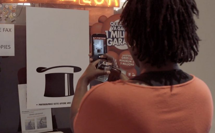
The creative is a magician’s hat poster with a message printed in invisible ink. Curious passers-by discover the mechanic by doing what people already do. They pull out a phone, take a picture, and turn the flash on. The flash reveals the hidden copy, and a lucky few are rewarded with a free ticket for the festival’s closing show.

A poster that turns curiosity into participation

The mechanism is invisible ink plus a flash-triggered reveal. Instead of asking for attention, the poster pays attention back. It gives you a reason to stop, and it gives you a satisfying “aha” the moment you do.

In high-traffic city out-of-home placements, the best interactive work rides on habits people already have, not instructions they have to learn.

In out-of-home, the strongest interactive ideas do not demand a new behavior. They attach to a behavior already in the environment and simply add a twist.

Why it lands for a magic festival

The medium is perfectly aligned with the message. The campaign does not merely advertise magic. It performs magic in the street. That alignment makes the experience feel like a preview of the festival rather than an ad for it. The real question is whether the medium can demonstrate the experience you are selling, not just describe it.

Extractable takeaway: When promoting an experience product, make the marketing behave like the product. Let the audience sample the feeling, not just read the promise.

The free-ticket twist strengthens the loop. The reveal provides instant reward. The prize provides delayed reward. Both motivate sharing, because people want friends to try it and to see if they win.

How to design a flash-reveal OOH interaction

  • Hide something worth revealing. The reveal must feel like a payoff, not a gimmick.
  • Use a native trigger. Flash photography is a default phone capability, not an app install.
  • Reward the behavior. Even a small chance of winning can meaningfully increase participation.
  • Make it repeatable. The interaction should be easy enough that people can show someone else on the spot.

A few fast answers before you act

What is “The Magic Poster” concept?

A festival poster printed with invisible ink that reveals its message when someone photographs it with a phone flash, turning a passive billboard into a small magic trick.

Why is the flash-triggered reveal effective?

It uses a built-in phone behavior, creates instant payoff, and turns the audience into the operator of the trick, which increases attention and sharing.

What makes it more than a novelty poster?

The mechanic reinforces the product truth. The campaign demonstrates magic rather than merely claiming it, making the ad itself a preview of the festival experience.

How can brands adapt this without copying the exact technique?

Design a simple reveal that matches your story, attach it to a native behavior in the environment, and ensure the revealed content is genuinely rewarding, not just hidden for hiding’s sake.

What should the hidden message say?

Keep the revealed copy short and emotionally rewarding in one glance, so the flash moment feels like a payoff and not a puzzle.