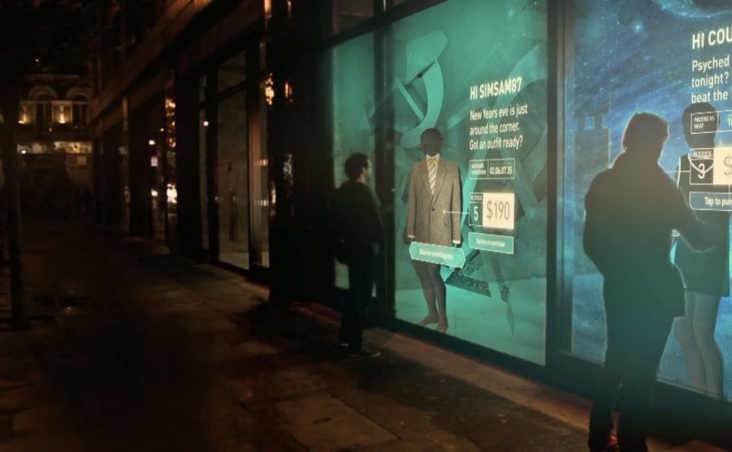
The Adaptive Storefront: BLE Retail Display

Shop windows, billboards, bus stops, and car showrooms do not have to be passive experiences. In the video below, a prototype interactive digital display adapts to whoever stands in front of it.

The display identifies shoppers using Bluetooth Low Energy (BLE) and reacts to personal data stored on the shopper’s mobile device, such as shopping habits and preferences. Shoppers can swipe through personalised content, place items in a virtual shopping cart, and purchase straight from the display.

When glass turns into a shoppable interface

This “adaptive storefront” concept takes a familiar retail surface and makes it behave like a storefront UI. Here, “adaptive storefront” means the window can recognise a nearby device via BLE and change what it shows based on data available on that device. Not a poster. Not a looped video. A live interface that changes per person and lets you complete an action while you are still in that high-intent moment of attention.

How the prototype behaves in front of a shopper

  • Detect. BLE proximity is used to recognise that a specific shopper is present.
  • Adapt. The display adjusts what it shows based on data available on the shopper’s phone.
  • Let the shopper drive. Swiping changes what is on screen, rather than forcing a fixed sequence.
  • Close the loop. Items can be added to a cart and purchased directly from the display.

In physical retail environments, the storefront is the first high-attention interface a brand controls before a shopper reaches the shelf.

Why it lands

Because the display can recognise a nearby device and accept input on the surface, it compresses discovery, consideration, and purchase into one interaction. The value is not the novelty of a “smart window”. It is the reduction of steps between interest and action, while the shopper’s intent is still fresh. The real question is whether you can do that with clear permission and control, not silent personalisation.

Extractable takeaway: A surface becomes valuable when it combines context with immediate action. Personalisation only earns its keep when it removes friction and helps a shopper decide faster, not when it merely looks clever.

What it is really trying to unlock for brands

Behind the demo is a clear ambition. Turn high-footfall surfaces into conversion surfaces. If the experience is permissioned and useful, it can bridge the gap between physical browsing and digital checkout without forcing a shopper to open an app, search, and start over.

That also hints at a measurement upgrade. A storefront that can be interacted with can be instrumented. What people swipe. What they ignore. What they add. Where they drop. That is a very different feedback loop than counting impressions.

Practical takeaways for adaptive storefronts

  • Start with one job-to-be-done. For example, “help me shortlist”, “show me what is in stock”, or “let me buy in two taps”.
  • Make control obvious. If swiping is the interaction, design the UI so people understand it in one second.
  • Keep data minimal and on-device. Use only what is needed to improve relevance, and avoid making the experience feel intrusive.
  • Design for the environment. Glare, distance, dwell time, and group behaviour change everything compared to mobile UX.
  • Plan the opt-in moment. The experience works best when the shopper understands why the screen adapts and what they get in return.

A few fast answers before you act

What is an “adaptive storefront” in plain terms?

It is a storefront display that changes what it shows based on who is standing in front of it, and lets the shopper interact and buy directly on the surface.

Why use BLE for this type of experience?

BLE enables low-power proximity detection, so a display can recognise a nearby device and trigger the right experience without requiring scanning a code each time.

What data is needed to personalise the display?

Only enough to improve relevance. For example, stated preferences, browsing history, or saved items, ideally kept on the shopper’s phone and shared with clear permission.

What makes this feel useful instead of creepy?

Permission, transparency, and value. The shopper should understand what is happening, control it, and get something meaningfully better than a generic screen.

What should you measure in a pilot?

Opt-in rate, interaction rate, add-to-cart rate, conversion rate, and whether the experience reduces time-to-decision without increasing drop-off.
Yahoo! JAPAN: Hands On Search

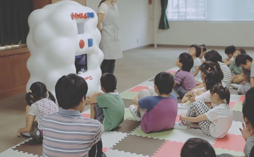
Yahoo! JAPAN introduces what it calls “Hands On Search”. A hands-on search experience that lets visually impaired children explore online concepts through touch, not screens.

A voice-activated kiosk is set up so children can speak what they want to “search” for. The system recognises the verbal request, pulls a corresponding 3D model, and prints a small physical object. For the first time, children can hold what they usually only hear described. From animals to landmarks and buildings.

Search becomes a physical output

The mechanism is voice input plus 3D printing output. Instead of returning text, images, or audio, the search result is manufactured into a tactile model the child can feel in their hands. Because the output is tactile, the child can verify shape and scale directly, which is why the interaction shifts from description to discovery.

In accessible technology design, the strongest innovation is often a translation layer that converts a dominant medium into the sense that an excluded audience can reliably use. That is the pattern worth copying. Change the output medium, not just the narration layer.

In accessible-learning contexts, the constraint is rarely intent but whether the output can be inspected without sight.

Why it lands

It reframes “search” as something more than browsing. It becomes discovery you can share in a classroom. The real question is whether your product can render its core value into the senses your excluded users actually rely on. The moment the object prints is also the moment learning becomes concrete. It is not an abstract promise about inclusion. It is a visible, touchable outcome.

Extractable takeaway: If your experience is inherently visual, do not just add narration. Add an equivalent output that preserves shape and scale in a form people can physically inspect, so learning moves from description to direct exploration.

Tactile-search patterns for product teams

  • Design for the missing sense, not the average user. Start with the constraint, then build the interface around it.
  • Make the interaction one-step. Voice request in. Physical result out. No menus, no setup rituals.
  • Curate the object library. Accessibility fails when content quality is inconsistent. The “catalogue” is part of the product.
  • Prototype in real learning environments. Schools and educators reveal whether the tool supports teaching, not just demos.

A few fast answers before you act

What is Hands On Search in one sentence?

It is a concept machine that turns spoken searches into small 3D-printed models, so visually impaired children can “touch” search results.

Why does 3D printing matter here?

Because it converts information into form. For someone who cannot see images, a physical model can communicate shape, proportion, and structure directly.

Is this a campaign or a product direction?

It plays like a campaign film, but the underlying idea is a product direction. Search as an output system that can render to different senses depending on user needs.

What is the biggest risk in copying this idea?

Building a beautiful prototype without a sustainable content pipeline. If the object library is thin, slow to expand, or low fidelity, usefulness drops quickly.

Where should you prototype first?

Prototype where learning happens. Schools and educators will quickly show whether the tool supports teaching, not just demos.

IAA 2013: Walk of Innovations

The 65th Internationale Automobil Ausstellung (IAA) has been running in Frankfurt am Main for the past two weeks. So on Saturday I decided to go for the motor show to catch up on the latest cars and also see first hand the much anticipated Nissan Nismo Watch.

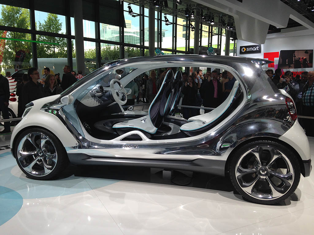
Most of the car makers in this year’s show were also present in IAA 2011. In fact they were even located in the same stands as 2011, with the same high tech touch displays to promote their cars. The difference was that their 2013 car models were now more hybrid and or electric only, for example this new four seater Smart.

Mercedes four seater Smart

What changed on the floor

While I walked around and looked for changes vis-à-vis what was shown in IAA 2011, I noticed that apart from the now expected large screens and touch displays, car makers were using all kinds of social media to engage with their visitors.

Engagement snapshots by brand

Here is a quick photo report of my engagement experiences with the various car makers.

Audi

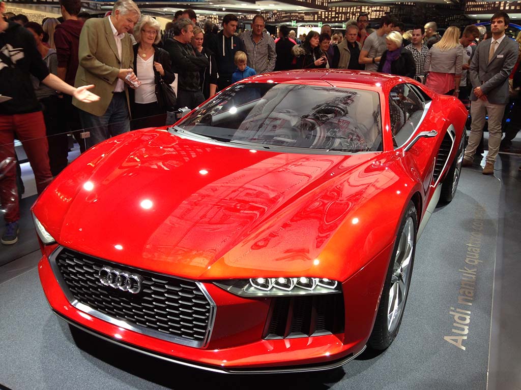
Audi Quattro Concept

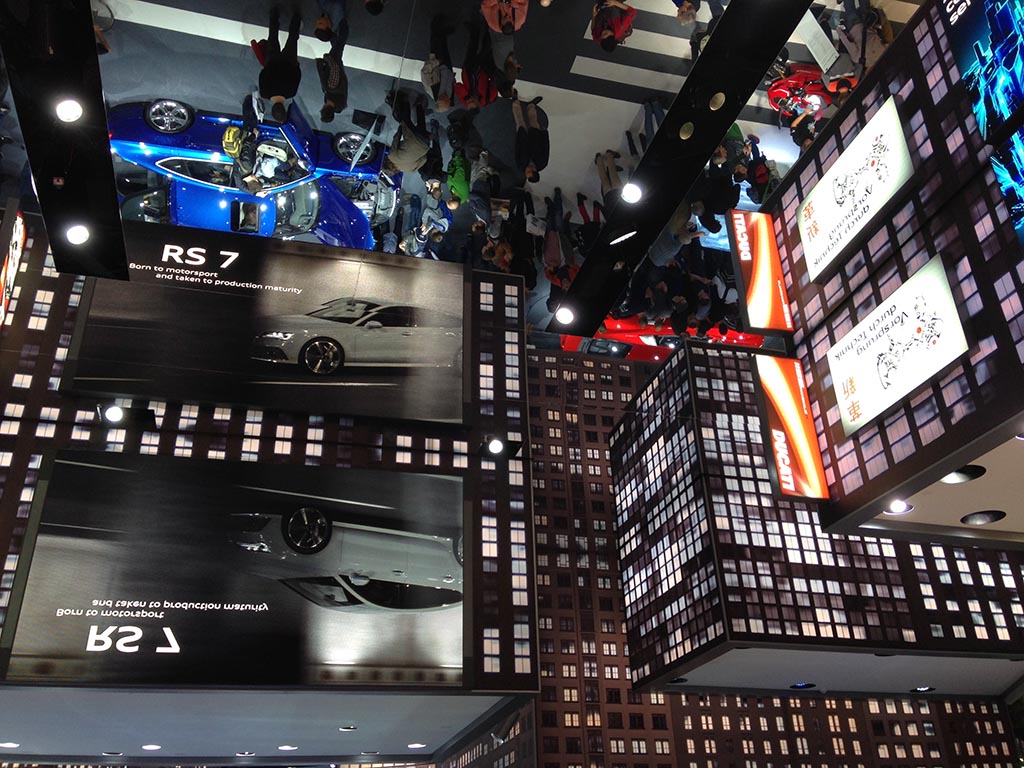
To make sure I did not miss Audi this year due to 200+ people standing in line to get into the Audi stand, I decided to visit very early in the morning. The line was short, but there were already hundreds of people inside. On walking in, I noticed that the concept for the stand was taken straight out of the Hollywood movie “Upside Down”.

Audi Upside Down

Visitor engagement at the stand was driven through a special photo booth. While people waited in line they got an iPad to play a game and answer three questions about Audi. Winners got custom giveaways like keychains, gummy bears, etc. After that, visitors were ushered into the photo booth which superimposed the photos onto custom Audi backgrounds. Visitors could take home a printed copy and later also download soft copies from www.audiphotoautomat.com.

Mercedes

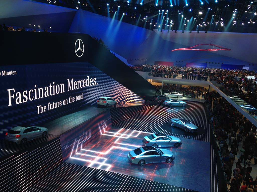
Next stop was the Mercedes stand which was also impossible to get into in 2011. From the below picture you can see why.

Fascination Mercedes

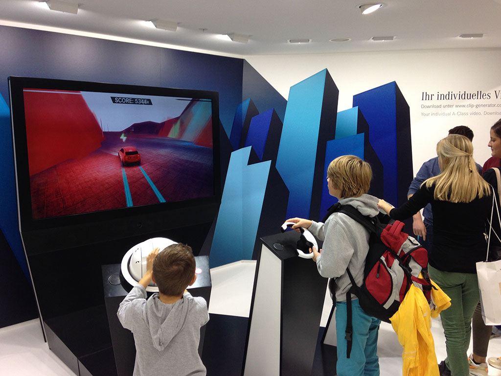
Mercedes put up a huge multi-sensory show that went on for over 20 minutes, while thousands of people just stopped and watched. Children visiting the stand were kept busy with car simulators.

Mercedes Car Simulator

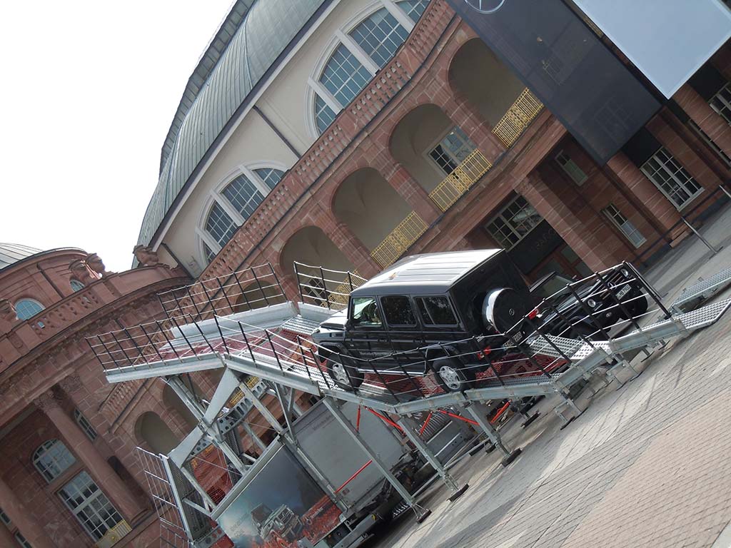
Outside the stand one could test drive the Mercedes off-road jeeps with the help of trained drivers.

Mercedes Offroad Test Drive

Hyundai

Hyundai was the first car brand I came across that was using the event to generate Facebook fans. For liking the Hyundai Facebook page, fans at IAA could win a Hyundai i30.

Hyundai Like Us Pillar

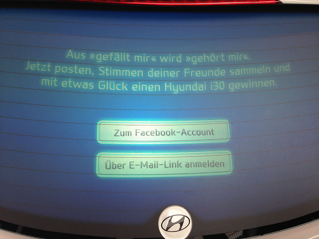
The rear windscreen of the i30 was converted into a touchscreen which people could use to instantly “Like” the brand’s Facebook page or choose to receive the fan page link via email.

Hyundai i30 rear window

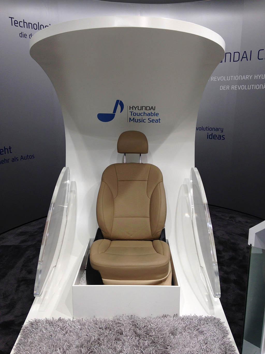
At the stand Hyundai also displayed a touchable music seat for hearing impaired drivers which vibrated as per the music being played. This was still in concept phase and the test seats were being developed out of Korea.

Hyundai Touchable music seat

Volkswagen

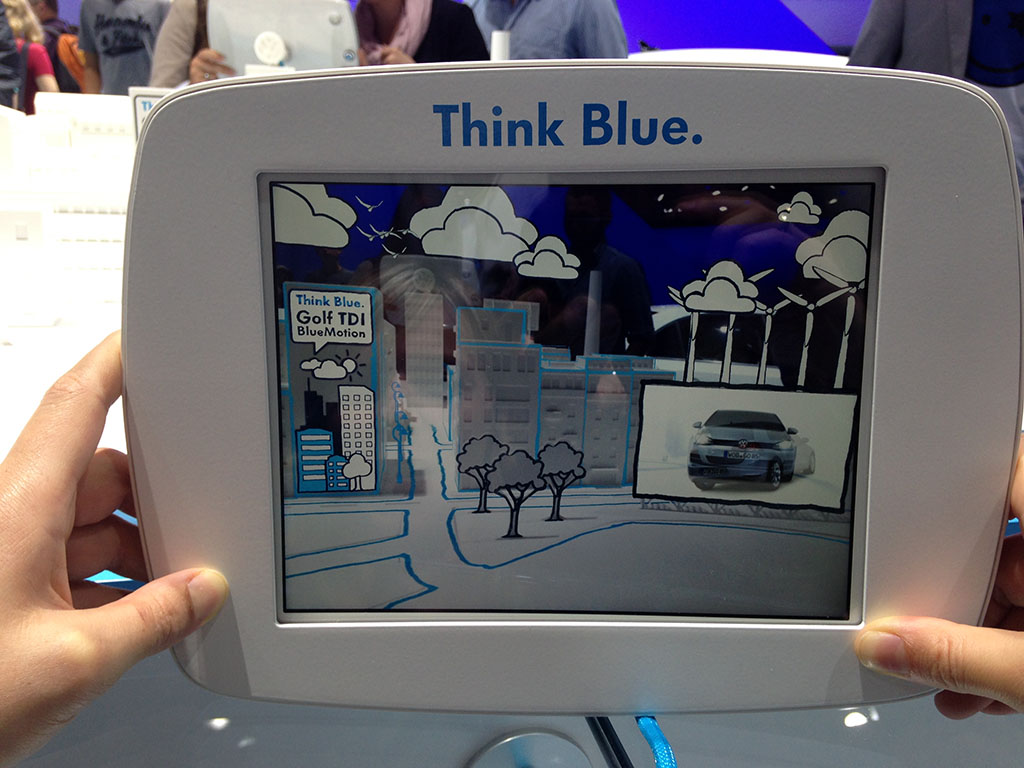
The Volkswagen “Think Blue” initiative was presented via an interactive augmented reality layer that was activated through the provided iPads.

Volkswagen Think Blue

Skoda

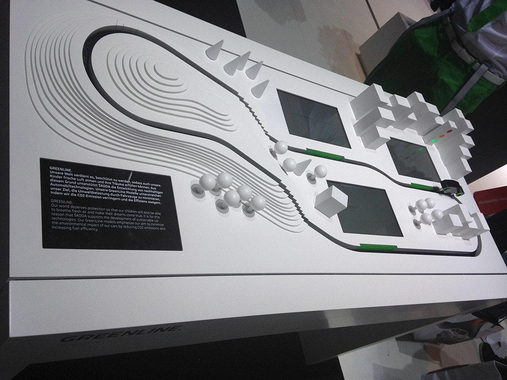
Skoda explained their Green Line initiative via a wooden toy car that was supported by the animations in the embedded touch screens.

Skoda Green Line

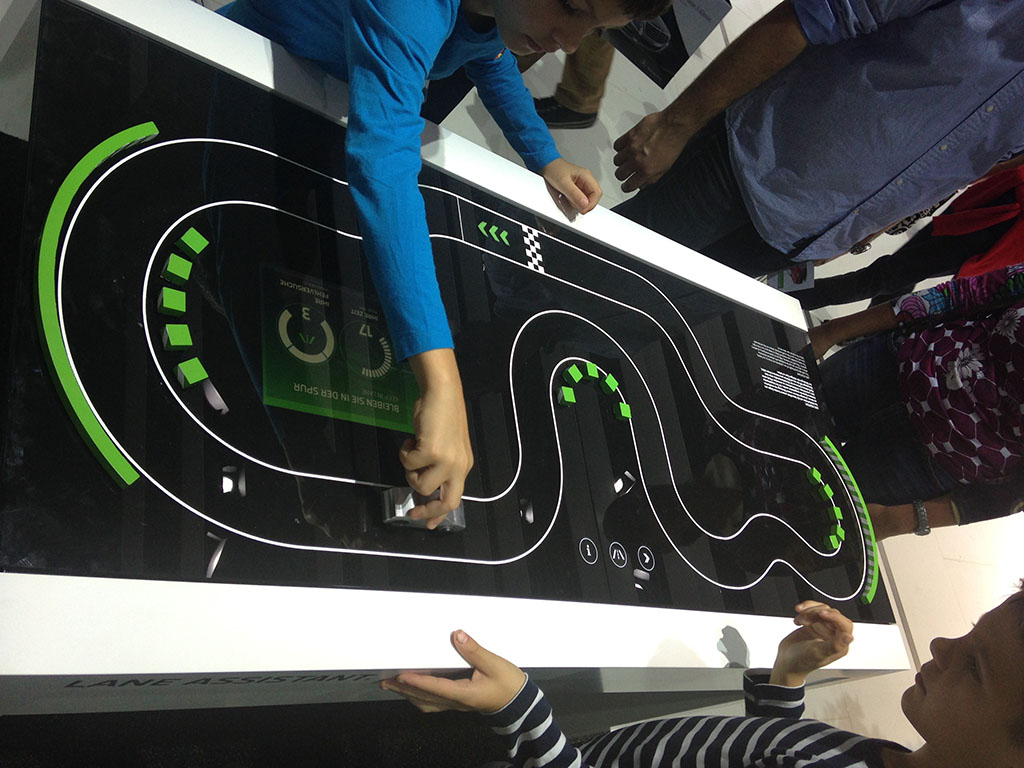
At the neighbouring table kids were engaged with games around the Green Line initiative.

Skoda Green Line Game

Michelin

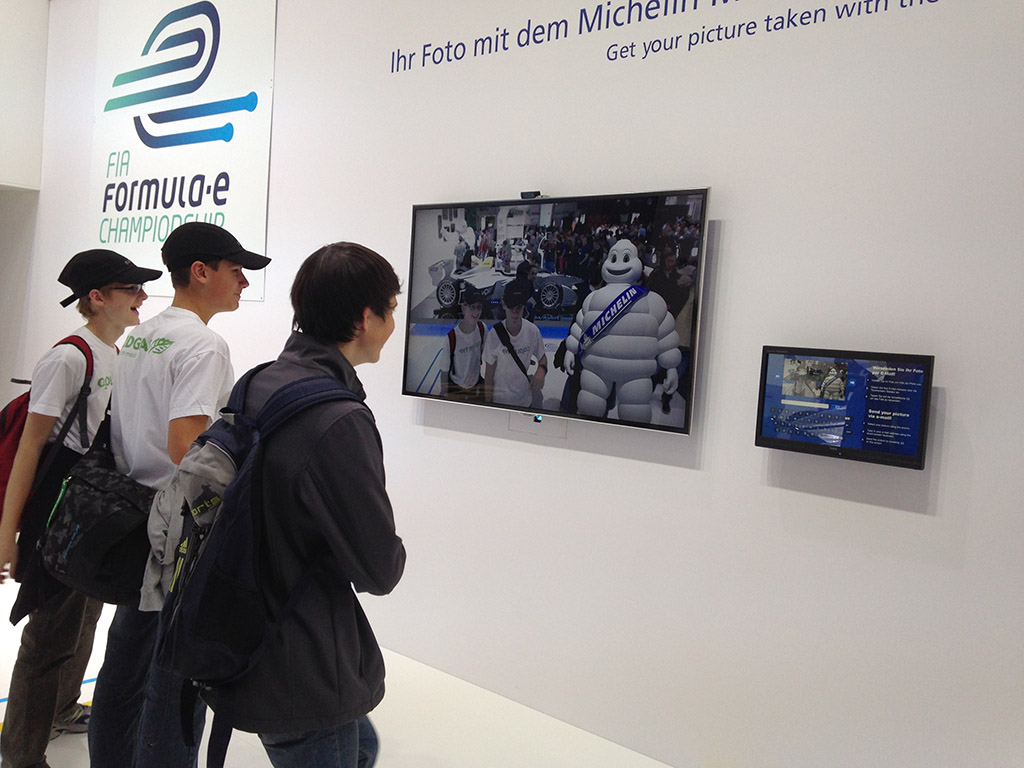
At the Michelin stand, visitors could take pictures with a virtual Michelin mascot and have the pictures emailed to themselves instantly.

Michelin Mascot

Nissan

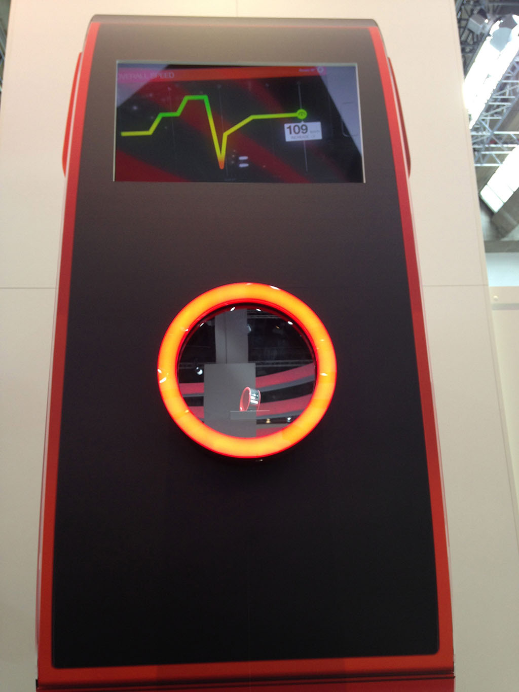
After having written about the Nissan Nismo Watch last week, I could not wait to see the real watch in action. But to my disappointment the watch was not there as announced. There was only a plastic dummy on display.

Nissan Nismo Watch

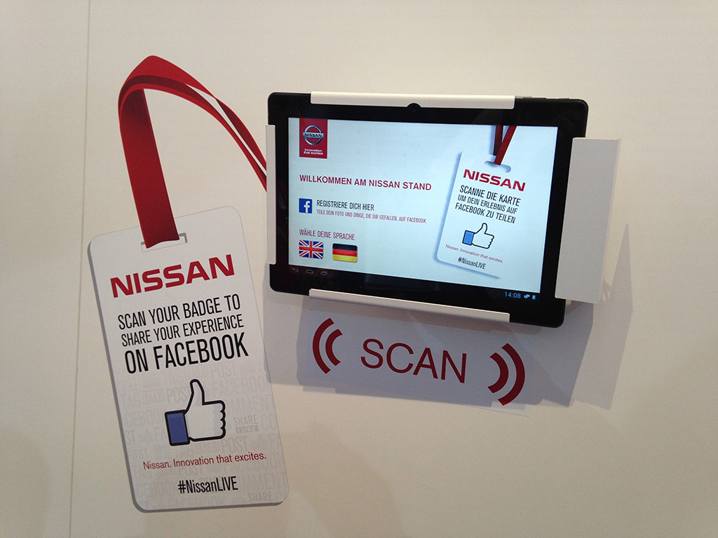
But I did take Nissan’s version of real life “Likes” for a spin (first spotted at the Renault stand in the 2011 Amsterdam Motor Show).

Nissan Real Life Likes

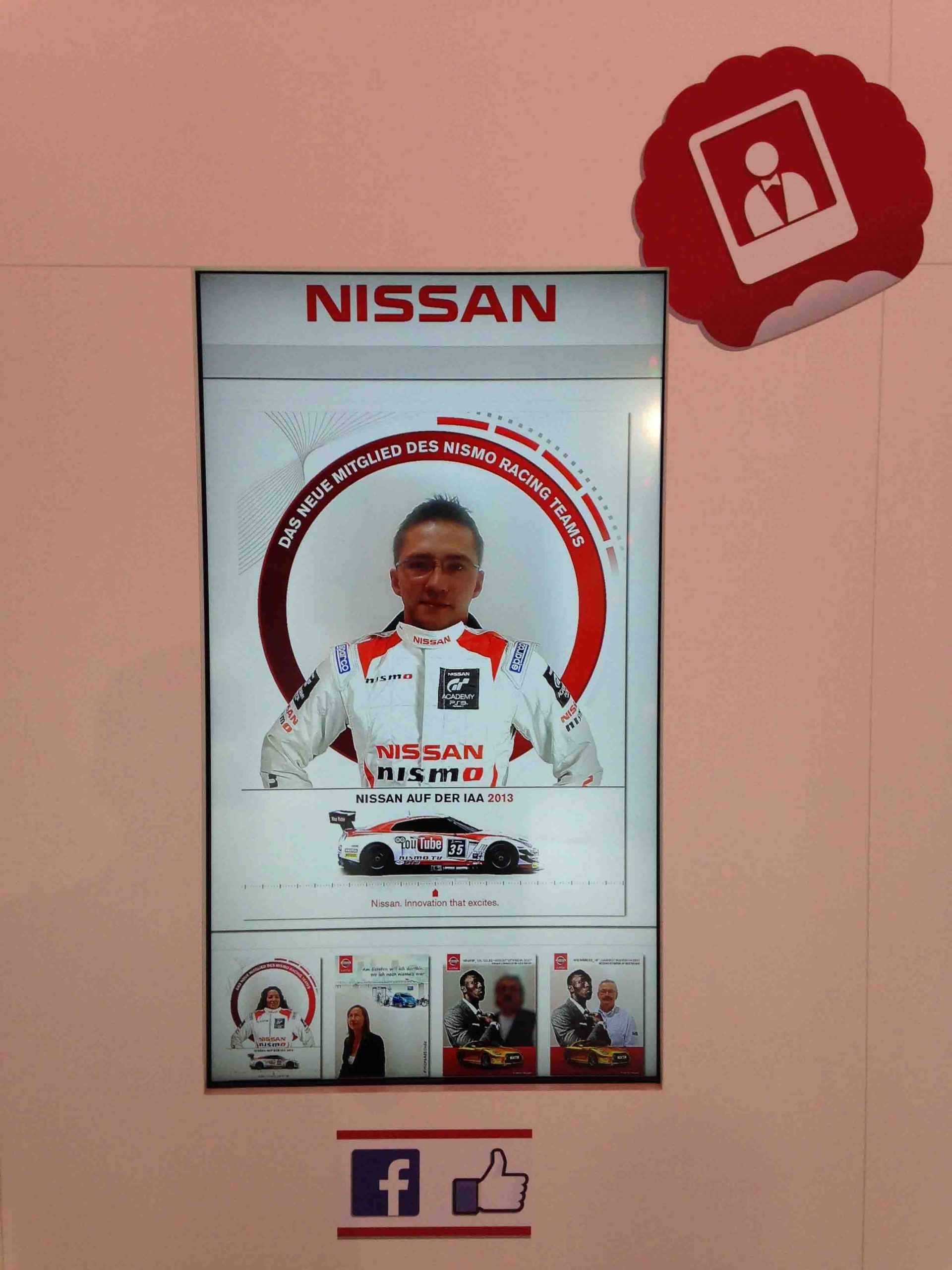
The RFID badges allowed visitors to post custom Nissan branded pictures of themselves onto Facebook.

Nissan Facebook Pillar

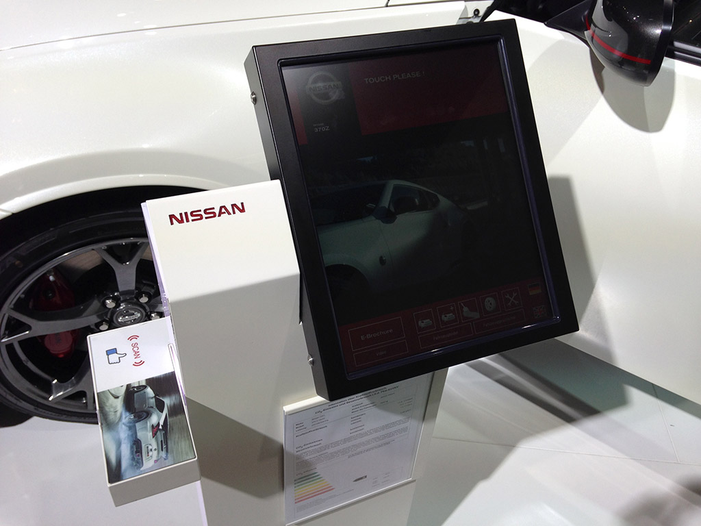
Visitors were also given the option to share the cars they like on Facebook via special Like buttons built into the car info pillars.

Nissan like a car button

Ford

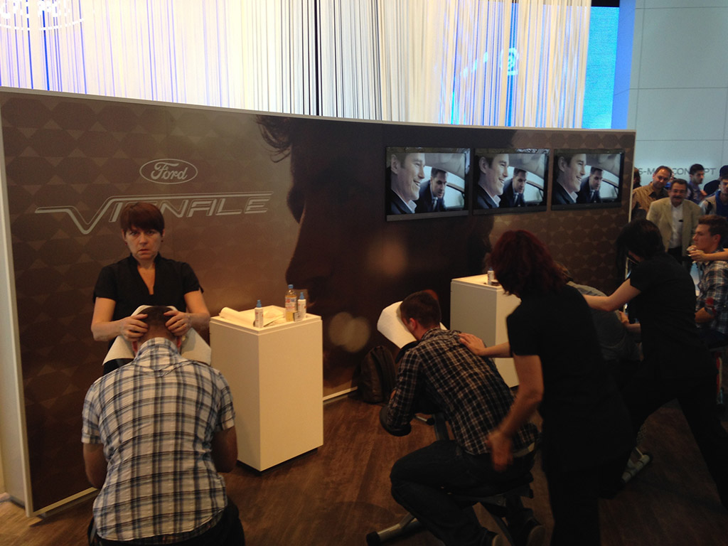
At the Ford stand this year visitors were given head and shoulder massages.

Ford head and shoulder massages

Then to experience the Ford EcoBoost, visitors were put in front of a leaf blower and their reactions captured and uploaded on the Ford Flickr channel.

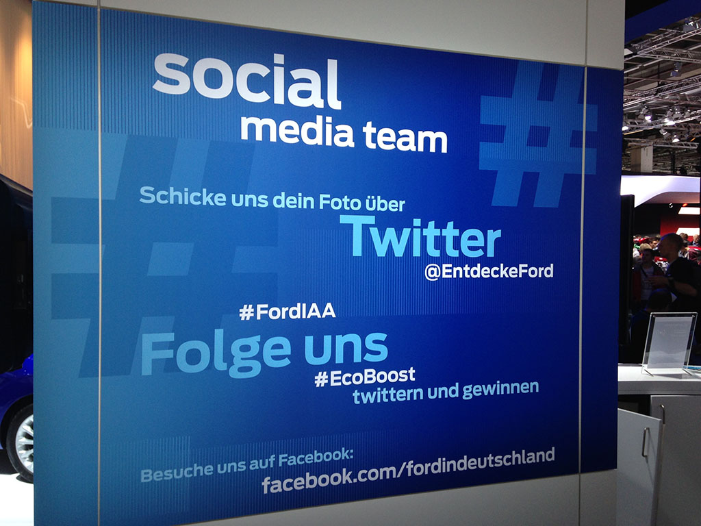
And for the more social visitors, Ford had a Twitter based contest running.

Ford IAA Twitter Contest

Kia

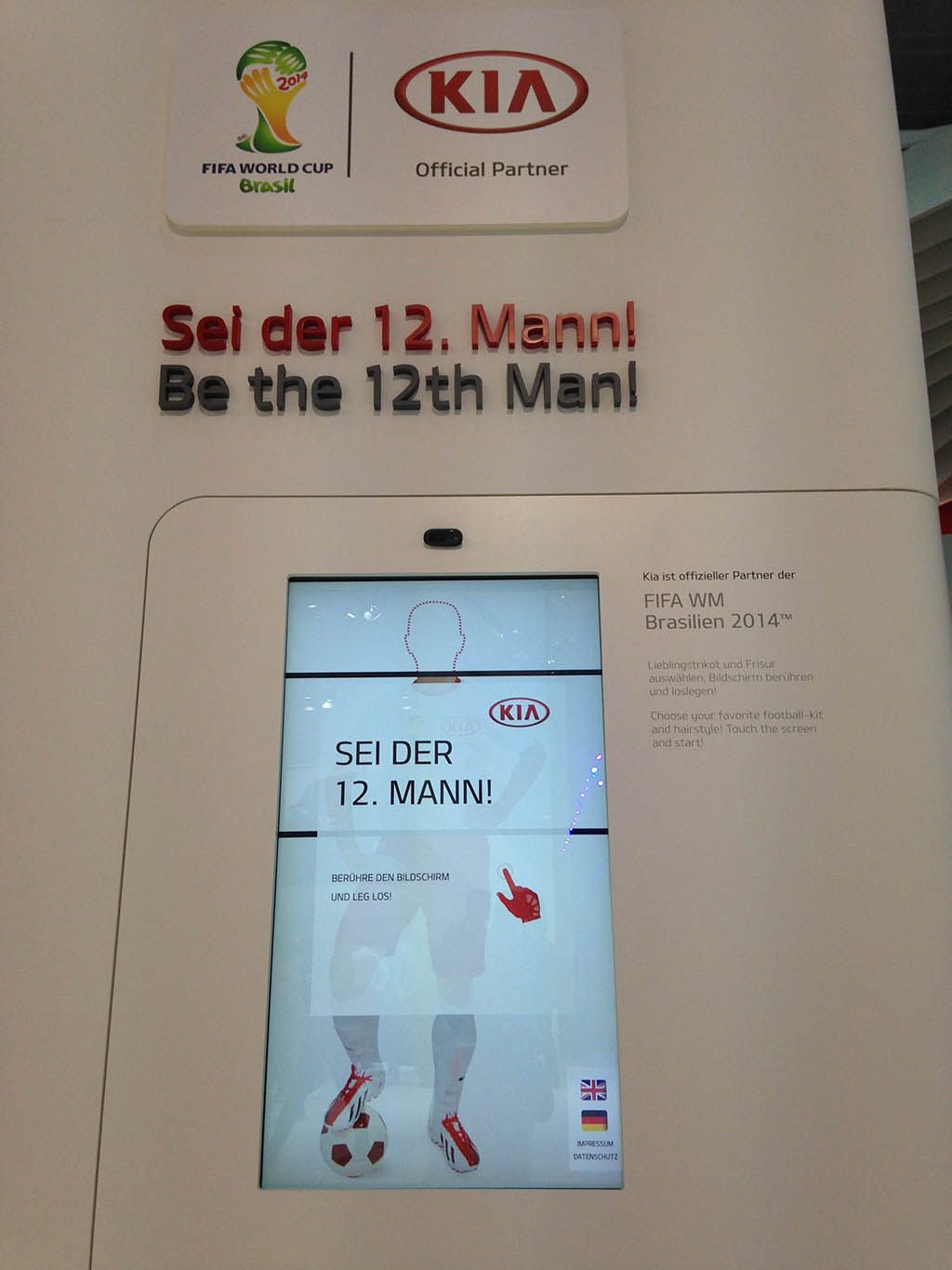
At Kia, visitors could superimpose their heads onto a football player and then have the custom postcard sent to their email IDs.

Kia 12th Man

Chevrolet

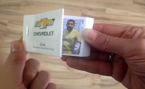
Visitors at the stand could make small flipbooks of themselves doing funny dances in front of the main character of the Hollywood film “Turbo”.

Chevrolet Flipbook

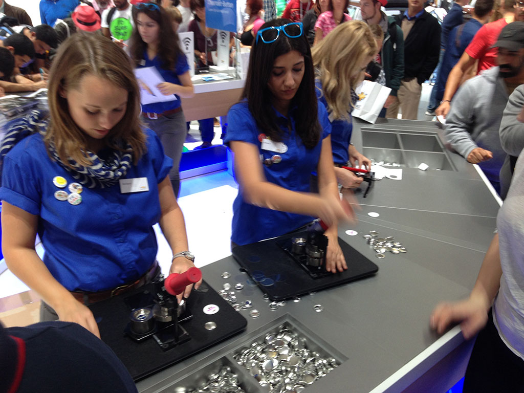
Or they could write special messages to their loved ones on a piece of paper and the team at Chevrolet would instantly convert them into wearable badges.

Chevrolet Badges

Chevrolet was also the only car maker at the IAA who was using Foursquare to offer discounts on their show merchandise.

Chevrolet Foursquare Check-in Special

Mini

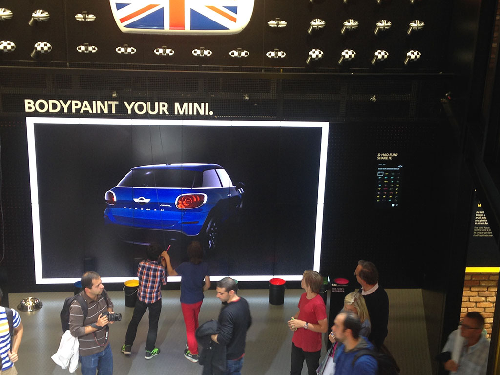
Mini this year gave visitors the option to body paint their cars and email the photos to themselves.

Bodypaint your Mini

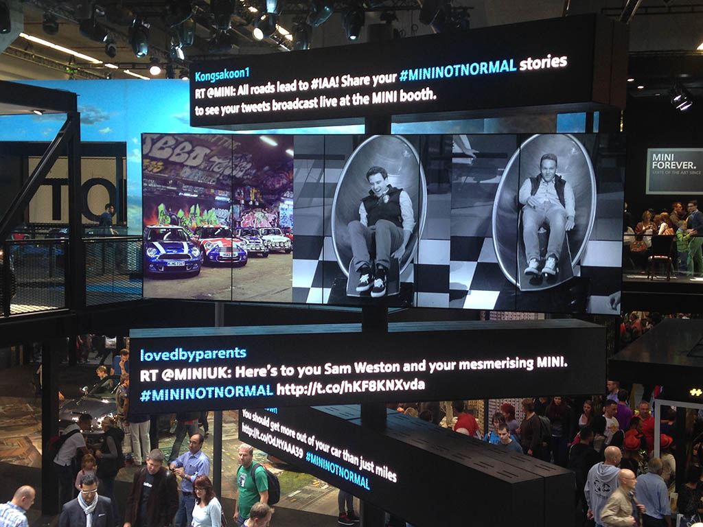
Visitors could also slide down a specially created tunnel at record speeds that were also photographed and displayed on a large overhead digital screen.

Mini Slide

BMW

BMW, like Mercedes, put up a multi-sensory show at their stand. But compared to Mercedes it was short and not as extravagant. Still pretty impressive.

BMW X5

Kumho Tyres

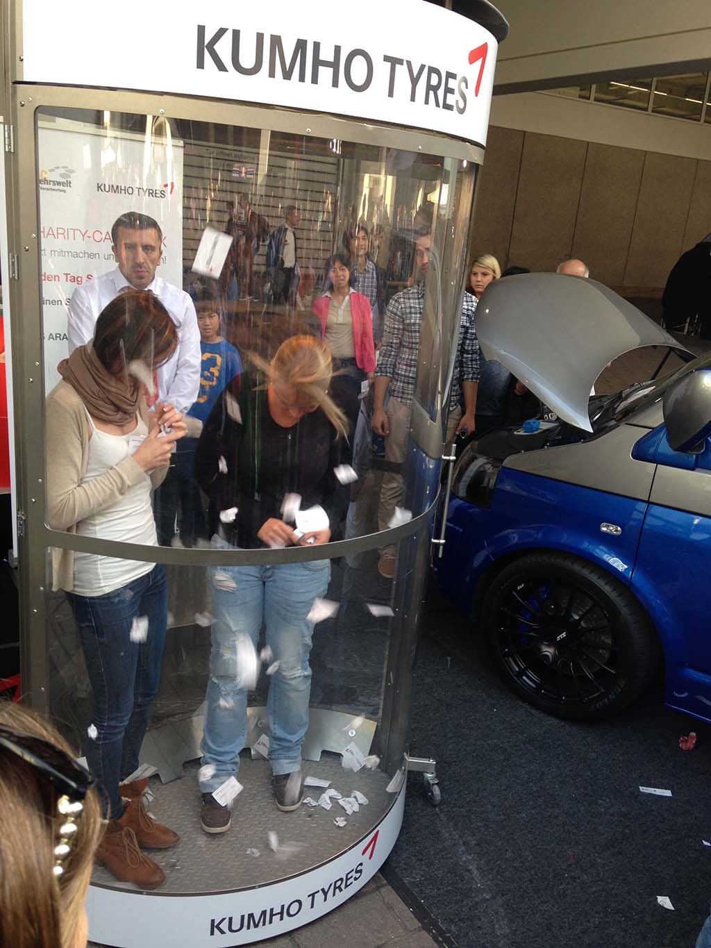
On the way out I spotted Kumho Tyres giving away various petrol and tyre related coupons. To win the coupons visitors had to catch them while being closed inside a wind cabin.

Kumo Tyres Coupons

Why this direction matters

Across the stands, the consistent pattern is not “more screens”. It is more reasons to create something. A photo. A badge. A flipbook. A posted image. A public interaction that becomes proof you were there. The stand stops being a catalogue, and starts behaving like a content studio that rewards participation. The real question is how a stand turns a visitor into a willing participant and publisher. The strongest stands here are the ones that give people something to make, not just something to look at. That works because visitors are more likely to remember, share, and talk about an experience when they leave with something they helped create.

Extractable takeaway: If you are designing for an event, do not start with channels. Start with a social object, meaning a photo, badge, flipbook, or other shareable artifact people can take away, share, or replay. Then build the simplest capture and distribution loop around it.

In large European trade shows, brands increasingly treat the stand as a live media channel where every interaction can become a shareable moment.

And that was a quick overview of what I experienced at the 65th Internationale Automobil Ausstellung. (To read about my experience at the 2011 show, click here.)

Until the next show in 2 years. This is Sunil signing off from IAA 2013.

What to steal from IAA 2013 for your next show

  • Queue utility. If people must wait, give them something to do that feeds the experience (Audi’s iPad game and questions).
  • Instant takeaways. Printed photos, emailed images, and small artifacts create memory and sharing triggers.
  • Low-friction publishing. RFID, built-in Like buttons, and email delivery reduce the “I’ll do it later” drop-off.
  • Make participation visible. Leaderboards, overhead screens, or public displays turn individual actions into crowd energy.
  • Match the mechanic to the brand truth. Eco themes paired with AR explainers, performance themes paired with physical challenges.

A few fast answers before you act

What is this IAA 2013 “walk of innovations” about?

It is a photo report from the IAA show floor in Frankfurt, focused on how different car brands used interactive touchpoints and social mechanics to engage visitors.

What is the main shift versus earlier shows?

Beyond large screens and touch displays, more stands are designed around capture and sharing, photo booths, RFID check-ins, instant email delivery, and social prompts.

Which engagement mechanics show up repeatedly?

Instant content creation (photos, flipbooks), low-friction sharing (RFID, embedded Like buttons), and public spectacle (multi-sensory shows, overhead displays).

What is the practical lesson for event marketers?

Design one clear participatory moment that produces a social object, then remove friction from capture and delivery so visitors can share immediately.

How do you keep these activations from feeling gimmicky?

Anchor the mechanic to a brand truth, and make the output useful or delightful for the visitor, not only promotional for the brand.