
Klépierre: Inspiration Corridor

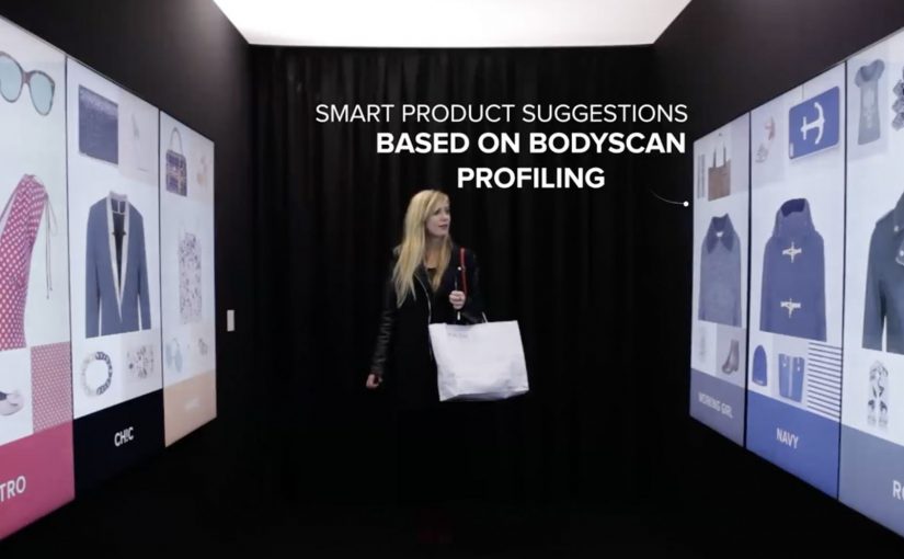
One of the biggest problems brick-and-mortar retailers face is that many consumers prefer the convenience of shopping online. So Klépierre, a European specialist in shopping center properties, decides to give customers a unique and personal window shopping experience that simultaneously advertises multiple brands available in its shopping center.

How the corridor turns browsing into a saved journey

The mechanism is a walk-in “inspiration corridor” that is described as using an infrared camera and live detection to adapt the interface to the visitor. The walls then show a curated set of products pulled from real-time inventory, and the visitor can tap items to add them to a personal shopping list. At the end, the selection syncs to the Klépierre mobile app, which then helps locate the chosen products in the mall.

Here, live detection means the corridor reads the visitor in the moment and adjusts what appears on the walls accordingly.

In European shopping centers, the winning retail experiences blend discovery and convenience, giving visitors a reason to browse physically while keeping the efficiency people associate with online shopping.

The result is a browse-first experience that keeps discovery and wayfinding in one flow.

Why this beats “more screens”

This lands because it does not ask shoppers to learn a new behavior. It upgrades a familiar one. Window shopping. The corridor simply makes browsing feel personal and actionable, then removes the “I’ll never find it again” friction by saving the picks and turning them into a navigable list. The stronger move is not to add more screens, but to make physical browsing easier to finish. That works because discovery, selection, and store-finding happen in one continuous interaction.

Extractable takeaway: If your category is losing visits to online convenience, do not fight browsing. Instrument it. Let people browse with their body language and taps, then hand them a saved list that makes the rest of the journey feel effortless.

The quiet business intent

The real question is whether one shared experience can turn mall-level discovery into measurable value for multiple tenants at once.

Klépierre is not only showcasing technology. It is selling a multi-brand promise. One interaction can route a shopper to several tenants, lift discovery across stores, and create measurable signals of interest without needing a single retailer to run the whole experience alone.

What mall operators should borrow

  • Curate across brands. A mall operator can create value by packaging discovery in a way individual stores cannot do alone.
  • Connect to live stock. Recommendations feel credible when they map to what is actually available right now.
  • Make saving the default. “Tap to add” is the key bridge from inspiration to purchase intent.
  • Close the loop with wayfinding. The experience should end with “here’s where to get it”, not just “wasn’t that cool”.
  • Design for low friction. The corridor should work in seconds, even for someone who did not plan to engage.

A few fast answers before you act

What is Klépierre’s Inspiration Corridor?

It is an in-mall interactive experience that personalizes product recommendations on surrounding walls and lets visitors tap to save items to a shopping list that syncs to the mall’s app.

How does the personalization work?

It is described as using live detection, for example via an infrared camera, to adapt recommendations and the interface to the visitor in the moment.

What problem does this solve versus standard mall advertising?

It turns passive promotion into active selection. Instead of only seeing brand messages, shoppers leave with a saved list and a practical path to find products.

What is the main metric to watch?

Saved items per session, app sync rates, store visit lift for featured tenants, and conversion from saved lists to purchases where measurement is possible.

What should you be careful about when deploying live detection?

Be explicit about what is being detected and why, keep the experience usable without any personal account setup, and avoid language that implies storing identities or profiling.
WestJet: Ultimate Las Vegas Upgrade

WestJet over the years has passionately given back to their guests with various unimaginable experiences.

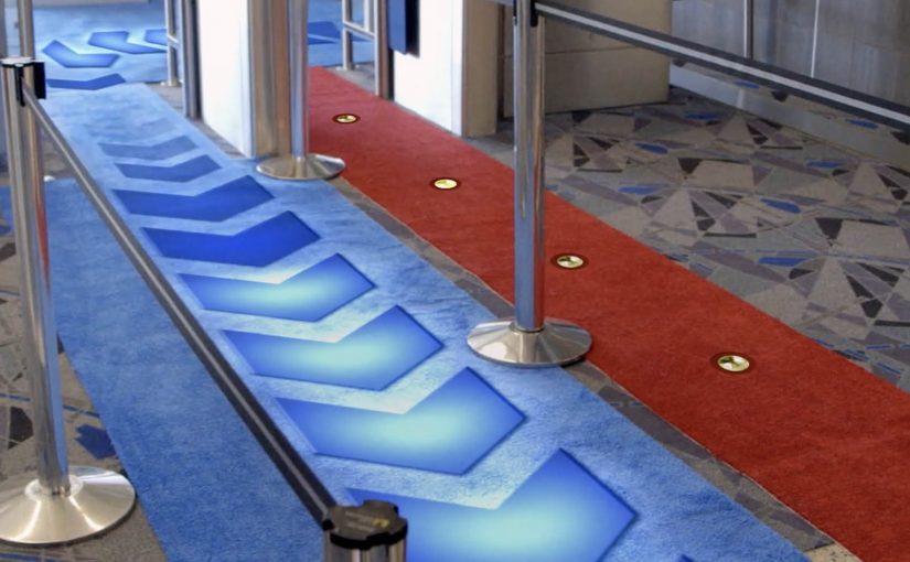
Now in their latest campaign targeting Toronto to Las Vegas bound WestJet guests, they got Las Vegas comedian Carrot Top to offer guests a special walk down the red or blue carpet. Those who chose to walk down the red carpet continued on their vacation as they had originally planned. Those who chose the blue carpet went with Carrot Top on an action-filled experience that included a stunning acrobatic display, a world-class DJ, a private airplane hangar, showgirls, and VIP access to the best of the city.

A choice mechanic that turns boarding into a story

The mechanism is a fork in the road with immediate consequences. Here, the choice mechanic is a designed decision point where one visible choice changes the path and the story. You are offered a simple choice, red or blue, with no time to overthink it. The red path is “normal”. The blue path is “something is happening”, and the reveal escalates quickly once the choice is made.

In travel and service brands, surprise upgrades work best when they are structured as a clear decision point that people can instantly explain to someone else.

Why it lands

This works because it gives guests a feeling of control while still delivering surprise. That mechanism works because a visible fork creates ownership before the surprise arrives, which makes the payoff feel earned rather than random. The blue carpet is not a random selection. It is a self-chosen leap into the unknown, which makes the outcome feel more personal and more shareable. The red carpet also matters, because it preserves contrast and keeps the twist believable.

Extractable takeaway: If you want a surprise to travel, wrap it in a simple choice. Choice creates ownership, and ownership turns a brand moment into a story people repeat accurately.

The business intent behind the spectacle

This is a loyalty play disguised as entertainment. It reinforces the idea that flying can include delight, not just transport. It also creates a strong piece of proof that WestJet treats guests as people, which is the kind of narrative that outperforms feature lists in crowded travel categories.

The real question is whether a service brand can turn a routine travel moment into a story guests want to retell.

What travel brands can steal from this

  • Use a binary choice: two paths create instant tension and clear storytelling.
  • Reward curiosity: let the “brave” option unlock the best outcome, then show why.
  • Escalate fast: once the choice is made, deliver the first payoff immediately to lock attention.
  • Make it filmable: design reveals that work from a handheld camera in real environments.
  • Anchor to a destination truth: Las Vegas is already a promise of spectacle. The upgrade simply makes that promise feel real early.

A few fast answers before you act

What is the WestJet “Ultimate Las Vegas Upgrade”?

It is a surprise experience for Toronto to Las Vegas travelers where guests choose a red or blue carpet. Red continues as normal. Blue triggers a curated VIP Las Vegas experience led by Carrot Top.

Why use a red vs blue choice?

Because it is instantly understandable, it creates viewer control, and it gives the story a clean structure with contrast between normal and extraordinary.

What makes this effective airline marketing?

It makes service tangible. Instead of claiming “we care”, the brand demonstrates it through a memorable experience that guests can share and retell.

What is the reusable pattern for other brands?

Create a simple decision point in a real customer journey, then attach an escalating surprise to one path so customers feel they opted into the moment.

What is the biggest risk with this format?

If the reveal feels confusing or staged, the audience disengages. The choice must feel real, the payoff must feel earned, and the execution must respect guest comfort.

Oakley: Pro Vision with Google Cardboard

When you picture a virtual reality (VR) headset, you probably imagine something high-tech and far too expensive to feel practical. Google Cardboard takes that assumption and flips it by turning a simple cardboard cutout into a phone-powered VR viewer.

Oakley borrows that logic and puts it exactly where people already accept cardboard. The packaging. Instead of being thrown away, the box becomes the device that unlocks the experience.

Packaging that turns into a VR product

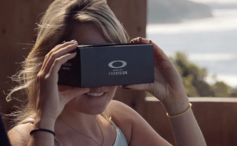
Google launched Google Cardboard as a cardboard cutout that turns Android phones into a VR headset. Oakley integrates that fold-and-slot concept into its sunglass packaging, so customers can transform the pack into a viewer and use their phone to access 360-degree content.

The payoff is described as a “you are there” look at extreme sports like surfing, skiing, mountain biking, skateboarding, and skydiving. It is less about specs and more about perspective.

In consumer product marketing, converting packaging from waste into a usable experience can create perceived value without adding new components.

Why this lands for an action-sports brand

This works because the medium matches the promise. Oakley is not only showing extreme sports. It is letting you look from inside the moment, using viewer control to make the content feel personal. The “VR made from packaging” twist also creates a good kind of surprise. The customer discovers the brand added value where they expected disposal.

Extractable takeaway: If your story is about immersion or perspective, build the experience trigger into something the customer already touches, then let the first interaction deliver the benefit before they read any explanation.

The commercial intent underneath

This is a purchase-adjacent experience. It turns the post-purchase moment into brand time, and it extends the product narrative beyond the sunglasses themselves. The packaging becomes a bridge between retail and content, with the customer doing the assembly that makes the story memorable.

The real question is whether the packaging can turn post-purchase curiosity into a usable brand experience, not whether it can imitate premium VR hardware.

What to steal from packaging-led immersion

  • Reuse an accepted “throwaway” material. If it is already in hand, it is frictionless distribution.
  • Make the first use obvious. Assembly and activation should be legible without instructions.
  • Match the experience to brand territory. Immersive POV content fits performance and extreme sports.
  • Design for sharing. If it looks clever on camera, people will demonstrate it for you.

A few fast answers before you act

What is Oakley Pro Vision in this context?

It is a packaging-led idea where an Oakley box folds into a Google Cardboard style VR viewer, using a phone to deliver 360-degree extreme sports content.

Why use Google Cardboard instead of a dedicated headset?

Because it lowers cost and setup. A phone plus folded cardboard is enough to deliver an immersive experience without asking people to buy new hardware.

What does 360-degree content add versus normal video?

It gives viewer control over where to look, which increases the sense of presence and makes the experience feel closer to a real point of view.

Where does the marketing value come from?

From turning packaging into a reusable object and extending brand time after purchase, while linking the product to high-adrenaline moments people want to feel.

What is the main failure mode with this pattern?

If the fold, fit, or onboarding is unclear, people will not assemble it. The physical usability has to be as strong as the content.