
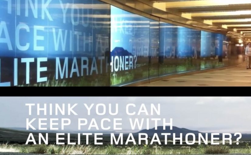
ASICS: Race Ryan Hall at Columbus Circle

ASICS wants to level up physical interaction with their brand. So around this year’s ING New York City Marathon, they built a 60-foot video wall in the Columbus Circle subway station and challenged passersby to race U.S. marathon runner Ryan Hall.

The wall plays life-sized footage of Hall running at marathon pace, turning a commute corridor into a short, sweaty benchmark. You do not “watch” the message. You try to keep up with it.

Why a race works better than a slogan

In high-traffic urban transit environments, the fastest way to make a performance claim believable is to let people feel it with their own body, not just read it. Most sports sponsorship visibility lives on banners and logos. This flips the value. It gives the audience a direct comparison: your pace versus elite pace. Because the wall sets an elite pace as a moving yardstick, that comparison makes the brand message tangible in seconds, and it creates a story people can retell immediately.

Extractable takeaway: If you need credibility fast, turn the claim into a simple physical test that anyone can try without setup.

The craft move: frictionless participation

No sign-up. No app download. No instruction manual. The interaction is instinctive. See runner. Run next to runner. That simplicity matters because subway audiences have short attention windows and low patience for setup.

What ASICS is really doing with this build

On the surface it is a fun stunt. Underneath it is a credibility transfer, meaning the elite standard makes the sponsor’s performance story feel earned when people experience the comparison firsthand. The real question is whether your brand promise holds up when people can compare themselves to an elite benchmark in public. This is a stronger sponsorship play than more logo visibility because it produces felt proof, not just awareness. By letting everyday runners test themselves against a real benchmark, ASICS positions itself closer to serious performance culture, not just event sponsorship.

Big-event activation moves to copy

  • Turn a claim into a test. If the audience can try it, they will believe it.
  • Make participation obvious. The interaction should be understood without reading instructions.
  • Place it where behavior already fits. A corridor invites motion. Use spaces that support the action.
  • Design for one-sentence retell. “I raced Ryan Hall in the subway” is the whole message.

A few fast answers before you act

What is the core mechanic of this activation?

A long-form video wall shows Ryan Hall running at marathon pace, inviting passersby to physically race alongside the footage.

Why does transit placement matter here?

Transit corridors create natural “run lanes” and constant foot traffic, so the activation gets high exposure and the behavior feels socially plausible.

What makes this more effective than a normal video billboard?

It turns viewers into participants. The message is experienced as effort and pace, not as information.

What is the biggest execution risk?

If the wall is hard to notice, the corridor is too crowded to move, or the interaction cues are unclear, people default back to walking and the idea collapses.

How would you measure success?

Dwell time, participation rate, repeat attempts, social sharing volume, and any lift in event-area brand consideration versus baseline sponsorship exposure.
Volkswagen Beetle: Juiced Up

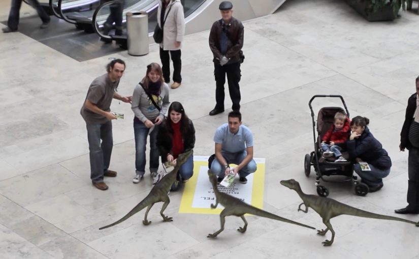
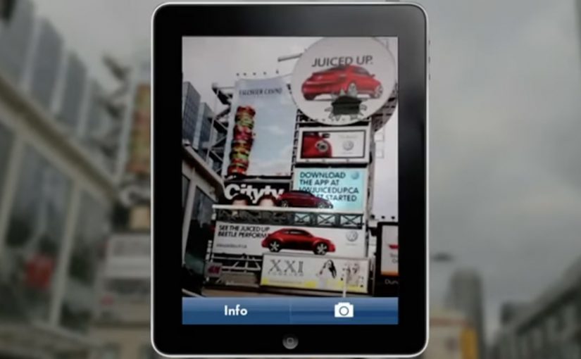
A billboard looks normal until you point your phone at it. Then the Beetle “juices up” into a 3D scene that spills out of the frame, turning a static poster into something you can explore.

That is the twist behind Volkswagen’s Beetle “Juiced Up” launch, created with Red Urban. Traditional out-of-home placements like billboards and bus shelters double as augmented reality markers. Download the custom app, scan the printed ad, and a 3D experience unlocks on your screen.

An AR marker is a printed visual pattern that a camera can recognize. When the app detects it, it anchors digital 3D content to the real-world poster so the animation appears to sit on top of the physical ad.

The best out-of-home work turns “I noticed it” into “I did something with it”, without asking people to learn a new behaviour.

Why AR markers work so well in out-of-home

Out-of-home already has the two things AR needs. Scale and repetition. People pass the same placements multiple times, which makes it easier for curiosity to build. Once someone scans, the experience feels like a hidden layer you only get if you engage. In global consumer brands running large-scale launches, out-of-home works best when it functions as a repeated trigger, not a one-time impression. A revamp is hard to communicate through copy alone. A 3D reveal makes the “newness” feel more tangible, even if the viewer only plays for a few seconds.

Extractable takeaway: Treat the physical placement as the interface. Make the first scan feel like the poster is “unlocking”, and keep the payoff immediate so the viewer control feels effortless.

What this launch is really optimizing for

This is not just about feature education. It is about reframing the Beetle’s personality and making the redesign feel more assertive and contemporary. The real question is whether your out-of-home is only a reminder, or a trigger that rewards interactivity. The app is a proof device, meaning it proves “this is different” by behaving differently than a normal poster campaign. This approach is worth doing only when the interaction reinforces the product story, not when it is novelty for its own sake.

What to steal for your next OOH-led activation

  • Make the trigger obvious. A single prompt, scan here, is enough. Let the payoff do the persuasion.
  • Anchor the interaction to the medium. If it is out-of-home, the phone should feel like a lens on the poster, not a separate experience.
  • Keep the first moment fast. If the 3D reveal does not land immediately, the novelty collapses.
  • Design for “I have to show you”. The best activations create a demo impulse that spreads in person.

A few fast answers before you act

What is “Volkswagen Beetle: Juiced Up”?

It is an out-of-home launch activation where Volkswagen posters and billboards act as AR markers. A dedicated mobile app unlocks a 3D Beetle experience when viewers scan the ads.

Why use AR markers instead of a standard QR code?

Markers make the poster itself the interface. That keeps the experience visually seamless, and it helps the 3D content feel physically attached to the real ad.

What is the main benefit of this approach for a product revamp?

It makes “newness” experiential. A 3D reveal can communicate attitude and redesign energy faster than a feature list.

What is the biggest practical risk with AR OOH?

Friction. If the app install and scan flow is slow, most people will not complete it. The reward has to justify the effort quickly.

What is the simplest way to improve completion rates?

Reduce steps and increase immediate payoff. Clear instruction at the poster, fast recognition, and an instant 3D moment that feels worth showing to someone else.