Share a Coke

Share a Coke

Despite healthy brand tracking data, 50% of the teens and young adults in Australia hadn’t enjoyed ‘Coke’ in the previous month alone. Here, “brand tracking” refers to awareness and preference metrics that can look healthy even when recent consumption is slipping.

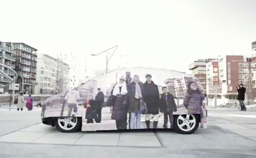
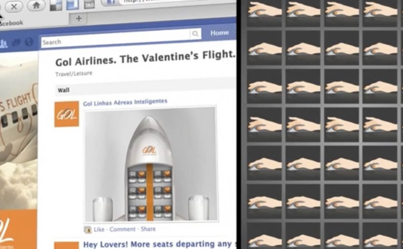
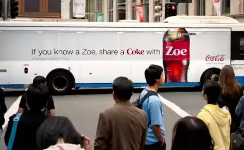
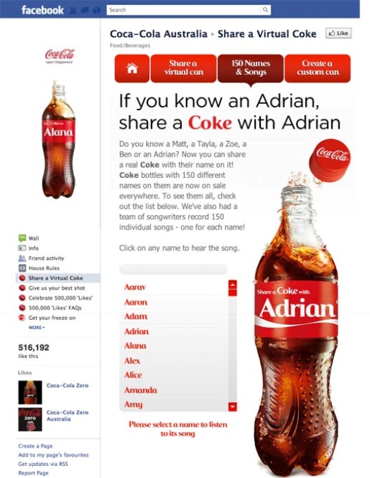
After 125 years of putting the same name on every bottle of ‘Coke’, they decided to do the unthinkable. They printed 150 of the most popular Australian first names on their bottles and then invited all Australians to ‘Share a Coke’ with one another.

Facebook image showing Coca-Cola promoting the Share a Coke campaign.

The result…

Packaging becomes the conversation

What stands out here is the simplicity. A bottle stops being just a product and becomes a prompt. A name makes it personal. Personal makes it talkable. Talkable makes it shareable.

Because the name turns the pack into a prompt, it triggers talk and sharing without requiring people to learn a new action.

In consumer brands with mass distribution and fragmented media, the pack is one of the most consistent touchpoints, so a pack-level prompt can carry an integrated campaign.

In a world where brands are fighting for attention across channels, this is a reminder that the pack itself can be the media, if it gives people a reason to participate.

Why it works (and why it is more than a label change)

It works because it makes personal relevance visible at the exact moment of choice, and that relevance is what people naturally want to point out and pass along.

Extractable takeaway: If you can make the product itself the trigger for a social action, you reduce friction and get sharing that feels like a natural behaviour, not a forced message.

  • It lowers the barrier to engagement. You don’t need a new behaviour. You just need to spot your name, or someone else’s.
  • It turns purchase into a social act. The “share” is built into the product, not bolted on as a message.
  • It scales personal relevance. The idea is big, but the execution is local. It lives in the names people recognise.
  • It links offline and online naturally. When something feels personal in-store, people are more likely to talk about it beyond the store.

The real question is whether your product can create a social reason to talk at the moment of choice, instead of asking media to do all the persuasion.

When you can bake the “share” into the product experience, packaging-led participation is a more reliable lever than a channel-first campaign plan.

What to take from this for integrated campaigns

  1. Start with a human trigger. A real reason for someone to say: “This is for me”, or “This is for you”.
  2. Make the product do the work. If the core idea is physically present, the campaign holds together across channels.
  3. Design for sharing as a behaviour. Not as a slogan. The easiest shares are the ones that feel natural and immediate.
  4. Keep it legible in one glance. The best integrated ideas can be understood instantly, without explanation.

A few fast answers before you act

What is the “Share a Coke” idea?

It is a packaging-led campaign where Coca-Cola printed popular first names on bottles, then invited people to “Share a Coke” with someone else.

What problem was Coca-Cola trying to solve in Australia?

Despite healthy brand tracking data, 50% of teens and young adults in Australia hadn’t enjoyed ‘Coke’ in the previous month, so the brand aimed to reignite consumption and relevance through conversation.

Why is printing names on bottles strategically interesting?

It makes the product feel personally relevant at the moment of choice. That personal relevance can trigger attention, talk, and sharing without needing complex mechanics.

Is this a “digital campaign” or a “packaging campaign”?

It is both, but it starts with the pack. The packaging is the trigger that can naturally extend into social sharing and broader integrated storytelling.

What is the transferable lesson for other brands?

If you can embed participation into the product experience itself, you reduce friction and increase the odds that people will carry your message across channels for you.

Mercedes-Benz F-CELL: The Invisible Drive

Mercedes-Benz F-CELL: The Invisible Drive

To demonstrate the claimed low impact of its new fuel cell vehicle, Mercedes-Benz has created an “invisible” car that blends into its surroundings.

The trick is a simple, showable hack. One side of the car is covered with LEDs. A camera captures what is on the opposite side, then the LED side displays that live feed so the vehicle appears to disappear from a specific viewpoint.

Stunts like this turn abstract emissions claims into a single, watchable proof-of-idea.

The mechanism that makes the metaphor work

This is not magic and it does not need to be. It is optical camouflage framed as a brand statement. Optical camouflage here means using a camera view and a display surface to mimic the background from a chosen angle. If the vehicle’s impact is close to “nothing,” the car should look like “nothing.” The LED-and-camera setup makes that metaphor instantly legible, even to someone who has never heard the term “fuel cell.” Because the illusion happens live on the car, the metaphor reads as evidence instead of post-production.

In enterprise automotive and mobility marketing, visual proof beats technical proof when the audience is not willing to parse specs.

The real question is whether your claim can be understood and repeated from a single viewpoint without the brochure. This is a strong sustainability communication move when the trick is honest and the metaphor stays tighter than the explanation.

Why it lands

It creates a physical moment people can point at. Sustainability messaging often lives in numbers, claims, and fine print. Here, the message is experiential. You see the effect with your own eyes, and you can describe it in one sentence.

Extractable takeaway: When your product promise is invisible, build a demonstration that makes the promise visible in under five seconds, using a single repeatable rule people can explain to someone else.

Steal the invisibility demo pattern

  • Pick one metaphor and commit to it. The entire execution serves one idea. That focus is why it travels.
  • Use real-world physics, not post-production. Even when the audience knows it is a trick, they trust it more when it is happening live.
  • Design for the shareable angle. Viewpoint-dependent illusions work because they are built for cameras and spectators, not just participants.
  • Make the explanation part of the experience. The best stunts include a built-in “how it works” story that spreads with the clip.

A few fast answers before you act

How does the “invisible car” effect work?

LED panels on one side of the car display a live video feed captured from the opposite side, creating a camouflage illusion from a particular viewpoint.

What is the brand point of using invisibility here?

It turns an environmental claim into a visual metaphor. If the impact is minimal, the car is presented as visually minimal within the scene.

Why do these technology stunts get attention when product specs do not?

They compress the story into a single moment people can see, record, and retell. That makes the promise easier to believe and easier to share.

What is the main risk when copying this approach?

Overcomplicating the trick. If the audience needs a long explanation to understand the effect, the stunt stops being a stunt and becomes a demo.

How do you keep a metaphor stunt from feeling like greenwashing theater?

Keep the claim narrow, make the trick transparent, and ensure the metaphor points to a product attribute you can substantiate elsewhere, even if most people never read the detail.

GOL: Valentine’s Flight Seat Challenge

GOL: Valentine’s Flight Seat Challenge

Brazilian airline GOL ran a Facebook activation designed to grow its online community and raise brand awareness in a highly competitive airline market. The insight behind it was simple. A trip can be one of the most romantic Valentine’s gifts to receive.

Over the Valentine’s weekend, GOL posted a series of images featuring empty airplane seats on its Facebook wall, without warning. The first people to see each image and comment the correct seat numbers won a pair of return tickets to any of GOL’s destinations.

The campaign was reported to have grown GOL’s Facebook community from 12,000 to over 200,000 in three days, making it number one in its category for the period.

A giveaway that rewards attention, not effort

The mechanism is a speed game disguised as a romantic prize. You do not fill out a form or write a story. You notice a post. You read a seat layout. You comment a number faster than everyone else.

In mass-market consumer categories, lightweight “attention rewards”, small prizes for noticing and reacting in the feed, can outperform complex promotions because they fit how people already behave in social feeds.

Why it lands

The execution stacks three accelerators. Surprise timing. A simple visual puzzle. A high-value reward that feels emotionally relevant to the weekend. That combination converts scrolling into urgency, and urgency fuels sharing and repeat checking, even among people who never win. The real question is whether your winner logic is instantly believable at feed speed.

Extractable takeaway: If you want rapid community growth, design a loop where the behaviour is already native to the platform, and the winner selection is instantly credible. Speed plus clarity beats creativity-plus-forms.

What the brand is really buying

Beyond awareness, this format buys habit. People learn that the page can drop value without notice, so they follow, refresh, and invite friends to watch too. The prize is the hook. The real outcome is an audience that has trained itself to pay attention at the brand’s tempo.

Steal this: Surprise-seat giveaway loop

  • Use a recognisable visual trigger. A seat map is instantly readable, even at feed speed.
  • Keep participation to one action. Commenting is frictionless. That matters more than polish.
  • Make the rules self-verifying. Everyone can see the seat numbers and understand who was first.
  • Lean on surprise scheduling. Unannounced drops drive repeat checking far better than a fixed timetable.
  • Match prize to context. A Valentine’s weekend mechanic wants a prize that feels like a shared experience.

A few fast answers before you act

What is the Valentine’s Flight Seat Challenge in one sentence?

It is a Facebook giveaway where GOL posted surprise images with empty seat layouts, and the first users to comment the correct seat numbers won return tickets.

Why does “first to comment” work so well on Facebook?

Because it rewards attention and speed, which are native behaviours in a feed. It also creates a visible, easy-to-trust winner logic.

What makes the seat map a strong creative device?

It is instantly legible, visually distinctive in the feed, and turns the brand’s core product into a simple game mechanic.

What is the biggest risk with this format?

Perceived fairness. If timing, moderation, or winner confirmation is unclear, the campaign can trigger backlash rather than growth.

What should you measure beyond follower count?

New follower retention after the weekend, engagement rate on subsequent posts, repeat participation behaviour, and whether awareness lift correlates with search and booking intent.