Zonacitas.com: Singles Finder App

Zonacitas.com: Singles Finder App

“Love is out there. If we get organized, there’s plenty for all.” That is the simple provocation behind the Singles Finder App built for Zonacitas.com, a major Argentinian dating portal.

Buenos Aires is often described as a nightlife-heavy city with thousands of bars, discos, and pubs. That abundance creates a practical problem for singles. Where do you go tonight if your goal is to actually meet someone?

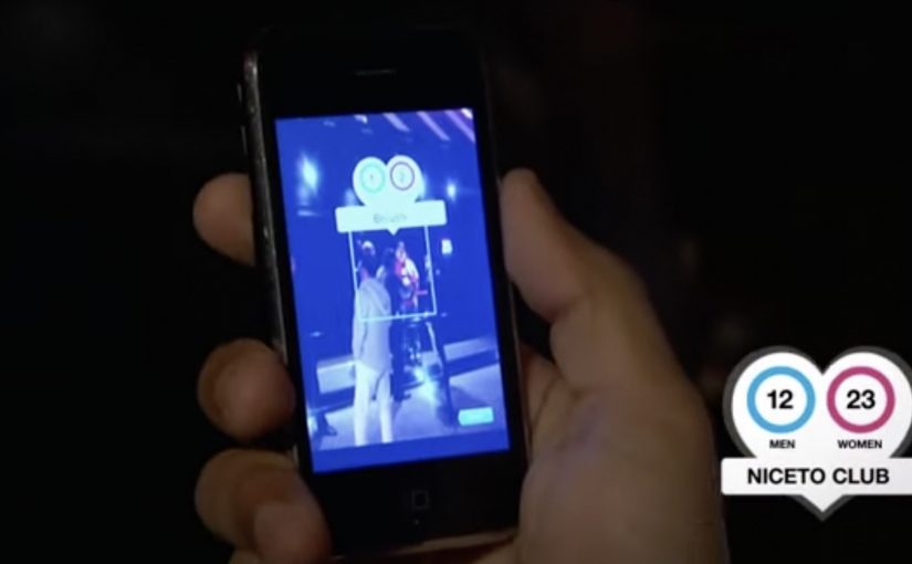
Singles Finder reframes the decision as information. It is described as a free iPhone app that shows the number of single prospects in each location, so users can choose where to go before they go.

Turning nightlife into a searchable index

The mechanism is straightforward. The app surfaces venue-level counts of single men and women, letting users compare options and pick the spot with the best odds for their intent, rather than relying on guesswork or luck.

In big-city nightlife ecosystems, the winning consumer experience is often the one that reduces uncertainty about where to invest your next two hours.

Why it lands

This works because it respects the real barrier. The hardest part is not downloading a dating app. It is deciding where to show up in the physical world. The real question is where you can increase the odds before you leave home.

Extractable takeaway: When your category depends on offline outcomes, shift the product value from “matching” to “decision support,” meaning a clear, comparable signal that helps people pick where to go before they leave. Help people choose where to go, not just who to message.

What Zonacitas.com is really buying

As positioning, it moves the brand from “dating portal” toward “nightlife utility.” As behavior, it encourages planning and repeat usage. As marketing, it turns a crowded, emotional category into a rational promise you can explain in one sentence. This is a stronger bet than competing on endless profiles and messaging alone.

Takeaways for location-driven products

  • Make the choice easier, not louder. Reduce the decision space with a simple comparison signal.
  • Shift value upstream. Solve the problem before the user commits time and money to a night out.
  • Design for “before I leave home.” The best moment is pre-decision, not mid-venue.
  • Keep the promise legible. A count is clearer than a vibe.

A few fast answers before you act

What is the Singles Finder App?

It is a Zonacitas.com mobile app concept that shows how many single prospects are in each nightlife location, helping users decide where to go before they head out.

Why is the “count per venue” mechanic persuasive?

It turns an emotional, uncertain choice into a comparable signal. Users can pick a venue based on odds rather than guesswork, which feels immediately useful.

What problem does this solve that typical dating portals do not?

It addresses the offline planning step. Instead of focusing only on profiles and messaging, it supports the real-world decision of where to show up tonight.

Who is this best for?

It is best for people facing many similar nightlife options and a time-bound goal. The value is reducing randomness in the “where do we go” decision.

How should the promise be explained in one line?

Explain it as “help me choose where to go tonight.” The clearer the decision it supports, the faster users understand why it is useful.

What should a brand measure for an activation like this?

App opens during peak nightlife hours, venue search and comparison behavior, downstream check-ins or venue visits where available, and retention driven by repeat planning on future nights.

Mercedes-Benz: Transparent Walls for PRE-SAFE

Mercedes-Benz: Transparent Walls for PRE-SAFE

For the PRE-SAFE® precrash system from Mercedes-Benz, ad agency Jung von Matt in Germany set out to make chaotic traffic intersections safer.

The idea was to let everyone “look around the corner” as if walls were transparent. In this execution, “transparent walls” means projecting a live camera view onto the building edge so the blind spot becomes visible. A camera filmed what was happening out of sight around the corner, and the live images were projected onto an 18/1-format billboard mounted on the building edge for approaching traffic to see.

When out-of-home becomes a live safety interface

This is not an awareness poster. It behaves like infrastructure. The corner. The blind spot. The moment of uncertainty. All become the media placement and the message at the same time.

The real question is whether your safety story behaves like a tool at the decision point, not a slogan people ignore.

How the mechanism creates “transparent walls”

  • Capture. A camera records the street view that drivers cannot see until they commit to the turn.
  • Project. A large-format display on the building corner shows that view in real time.
  • Anticipate. People approaching the intersection get a few extra seconds to recognise a cyclist, car, or hazard.

In urban mobility and automotive safety communications, making risk visible in the moment can change behaviour faster than warning copy.

Why it lands

Safety messages often fail because they arrive as abstract advice. This one arrives as immediate utility. It gives people a concrete, legible advantage at the precise point where bad outcomes happen. Because the live projection turns hidden risk into visible information, the benefit is believed without asking anyone to trust a claim. Safety-led brand work should earn attention through utility, not admonition. The result feels less like advertising and more like “someone fixed a problem.”

Extractable takeaway: The most persuasive safety communication is not a claim. It is a demonstrable reduction of uncertainty, delivered at the exact moment people need it.

What the brand intent looks like underneath

The stunt does double duty. It dramatizes what PRE-SAFE® is for without explaining sensors, thresholds, or system logic. It also signals a brand posture. Mercedes-Benz is not only selling performance. It is selling anticipation.

Steal this pattern: make uncertainty visible

  • Build the message out of the environment. Pick a real-world constraint your audience feels, then solve it visibly.
  • Make the proof self-evident. If people can understand the benefit in one glance, the idea scales.
  • Reduce uncertainty, not fear. Practical clarity outperforms shock in public safety-adjacent work.
  • Choose the right “moment.” Place the intervention where decisions are made, not where people are merely passing through.
  • Design for all road users. Intersections are shared systems. Make the benefit readable for drivers, cyclists, and pedestrians.

A few fast answers before you act

What is “Transparent Walls” in one sentence?

It is a digital out-of-home installation that shows live footage from around a blind corner on a building-edge billboard, so approaching traffic can spot hazards earlier.

How does this connect to PRE-SAFE®?

It demonstrates the value of anticipation. Seeing danger earlier is the human equivalent of what precrash systems aim to deliver technologically.

Why use a live camera feed instead of a scripted film?

Because real-time content makes the utility undeniable. People trust what they can see unfolding right now.

What are the main execution risks?

Latency, visibility in different lighting conditions, weather robustness, and ensuring the display informs rather than distracts drivers.

How would you measure success?

Observed speed adjustments, braking behaviour changes, near-miss reduction at the intersection, dwell/attention metrics, and sentiment around perceived usefulness.

Samsung: Unleash Your Fingers

Samsung: Unleash Your Fingers

For the launch of the Galaxy S II in France, Samsung brought JayFunk, the internet finger tutting phenomenon, from Los Angeles to Paris to deliver an incredible and surprising choreography.

When “touch” becomes performance

Finger tutting is a style of dance where intricate shapes and geometric figures are created using hands and arms. Samsung frames that craft as the purest expression of what a touch device asks of you. Your fingers become the headline.

The mechanic is the metaphor

The film does one clear thing. It takes a niche skill. It stages it like a reveal. It lets the choreography do the talking, then uses visual treatment to make the hands feel almost “interface-like”. The message is implicit. This is a phone built for what your fingers can do.

In consumer electronics launches, the fastest route to preference is often a single metaphor that makes a feature feel obvious without listing specifications.

Why it lands

This works because it respects attention. There is no explanation tax, no product demo checklist, and no forced storyline. It is a short, repeatable spectacle that makes “touch” feel expressive, not functional. Because the performance externalizes touch as a visible skill, the product promise becomes intuitive before the viewer processes a single specification. Samsung’s own newsroom later described the video as quickly climbing viral charts and reaching millions of views at the time, which fits the format. It is built to be replayed and forwarded.

Extractable takeaway: When your product benefit is hard to visualize, borrow a human craft that embodies it, then let the craft carry the proof while the brand stays in the background.

What Samsung is really signalling

The brand is not only selling a handset. It is staking a position in culture. Touchscreens are not just input. They are a playground. Casting a specialist performer signals modernity, precision, and mastery, all without ever saying those words.

The real question is how to make touch feel culturally meaningful before anyone asks about specifications.

What launch teams can take from this

  • Lead with a single, watchable skill. Spectacle beats explanation when the benefit is sensory.
  • Make the metaphor tight. Fingers, touch, gestures. Everything points to one idea.
  • Keep product presence restrained. Let the audience connect the dots. It feels smarter and travels better.
  • Design for replay. Short, surprising sequences outperform long narratives for launch buzz.
  • Use culture as targeting. A niche community can become your amplification engine if you treat it with respect.

A few fast answers before you act

What is the main idea behind “Unleash Your Fingers”?

Turn touch interaction into a cultural performance, so the phone’s core benefit is felt rather than explained.

Why use finger tutting instead of a normal product demo?

Because it externalizes “dexterity on glass” in a way people can immediately understand and want to share.

What should a brand be careful about with a performance-led launch film?

Do not let the performance become disconnected from the product. The metaphor must stay legible, and the brand role must feel earned.

How could a non-tech brand apply the same approach?

Pick a human craft that embodies your promise, then film it so the craft proves the point without heavy narration or feature lists.

What is a practical success metric for work like this?

Beyond views, look for lift in branded search, share rate, completion rate, and recall of the single idea the film is built around.