
Sodimac: The 5-Second Skip Behavior Ad

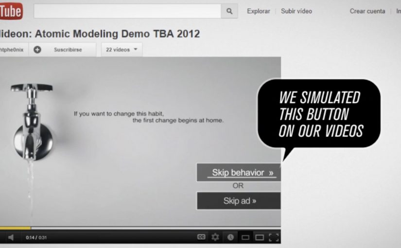
Viewers usually spend five seconds counting down to the “Skip Ad” button. Homecenter Sodimac from Chile uses that exact moment to ask a better question: do you want to skip the ad, or skip the behavior?

Working with agency MayoDraftfcb, Sodimac created a set of environmental messages that turn the skippable format into a moral choice. The button becomes the idea. Either you opt out, or you commit to changing a small wasteful habit.

A tiny mechanic that flips the meaning of “skip”

The creative move is to hijack an interface behavior people already know. That matters because it removes learning friction. The audience understands what to do instantly, and the campaign only has to change what that action means.

In brand communication, this is a neat example of interface-led storytelling. By that I mean the story is carried by a native UI element, not just the film around it.

The platform UI is not just a container for the message. It is the message.

In skippable video media, the first five seconds are the only attention you can reliably design for.

Why this works better than a standard awareness film

It uses the countdown moment as the content, so the viewer understands the choice instantly and the message lands before the skip reflex kicks in.

Extractable takeaway: If the platform gives people a default behavior, design your idea so that default action becomes the point, not the obstacle.

  • It is time-native. The idea fits the five-second window instead of fighting it.
  • It creates viewer control. The viewer makes an explicit choice, not a passive nod.
  • It is measurable. The “change” action is a click, not a vague sentiment.
  • It is consistent with the topic. Environmental habits are about small repeated actions. The format mirrors that.

Reported impact, and the real lesson

The campaign is reported to have driven over 80,000 people to choose the “change” option within a week. This is a smarter use of pre-roll than most awareness films because it makes the click mean something. The real question is whether your first five seconds invite a meaningful choice or just a reflexive skip. The bigger takeaway is structural: if you can turn a default skip behavior into a meaningful action, you get engagement that feels earned rather than bought.

Design rules for your next skippable campaign

  • Build for the first five seconds, and make the idea readable without audio.
  • Use the interface as a prop, buttons, timers, overlays, or any native UI element that viewers already trust.
  • Offer a single clean choice, so the click means something unambiguous.
  • Make the action lead somewhere useful, tips, tools, pledges, or a next step that matches the promise.

A few fast answers before you act

What is the core idea in one line?

It reframes the skippable pre-roll moment. Skip the ad, or skip the bad habit.

Why does this mechanic fit environmental messaging?

Because sustainability is built on small decisions repeated often. A skippable ad is also a small decision, repeated often.

What makes this different from a normal call-to-action?

The CTA is embedded inside a familiar platform behavior. The campaign is not asking for extra attention. It is redirecting an existing action.

What is the biggest risk with “interface hijack” ideas?

Here, “interface hijack” means repurposing a familiar UI element like the Skip button without hiding what is happening. If the viewer feels tricked, trust collapses. The choice has to feel fair, clear, and reversible.

What should you measure to prove it worked?

Click choice rate, completion rate, and downstream behavior on the landing destination, plus any lift in eco-tip engagement over the campaign window.
Volkswagen: The BlueMotion Label

A magazine gets read, then it gets tossed. The campaign framing cites a blunt number: 77% of magazines, along with their ads, end up in the trash, which makes the medium itself feel like waste.

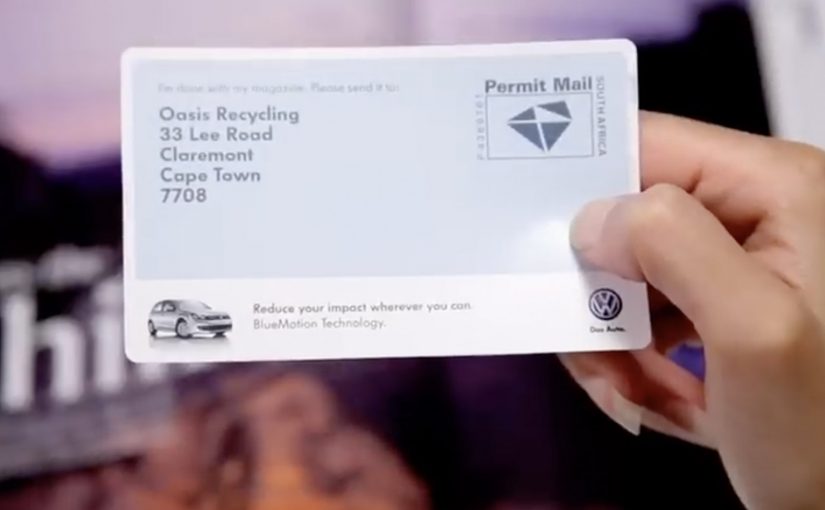
So when Volkswagen wants to promote the eco-conscious thinking behind its BlueMotion vehicles, Ogilvy develops a print insert that does not just talk about recycling. It makes recycling the default next step.

The insert is designed to get people in Cape Town to recycle their magazines via the city’s post boxes. Once you are done reading, you use the insert and drop the magazine into a post box, turning postal infrastructure into a recycling pathway instead of sending the paper to landfill.

When the medium becomes the message

The mechanism is a print ad that changes the fate of the print medium. Instead of adding more paper persuasion, it converts the entire magazine into something that can be routed to recycling, using a familiar behavior, posting, to remove the friction of “finding a recycling option”.

In consumer marketing, “sustainability” claims land best when the communication channel follows the same rules the product is asking people to adopt.

The strongest sustainability advertising makes the medium do part of the environmental work itself. The real question is whether the communication changes the waste behavior around the product, or just describes a greener intent.

Why it lands

This works because it removes hypocrisy. If you are going to sell eco-conscious thinking, your ad cannot behave like disposable clutter. By turning the magazine itself into the recyclable object, the campaign gives people a satisfying feeling of doing the right thing with almost no extra effort, and it makes the brand promise feel practical rather than moralizing.

Extractable takeaway: If your benefit is “less waste”, design the communication so it physically reduces waste, and let the proof be the experience, not the copy.

What to borrow from the BlueMotion Label

  • Replace messaging with utility. If you can change behavior directly, you do not need to preach.
  • Use existing infrastructure. People already know how to use post boxes, so adoption is friction-light.
  • Make the action one-step. The closer the action is to the moment of disposal, the higher the follow-through.
  • Make the proof visible. A physical insert is something people can show, talk about, and demonstrate.

A few fast answers before you act

What is “The BlueMotion Label”?

A Volkswagen BlueMotion print insert designed to make magazine recycling easy by letting readers use post boxes to route finished magazines into a recycling flow.

Why is this stronger than a standard eco-themed print ad?

Because it behaves like the promise. It reduces waste through the ad itself, instead of adding more disposable paper to argue about sustainability.

What behavior change does it target?

Moving magazines from “trash by default” to “recycle by default” at the exact moment people finish reading.

What is the key execution ingredient?

Friction removal. The action must be simple enough that people will do it immediately, without searching for a recycling option.

When should brands use this pattern?

When your claim depends on credibility, and you can redesign the medium or distribution so the communication itself demonstrates the value.

CuteCircuit x Ballantine’s: tshirtOS

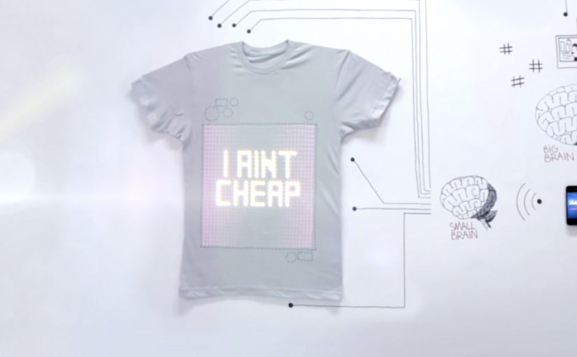
A grey T-shirt looks ordinary until it lights up and starts broadcasting whatever you choose. Text. Images. A status. A moving graphic. Your chest becomes a screen.

London fashion house CuteCircuit, in collaboration with whisky brand Ballantine’s, introduces tshirtOS, described as a wearable, shareable, programmable T-shirt built for digital creativity.

Here is a short making-of film, described as having received over 500,000 views.

What tshirtOS actually is

At the center is a 32 by 32 grid of 1,024 LEDs on the front of the shirt, controlled via an app on your phone. The concept is expanded with built-in components including a micro-camera, a microphone, an accelerometer, and speakers. The result is a garment that can display and capture content, then push it outward as a wearable broadcast. Here, that means the shirt itself becomes the display surface and the phone becomes the control layer.

In global consumer culture, where mobile is the primary tool for self-expression, programmable wearables turn identity signals into a personal channel that travels with the wearer.

Why it lands

Most “future of fashion” ideas die because they look like tech demos instead of culture. tshirtOS works as a story because it keeps a familiar object, the plain tee, then adds one new superpower that everyone understands immediately. You can show something. Right now. In public. Because the output appears on a familiar object people already understand, the technology reads as communication before it reads as hardware. That instant legibility makes the idea feel less like a gadget and more like a new medium.

Extractable takeaway: If you are launching a new interface, anchor it in a familiar form factor, then make the first benefit obvious in one glance so the audience explains it for you.

What the brands are really betting on

The ambition is bigger than a one-off prototype. It is a new creative canvas that sits between fashion, social content, and live communication. Ballantine’s gets cultural adjacency to creativity and experimentation, while CuteCircuit extends its interactive fashion narrative into something that looks commercially repeatable.

The real question is whether a programmable garment can move from prototype theater into a repeatable medium people instantly understand and want to use.

The second film, “T-shirt of the future,” puts tshirtOS into a night-out storyline. It is described as having already generated over 1.3 million views.

What to steal from tshirtOS

  • Prototype the medium, not the message. When the platform is new, the product itself is the headline.
  • Design for instant comprehension. If it cannot be understood in a second, it will not spread.
  • Show it in culture, not a lab. A night out beats a spec sheet for explaining why it matters.
  • Make it programmable. Viewer control creates infinite variations without infinite production.

A few fast answers before you act

What is tshirtOS in one line?

A programmable T-shirt concept that uses a 32 by 32 LED grid and a mobile app to display and share digital content in real time.

What hardware is described as being inside the shirt?

A 1,024 LED grid plus components including a micro-camera, microphone, accelerometer, and speakers.

Why does a programmable shirt matter for brands?

It turns the wearer into a moving, controllable surface for expression, which can connect live moments to digital content without relying on external screens.

What is the main adoption barrier?

Practicality and cost. Washability, comfort, battery life, and price all determine whether it becomes a product or stays a prototype.

What is the strongest creative use case?

Live, personal expression in social settings, where instant visual output is part of the experience and the wearer wants to change what is displayed on the fly.