
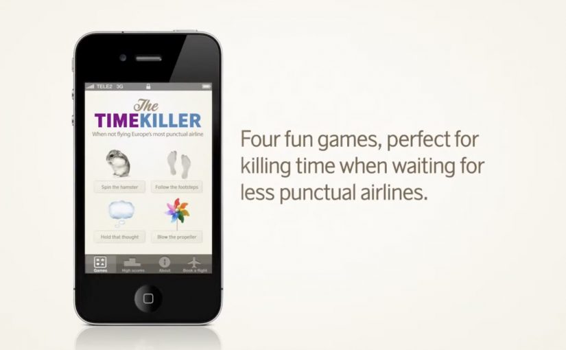
SAS TimeKiller App: for delayed flights

For the last two years in a row, SAS (Scandinavian Airlines) wins recognition as Europe’s most punctual airline. With their ad agency SWE Advertising Stockholm, they create a small time-wasting utility app that is not actually made for loyal SAS customers, but for customers of competitor airlines. Here, a “utility app” means a tiny set of simple time-wasters meant to fill airport waiting time, not a booking tool.

The idea is to poke fun at SAS’ rivals by suggesting their passengers will need this app from SAS because chances are their flight will be delayed and they will need something to kill time with.

Punctuality is a service promise that is easier to demonstrate through playful proof than to claim in a static ad.

Why the joke works as a positioning tool

The app is framed as “help” for the wrong audience. That reversal does two things at once. It flatters SAS’ own performance, and it gives people a sharable punchline that does not require you to know anything about the airline’s route map or pricing.

Extractable takeaway: If you have a provable operational edge, package it as “help” for the people who do not have it. The inversion makes the proof memorable and easy to retell.

What the utility format adds

A utility app earns attention differently than a film. People understand the use case immediately, and the brand is present during the exact moment when “punctuality” becomes emotionally relevant, which is waiting around with nothing to do. Because the brand shows up inside that boredom, the punctuality claim feels like lived experience rather than marketing.

In European travel markets where delays are a shared irritation, proof-based humor like this can travel faster than polished slogans.

The real question is whether your brand can turn a performance claim into something people choose to share.

Competitor teasing like this is worth doing only when your punctuality claim can withstand scrutiny.

Steal the move: playful proof of punctuality

  • Target the competitor’s pain point. The message lands because it attaches to a real frustration, delays.
  • Make the idea explainable in one line. “An app for when your airline is late” is instantly clear.
  • Let the brand voice do the selling. The confidence in the joke is the differentiator.
  • Choose a format that matches the claim. If the promise is saving time, build something that lives inside wasted time.

A few fast answers before you act

What is the SAS TimeKiller App?

It is a light utility app positioned as a set of simple time-wasters for passengers who end up waiting because their flight is delayed.

Who is the app really aimed at?

Competitor airline customers. The concept uses them as the audience so SAS can underline its punctuality by contrast.

What is the core message SAS communicates?

If you fly SAS, you should not need a time-killing app at the airport. If you fly someone else, you might.

Why is an app a smart channel for this idea?

Because it places the brand in the exact moment of frustration and boredom, which makes the message feel relevant rather than abstract.

What is the main risk with this kind of competitor jab?

If your own operational performance slips, the joke can backfire. This format works best when your proof point is consistently strong.
Subway “Daredevil Delivery”

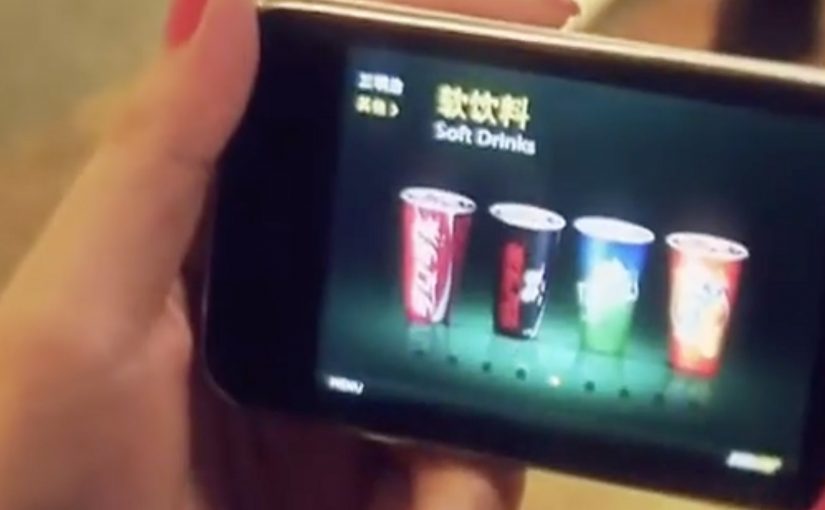
Subway was facing massive competition from other fast food chains in China. Mobile agency iconmobile was given the task to claim the mindsets of their target audience in an innovative way that also triggered sales.

A mobile game was created to let users step into the role of a subway delivery guy. Rather than just providing an emotional benefit, the app also included…

  • a map that provided direction to shops nearby
  • a click-2-call order function
  • a mobile coupon channel to trigger sales according to the users behaviour

Here, a mobile coupon channel means offers delivered through the phone based on what the user does in the experience, not a generic discount blast.

Why the mechanics matter

The idea combines three practical conversion tools with gameplay. A nearby-store map reduces “where do I go”. Click-to-call reduces “how do I order”. Coupons reduce “why now”. The game gives all of it a reason to be opened in the first place. This is smart mobile thinking because it makes the route from attention to order materially shorter. The real question is how to turn a branded interaction into a faster path to purchase.

Extractable takeaway: entertainment works harder when it removes friction at the exact moment interest is highest.

In mobile-led fast food categories, this matters because attention is easy to win for a moment, but ordering friction still kills intent fast.

What Subway is really trying to do

The business intent is to turn branded play into store discovery, faster ordering, and timed coupon redemption.

What to borrow for mobile campaigns

  • Attach utility to entertainment. Games can drive attention, but the built-in tools drive action.
  • Keep the path to purchase short. If ordering is a tap away, intent has less time to cool down.
  • Use behaviour to time incentives. Coupons work better when they match what the user is doing in the moment.

A few fast answers before you act

What is Subway “Daredevil Delivery”?

A mobile game campaign in China that put users in the role of a Subway delivery guy, paired with tools that could trigger real orders.

Which agency created it?

iconmobile.

What features connected the game to sales?

A nearby-store map, a click-to-call ordering function, and a mobile coupon channel based on user behaviour.

Why is this stronger than a branded game on its own?

Because the game creates attention, while the map, call function, and coupon channel give that attention a direct path to store visits and orders.

What is the key lesson for mobile?

Pair a fun mechanic with immediate utility, so the experience can convert curiosity into action without friction.

Airwalk: The Invisible Pop-Up Store

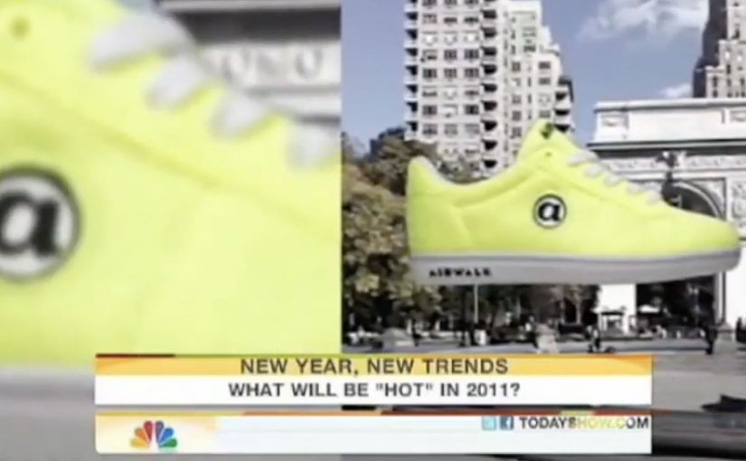
GoldRun and Young & Rubicam have created what is billed as the world’s first invisible pop-up store. Here, “invisible” means the storefront is an AR layer that only appears on a phone at specific GPS coordinates.

Sneakerheads and skaters visit the virtual store at Washington Square Park in NYC and Venice Beach in LA. You show up, look through the phone, and the drop reveals itself.

A pop-up you cannot see until you are there

The mechanism is a location-based AR layer. The product is GPS-linked to specific places, so access is earned by presence, not by refreshing a webshop.

Instead of browsing shelves, people “capture” the virtual sneaker in the app and unlock a purchase path. The retail action is still commerce, but the pre-commerce moment is play.

In youth culture launches where scarcity and scene credibility matter, location-based drops create stronger heat than broad e-commerce blasts.

Why this lands with sneaker culture

This is not just novelty AR. It taps into three instincts that already exist in sneaker communities:

Extractable takeaway: When scarcity is the story, make the constraint experiential (where, when, who) so fans can earn access and retell the effort.

  • Scarcity: limited runs feel meaningful when access is constrained.
  • Proof of effort: being there becomes part of the story and the status.
  • Social retell: the experience is easy to describe and easy to show.

The “invisible store” framing also upgrades the idea from a promo to a cultural moment. It makes the drop feel like an event that happened, not a product that launched.

The business intent under the stunt

Airwalk gets a high-impact relaunch without paying for traditional retail real estate. The brand borrows the authenticity of parks and beaches, then turns those places into distribution.

The real question is whether you can make showing up part of the product value, not just the marketing.

That matters because it makes the product and the environment inseparable. The sneaker is not simply “for” skaters and surfers. It appears where they actually are.

Launch moves from geo-locked pop-ups

  • Make access physical, even if the product is bought digitally.
  • Turn scarcity into a mechanic, not a banner headline.
  • Design a one-sentence retell, for example “the store only exists at two spots.”
  • Pick locations that already signal the brand, so the setting does some of the messaging work.

A few fast answers before you act

What is an “invisible pop-up store” in practical terms?

It is a temporary retail experience that exists only through a phone interface at specific real-world coordinates. No physical store build is required.

What is the core mechanic that drives participation?

Geo-fenced discovery. People must travel to a location to reveal the product, then complete an action in-app to unlock purchase.

Why not just sell the shoes online normally?

Because the launch is the marketing. Turning purchase access into a hunt creates earned attention, social proof, and a stronger sense of drop culture than a standard checkout flow.

What are the biggest risks with this approach?

Friction and disappointment. If the experience is hard to access, unstable on devices, or feels unfair due to distance, enthusiasm flips quickly.

What should a brand measure to know if it worked?

Location visits, completion rate from “found” to purchase, time-to-sell-out, and the volume and quality of organic sharing that shows people proving they were there.