
Depaul UK: iHobo

It is easy to ignore a homeless person as you walk past them on the street, but after having one on your phone for three days Depaul UK hopes you will see the complex and varied issues behind youth homelessness.

This free app was created pro bono by Publicis London to raise awareness of Depaul UK, a charity devoted to youth homelessness in the UK.

Three days with a person you cannot swipe away

The mechanism is designed to feel like responsibility, not content. Over three days, the app keeps returning with prompts from a single “virtual homeless person”, pulling you back into their needs and decisions at inconvenient, everyday moments. That works because repeated prompts turn passive sympathy into felt responsibility.

In UK urban life where homelessness is visible but easy to mentally filter out, sustained micro-interruptions, small prompts that arrive during ordinary routines, can create empathy better than one big, easily-dismissed message.

Why it lands

The idea works because it weaponizes time. You do not get a one-minute burst of sadness and a clean exit. You get repeated friction, enough to feel the difference between “seeing” homelessness and “living alongside” it, even in a small way.

Extractable takeaway: If you need real attention for a complex cause, build a short, bounded experience that returns to the user repeatedly, then make the “I did something” step simple and immediate.

What Depaul is really trying to change

The real question is how to make someone feel ongoing responsibility for a problem they usually pass in seconds.

This is fundraising logic disguised as experience design. Depaul is trying to reach people who do not respond to posters and leaflets, and to do it on the device they check constantly. The app turns awareness into a relationship, then uses that relationship to make donating feel like a natural next step.

What cause campaigns can take from iHobo

  • Use duration as the persuasion. Three days is long enough to form a habit, short enough to try.
  • Design for interruption, not bingeing. Timed prompts beat long videos for sustained attention.
  • Keep the user’s role clear. Caring, deciding, responding. Clarity prevents drop-off.
  • Bound the experience. A defined end reduces resistance to starting.

A few fast answers before you act

What is iHobo?

A free mobile app created for Depaul UK that asks users to look after a “virtual homeless person” for three days to build awareness of youth homelessness.

What is the core mechanism?

Time-boxed engagement. The app returns with prompts over multiple days, creating repeated contact that is harder to ignore than a single awareness message.

Why three days?

It is long enough to create attachment and repeated friction, but short enough that people will still commit to trying it.

What makes this different from a standard charity film?

It turns passive viewing into ongoing responsibility. The message arrives on your schedule, not the campaign’s.

What is the most reusable lesson for other causes?

If the issue is complex, do not rely on a single emotional peak. Build a short series of small, repeated moments that accumulate into understanding and action.

Renault Espace: iPad 360° View

The Renault Espace is a large MPV from French car-maker Renault. With a new iPad app, Renault gives users an onboard view of the Espace like never before.

The application is a 360 degree interactive video. All you need to do is tilt your iPad and explore different angles as if you were right there.

A virtual showroom that behaves like your head

The mechanism is refreshingly direct. The app uses the iPad’s motion sensors to map physical movement to viewpoint changes inside the car. Instead of tapping through static photos, you “look around” by moving the device. It is a smart use of motion sensing because it keeps the interface invisible and the focus on the cabin.

In automotive consideration journeys, anything that increases spatial understanding of the interior helps bridge the gap between online browsing and a test drive.

Why it lands

Interior experience is one of the hardest things to communicate in standard car marketing. This solves that by letting the user control perspective. It also creates a calmer kind of interactivity. No menus, no instructions, no friction. Just tilt and explore.

Extractable takeaway: When your product has a strong spatial component, give people viewer control over perspective. It builds confidence faster than adding more copy.

What Renault is really trying to achieve

The real question is whether this kind of “tilt to explore” experience reduces uncertainty enough to make a showroom visit feel worth it.

This is a digital test-sit, a lightweight simulation of sitting in the cabin so you can judge layout and comfort before a showroom visit. It is designed to make the Espace feel accessible before a showroom visit, and to reduce uncertainty about cabin layout, visibility, and perceived comfort. Done well, it also keeps attention longer than a typical brochure flow.

Steal this for spatial product demos

  • Use motion as navigation. If the device supports it, motion control can feel more natural than UI controls.
  • Keep the interaction single-mode. One behaviour. Tilt to look. That simplicity is the feature.
  • Prioritise the interior. For family vehicles, cabin experience often sells more than exterior styling.
  • Let curiosity drive. Give users freedom to explore, rather than forcing a predetermined tour.
  • Make it fast to load. Interactive video dies when buffering becomes the dominant experience.

A few fast answers before you act

What is this Renault Espace iPad app in one sentence?

It is an iPad experience that uses a 360 degree interactive onboard video so users can tilt the device to explore the Espace interior from different angles.

Why use 360 video instead of a standard photo gallery?

Because it communicates space and layout more effectively. Users can look where they want, which reduces uncertainty faster than scrolling images.

What makes “tilt to explore” feel intuitive?

It mirrors how people look around in real life. Physical movement maps directly to viewpoint changes, so interaction feels natural.

What is the main execution risk?

Performance. If motion tracking feels laggy, or the video quality is poor, users will abandon quickly and the experience will feel like a gimmick.

What should you measure if you ship this type of experience?

Time spent, percentage of users who explore multiple viewpoints, completion rate, repeat sessions, and whether it correlates with test-drive requests or dealer inquiries.

The Escape Service: Press the red button

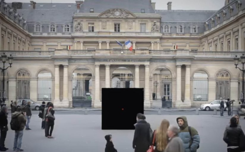
DDB Paris creates a new service for the French rail booking site Voyages-sncf.com. “The Escape Service” lets people escape to any destination they want by simply pushing a magical red button.

Together with the French collective Pleix, they design three celebrations that emerge from a 3×3 meter black box that unfolds like a giant jack-in-the-box. In Paris, the cube lures passers-by in, asks where they want to go, then bursts into a destination-themed surprise and hands out a mock ticket for the chosen trip.

The film also ends by inviting viewers to press the button themselves and experience a first-person view version of the Escape Service. That first-person view version is a POV cut where the camera takes your place at the button.

A black box that behaves like a travel shortcut

The mechanism is deliberately minimal. There is one obvious choice, press the red button. The payoff is oversized, because the box transforms into a celebration that makes “go anywhere” feel real without explaining routes, prices, or schedules.

In European rail and travel marketing, turning an abstract promise like “escape” into a public, physical moment helps people imagine the journey instantly.

Why the red button is the real interface

The button turns travel intent into an action you can perform in one second. That matters because it removes hesitation. You do not need to “plan” to participate. You only need curiosity, and the street does the rest.

Extractable takeaway: When your promise is intangible, make the first step a one-second action that people can try without planning, then let the payoff do the explaining.

What the campaign is really proving for Voyages-sncf.com

This is not about a single destination. It is about choice and immediacy. The idea says: if you can decide on the spot, you can book on the spot. The mock ticket detail pushes the story from spectacle into something you can take away and show.

The real question is whether your service promise can be compressed into one action people will try without needing more information.

This kind of one-action interface is worth copying when you need to turn curiosity into intent fast.

Moves to borrow from the red-button mechanic

  • Reduce the interaction to one decision. One button is better than a menu when you need street participation.
  • Make the reward visible to bystanders. If spectators can understand the payoff, the crowd recruits the next person.
  • Personalize the outcome fast. A destination choice and a ticket-like takeaway make the moment feel “mine”.
  • Bridge offline to online without forcing it. A first-person online version extends reach without changing the story.

A few fast answers before you act

What is “The Escape Service” for Voyages-sncf.com?

It is a public pop-up experience where a black box invites people to press a red button, choose a destination, and trigger a surprise celebration that dramatizes the idea of escaping by train.

Why use a red button and a box?

Because it is self-explanatory. A single button removes friction and creates a clear before-and-after moment that people remember and film.

What makes this more than a stunt?

The mechanic maps cleanly to the service promise: pick a destination and go. The mock ticket detail turns the experience into a personal travel intent, not only entertainment.

How does this support online booking?

It makes “decide and book” feel effortless. The film’s first-person online extension reinforces that the same impulse can continue digitally.

What is the transferable lesson for service marketing?

When your product is intangible, build a physical interface that compresses the benefit into one action and one memorable payoff.