
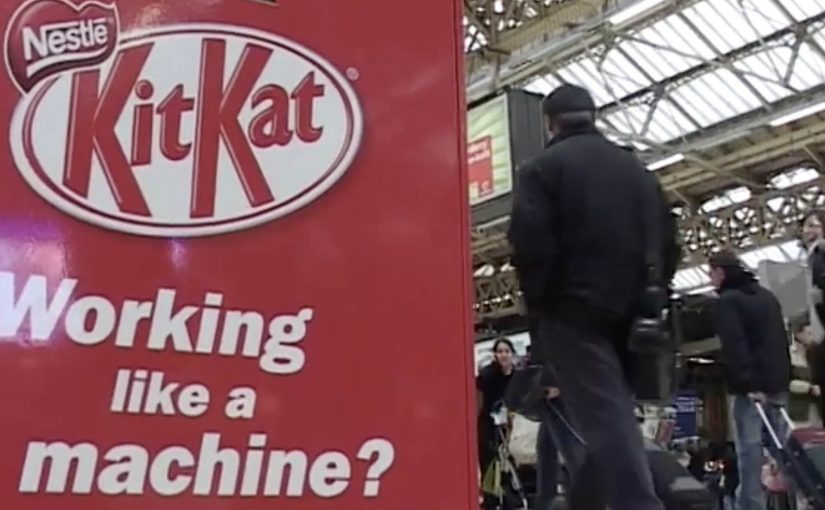
KitKat: Human Vending Machine

We all know how it feels to need a break from the routine of working like a machine. That is why KitKat brought a quirky trend from Japan over to the UK by installing a human vending machine in London’s busy Victoria Station.

Commuters were given a chance to buy a KitKat for 20p, but from a machine with a real difference. A real person operated it from inside, turning a quick purchase into a small moment of surprise and a quick chat. The money was described as going to charity.

A vending machine that replaces automation with a person

The mechanic is straightforward. It looks like a standard vending machine on the concourse. You put money in. You make a selection. Then a real “vendor” inside the unit hands you the bar, human-to-human, at vending-machine speed.

In high-traffic commuter environments, ambient activations (quick, in-the-flow brand interactions placed in public space) work best when the interaction is instant, the reward is obvious, and bystanders can understand the joke in one glance.

Why it lands

This works because it turns the very thing people are tired of, being treated like a machine, into the punchline. The vending format signals efficiency and routine. The human reveal breaks that expectation and delivers the “Have a break” idea as an experience, not a line of copy.

Extractable takeaway: If your brand promise is about relief, do not only describe relief. Stage a short, public interruption of routine where the consumer feels the promise in real time.

What the activation is really doing for the brand

The real question is whether you can make the “Have a break” promise felt without turning the commute into a bottleneck.

This is a strong format when the idea is obvious from a distance and the handoff stays genuinely fast.

At face value, it is a cheap bar and a good deed. Underneath, it is a behavioural prompt in a place where people are stressed, rushed, and receptive to a small uplift. The “human machine” also creates instant social proof. Every interaction becomes a tiny piece of live theatre that recruits the next person in line.

How to borrow the human-vending-machine pattern

  • Make the concept self-explanatory. The best stunts do not need instructions. The crowd teaches the crowd.
  • Build one clean reveal. A single unexpected moment beats multiple clever steps.
  • Design for the queue. Waiting becomes part of the experience and amplifies visibility.
  • Anchor the stunt to the brand line. The “break” is the product, and the bar is the proof.
  • Give people a reason to feel good. A charity tie-in can reduce cynicism and increase participation.

A few fast answers before you act

What is the “human vending machine” idea in one line?

A vending machine that dispenses KitKat bars, but the dispensing is done by a person inside the unit, turning a routine purchase into a surprise interaction.

Why does this work specifically in a commuter station?

Stations concentrate stress, repetition, and time pressure. A fast, playful interruption is more valuable there than a slow, explanatory brand experience.

What makes it feel like a KitKat idea rather than a random stunt?

The experience embodies the brand’s break positioning. It converts “take a break” from a slogan into a short, tangible moment.

What is the main execution risk?

Throughput. If the interaction slows down and the queue becomes frustrating, the stunt flips from “break” to “delay” and the mood collapses.

What should you measure beyond footfall?

Queue conversion rate (people who stop and join vs those who pass by), average interaction time, sentiment in on-site reactions, and whether the activation shifts purchase behaviour during the commute window.
AXA: iPhone App for Car Accidents

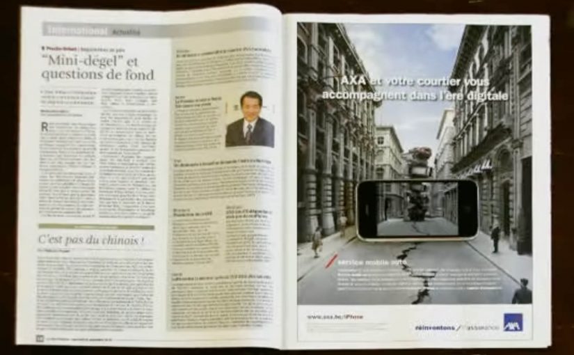
AXA is Belgium’s first insurance company to launch an iPhone app. Their free application helps and guides you through some basic steps when you have a car accident.

To launch this new app Duval Guillaume Antwerp / Modem from Belgium created an innovative print ad that required your iPhone to complete the message.

Why the print idea is a smart match

The product promise is practical. Help me when I am stressed and do not know what to do next. The launch mirrors that by making the iPhone essential to “finishing” the ad, so the viewer experiences the role of the phone immediately. Because the viewer has to use their own device to complete the message, the concept is remembered as help in the moment, not a feature claim. In European insurance marketing, the first interaction needs to make crisis guidance feel tangible.

Extractable takeaway: If your product is built for high-stress moments, design the launch so people experience the first step, not a promise about steps.

  • Device as the missing piece. The iPhone is not just where the app lives. It is how the message becomes complete.
  • Low barrier to understanding. You do one simple action and the concept clicks.
  • Print-to-mobile bridge. The campaign uses print to trigger a mobile behavior, instead of treating print as a dead end.

What to reuse from this approach

The real question is whether your launch makes someone feel guided before they have to believe you.

If the utility of your app is “guidance in a critical moment”, your launch should demonstrate guidance, not describe it. By “guidance”, I mean a few clear, step-by-step prompts that reduce decision load when people are stressed. A small, tangible interaction can do that faster than any list of features.

  • Start with one action. Give people a single, low-friction step that mirrors the moment your app is built for.
  • Make the device essential. Let the phone complete the story so the product role is experienced, not inferred.
  • Bridge media into behavior. Use the channel to trigger the next step, not just to carry copy.

A few fast answers before you act

What does the AXA Belgium iPhone app do?

It helps guide drivers through basic steps after a car accident, providing practical assistance when they need it most.

Who created the print launch ad?

Duval Guillaume Antwerp / Modem (Belgium) created the print execution to launch the app.

What made the print launch ad innovative?

The print execution required the viewer’s iPhone to complete the message, turning the phone into an active part of the ad rather than a separate channel.

Why is this a strong launch mechanic for an insurance app?

It demonstrates the phone’s role as a helper in-the-moment, which aligns directly with the app’s accident-assistance promise.

What is the transferable pattern?

Design a simple physical or media trigger that forces a first interaction with the device. Then let that interaction explain the product in seconds.

Nokia Push: Connected Snowboarding in Beta

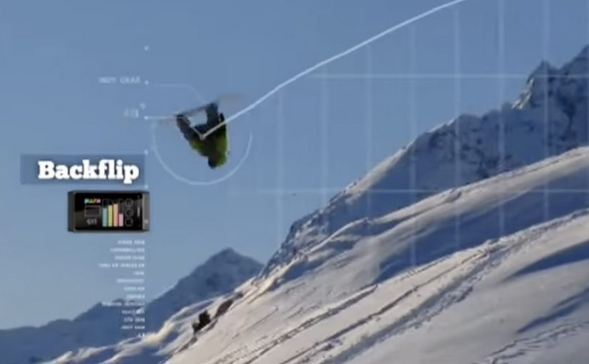
Even though Nokia has joined the Google and Apple smartphone party pretty late, they are clearly trying to innovate fast. With Nokia Push, they take a run at re-imagining snowboarding as a connected game you can play on any mountain in the world.

The idea is to mix gaming and reality using the data you generate while you ride. Bigger tricks, higher speed, crazier turns, more points. The experience is synced to your social life in real time, while also logging your full day on the mountain online.

Snowboarding, scored like a game

The core move is to treat a sport session as a live system of signals. Your board and your body generate performance data, and the platform translates that into a score and a story you can share. Because the system turns raw motion into immediate feedback and status, it gives riders a reason to repeat, improve, and share.

In global consumer tech marketing, sensor-driven “real-world games” help turn product capability into a shared, measurable experience.

Why Nokia frames it as “Push”

Nokia is not only showcasing hardware. It is showcasing a way of thinking. Open experimentation, community participation, and a product narrative that evolves in public instead of arriving fully finished. The real question is whether your “connected” feature creates a loop people want to compare and build on, not just data they can collect. That matters because the value is not just in the feature set. It is in the ecosystem effect, meaning the value that grows when other people can react to it, compare it, and build on it. Brands should treat beta as part of the product narrative, not a pre-launch excuse.

Extractable takeaway: If you can score the real world, ship the scoring and sharing loop early, so the community helps define what “good” looks like.

Where the story is heading next

By 2011, Nokia Push is set to collaborate with Burton Snowboards, described at the time as the world’s biggest snowboarding company, to create a new type of connected snowboarding. Work has already started, and the collaboration is positioned to run in the spirit of the Push project. Transparently, and openly in beta.

Regular progress videos are expected to detail what is being built and to count down to a beta moment at next year’s Burton Euro Open in January.

Steal this: connected sport as a game

  • Make the user the instrument. If the user’s movement creates the data, engagement becomes intrinsic, not forced.
  • Turn performance into a narrative. A score is useful. A replayable story is shareable.
  • Design for viewer control. Let people choose where, when, and how intensely they participate.
  • Ship in public. If the build is evolving, show the evolution so the community feels like a co-owner.

A few fast answers before you act

What is Nokia Push, in simple terms?

A concept that turns a real-world activity into a connected game by capturing performance data, scoring it, and sharing it socially.

What makes this different from a normal sports tracker?

The framing. It is built like a game with points and progression, not only like a dashboard for self-measurement.

Why does the “any mountain” promise matter?

It suggests the arena is the world, not a controlled venue. That universality is what makes it feel like a platform rather than a one-off stunt.

How does the beta, open approach help the campaign?

It creates an unfolding story. People can follow progress, anticipate milestones, and feel part of something that is being built, not just sold.

What is the biggest execution risk with this type of idea?

If setup is complex or sensor reliability is weak, the magic collapses. The experience has to feel effortless enough to use on a cold mountain with gloves on.