
Lacta: Love in Action

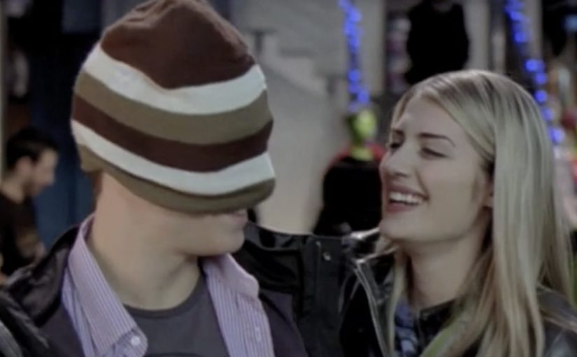
Following the grand success of Lacta’s interactive film in November 2009, Kraft Foods and OgilvyOne Athens set out to create yet another integrated campaign for Lacta, Greece’s leading chocolate brand. This time, instead of producing another love story themselves, they set out to create one with their audience.

Kraft Foods and OgilvyOne crowdsourced a 27-minute branded-entertainment film, involving the audience in everything from writing to casting and styling the actors. Some even popped up as extras in the finished film. During filming, audiences were kept updated through the campaign blog, Facebook, Twitter, YouTube and Flickr.

Here is a 3 minute video case study on the same.

Then on Valentine’s Day the film was aired on Greece’s top TV channel and online, with great success.

What makes this more than “UGC”

The smart leap is that the audience is not just submitting stories. They are being pulled into the messy, high-signal parts of production. Decisions that normally sit behind closed doors. Casting, styling, and creative direction. That raises commitment, because participation shifts from “I sent something” to “I helped shape what shipped.”

In European FMCG branded entertainment, letting people influence production decisions can turn a single film into a sustained participation loop that runs for weeks, not minutes.

Why this lands

This works because it gives people a credible reason to keep coming back. Not to watch ads, but to follow progress, vote, debate, and see whether their influence makes the final cut. The film becomes the payoff, but the real engine is the journey. A public build, meaning a production process made visible as it develops, turns pre-release into its own entertainment.

Extractable takeaway: If you want long-lived attention, make the audience’s role structural, not decorative. Put participation into decisions that change the output, then publish visible progress so people feel their involvement has weight.

The commercial intent underneath

Lacta gets what a standard Valentine’s spot struggles to buy. Time, conversation, and emotional ownership at scale. The brand also stays relatively in the background, so the entertainment is allowed to carry the attention while the association builds quietly.

The real question is whether the audience is helping shape the asset or merely reacting to it.

What to borrow from participatory production

  • Open up real decisions. Voting on meaningful choices beats asking for comments.
  • Show progress publicly. Updates and behind-the-scenes keep momentum alive.
  • Let contributors appear in the output. Even small “extra” moments create powerful ownership.
  • Build a finale moment. A premiere date gives the whole participation arc a shared finish line.

A few fast answers before you act

What is Lacta “Love in Action”?

It is a crowdsourced branded-entertainment film initiative where audiences contributed to and influenced key parts of the production, from story and casting to styling.

What makes this different from a normal brand film?

The audience is involved before release and in decisions that shape the final output, so the build process becomes part of the entertainment.

Why run it across so many platforms?

Because production is a multi-week narrative. Different channels support different behaviours. Updates, voting, sharing, and behind-the-scenes participation.

Why is Valentine’s Day a strong launch moment?

The theme is culturally aligned with love stories, and the calendar creates a natural deadline and shared viewing moment.

What is the main risk when crowdsourcing content like this?

If participation feels cosmetic, people drop out. The audience needs visible proof that their input changes outcomes, and the process must be curated so quality stays high.
Vodafone: Banknote Sticker for Roaming

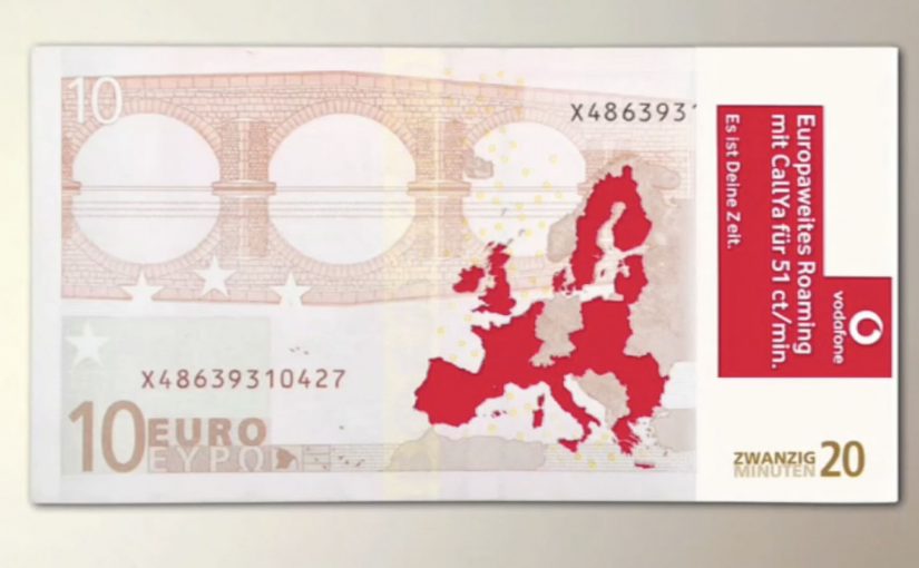
To promote Vodafone’s cheap roaming tariff for Europe, Scholz & Friends chose a medium that does not compete for attention. They modified banknotes with stickers, so the message reaches people in a very specific place, their wallet.

The idea is as low-tech as it is disruptive. Instead of asking travellers to notice another poster, banner, or leaflet, the campaign piggybacks on something they already handle repeatedly while travelling.

Roaming costs are a practical irritation. The sticker works because it shows up when travellers are already handling money.

Why a sticker on cash beats a billboard

Most media fights for a glance. A banknote already has “permission” to be looked at, checked, counted, and passed along. Adding a sticker turns that routine behavior into repeated exposure, without needing a second of extra attention budget.

Extractable takeaway: If the offer is about saving money or reducing travel friction, place it inside a ritual people already repeat, not in a channel that asks for attention first.

It is also inherently portable. Cash moves through hands, venues, and neighborhoods, which gives the idea a built-in distribution logic that feels organic rather than broadcast.

For price-led travel offers, wallet insertion beats billboard spend because it shows up at decision time.

What the mechanic is really doing

  • Context targeting: travellers touch cash, exchange cash, and pay in unfamiliar places.
  • Frequency: one note can generate dozens of impressions across multiple days.
  • Zero clutter: the message lives where ads rarely live, inside the payment ritual.

That is the core “clutter breaking” move. It replaces interruption with insertion.

For European travellers moving across borders, wallet-level touchpoints cut through because they appear at the exact moment people are thinking about money and connectivity.

The real question is whether you can attach your promise to a repeated behavior, instead of paying to interrupt one.

Business intent under the simplicity

The immediate goal is recall for “cheap EU roaming” at the moment a traveller is likely to make a connectivity decision. The deeper goal is brand association with practical travel confidence, meaning Vodafone as the network that makes cross-border usage feel less stressful.

Wallet-level touchpoints to borrow

  • Choose a touchpoint people already trust, then add a light layer of message.
  • Exploit repeated rituals, paying, checking, stamping, validating, not one-off exposure.
  • Keep the promise instantly legible, one benefit, one reading, no decoding.
  • Design for pass-along, so distribution is a property of the medium, not a separate plan.

A few fast answers before you act

What makes this “ambient” instead of traditional advertising?

The message is placed inside an everyday object people already use, rather than in a dedicated ad space that competes for attention.

Why is the wallet a powerful media channel for travel offers?

Because it is handled frequently during travel, and it naturally frames the offer around cost and practicality.

What is the main risk with banknote-based ideas?

Control and coverage. You cannot fully control who receives the notes, and scale depends on distribution logistics and how widely the notes circulate.

How do you measure impact when the medium is not digital?

Use proxies like search lift for the tariff term, store inquiries, roaming plan activations, and time-boxed correlation against the distribution window.

What is the transferable lesson beyond telecom roaming?

If your promise is about saving money or reducing travel friction, placing it inside a payment or travel ritual can outperform louder media because it arrives in-context.

Bar Aurora & Boteco Ferraz: $73,000 Bar Tab

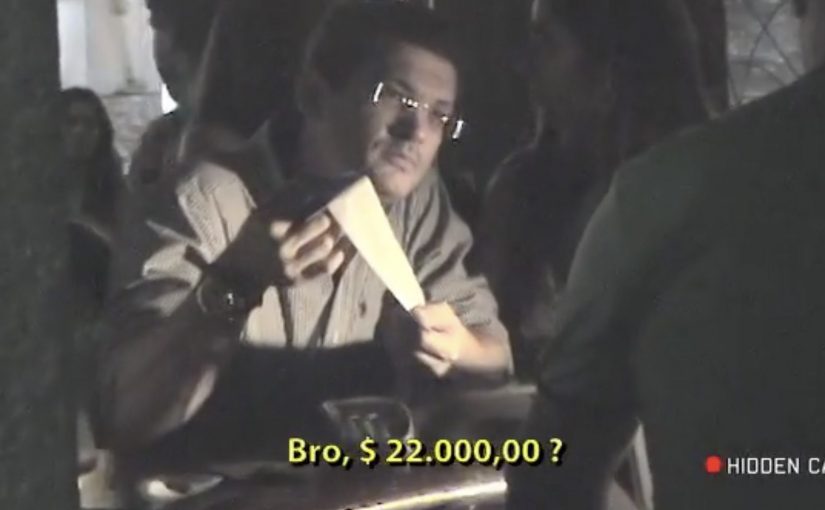
At Bar Aurora and Boteco Ferraz, the bar tab can land like a punch. A normal night out suddenly totals $73,000.

The number is deliberately absurd. Instead of “just” charging for drinks, the receipt is designed to confront patrons with the kinds of costs that a drunk-driving crash can trigger, described as an itemized ledger of consequences rather than a generic warning.

Ogilvy Brasil (São Paulo) ties the message to the moment that matters most. Right after the drinking. Right before the decision to drive.

A receipt that speaks at the exact decision point

The mechanism is simple and brutal. Take a familiar ritual, the bar tab, and turn it into a personalized “cost statement” that patrons cannot ignore because it arrives inside a context they trust and understand. It works because the receipt arrives as a trusted artifact at the exact moment the choice is being made.

That timing does most of the work. The message is not competing with the rest of the day’s noise. It shows up when someone is already weighing options like “I’m fine” versus “I should take a taxi.”

In public-interest and brand-led behavior-change work, point-of-decision interventions outperform broad awareness because they collide with behavior, not intentions.

Here, a point-of-decision intervention is a prompt delivered at the moment someone is deciding what to do next.

The real question is whether you can make the consequence feel immediate enough to change the drive-or-taxi decision.

Why the anger matters more than the poster

People get annoyed because the interruption feels personal. That emotion spike is useful. It snaps the brain out of autopilot, forces a re-check, and reframes the “big deal” as a concrete, financial, immediate-looking problem.

Extractable takeaway: If the risky behavior feels like a small, private choice, make the consequence feel like a concrete, personal ledger entry that appears at the decision point. Reduce abstract harm into a format the audience already treats as “real.”

Done well, this does not need moralizing language. The receipt format does the persuasion quietly. It turns “don’t do this” into “here is what this can cost you, in a language you already understand.”

What the bar gets out of it

This is cause work that also behaves like brand building. It positions the venue as the place that looks after customers beyond the last drink, and it gives staff a socially acceptable reason to start a safer-ride conversation without sounding preachy.

It also travels. The idea is easy to retell, easy to film, and built for word-of-mouth because the “$73,000” moment is inherently shareable.

Patterns to reuse from the $73,000 tab

  • Move the consequence into the present tense. Don’t explain risk. Render it.
  • Use a trusted artifact. Receipts, tickets, confirmations, packaging, dashboards. Anything the audience already believes.
  • Interrupt without humiliating. Aim for friction and reflection, not public shaming.
  • Design for the handoff. The moment should naturally lead to a safer alternative (taxi, ride-share, designated driver) without needing a speech.

A few fast answers before you act

What is the “$73,000 Bar Tab” idea?

It is an anti drink-driving activation where patrons receive a dramatically inflated bar tab that reframes a “small” choice as a high-cost outcome, using the receipt format to make the warning feel concrete.

Why use a bar tab instead of a standard awareness ad?

A bar tab arrives at the point of decision, when a person is actively choosing what to do next. That timing creates immediate relevance and forces the brain out of autopilot in a way a poster rarely can.

What is the key mechanism that makes it persuasive?

Format plus timing. The message is delivered inside a familiar, trusted artifact, at the exact moment the audience is weighing whether they are “okay to drive.”

How can brands adapt this pattern without backlash?

Keep the intervention private, keep the tone factual, and pair it with an obvious safer alternative. The goal is reflection and route change, not punishment.

What should the moment lead to immediately?

Build in an easy handoff to the safer choice, so the “pause” turns into action, like taking a taxi, using ride-share, or calling a designated driver.