Hyundai Genesis: A Message to Space

Hyundai Genesis: A Message to Space

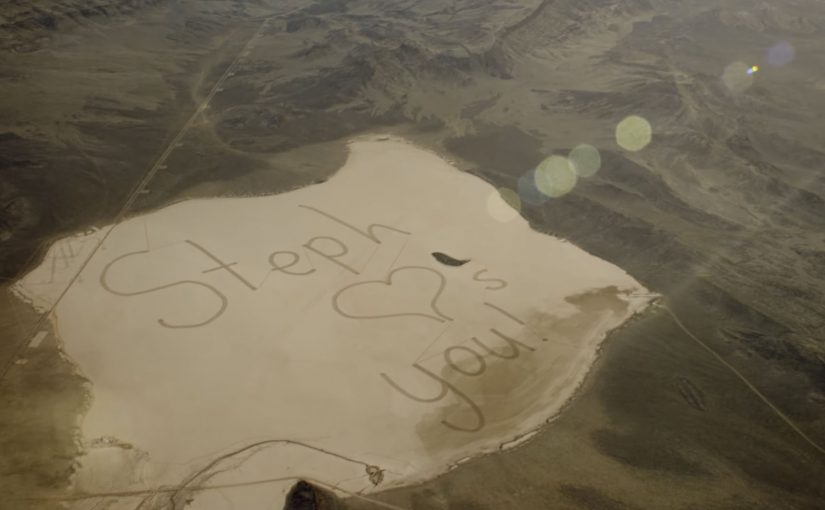
Eleven Hyundai Genesis sedans drive in formation across Nevada’s Delamar Dry Lake, not to show handling, but to write a sentence.

A 13-year-old girl from Houston, Stephanie, misses her astronaut father as he works aboard the International Space Station. Hyundai turns that human truth into a brand-scale gesture. The cars “draw” “Steph loves U” in tire tracks across the dry lake bed. The result is described as larger than one and a half Central Parks. It is also described as being certified by Guinness World Records as the world’s largest tire track image.

From choreography to a message you cannot ignore

The mechanism is straightforward and bold. Take a blank natural canvas. Assign each car a path. Choreograph the movement so the negative space becomes handwriting at a gigantic scale. Then validate the scale with a record body so the stunt becomes a fact people repeat, not just a film people watch.

In global automotive marketing, where products often feel interchangeable in feed-based media, a physical proof stunt creates memorability by turning precision into a story people can retell.

Why it lands

It works because the brand is not asking for attention. It is earning attention by doing something that only coordinated engineering and serious planning can pull off. The emotional hook is intimate, and the execution is absurdly large. That contrast creates instant share value, and it gives the Genesis name a halo of control and capability without needing to say it out loud.

Extractable takeaway: If you need breakthrough, build a single, verifiable act that scales a private human moment into a public artifact, and make the artifact the headline, not your messaging.

What the stunt is really selling

The real question is how to turn a private emotion into a public proof of brand capability without making the brand feel like the hero.

This is one of the rare brand stunts where scale sharpens the emotion instead of burying it.

On the surface, it is a daughter sending a message. Underneath, it is Hyundai demonstrating disciplined coordination. Eleven vehicles behaving like one pen. The brand promise becomes “we can execute the impossible precisely”, which is a stronger feeling than another round of luxury feature claims.

What to borrow from this precision stunt

  • Start with a real relationship. One clear human story beats a composite “target audience”.
  • Make the action the media. A physical artifact outlives the launch window and travels as proof.
  • Engineer a repeatable headline. A record, a scale comparison, or a singular first can carry the story.
  • Let meaning come from constraints. Fewer words. Bigger commitment. Higher credibility.

A few fast answers before you act

What is “A Message to Space”?

It is a Hyundai Genesis marketing stunt where 11 cars drive in formation to create a massive tire track message, “Steph loves U”, intended to be visible to a father on the International Space Station.

What is the core mechanism that makes it shareable?

A simple sentence rendered at extreme scale through choreographed driving, then amplified by third-party validation and a short film that captures the creation.

Why use a Guinness World Records angle?

Records reduce skepticism. They turn “big” into a named achievement people can cite, which helps the story travel beyond advertising audiences.

What is the biggest risk with this style of stunt?

If the human story feels manufactured, the spectacle becomes empty. The emotional truth has to lead, or the record becomes the only thing people remember.

What is one modern adaptation of the same pattern?

Create a single, verifiable public artifact that embodies your brand promise, then design the content around documenting the artifact, not explaining it.

Microsoft: Big Data to Predict Traffic Jams

Microsoft: Big Data to Predict Traffic Jams

Big Data is increasingly being used to find solutions to problems around the world. In this latest example, Microsoft partnered with the Federal University of Minas Gerais, one of Brazil’s largest universities, to undertake research that helps predict traffic jams up to an hour in advance.

With access to traffic data, including historical numbers where available, road cameras, Bing traffic maps, and drivers’ social networks, Microsoft and the research team set out to establish patterns that help foresee traffic jams 15 to 60 minutes before they happen.

What “big data” means in this context

Here, “big data” is not a buzzword. It means combining multiple high-volume signals that each describe traffic from a different angle. Flow and speed data. Camera feeds. Map-layer congestion indicators. And sometimes social or incident signals that explain why conditions change.

How the prediction model is positioned

The mechanism is short-horizon forecasting. Aggregate live and historical traffic conditions. Detect repeating patterns and transitions. Then output a probability that a segment will shift from free-flowing to congested within the next 15 to 60 minutes. The goal is not perfect certainty. It is an early warning that is useful enough to reroute, rebalance signals, or advise drivers.

In urban mobility programs, 15 to 60 minute congestion prediction is a practical layer between raw telemetry and real-world operational decisions.

Why it lands

This works because it targets a time window people actually feel. Short-horizon forecasting matters because it aligns the prediction with the moment when routes, signals, and departures can still change. The real question is whether earlier warning is reliable enough to trigger better decisions before congestion locks in. Useful prediction beats perfect prediction in operational systems.

Extractable takeaway: When a prediction is delivered inside the decision window, it creates value even if it is not perfect. The win is earlier choices, not flawless foresight.

What to steal for traffic prediction

  • Design for actionability: pick a forecast horizon that matches real decisions, not academic elegance.
  • Blend signals carefully: combine steady signals, like flow data, with explanatory signals, like incidents or events, when available.
  • Communicate confidence: a probability and a time window often beats a single definitive “will happen” claim.
  • Validate across cities: portability matters, because traffic behaviors vary by road network and culture.
  • Measure the right outcome: accuracy matters, but reduced delay and better routing outcomes are the real business KPIs.

A few fast answers before you act

What is Microsoft trying to do here?

The project aims to predict traffic jams 15 to 60 minutes ahead by combining traffic flow data, map signals, cameras, and other contextual inputs to spot patterns before congestion forms.

Why is 15 to 60 minutes the useful range?

It is long enough to change routes, adjust signal timing, or delay a departure. It is short enough that conditions have not completely changed since the forecast was generated.

What data sources matter most?

Traffic flow and speed data usually provide the core signal. Cameras, incidents, events, and social signals can add context that improves timing and explains sudden changes.

What does “80% accuracy” actually mean?

It is typically reported as the share of correct predictions under a defined test setup. The real value depends on how accuracy is measured, what baseline is used, and how the prediction is turned into driver or city actions.

Where does this approach fit in a smart-city stack?

It sits between sensing and intervention. Sensors and maps detect current conditions. Prediction estimates near-future conditions. Then routing, signaling, and traveler information systems act on that forecast.

Amazon Dash: The Button That Rewrites Loyalty

Amazon Dash: The Button That Rewrites Loyalty

A one-click purchase is not the point. Default is.

Amazon Dash Button looks simple. A branded button you stick near the place of usage. You press it. The same item arrives again.

But the strategic move is not “one click.” It is making the reorder the default behavior.

Dash Button turns repeat buying into an ambient habit. By “ambient habit,” I mean a repeat action triggered by the environment rather than an active shopping session. It shifts commerce away from discovery and toward automation. It pushes the battle for the customer from the shelf and the screen to the home.

What the Dash Button does

Dash Button is a small connected device tied to one specific product, and often one specific pack size. You link it to your Amazon account. You place it where the need occurs.

Examples are obvious in everyday life:

  • Detergent button near the washing machine
  • Coffee button in the kitchen
  • Pet food button near the feeding area

When the product runs low, you press. Amazon confirms the order, typically via app notifications, and ships.

The experience is intentionally narrow. That narrowness is the innovation.

In consumer convenience products, loyalty is often less about love and more about default.

In high-frequency household categories, the interface at the point of use can matter more than the message at the point of sale.

Why the narrowness matters

Dash Button removes three high-friction moments that brands fight over every day. Because one button equals one SKU, the moment of need no longer reopens the choice.

Extractable takeaway: If you can turn repeat purchase into a single configured action, you shift competition from persuasion in the moment to setup before the moment.

  1. Search. The customer does not type a query.
  2. Comparison. The customer does not see alternatives.
  3. Persuasion. The customer does not view ads, ratings, or promotions in the moment.

In other words, the customer does not shop. They simply replenish.

Once a household adopts replenishment behavior, the role of branding changes. The brand becomes less about persuasion and more about being the chosen default.

The hidden bet. Repeat purchases are the real moat

Dash Button is a physical expression of a platform strategy.

If Amazon captures replenishment categories, it wins the durable, high-frequency part of retail. The items that quietly drive recurring revenue and predictable logistics.

The button also functions as a data instrument. It reveals how often a household needs a product, where it is used, and which categories are truly habitual versus occasional.

That insight feeds subscriptions, predictive delivery, and future interface removal.

What this signals to CPG and retail leaders

Dash Button compresses marketing into an upstream decision.

The real question is how you become the configured default before the point of purchase even exists.

For CPG leaders, this forces uncomfortable clarity on loyalty, pack architecture, trade visibility, and availability. For retailers, it signals a shift in power toward whoever owns the reorder interface.

The consumer tension. Convenience vs control

Dash Button introduces a trust tradeoff.

Consumers value convenience, but they also worry about accidental orders, loss of price checks, oversimplified choice, and dependence on a single platform.

Those tensions do not invalidate the model. They clarify what platforms must solve through better confirmations, clearer reorder states, and smarter replenishment rules.

The bigger story. Interfaces disappear

Dash Button fits a broader direction in commerce. Buying moves away from screens and toward contexts.

The pattern is consistent: less explicit shopping, more embedded intent, more automation, and more default-driven brand outcomes.

Dash Button is not the endpoint. It is an early, tangible step toward commerce that feels invisible.

What to steal from Dash-default loyalty

  • Win the setup, not the moment. Treat the “configured default” as the real battleground, not the last-second persuasion layer.
  • Make narrowness a feature. If the goal is replenishment, deliberately constrain the action so choice does not reopen at the moment of need.
  • Put the trigger where the need occurs. The closer the interface sits to usage, the more it behaves like an always-on shelf for repeat buying.
  • Design for convenience with control. Keep confirmations and reorder states clear so automation feels helpful, not risky.

A few fast answers before you act

What was Amazon Dash?

Dash was a physical reorder button that let customers buy a specific everyday product with one press, removing browsing and checkout steps.

What is the core mechanism?

Turning replenishment into a default action. One button equals one SKU. The interface collapses choice into speed and habit.

Why does this change loyalty dynamics?

Because the reorder interface becomes the brand decision. If the button exists, switching requires extra effort, so the default compounds over time.

What is the business intent?

Increase repeat purchase frequency and reduce churn by owning the replenishment moment and lowering friction to near zero.

What should other brands steal?

Design for the reorder moment. If your category is habitual, the winning move is to remove steps, make the default easy, and earn repeat behavior through convenience.