Benefit Cosmetics: Temptation Telephone

Benefit Cosmetics: Temptation Telephone

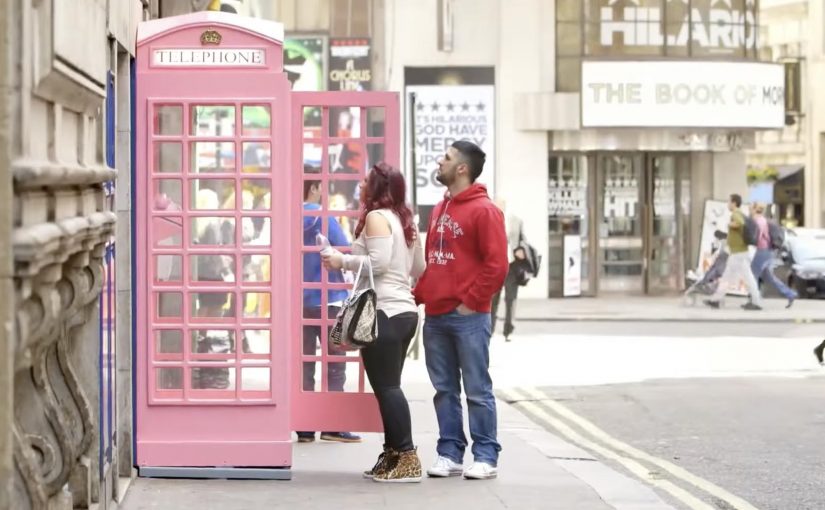
‘Ring ring…’ A pink telephone starts ringing in the middle of London. The question is simple. Do you pick it up.

Benefit Cosmetics places a pink phone booth on a busy street for a day and turns the call into a dare. If you answer, you are pulled into a pop-up “celebrity moment”. A quick makeover, then a trip to Café de Paris where you are pushed onto the stage to sing Whitney Houston’s “I Wanna Dance With Somebody” with a live band in front of a packed room.

The temptation mechanic

The mechanism is built around a single micro-decision, meaning one small public choice with immediate consequences. Answering a ringing phone in public. The payoff is immediate escalation. You are not given a flyer or a discount. You are given a story you will retell. The booth, the ring, the dare, the stage. The whole thing is designed to transform a passerby into the headline.

In beauty retail and experiential marketing, the fastest way to earn attention is to convert curiosity into a socially shareable moment that makes the participant feel chosen.

Why it lands

This works because it exploits a universal impulse. Most people want to know what happens if they answer. The booth creates theatre, the ringing creates urgency, and the venue creates legitimacy. That sequence works because the first action feels harmless, while the public payoff turns a passing impulse into a memorable story. The participant does not feel like they “took part in advertising”. They feel like they got a once-only experience, which is exactly what makes the footage feel authentic and replayable.

Extractable takeaway: When you can own a clear “dare”, design it around a tiny public action with a big, fast reward, then stage the reward somewhere iconic so the story carries your brand without further explanation.

What Benefit Cosmetics is really selling

The real question is whether Benefit can make confidence feel like something you step into, not something you buy. Benefit is not really selling makeup here. It is selling permission to be bold. The makeover is a prop. The real product is the feeling of stepping into the spotlight for ten minutes.

What to steal from Benefit’s temptation loop

  • Engineer a single, obvious trigger. One action. One choice. Answer or walk past.
  • Pay off immediately. Curiosity dies fast. Reward it fast.
  • Borrow an iconic container. A recognizable venue turns a stunt into “a real event”.
  • Make the participant the content. Their nerves and laughter do more than scripted copy ever will.

A few fast answers before you act

What is Benefit’s “Temptation Telephone”?

A one-day street activation where a ringing pink phone booth lures passersby into answering, then escalates into a makeover and a live on-stage performance at Café de Paris.

Why does the ringing phone work as a trigger?

Because it creates an unavoidable question. Who is calling. What happens if I answer. That curiosity produces voluntary engagement.

What role does Café de Paris play in the idea?

It supplies instant credibility and spectacle. The venue makes the payoff feel like a “real night out”, not a brand demo.

What makes this feel shareable rather than staged?

The participant’s reaction arc. Hesitation, commitment, then performance. Viewers watch to see whether the person goes through with it.

When is this pattern a good fit?

When your brand can credibly promise confidence, fun, or transformation, and you can deliver a fast, memorable payoff tied to a single public decision.

Adshels with Difference: IKEA LEDshel and ANAR

Adshels with Difference: IKEA LEDshel and ANAR

Here are two adshel innovations currently doing rounds online. An adshel is a street shelter advertising unit, typically at a bus stop. Both use the media surface itself as the message, not just a place to hang a poster.

Ikea LEDshel

IKEA swapped the regular neon tubes found in adshels around Vienna with its LED range. The product becomes the medium, and the demonstration happens at full scale in the street. Credited to DDB Tribal Vienna, the move turns “better light” into something you can experience, not just read about.

Only for children

In an effort to give abused children a safer way to reach out for help, the Spanish organization Fundación ANAR created an ad that displays a different message to adults and children at the same time.

The poster uses a lenticular top layer to show different images at varying angles and heights. An adult sees the image of a sad child with the line: “sometimes, child abuse is only visible to the child suffering it.” A child sees bruises and a direct help message with a phone number. This work is widely credited to Grey Group España.

What makes these “adshels with difference”

The shared mechanism is simple: upgrade the shelter from a passive frame into an active communicator. One example changes the hardware so the ad site demonstrates the product. The other changes the optical layer so the message adapts to who is looking.

Because the shelter itself performs the claim, the viewer can grasp the argument in seconds, which is why these ideas travel in public space.

In European city out-of-home media, small physical changes to the site often persuade more powerfully than a clever headline alone.

The real question is whether your out-of-home idea still works when the media unit itself has to do the explaining.

These are the out-of-home ideas worth borrowing because the medium carries the proof, not just the copy.

Why it lands

It makes the proof unavoidable. IKEA does not claim “LED looks better.” It lets the street lighting show it. ANAR does not claim “victims can’t speak safely.” It builds a channel that protects the child in plain sight.

It respects context. Adshels sit in public space where attention is brief. Both ideas communicate at a glance, because the medium itself is doing part of the explanation.

It uses targeting without data. The lenticular execution “targets” by viewpoint and height, not cookies. It is a physical interface decision, not a digital one.

Extractable takeaway: Out-of-home innovations travel when the site behavior carries the argument. If the medium demonstrates the product, or adapts the message to the viewer’s vantage point, the campaign becomes self-explanatory and hard to ignore.

Borrowable adshel moves

  • Turn the placement into the demo. If the product has a sensory benefit, make the environment show it.
  • Use physical segmentation. Angle, distance, height, light, and motion can personalize a message without any personal data.
  • Design for public constraints. Fast comprehension wins. The structure should communicate before the copy finishes.
  • Let the medium do the persuasion. When the execution is the proof, the message needs fewer claims.

A few fast answers before you act

What is an “adshel” in this context?

A street shelter advertising unit, typically at bus stops, that combines a poster frame with lighting and protective glass.

What is the IKEA LEDshel idea actually demonstrating?

LED lighting quality in real conditions. The shelter itself becomes a live showroom for the light range.

How does the ANAR poster show two messages at once?

Through a lenticular layer that changes what is visible based on viewing angle and height, so adults and children see different visuals and text.

Why is this more effective than a standard awareness poster?

Because it delivers a help message to the child without alerting the accompanying adult, which is the real constraint in the situation.

What is the reusable principle across both examples?

Make the media unit behave like the idea. When the medium demonstrates, adapts, or protects, the campaign does not need heavy explanation.