JWT Brazil: Black Bar Donation

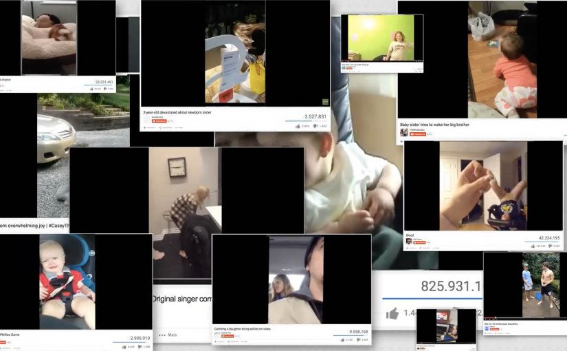
Videos that are recorded vertically and then posted online generally end up with black bars on either side. Lots of viewers find that wasted space annoying. So JWT Brazil came up with the “Black Bar Donation” campaign, which lets creators donate those bars to NGOs that need help promoting themselves.

On the campaign microsite, people select a vertical video to upload, tag it with the NGO of choice, and then publish it directly to their own channel with the NGO messaging living inside the black bars.

In digital marketing where attention is scarce, the smartest cause campaigns repurpose existing media waste into useful inventory without asking audiences to change their habits.

Turning a formatting mistake into donated media

The idea is neat because it starts from a real irritation. The bars are normally dead space. Here they become a donation surface that travels with the content, wherever the video gets shared or embedded. The “media spend” is created from a mistake people already make every day.

Standalone takeaway: When you can transform a widely repeated user error into a benefit for someone else, you get scale through behaviour, not through budget.

The mechanism: creator-led distribution with a cause payload

Traditional NGO awareness depends on buying reach or earning press. This flips the model. Creators supply the distribution. The campaign supplies the insert. NGOs receive a consistent message container that rides along with user-generated video.

It also gives creators a low-effort way to feel helpful. Upload once, choose a cause, publish. No new platform to build an audience on. No complicated call to action.

Why the “black bars” frame is a strong creative device

The bars work because they are visually stable. They sit outside the main video action, so the NGO message does not compete with the creator’s content. At the same time, the contrast is impossible to miss because the bars are solid, empty shapes that viewers are already staring at.

What to steal if you want scale without media spend

  • Find a ubiquitous waste surface. Dead space, downtime, defaults, leftovers. Anything people already produce at scale.
  • Make contribution feel effortless. One clear action, one clear outcome. No learning curve.
  • Keep the creator’s content intact. Add value around it, not on top of it.
  • Design for portability. The message should travel with the asset as it gets re-shared.
  • Make the intent obvious. Viewers should instantly understand that the added space supports a cause.

A few fast answers before you act

What is “Black Bar Donation” in one sentence?

It is a campaign that repurposes the black side bars on vertical videos as donated ad space for NGOs, so the NGO message travels with the video when it is published and shared.

Why does this work better than a normal PSA video?

Because it piggybacks on content people already choose to watch. The NGO message becomes part of the viewing frame, not an interruption users try to skip.

What makes this campaign scalable?

The supply is user behaviour. As long as creators keep shooting vertical video and uploading it, the campaign has new “inventory” to convert into donated space.

What is the biggest risk with this model?

Quality control and brand safety. If the creator video is problematic, the NGO message can end up adjacent to content it would never choose intentionally.

How would you adapt this idea for other platforms or formats?

Look for other consistent “frame” areas that do not disrupt the core content. Then build a simple creator workflow that lets people attach a cause payload without editing tools.

The Cleanest Twitter Account

Twitter is one of the most used social networks worldwide. With billions of tweets being generated everyday, Spontex, a French homecare brand found it to be a mess.

To fight dirt online and at the same time have the cleanest Twitter account in the world, they created @SpontexFrance and started tweeting in white. This not only gave their Twitter timeline a spotless look, it got people talking about their unique Twitter account.

At first glance, the tweets from the account seemed to be blank. Clicking the tweets unlocked the secret messaging behind them. In some cases the first person to favourite the tweet won free products from Spontex.

Why “tweeting in white” is a smart brand mechanic

The idea is simple but loaded with meaning. White space signals cleanliness. The feed looks calm and “spotless” compared to the usual noisy timeline. The second step. Clicking to reveal the message, turns curiosity into engagement without needing shock tactics.

What to borrow for social ideas

  • Make the format the message. The visual cleanliness is the product proof.
  • Add a lightweight unlock. One click turns passive scrolling into active participation.
  • Reward fast interaction. “First to favourite” makes the feed feel live and worth checking.

A few fast answers before you act

What did Spontex do on Twitter?
They created @SpontexFrance and tweeted in white so the timeline looked “clean” and the messages appeared blank until opened.

Why did the tweets look blank?
Because the text was designed to blend into the background. Clicking the tweet revealed the hidden message.

How did the campaign drive engagement?
People had to click to unlock the message, and in some cases the first person to favourite a tweet won free products.

What is the core takeaway?
Use a platform-native behaviour (scrolling and clicking) and a simple visual twist to make participation feel like discovery, not advertising.

WestJet: Ultimate Las Vegas Upgrade

WestJet over the years has passionately given back to their guests with various unimaginable experiences.

Now in their latest campaign targeting Toronto to Las Vegas bound WestJet guests, they got Las Vegas comedian Carrot Top to offer guests a special walk down the red or blue carpet. Those who chose to walk down the red carpet continued on their vacation as they had originally planned. Those who chose the blue carpet went with Carrot Top on an action-filled experience that included a stunning acrobatic display, a world-class DJ, a private airplane hangar, showgirls, and VIP access to the best of the city.

A choice mechanic that turns boarding into a story

The mechanism is a fork in the road with immediate consequences. You are offered a simple choice, red or blue, with no time to overthink it. The red path is “normal”. The blue path is “something is happening”, and the reveal escalates quickly once the choice is made.

In travel and service brands, surprise upgrades work best when they are structured as a clear decision point that people can instantly explain to someone else.

Why it lands

This works because it gives guests a feeling of control while still delivering surprise. The blue carpet is not a random selection. It is a self-chosen leap into the unknown, which makes the outcome feel more personal and more shareable. The red carpet also matters, because it preserves contrast and keeps the twist believable.

Extractable takeaway: If you want a surprise to travel, wrap it in a simple choice. Choice creates ownership, and ownership turns a brand moment into a story people repeat accurately.

The business intent behind the spectacle

This is a loyalty play disguised as entertainment. It reinforces the idea that flying can include delight, not just transport. It also creates a strong piece of proof that WestJet treats guests as people, which is the kind of narrative that outperforms feature lists in crowded travel categories.

What to steal

  • Use a binary choice: two paths create instant tension and clear storytelling.
  • Reward curiosity: let the “brave” option unlock the best outcome, then show why.
  • Escalate fast: once the choice is made, deliver the first payoff immediately to lock attention.
  • Make it filmable: design reveals that work from a handheld camera in real environments.
  • Anchor to a destination truth: Las Vegas is already a promise of spectacle. The upgrade simply makes that promise feel real early.

A few fast answers before you act

What is the WestJet “Ultimate Las Vegas Upgrade”?

It is a surprise experience for Toronto to Las Vegas travelers where guests choose a red or blue carpet. Red continues as normal. Blue triggers a curated VIP Las Vegas experience led by Carrot Top.

Why use a red vs blue choice?

Because it is instantly understandable, it creates viewer control, and it gives the story a clean structure with contrast between normal and extraordinary.

What makes this effective airline marketing?

It makes service tangible. Instead of claiming “we care”, the brand demonstrates it through a memorable experience that guests can share and retell.

What is the reusable pattern for other brands?

Create a simple decision point in a real customer journey, then attach an escalating surprise to one path so customers feel they opted into the moment.

What is the biggest risk with this format?

If the reveal feels confusing or staged, the audience disengages. The choice must feel real, the payoff must feel earned, and the execution must respect guest comfort.