adidas Y-3 Interactive Live Stream

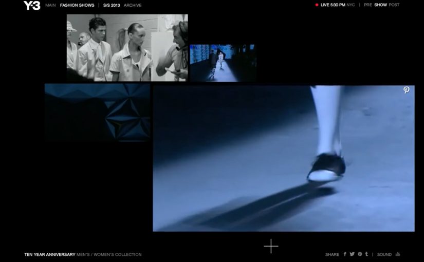
At New York Fashion Week in September 2012, adidas Y-3 revealed its Spring/Summer 2013 collection with an “Interactive Live Stream Experience” built by Acne Production. The online audience got four different runway views, could magnify one view without losing perspective of the show as a whole, and could pin each look to Pinterest.

Since 2010, I have noticed a steady increase in innovations at fashion shows around the world. This execution pushed that trend forward by treating the live stream itself as a designed product, not a passive camera feed.

The context. Y-3 at New York Fashion Week

The show marked the 10th anniversary of adidas’ partnership with Yohji Yamamoto. Athletes, celebrities, and fashion mavens gathered at St John’s Center, which was transformed by Dev Harlan’s 3D projections.

The experience. Four views, one zoomed, full context retained

Acne set up the live stream with four concurrent runway angles. The key interaction was control. Here, control means choosing which runway angle to enlarge while the rest of the show stays visible. Because viewers could focus on one angle without losing the full stage picture, the stream felt curated and intentional rather than fragmented.

Why Pinterest mattered in the flow

Pinning each look turned viewing into collecting. It captured intent at the moment of attention and let the audience take the show with them. One click turned a runway moment into a saved, shareable reference.

Extractable takeaway: When a live format lets people save individual moments without leaving the experience, attention becomes portable and the event keeps working after it ends.

In fashion and brand storytelling, the scalable advantage is not just reach, but designing a live moment so viewers can navigate it, keep pieces of it, and revisit it later.

The business intent is to turn fleeting runway attention into saved looks and shareable references without pulling viewers out of the live moment.

This is a stronger digital show model than a single passive camera feed because it turns viewing, collecting, and sharing into one connected experience.

The real question is how to turn a live stream from a one-time broadcast into a format that creates ongoing attention and reuse.

What fashion brands can lift from this

  • Give viewers control, not just a feed: Multiple camera angles plus a “magnify” interaction keeps a live stream feeling explorable, not passive.
  • Preserve context while zooming in: Let people focus on one view without losing the whole runway. That is the difference between browsing and watching.
  • Make curation the sharing mechanic: “Pin each look to Pinterest” turns the show into a personal collection that naturally travels beyond the event.
  • Use production craft as a multiplier: 3D projections and a transformed venue become part of the story, not just decoration, and they travel well in recaps.
  • Design for the afterlife of the live moment: The live experience creates assets and saved looks that keep circulating after the show ends.

A few fast answers before you act

What was the adidas Y-3 Interactive Live Stream?

It was a multi-angle live stream for the Y-3 Spring/Summer 2013 runway that let viewers zoom one camera view while still keeping the full-show context, and pin looks to Pinterest.

What was the core interaction pattern?

Multi-view streaming with user-controlled emphasis. Viewers chose what to focus on without breaking the narrative of the show.

Why did “keep context” matter in live streaming?

If zoom removed context, viewers felt lost. Keeping the full show visible preserved rhythm and made the experience feel like one coherent event.

Why add Pinterest at the point of viewing?

It turned attention into a saved action immediately. Instead of asking viewers to remember a look later, the stream let them collect it while interest was highest.

What is the practical lesson for digital show formats?

Design the stream like a product. Give the audience simple controls that match how they watch, and offer a frictionless way to save and share what they like.

AR in 2013: Three Retail-Ready Examples

Augmented Reality in 2013: when the real world becomes the interface

With smartphones and tablets becoming part of our everyday life, we also see more augmented reality apps mixing the virtual and the real world in 2013. Here are some examples from ARworks that recently caught my eye.

Audi Singapore Showroom app

For the opening of their biggest showroom in South-East Asia, Audi created AR experiences that allowed visitors to fly around the showroom building without actually boarding a plane, or drive the Audi R18 race car around Singapore at full speed without the risk of getting a ticket. What’s more, they even allowed visitors to personalize their individual license plates and then take photos with the car.

Dakar race in a shopping mall

A real Dakar desert racecourse was built for the new Opel Mokka on a 4mtrs long table that was placed in a shopping mall. Visitors could use the provided iPads to race against time and each other. The results were then shared on Facebook, and the weekly and overall winners received various prizes.

Christmas Ornament Sling

Deutsche Telekom, for their Christmas promotion, developed an iPad app where visitors could throw virtual Christmas ornaments containing their personal message onto a huge Christmas tree erected in a mall. A successful hit to one of the real ornaments on the tree lit it up through an integrated server application.

The pattern across all three: AR turns “watching” into doing

None of these examples treat AR as a gimmick. Each one uses the device as a bridge between curiosity and action. You explore a building. You race a course. You aim a message at a real tree. The screen stops being a place to consume. It becomes a tool to participate.

In retail and shopper environments, augmented reality works best when it turns a physical setup into a simple, repeatable action loop for the visitor.

The real question is whether your AR layer gives the visitor a simple verb and a payoff worth repeating.

Why retail is the natural habitat for AR

Retail already has the ingredients. Footfall, dwell time, and physical objects that can anchor the experience. AR simply adds a layer of viewer control. The visitor decides where to look, what to try, and what to share. This works because the physical anchor keeps the choice set small, so the device can turn curiosity into a low-friction action with an immediate outcome.

Extractable takeaway: AR earns its keep when the physical setup stays simple and the device turns it into a repeatable action that produces a visible outcome worth sharing.

What’s really being built here

These are not “apps.” They are engagement machines, meaning they turn a physical setup into an interaction loop with a reward and an easy share path. Each one creates a clear reason to interact, a clear reward for completing the action, and a clear path to share or repeat. That is how you turn novelty into behavior.

Four retail-ready AR mechanics to copy

  • Anchor it physically. Anchor the experience to a physical object people can gather around. A showroom, a tabletop course, a tree.
  • Give the visitor a simple verb. Fly, drive, race, sling. Actions beat features.
  • Design a tangible payoff. A photo, a score, a lit ornament. Make the outcome tangible.
  • Make sharing a by-product. Make sharing a natural by-product of the activity, not a forced button at the end.

A few fast answers before you act

What makes these 2013 AR examples feel “ready” for real audiences?

They are built around clear actions and clear rewards. The device is used to do something in the physical environment, not just view an overlay.

Which devices are central to these activations?

Tablets and phones are the delivery mechanism. The examples explicitly reference iPads and handheld devices for the AR interaction.

What role does sharing play in these concepts?

Sharing is tied to the activity. Photos with the car, results shared on Facebook, and personal messages sent as virtual ornaments.

What is the common mechanic across the three examples?

The camera-enabled device acts like a controller that links a real-world setup to a virtual experience, giving the viewer control over exploration and interaction.

How do you keep AR from feeling like a gimmick?

Make the overlay serve a real action and a visible outcome. If the visitor can do something concrete and see a result that is worth showing, the experience stops being novelty and starts being behavior.

Marie Claire: Print Pages You Can Tap to Buy

Enabling readers to buy directly from magazines or newspapers is slowly going to become the industry standard, as revenues from print continue to slip.

Last year Ikea re-imagined their catalog via a special visual recognition app that brought its pages and offerings within to life. Now Marie Claire has taken it one step further by letting their readers use the Netpage app to interact with its printed pages, clip, save, share, watch and buy.

The Netpage app is described as using a combination of image recognition, augmented reality and digital twin technology. Hence no special codes, watermarks or special printing processes are required. In this context, “digital twin” is used to describe a digital counterpart of each page that can be recognized and linked to interactive layers.

Shoppable print, without QR code clutter

Shoppable print is the fusion of editorial content and commerce, where a reader can move from “I want that” to checkout directly from the page. The key difference here is interaction that is designed to feel native to reading. Not bolted on as a separate scanning ritual. Because the interaction stays inside the reading flow, it reduces friction, which is why it can earn repeat use instead of feeling like a one-time gimmick.

In magazine and brand teams trying to keep print premium while still making it measurable, invisible recognition is the interaction pattern that scales best.

The real question is whether your print pages can create measurable intent without forcing readers out of the reading flow.

Why this matters for magazines and brands

Once print becomes tappable, meaning a phone can recognize a specific page and surface actions, the page stops being an endpoint. It becomes a trigger for a whole set of actions, saving for later, sharing with friends, watching richer product context, and buying immediately.

Extractable takeaway: If a page can trigger trackable actions and even checkout, the magazine is no longer only monetized by ads and subscriptions. It can also participate in the transaction path.

Practical moves for tappable print commerce

  • Design interaction as a reading behavior, quick actions that fit the moment, not a separate “tech demo.”
  • Reduce visual noise, if recognition can be invisible, the page stays premium.
  • Offer multiple intent paths, not everyone wants to buy now, but they might save, share, or watch.
  • Make the jump from inspiration to action short, the fewer steps, the more commerce you unlock.

Publishers and brands should treat tappable print as a measurable commerce layer, not a novelty. The future is all about content being fused with commerce so that it’s a quick step from reading about an item to buying it. So get ready!


A few fast answers before you act

What does “interactive print” mean here?

It means a printed page can be recognized by a phone app and instantly connected to digital actions like clipping, saving, sharing, watching content, and buying.

How is this different from QR codes?

The interaction is designed to be code-free on the page. The recognition layer is meant to feel invisible, so the magazine layout stays clean.

What is the core value for readers?

Convenience. Readers can act on interest immediately, whether that means saving an item, sharing it, or purchasing it, without leaving the content context.

What is the core value for publishers?

A measurable engagement layer and a commerce path. Pages can generate trackable actions and potentially incremental revenue beyond print ads.

What is the biggest adoption risk?

Habit change. If the scanning flow feels slow or unclear, people will not repeat it. The first experience must be fast, obvious, and rewarding.